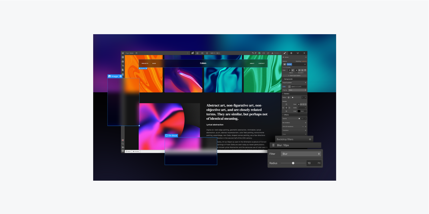
Elevate your foreground content by utilizing and overlaying background filters to generate distinctive visual effects on your background components. You can also instantly preview each background filter in your design — all without the need for any custom code.
Important: Background filters are currently in beta. These styles won’t display accurately on Firefox in the Webflow Designer or published sites until support is integrated into Firefox. Refer to current browser support.
This tutorial will cover the following:
- Definition of a background filter
- Behavior of background filters
- Adding background filters to an element
Definition of a background filter
Integrating a background filter to any element enables you to implement filter effects (e.g., blur, color shift, contrast, etc.) to transparent areas within the element’s boundary. Anything visible behind the element through the transparent areas will be influenced by the background filter.
You can also implement several background filters to a single element. You can stack and merge the background filters to produce a variety of visual effects.
Key detail: Since the background filter is applied to everything behind the element, to observe the effect, you must make the element, some parts of the element, or its background somewhat transparent.
Comparison of background filters versus filters
Background filters deliver the same impact as filters, with one significant contrast — background filters are exclusive to areas behind the element rather than to the element and its descendants. On the contrary, filters directly affect the element and its descendants, without impacting anything behind the element.
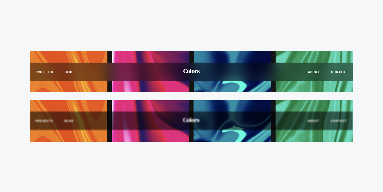
Behavior of background filters
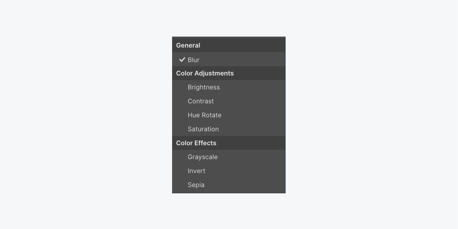
The Webflow’s Style panel contains 8 Background filters in the Effects category. Filters that operate similarly are grouped together in the Background filters dropdown. These filter groupings comprise:
- General (Blur)
- Color alterations (Brightness, Contrast, Hue rotate, and Saturation)
- Color effects (Grayscale, Invert, and Sepia)
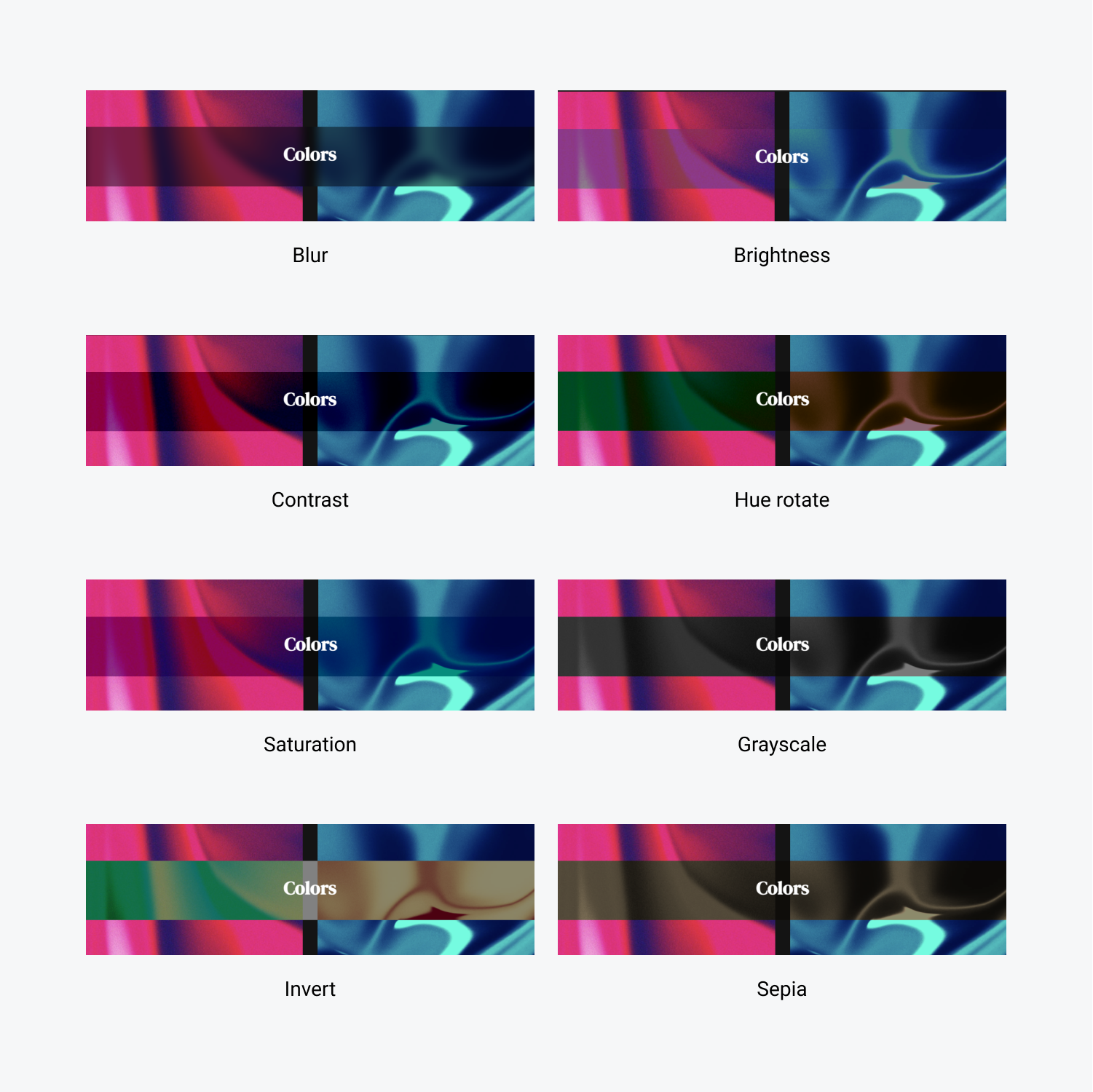
Let’s explore how each background filter functions when applied to an element with somewhat transparent content.
General
Blur
Blur renders a gaussian blur to your content. The blur radius dictates the intensity of the blur — larger values result in more blur, while smaller values lead to lesser blur.

Color alterations
Brightness
Brightness adjusts the brightness of content to appear brighter or dimmer. You can regulate the degree — values below 100% diminish brightness, while values exceeding 100% heighten brightness.
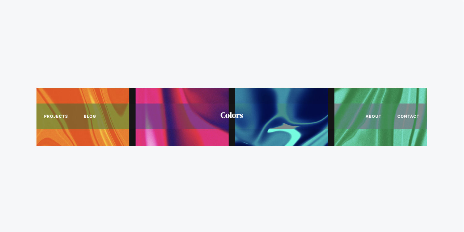
Contrast
Contrast amplifies or decreases the contrast of your content. You can modulate the magnitude — values below 100% reduce contrast, while values over 100% enhance contrast.
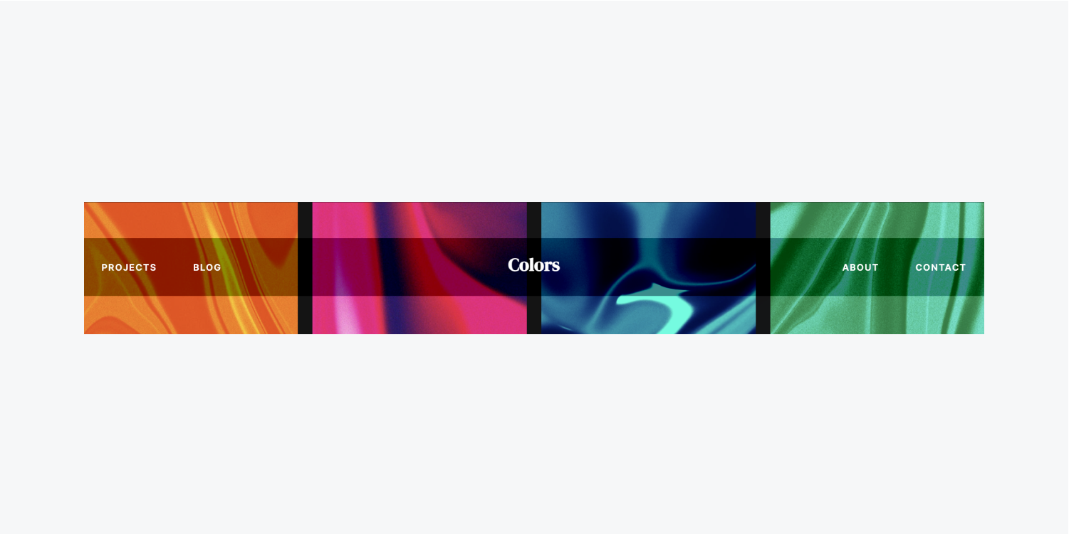
Hue rotate
Hue rotate alters the global hue of your content, based on hues present across a standard color circle. Youcan adjust the degree at which the hue shifts around the color circle. Smaller angles (e.g., 10 degrees) will show cool colored hues, while larger angles (e.g., 340 degrees) will display warm colored hues. You have the option to manually input degrees beyond 360, resulting in the color circle wrapping around (e.g., 400 degrees will look the same as 40 degrees).
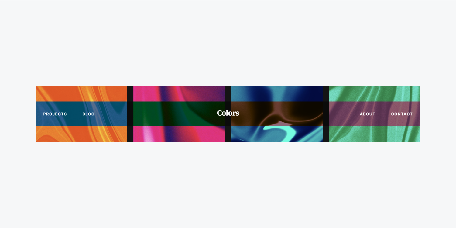
Saturation
Saturation can be adjusted to increase or decrease the saturation of your content. Values below 100% decrease saturation, while values above 100% increase it.

Color effects
Grayscale
Grayscale converts your content to grayscale. You can modify the intensity — values below 100% reduce the grayscale effect, while values at or above 100% show complete grayscale content.
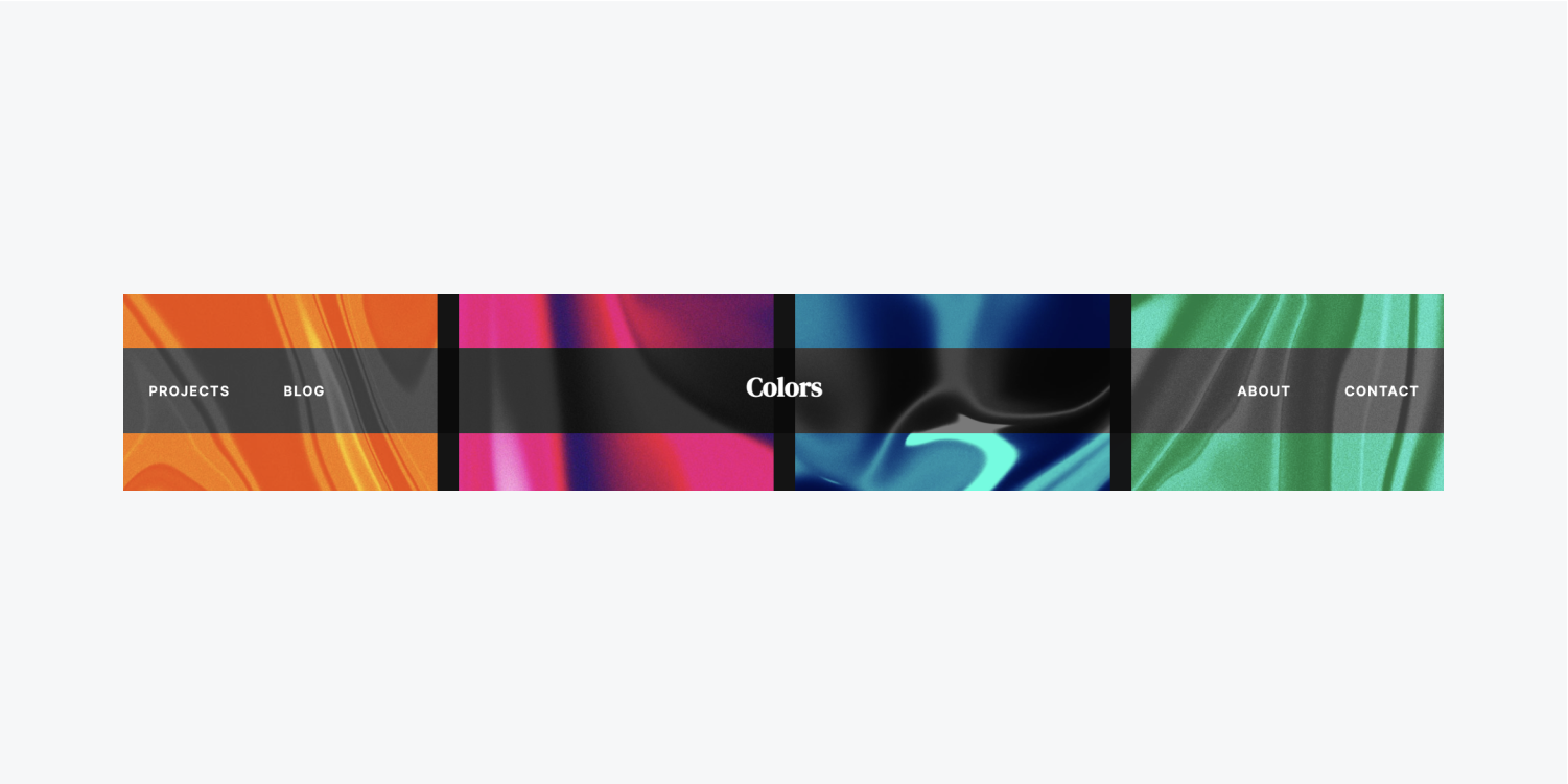
Invert
Invert changes the colors of your content by inverting them. You can alter the effect — values below 100% reduce the inversion effect, while values at or above 100% show content completely inverted.
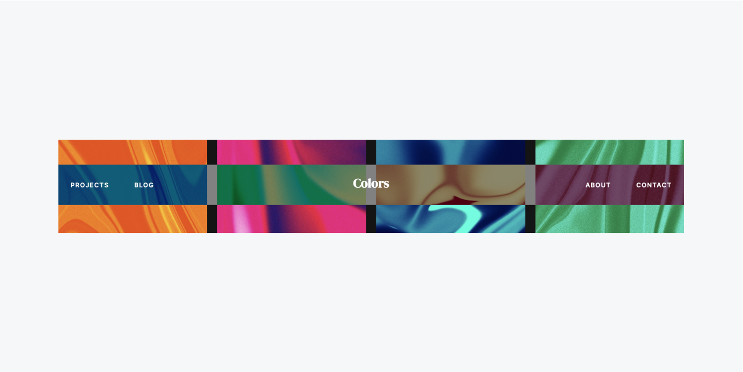
Sepia
Sepia changes your content to a sepia tone. You can adjust the level — values below 100% lessen the sepia effect, while values at or above 100% display entirely sepia-toned content.

How to incorporate backdrop filters into an element
You can apply backdrop filters to any element you design. To visualize the effect, ensure that your element’s content has some transparency. This can be achieved by using SVG or PNG images, giving the element a transparent background, or decreasing the element’s opacity.
Let’s use a blur backdrop filter on an element:
- Choose your element
- Access the Style panel > Effects > Backdrop filters
- Click the “plus” icon next to Backdrop filters
- Open the filter dropdown menu to view available filters
- Hover over any filter to preview the effect
- Select Blur from the dropdown menu
- Adjust the blur radius to set the desired blur level on your element
- Click away from the backdrop filter settings to save your modifications
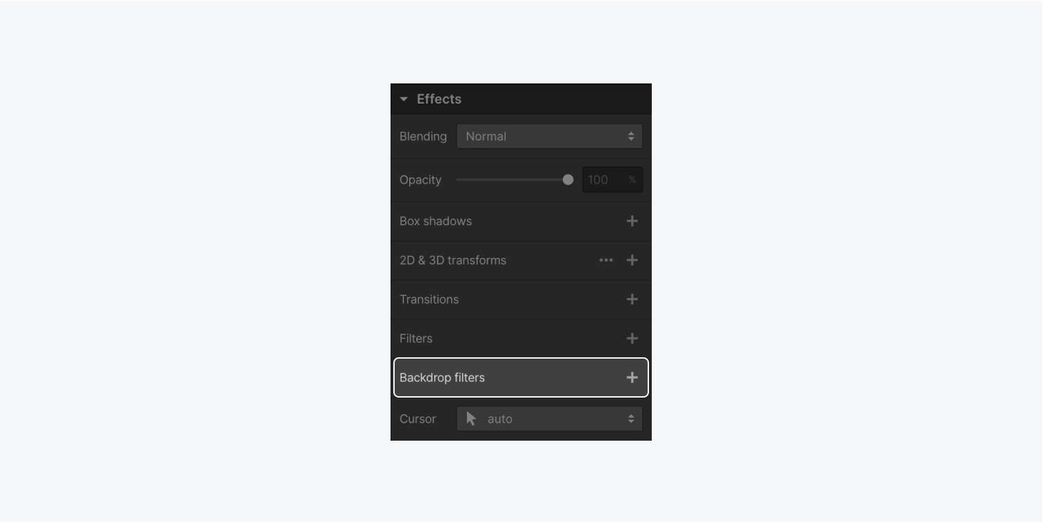
If you desire to layer multiple filters, you can follow the same steps repeatedly. A combination of filters can be seen as layers where you have the flexibility to adjust their arrangement by dragging and dropping.
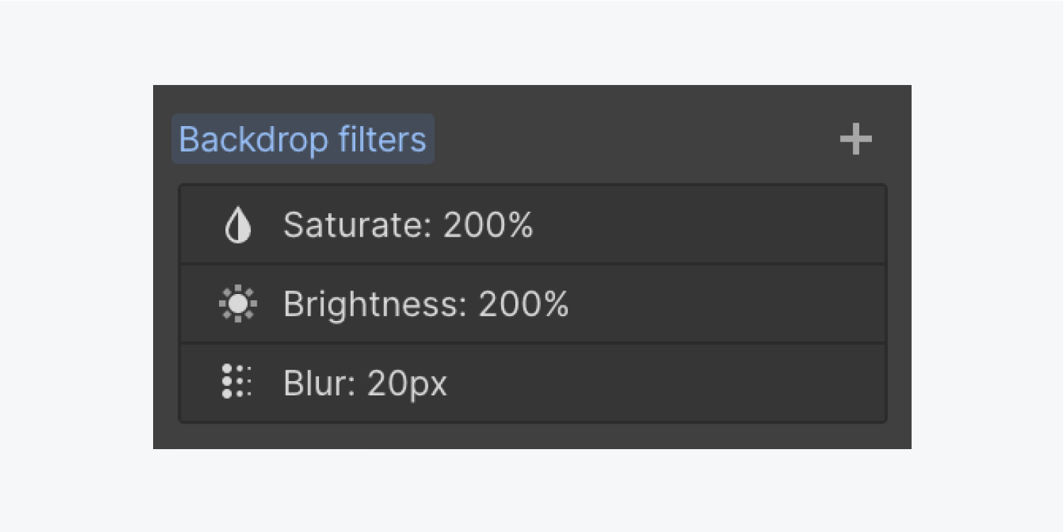
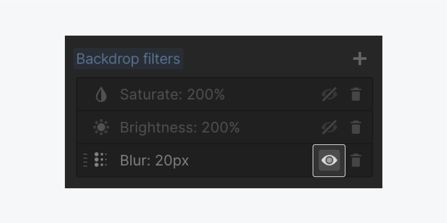
To alternate between visible and hidden states for each backdrop filter effect:
- Access the Style panel > Effects > Backdrop filters
- Hover over the desired filter to either conceal or reveal it
- Click on the “eye” emblem to change the visibility of the filter
To customize your filter’s configurations:
- Access the Style panel > Effects > Backdrop filters
- Locate the filter you wish to modify to access its settings
- Implement your adjustments and exit the filter’s settings to save your changes
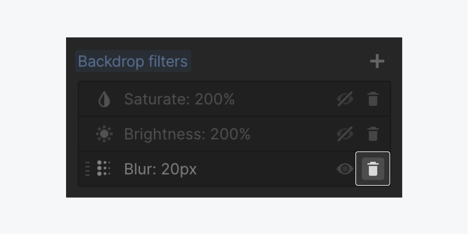
To eliminate a filter:
- Access the Style panel > Effects > Backdrop filters
- Hover over the filter you want to erase
- Click on the “trash” icon
Additional resources: Find out more about the Style panel.
- Include or eliminate Workspace spots and members - April 15, 2024
- Centering box summary - April 15, 2024
- Store a site for future reference - April 15, 2024
