An aesthetically pleasing site displaying all your remarkable work isn’t very valuable if you fail to also facilitate clients in contacting you. The solution? An influential call to action with a prominently placed contact form on your homepage that motivates clients to engage your services. Moreover, transform the contact form into a Symbol for reusability purposes.
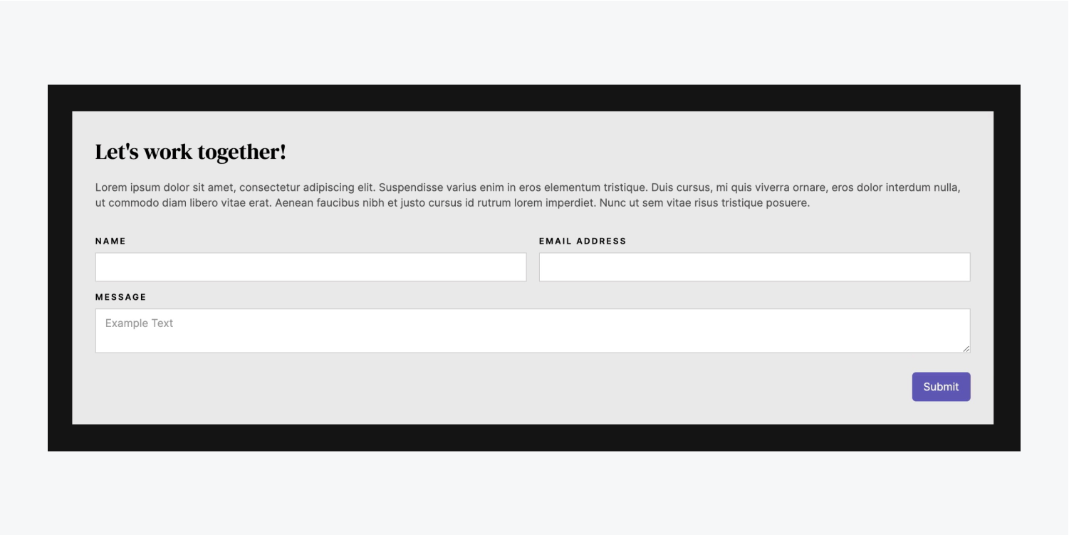
In this tutorial, you will discover how to incorporate a contact form into your project by completing the following steps:
- Integrate the Form
- Set up the Form
- Design the Form
- Convert it into a Symbol
Follow the steps and access the resources for this tutorial.
Integrate the Form
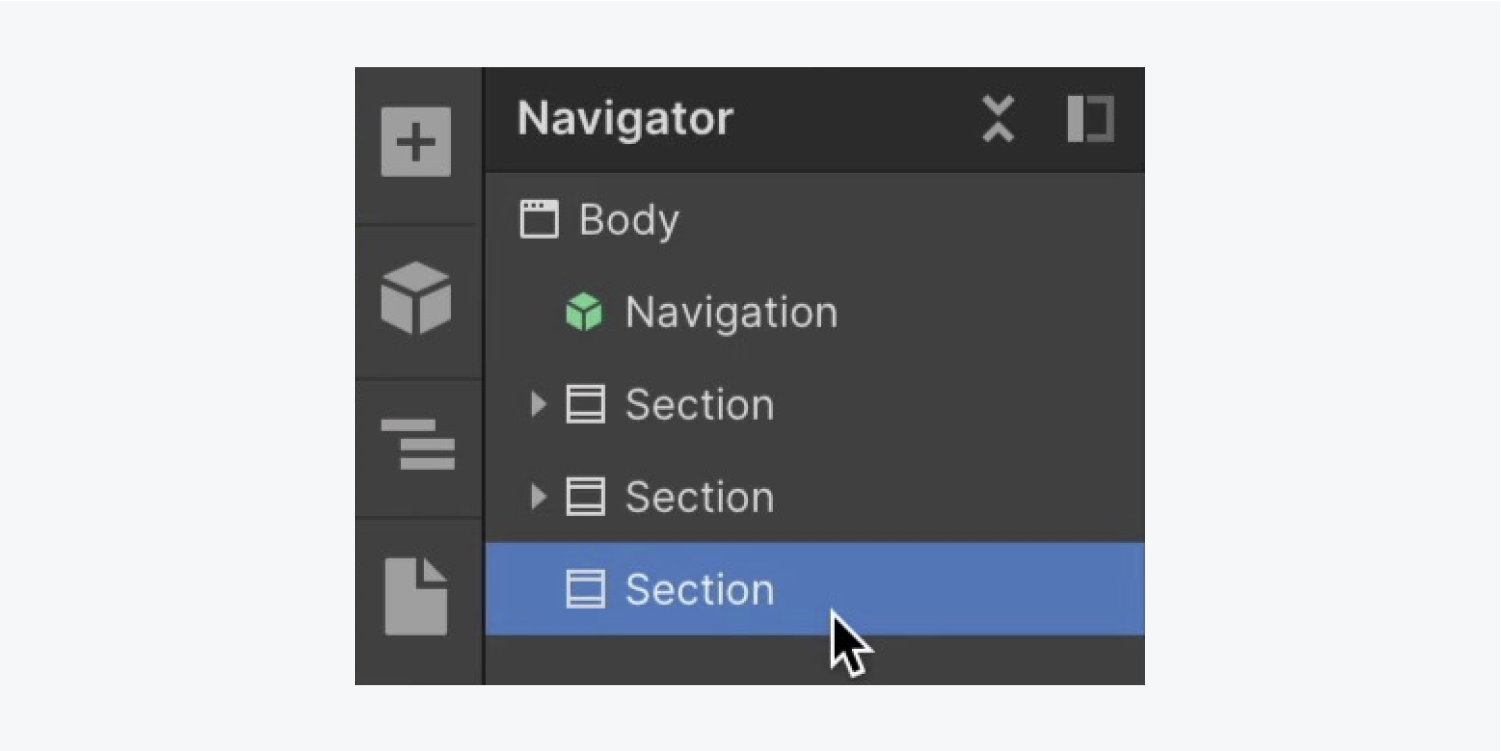
Begin by adding an additional Section to the homepage:
- Launch the Navigator
- Access the Add panel
- Drag a Section into the Navigator and position it below the existing 2 Sections
Reapply the “Section” class to our new Section to maintain the 60 pixels of top and bottom padding we had previously set:
- Access the Style panel
- Click on the Selector field
- Choose “Section” from the Existing classes
Add a Container to the new Section to ensure our elements are well-contained:
- Access the Add panel
- Drag a Container into the new Section
- Select the Container and click on the Selector field
- Choose “Container” from the Existing classes
Proceed to include a Form block within the Container:
- Access the Add panel
- Drag a Form block into the Container

Set up the Form
Initially, the Form block comes with 2 components – “Name” and “Email address” fields. Let’s append a third field along with its corresponding label:
- Access the Add panel
- Drag a Text area into the Form (to allow visitors to insert a message)
- Access the Add panel
- Drag a Label into the Form positioned above the Text area field
- Double-click on the default Label text and modify it (e.g., “Message”)
Customize our Field label:
- Select the “Name” Field label
- Access the Style panel > Typography
- Access More type options and select Capitalize
- Set the letter spacing to 2 pixels
- Reduce the font size to 12 pixels
A “Field label” class has been automatically generated when implementing the above style alterations. Let’s apply those changes to the remaining Field labels in our Form:
- Choose the “Email Address” Field label
- Access the Style panel
- Click on the Selector field
- Choose “Field label” from the Existing classes
Repeat the preceding steps for the other Field label (e.g., “Message”).
Note: You can swiftly access the Selector field within the Style panel by selecting your element and pressing Command + Enter (Mac) or Control + Enter (Windows).
Now that the “Field label” class has been applied to all the Field labels within our Form, let’s adjust the font size (impacting all elements with the same applied class):
- Choose a “Field label” from your Form
- Access the Style panel > Typography
- Reduce the font size to 11 pixels
Design the Form
Select the Form block for styling:
Diversify the font color of the Form block:
- Access the Style panel > Typography
- Click on the color picker and adjust the font color to black
Adjust the font size along with the line height to enhance the legibility of the form. Additionally, modify the various form elements to ensure a consistent and visually appealing user experience.
Modify the background color to ensure our text is easily readable against it:
- Access the Style panel and navigate to Backgrounds
- Choose the color picker and adjust it to a light gray shade (e.g., “#e9e9e9”)
Now, let’s include some padding:
- Go to the Style panel and click on Spacing
- Add 30 pixels of padding on all sides
Important: To efficiently add margin or padding across all sides of an element, hold down Shift while dragging one of the margin or padding controls.
We will also introduce a Heading within our Form block to encourage our site visitors to reach out to us:
- Access the Navigator
- Open the Add panel
- Drag a Heading into the Navigator and place it at the top of the Form block
- Double-click on the Heading to modify the default text (e.g., “Let’s collaborate!”)
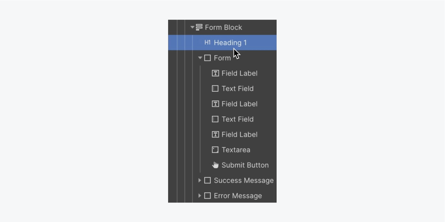
Since we have already established a “Secondary heading” class, let’s assign the same class to the Heading within our Form:
- Select the Heading in the Form
- Access the Selector field
- Opt for “Secondary heading” from the list of Existing classes
Additional information: The original “Secondary heading” on your homepage derives its color (white) from its parent element — the Body (all pages tag). The “Secondary heading” located in the Form inherits its color (black) from its parent — the Form block.
Let’s insert a Paragraph into the Form block:
- Access the Navigator
- Open the Add panel
- Drag a Paragraph into the Navigator and position it within the Form block, following the “Secondary heading”
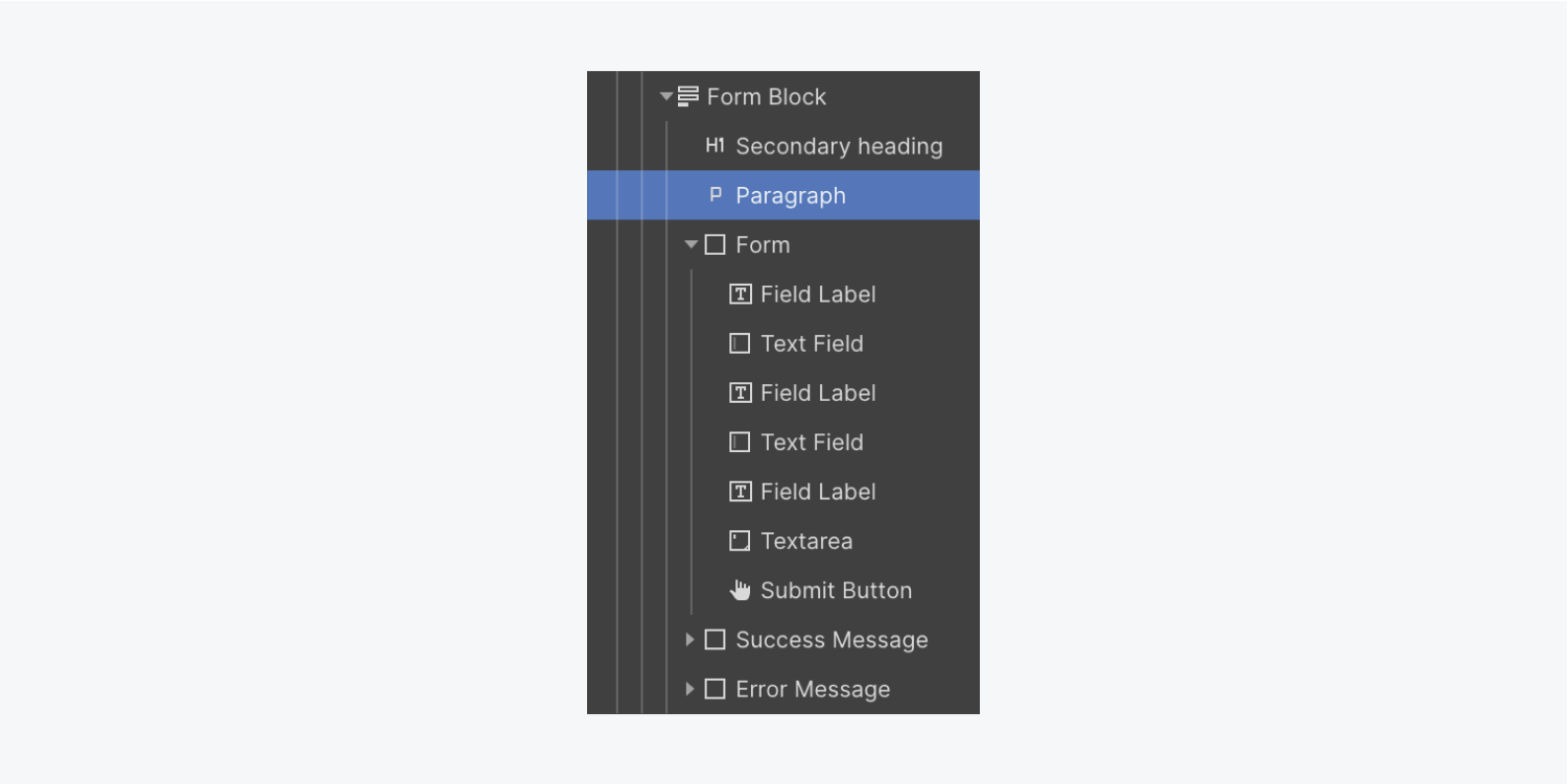
Given that we don’t have any predefined paragraph styles suitable for our contact form, let’s design this paragraph and establish a new class for it:
- Select the Paragraph within your Form block
- Access the Style panel and navigate to Typography
- Choose the color picker and adjust the opacity to 68
- Click on the Selector field and rename the default class (e.g., “Dark paragraph”)
- Access the Style panel and proceed to Spacing, then increase the bottom margin to 30 pixels
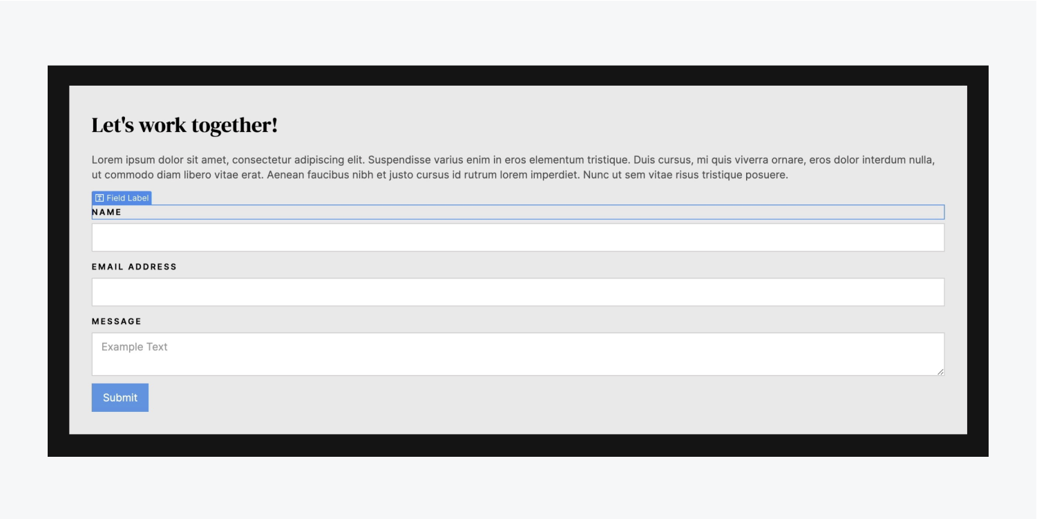
Let’s introduce a Grid into our Form to arrange our fields side-by-side:
- Grab a Grid from the Add panel and position it at the top of the Form
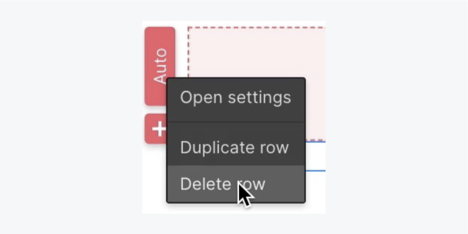
- Right-click on the second row of the Grid and choose “Delete row” from the settings menu
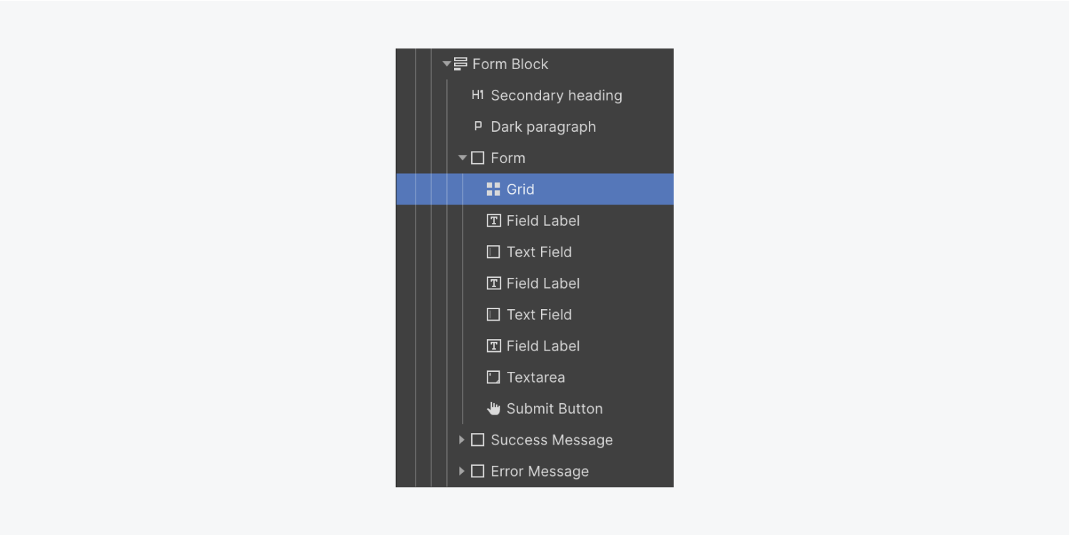
Let’s incorporate a Div block within the Grid to host some of our Form elements:
- Access the Navigator
- Open the Add panel
- Drag a Div block into the Navigator and position it inside the Grid
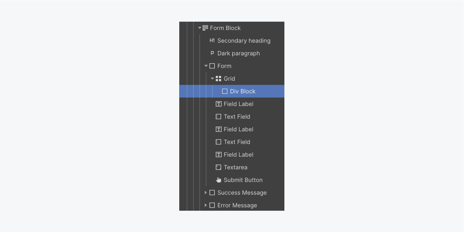
Select and move the “Name” Field label alongside its corresponding Text field into the Div block.
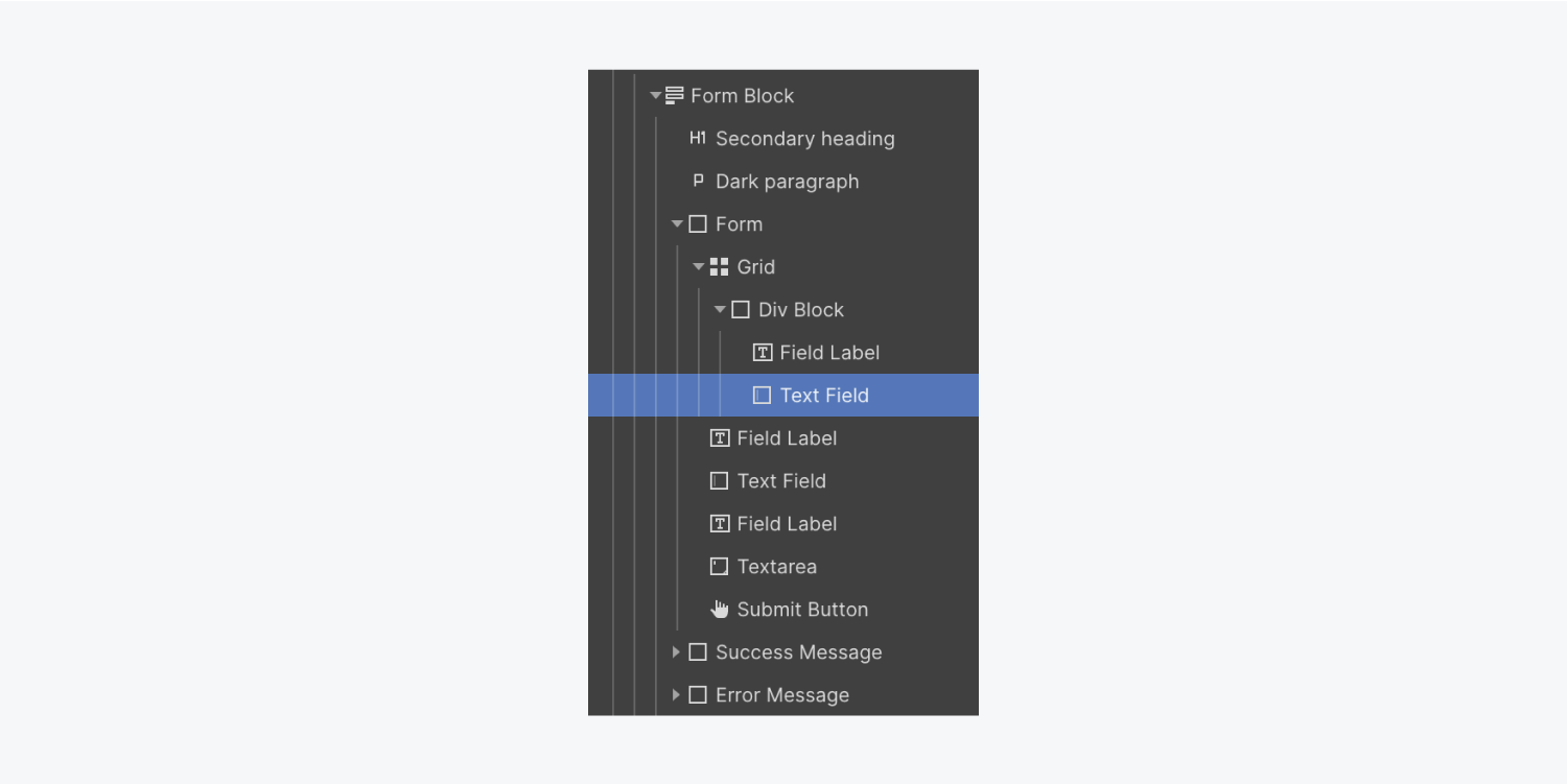
Let’s include a new Div block in the second cell of the second Grid so we can place our remaining Form elements inside it:
- Access the Navigator
- Open the Add panel
- Drag a Div block into the Navigator and position it within the Gridbelow the initial section
Choose and move the “Email address” Label and its corresponding Text box into the following section.
Let’s shift the Send button to the right side of the Submission form. To achieve this, we will begin by configuring the Form into a Flex format:
- Click on the Submission form
- Access the Styling panel > Layout settings
- Adjust the Display option to Flex and Direction to Vertical
We’ll customize the behavior of the Send button and modify its Background tone:
- Choose the Send button
- Access the Style panel > Flex control > Alignment and arrangement
- Select rightalignment
- Navigate to Background settings and utilize the color palette tool
- Adjust the default color scheme (e.g., “#6057c3”)
You may also create a variable to reuse this color for other elements.
Now, let’s add some curvature to the Send button:
- Access the Style panel > Border settings
- Set the Curve size to 5 pixels
To provide space around the button, move it slightly away from the form components above it:
- Go to the Style panel > Spacing
- Adjust the top spacing to 15 pixels
Transform it into a Symbol
Finally, convert the Form segment into a Symbol for repeated usage within the project:
- Select the Form segment
- Right-click on the Form segment’s tag
- Opt for “Generate Symbol” from the dropdown and assign a name (e.g., “Contact form”)
You’re all set — a contact form awaits new submissions!
- Include or eliminate Workspace spots and members - April 15, 2024
- Centering box summary - April 15, 2024
- Store a site for future reference - April 15, 2024
