Consider your main section as the front page of a popular novel — captivate your visitor’s attention with strong text and attractive visuals to encourage them to discover more about your distinct brand.
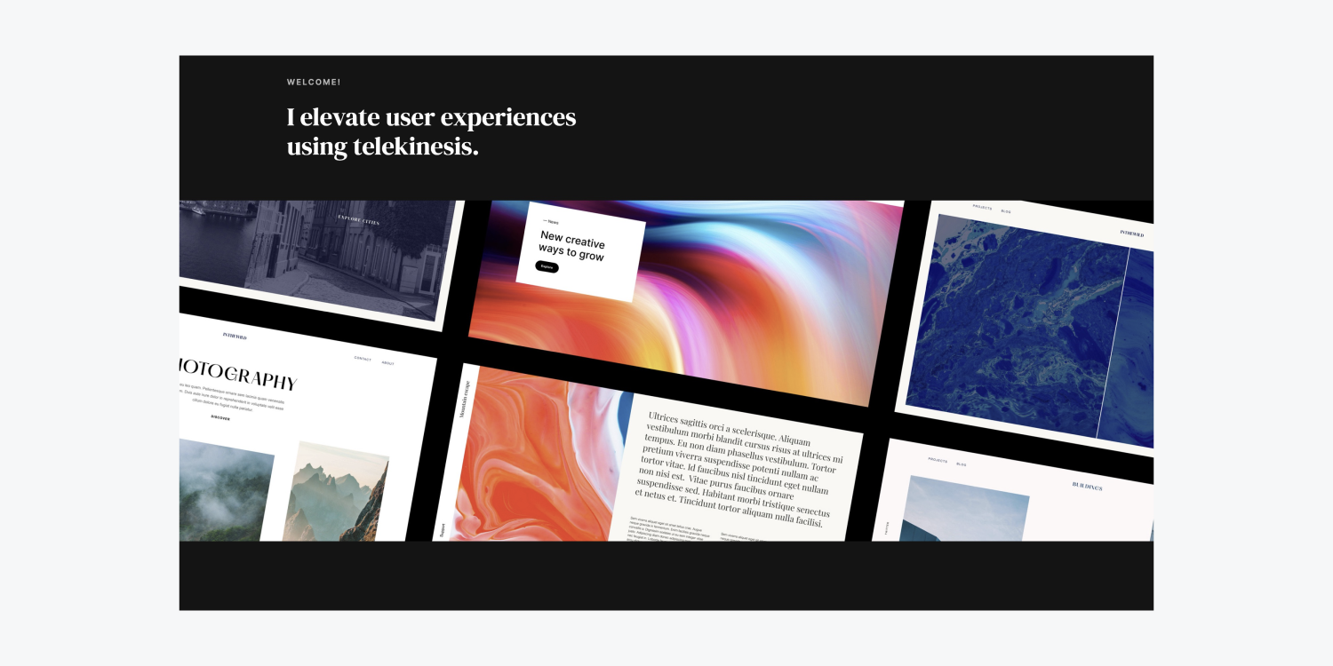
In this tutorial, you will discover ways to craft your main section using these steps:
- Arrange the main section
- Integrate the text components
- Modify the Body (All pages) tag
- Introduce the main visual
Go through and grab the resources for this tutorial.
Arrange the main section
Prior to adding any elements to the page, import your resources — your image files — into the Asset panel:
- Choose the resources on your machine
- Drag the resources directly into your project (they will be automatically included in the Asset panel)
Let’s establish the primary layout of the main section — a Container within a Section:
- Drop a Section component from the Add panel onto the page (the Section has a default width of 100%)
- Insert a Container into the Section
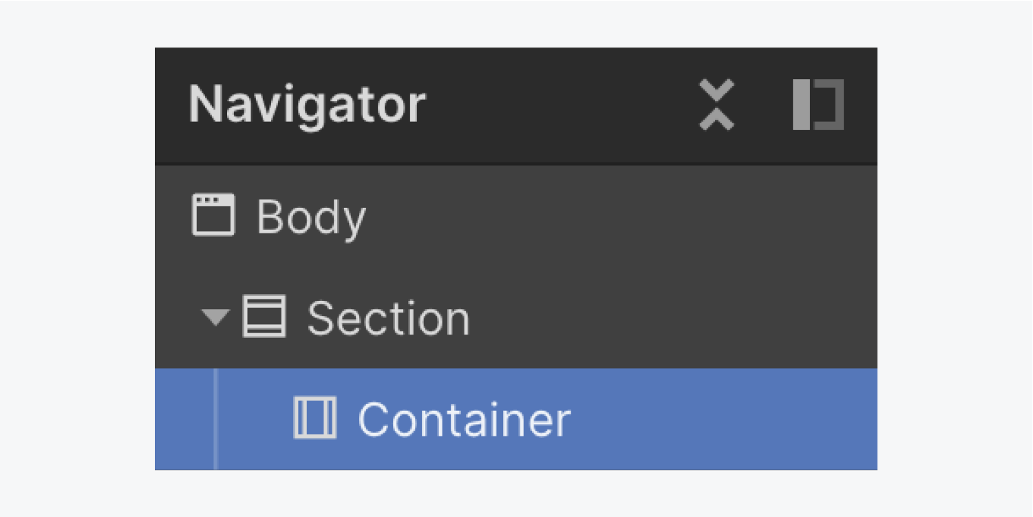
The Container maintains all content neatly contained within that Section, hence you will be dragging many of your added elements into that Container.
Integrate the text components
Let’s incorporate our initial text element:
- Drag a Text block from the Add panel into the Container
- Double-tap the default text to change it (e.g., “Welcome!”)
Let’s add our second text component:
- Pull a Heading from the Add panel into the Container below the Text block
- Update the default text by double-clicking it (e.g., “I enhance user experiences through telekinesis.”)
The text components you’ve applied to the Container influence the height of the Container, consequently affecting the height of the Section.
If you select the Section and observe its Spacing in the Style panel to the right, by default it lacks padding — the space inside an element’s boundary. And it also lacks margin — the space outside an element’s boundary. The text abuts the edge of the Section.
You can regulate the space around the Section using margin and padding to provide your Section and its content more breathing space.
Begin by altering the default Spacing values of the Section to incorporate padding on the top and bottom:
- Select the Section
- Access Style panel > Spacing
- Include top and bottom padding of 60 pixels
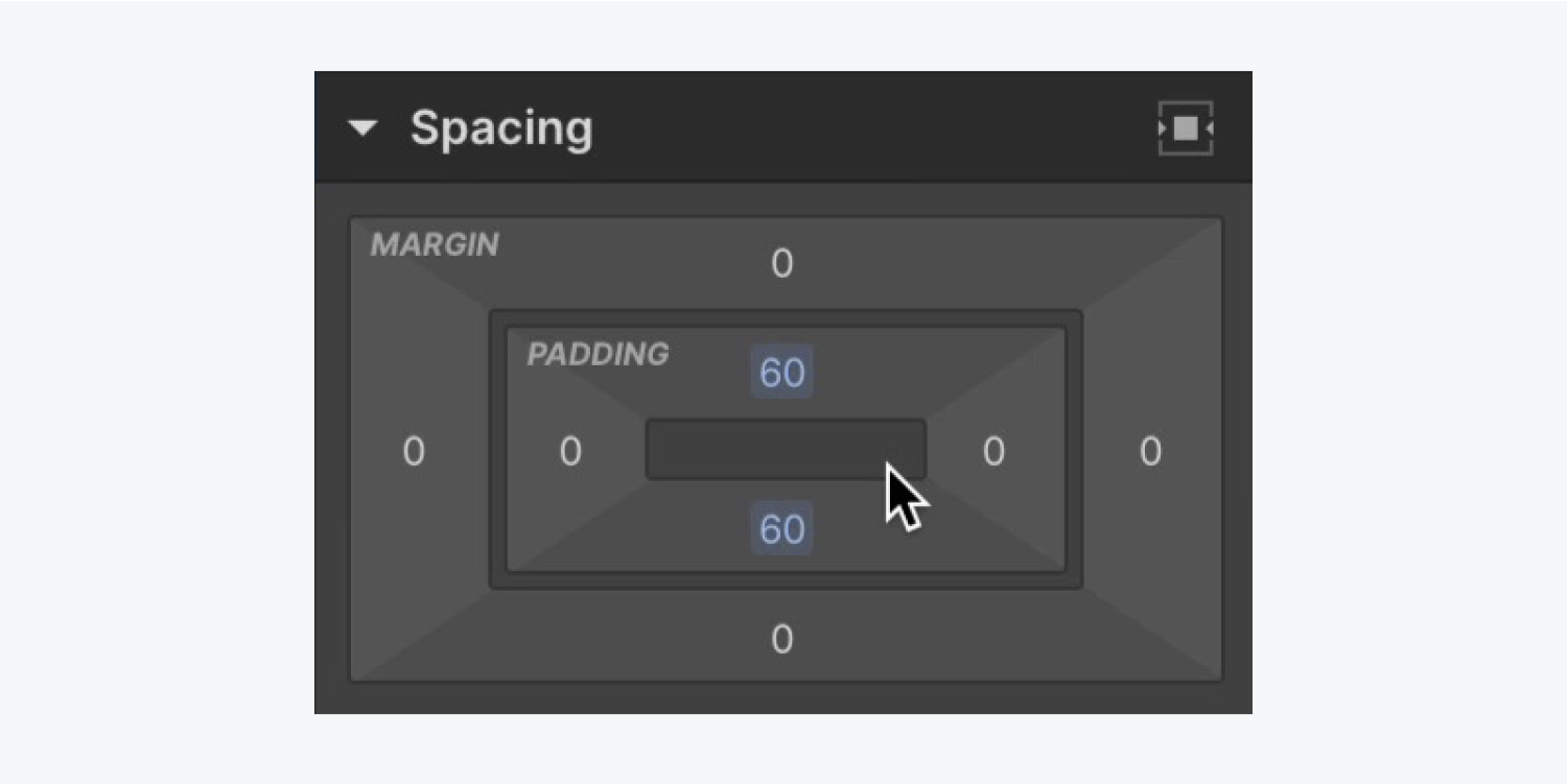
Note: To quickly apply margin or padding to opposite sides of an element, hold down Option (on Mac) or Alt (on Windows), and adjust one of the margin or padding controls.
Modify the Body (All pages) tag
Modifying the Body (All pages) tag allows you to establish default styles that will be inherited across your project. For instance, you can define a default font, introduce new fonts, etc.
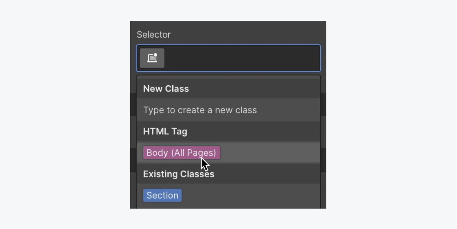
Initiate by selecting the Body (All pages) tag for updating:
- Choose the Body element from the Navigator
- Enter the Selector field in the Style panel
- Choose the Body (All pages)tag from the dropdown
Let’s append some fresh fonts to our project:
- Go to Style panel > Typography and click on the current font to reveal the Fonts menu
- Select Add fonts
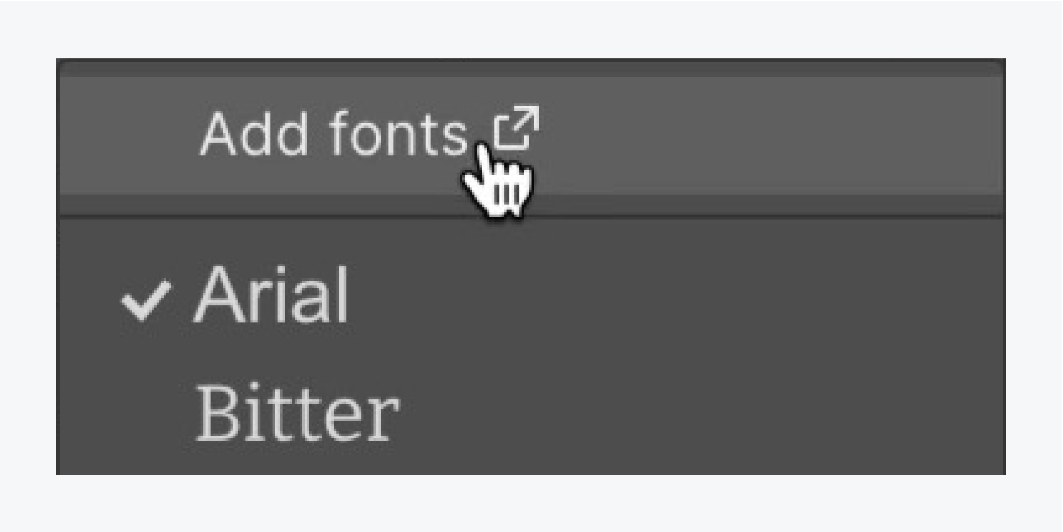
Select the 2 fonts you wish to introduce to your project:
- Include Inter from the Google Fonts selection
- Tick Regular and 600 as the variations to add
- ClickInclude typeface
Recapitulate the aforementioned process to integrate the second style into your venture, DM Serif Display with Regular as the classification.
Click on the Creator tab on your control panel to navigate back to your project.

Now that you’re back at the Creator, reselect the Body element and pinpoint the Body (All pages) tag in the Selector bar to continue tweaking the default design styles of your venture.
Update your default project typeface to the recently integrated one:
- Unveil the Design panel > Typography
- Tap on the existing typeface to explore the Fonts choices
- Select a fresh typeface (e.g., “Inter”)
Furthermore, let’s modify the backdrop hue:
- Access the Design panel > Backgrounds
- Activate the standard color palette to reveal the color selector
- Adjust the color to a dark grey shade (e.g., “#141414”)
Given that the default textual hue is also dark grey, the present text over the dark grey backdrop isn’t easily readable. While keeping the Body (All pages) tag selected, let’s transition the default textual hue to a more readable option:
- Open the Design panel > Typography
- Click on the standard color palette to unveil the color selector
- Elevate the contrast between the backdrop hue and the textual hue by opting for a lighter textual hue (e.g., “white”)
Now that you’ve refined some of the Body (All pages) tag default styles that will be spread across your venture, you can start styling some of the distinct components you’ve introduced.
Let’s refine the Title with an alternative typeface:
- Pick the Title
- Expose the Design panel > Typography
- Opt for a new Typeface (e.g., “DM Serif Display”)
- Select a Thickness of 400
Furthermore, let’s stipulate a maximum width on the Title:
- Pick the Title
- Access the Design panel > Size
- Adjust the Max W (maximum width) to 450 pixels
Note: when resizing the width or height of an element, you can swiftly move up or down by 10 pixels by pressing Shift together with the up or down arrows.
Also, let’s transform the typeface styles of the Text bloc atop our design:
- Pick the Text bloc
- Access the Design panel > Typography
- Choose a Thickness of 600
- Press the “More typography options” reveal button and choose Capitalize
- Configure the Character spacing to 2 pixels
- Decrease the Dimension to 12 pixels
- Press the default color palette to reveal the color selector
- Decrease the Transparency (the Alpha) to 70

Construct the protagonist visual
Let’s integrate the protagonist visual into our venture:
- Open the Assets panel
- Drag the protagonist visual into the Enclosure beneath the text
Let’s tweak the maximum width of the Enclosure to enhance the appearance of the content on the page:
- Select the Enclosure
- Open Design panel > Size
- Configure the Max W (maximum width) to 1200 pixels
Since our protagonist visual is contained within the Enclosure, it’s confined by the width of that Enclosure. To make the protagonist visual occupy the entire width of the browser, let’s move the protagonist visual out of the Enclosure and into the Segment:
- Select the protagonist visual
- Move the visual into the Segment
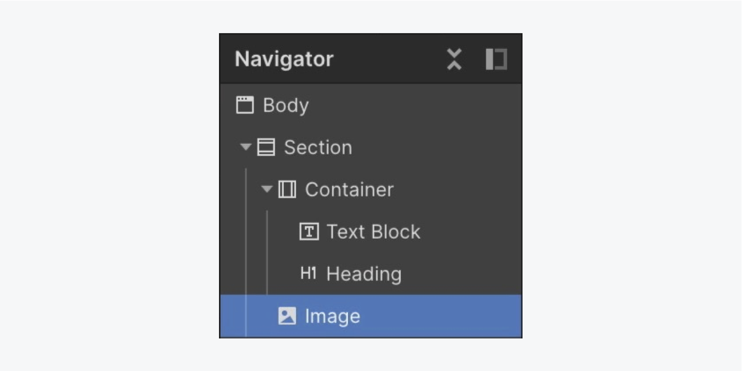
Note: you can grasp the edge of the canvas and resize it left or right to preview the design on various screen widths.
Let’s adjust the spacing between the Title and the protagonist visual to provide some room to breathe:
- Pick the Title
- Incorporate a bottom margin of 60 pixels

You’ve now successfully laid out the fundamental framework of your section! Great job!
- Include or eliminate Workspace spots and members - April 15, 2024
- Centering box summary - April 15, 2024
- Store a site for future reference - April 15, 2024
