Prior to beginning: Take a look at our flexbox introduction.
In this tutorial, you will discover:
- Techniques for centering individual elements
- Approaches for centering multiple elements
How to centrally position an individual element
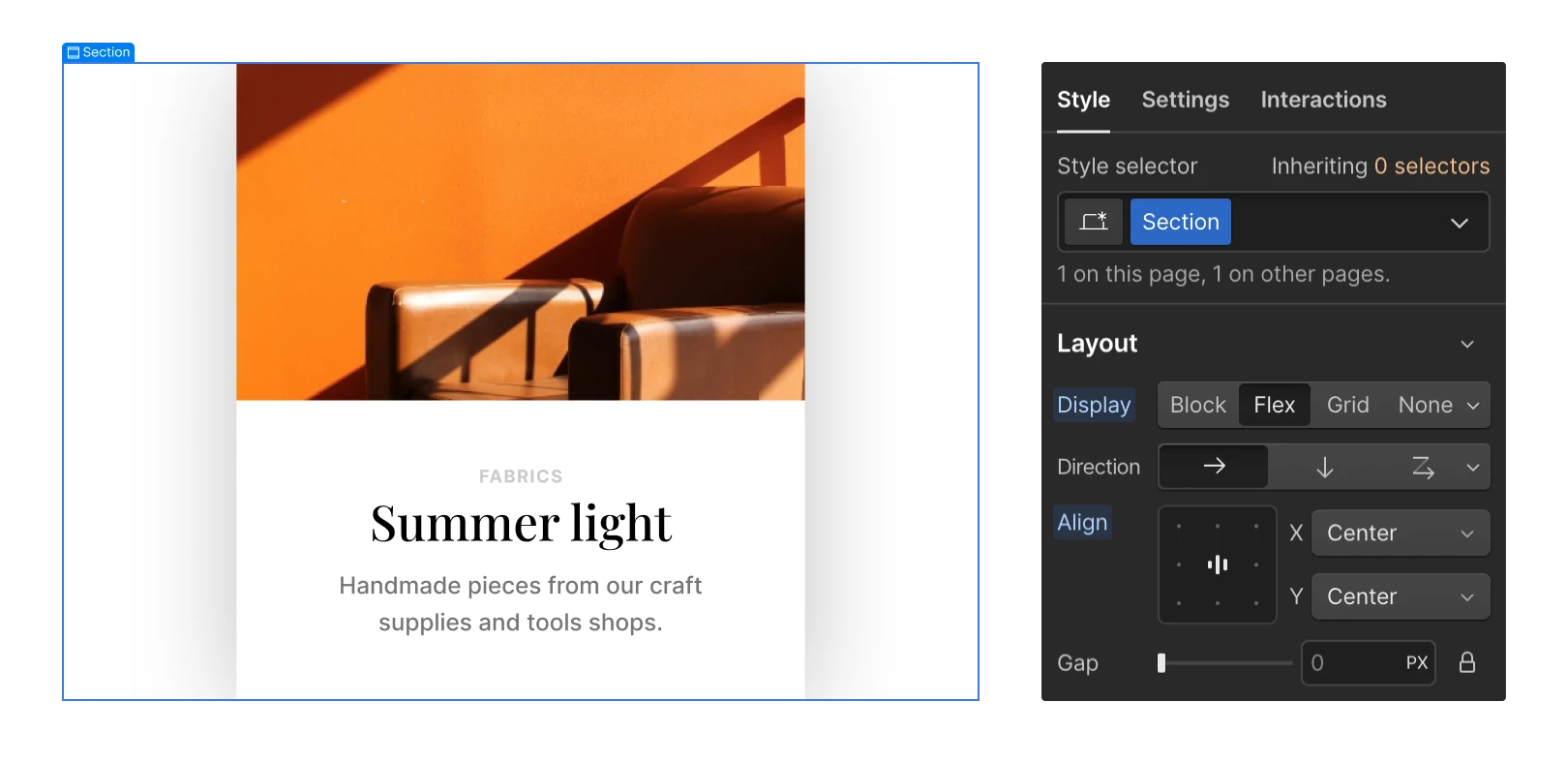
To center one element both vertically and horizontally within its parent container:
- Identify the parent container on the canvas or in the Navigator
- Navigate to Style panel > Layout > Display
- Press on Flex
- Select the centercell in the alignment box (you can also opt for Center from both the X and Yaxis dropdowns)

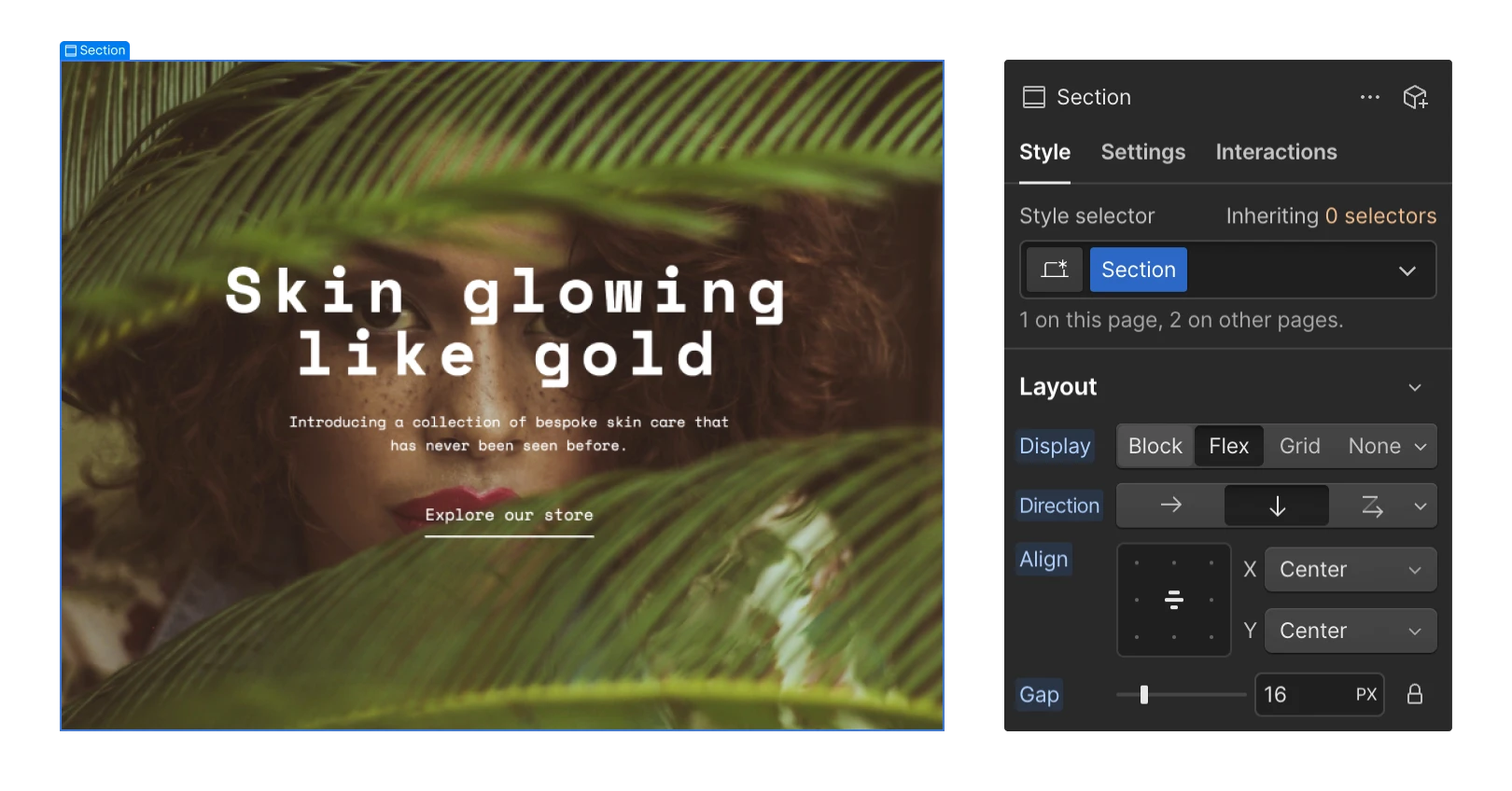
You can also apply the steps above to center an individual element that contains multiple child elements within its container — for example, aligning a container with a heading, paragraph, and link block inside.

How to centrally position multiple elements
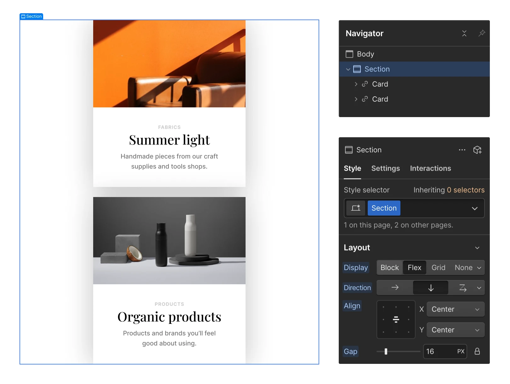
You can utilize flexbox to centrally position multiple elements within their container. This can be advantageous, for instance, if you have two card elements that need to be arranged and centered both horizontally and vertically:
- Identify the parent container on the canvas or in the Navigator
- Navigate to Style panel > Layout > Display
- Press on Flex
- Click the vertical “down arrow” icon to adjust the flex direction to vertical
- Select the centercell in the alignment box (you can also opt for Center from both the X and Yaxis dropdowns)

Discover more about flexbox.
Latest posts by Ewan Mak (see all)
- Include or eliminate Workspace spots and members - April 15, 2024
- Centering box summary - April 15, 2024
- Store a site for future reference - April 15, 2024

