Many times, we create designs on screens that are not as expansive as 27 inches. Particularly on smaller devices like the MacBook Pro laptops. While the content on websites appears well on smaller screens, it might not look as appealing when viewed on larger devices such as the iMac. This discrepancy occurs because Sections (the parts containing our content) appear excessively wide. Ensuring that your designs are responsive enables them to adapt and rearrange content according to the browser’s width.
This tutorial will delve into:
- Establishing a wrapper
- Testing your design
In our demonstration, we have incorporated a Section element within the Body element. Within this Section, a Container element encompasses our content.
Sections essentially function as divs and occupy the entire available width. Consequently, they tend to appear never-ending on larger screens due to their full-width nature.
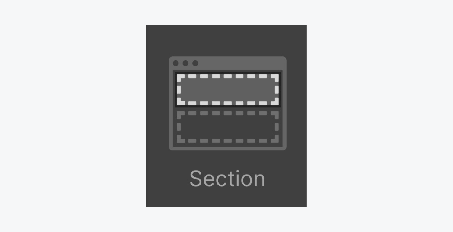
By adding a Section element to your page from the Elements panel (A), it automatically spans the full width of the body.
Pro Tip: For a consistent website structure, include Sections in the body element, followed by organizing your content within Containers placed inside these Sections. Learn more about Sections.
Subsequently, position your Sections within a Div block, which acts as the parent element to these sections.
Establishing a wrapper
Introduce a div directly into the Body element.
Then, place your content inside (putting each Section within the Div block). On this Div block, modify the width, margins, and maximum width in four simple steps:
- Begin by assigning a class name to the Div block (e.g. Wrapper)
- Specify the width as 100% (indicating full width)
- Align both left and right margins to auto (to center it)
- Establish a maximum width (e.g. 2000 pixels)
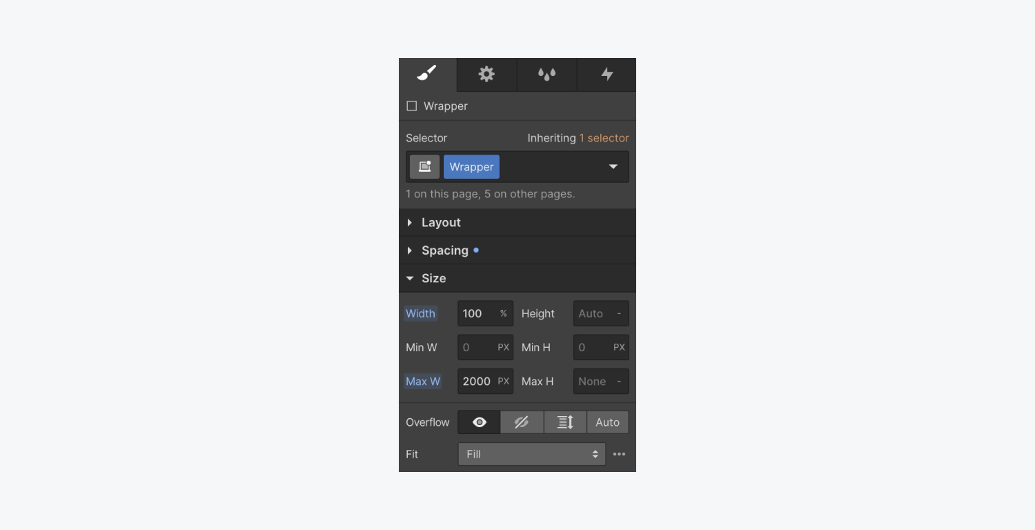
When previewing on our laptop (which is narrower than 2000 pixels), you’ll notice no changes. Why? The maximum width we set for our “Wrapper” was 2000 pixels, exceeding the width of our existing laptops.
Testing your design
There are two methods to evaluate our “Wrapper” element:
- Incorporate larger breakpoints
- Chrome devices tool
Reviewing larger breakpoints
Preview larger breakpoints directly within the Designer to envision your design on a 27-inch iMac screen.
To execute this:
- Access the Canvas settings
- Enter a pixel value (e.g. 2560)
- Press Return on your keyboard
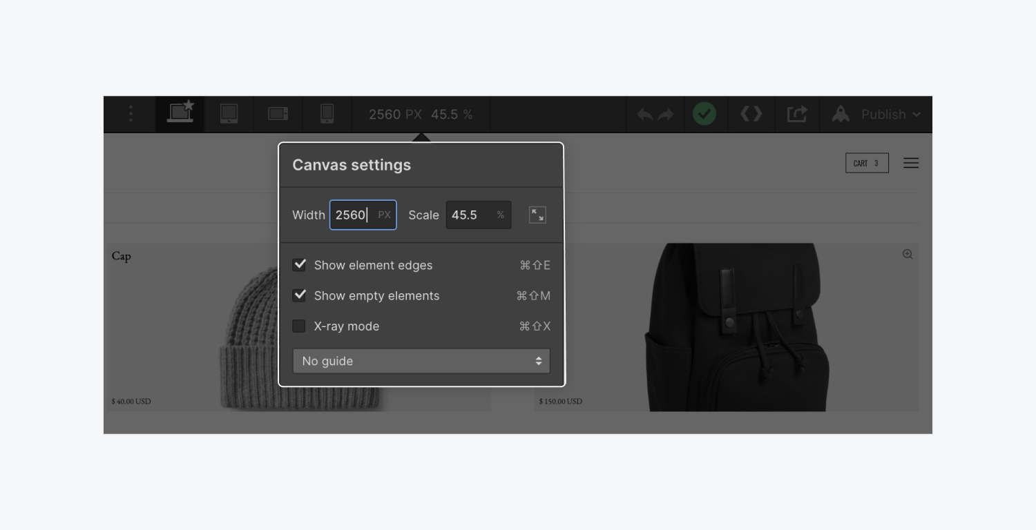
Each alteration made exhibits a subsequent scaling effect (e.g. 45.5%) enabling a glimpse of how the content would look on a display almost twice its original size.
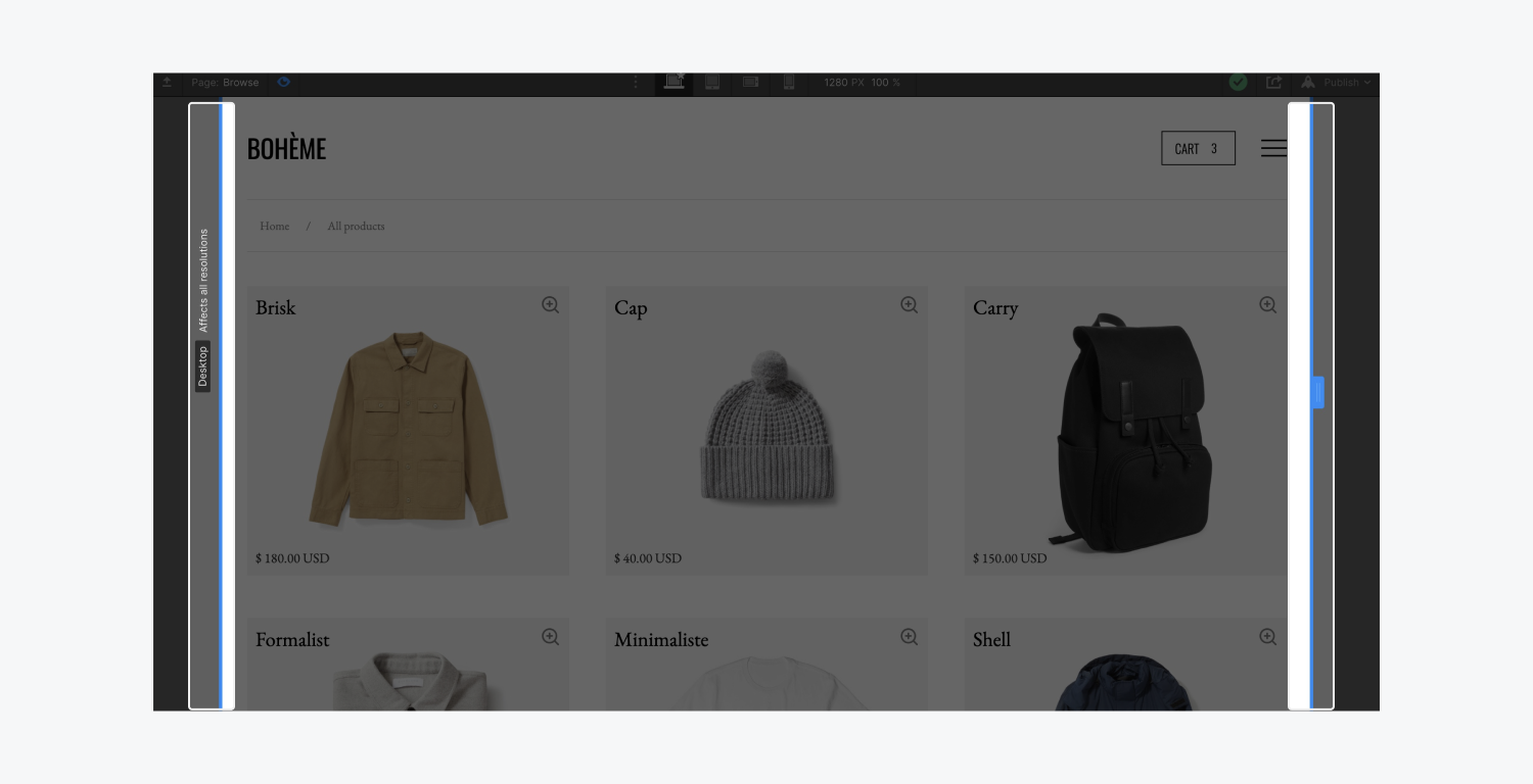
In preview mode, regardless of the canvas size, you can seamlessly transition between various breakpoints from desktop to tablet to mobile devices.
Chrome devices tool
Google’s browser, through the Device Mode feature, offers an emulation of your webpage’s appearance and interaction on various devices. This emulation mimics adjusting the Canvas settings, allowing you to experience different devices directly from the browser.
To utilize this:
- Click the Toggle Device Toolbar to unveil the UI that lets you mimic viewports.
- Enter your preferred dimensions in the top panel (width/height)
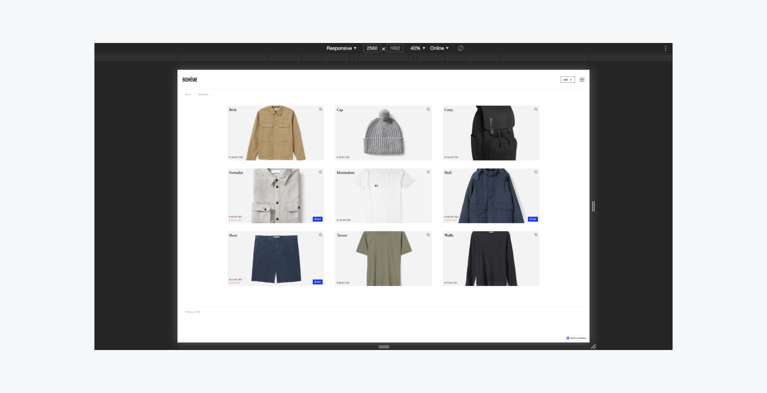
The Device Toolbar typically opens in Responsive Viewport Mode by default. You can drag the handles to resize the viewport to your desired dimensions or input specific values in the width and height fields.
This concludes the guide on designing for larger screens in Webflow.
- Include or eliminate Workspace spots and members - April 15, 2024
- Centering box summary - April 15, 2024
- Store a site for future reference - April 15, 2024
