You have the ability to personalize your site design for various screen dimensions by utilizing Webflow’s integrated responsive breakpoints (also called media queries). Upon loading a site, the default breakpoint is the desktop view; however, there are an additional 6 breakpoints available.
Within this tutorial, you will gain an understanding of:
- Applying styles on different breakpoints
- Incorporating larger breakpoints
- Adjusting the canvas size
- Overriding styles on breakpoints
- Resetting styles
- Testing responsiveness and fluidity
Applying styles on different breakpoints
Styling modifications flow both upwards and downwards (bidirectional flow). Starting from 992px (desktop) and cascading downwards to mobile, styles applied on desktop, 1280px, 1440px, and 1920px flow upwards to larger devices. The styles set on the desktop breakpoint extend downwards and are applied to tablets and both mobile device sizes. All styles set on tablets will carry over to mobile breakpoints. Any inherited styles from a higher breakpoint can be overridden.
This cascading behavior applies to textual styles unless explicitly changed. You can tailor your designs for both small and large screens using breakpoints.
Changing breakpoints
Whether you are in design or preview mode, you can transition between different breakpoints by utilizing the device icons positioned in the top bar of Webflow’s Designer.
Additionally, you have the option to resize the Designer canvas to preview the responsiveness of your site on different devices.

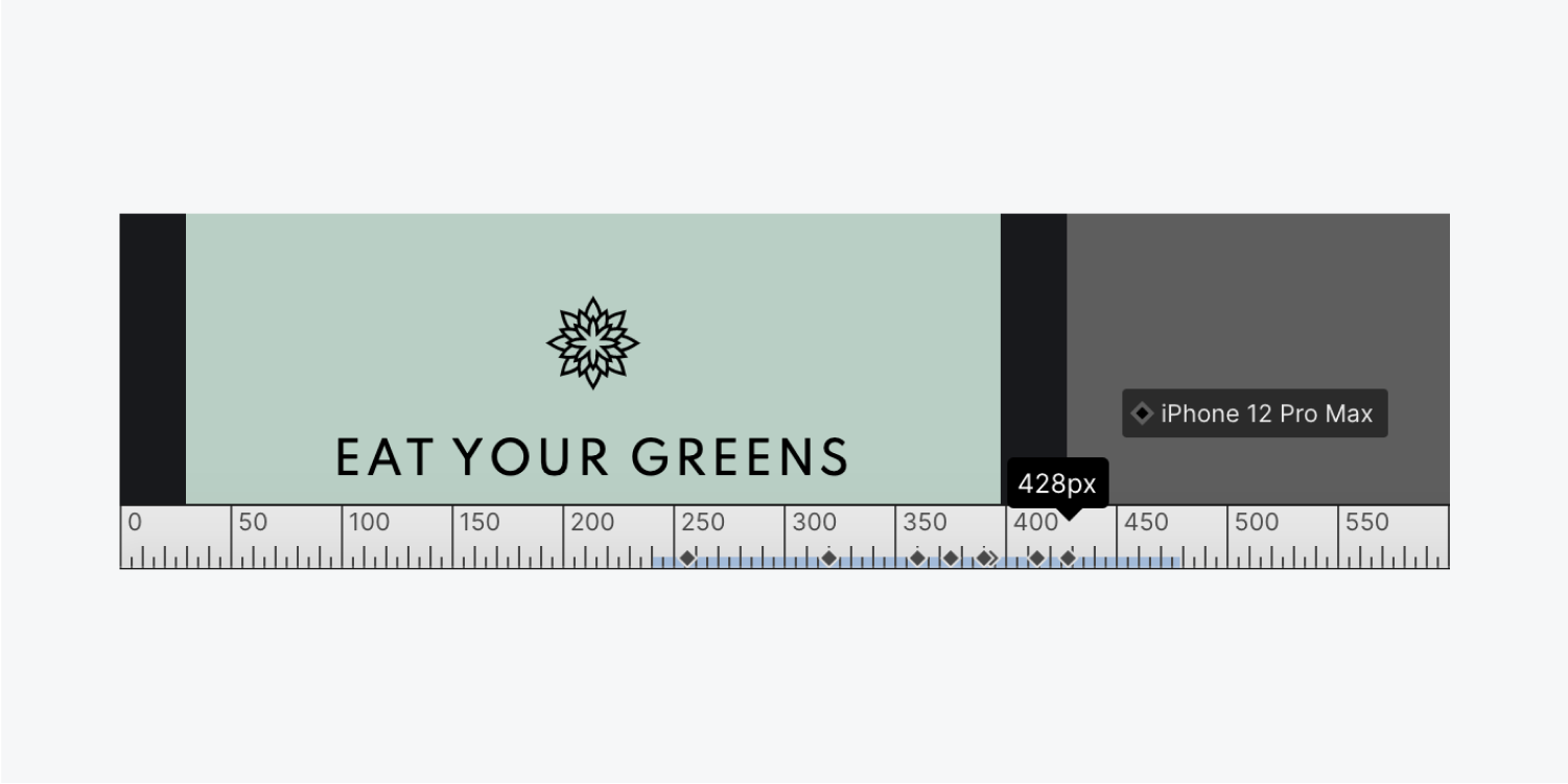
While adjusting the canvas size, you can determine which devices fall within the current canvas width.
Identifying style inheritance
Styles can acquire their values in two distinct manners:
- Being defined on a specific breakpoint
- Being inherited from a cascading breakpoint
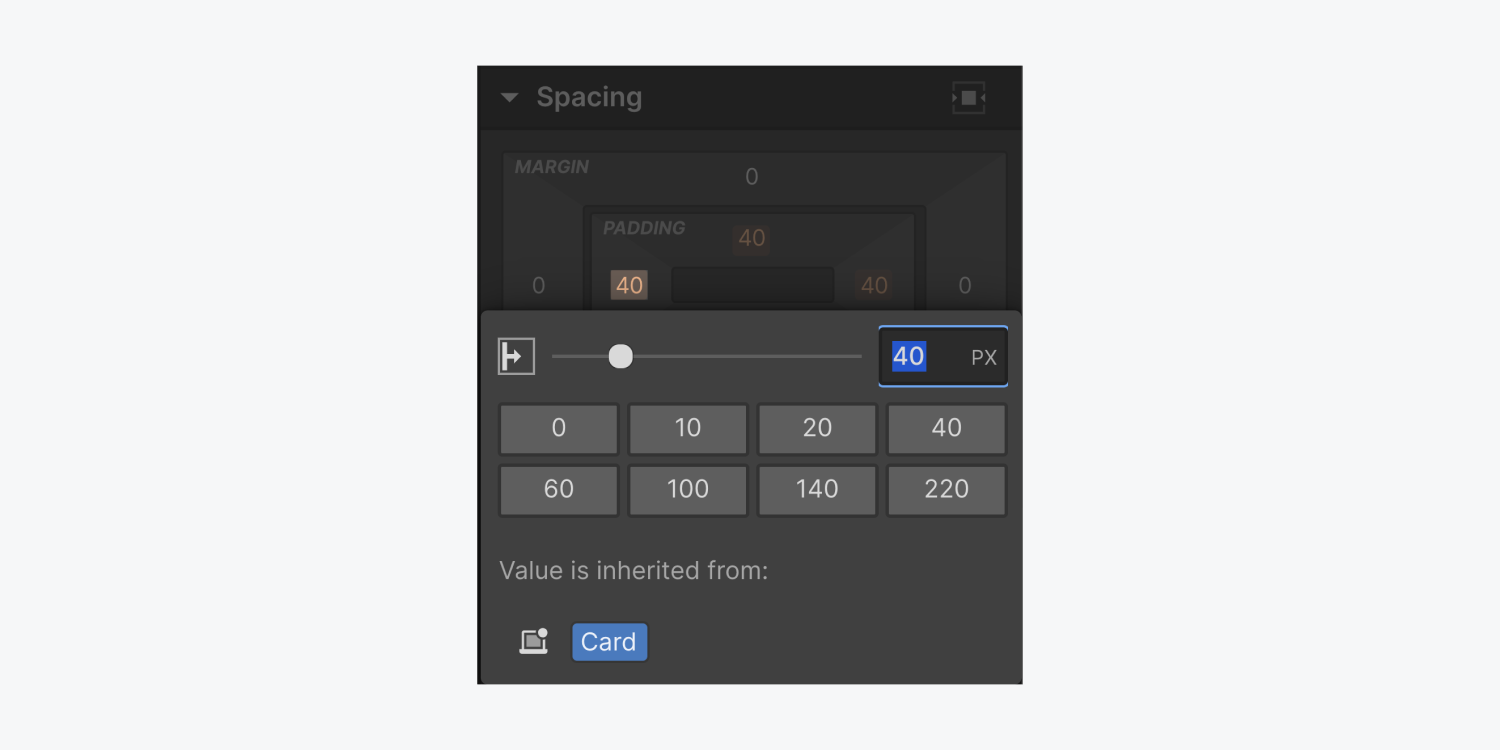
For example, a style on the mobile breakpoint can originate from the mobile breakpoint itself or from an alteration on the tablet breakpoint that cascaded down. The Style panel displays the inheritance of a style through the blue or orange labels and icons adjacent to style properties.
Incorporating larger breakpoints
We currently exist in a digital realm where an array of electronic devices can access websites—ranging from desktop computers to various mobile devices. Each device possesses a distinct viewport size, necessitating your site layout to be responsive across these viewports by utilizing breakpoints. A breakpoint represents the screen width at which your layout adjusts to suit the new viewport dimensions.
For instance, within the Webflow canvas, the tablet breakpoint commences at a width of 768 pixels. If someone visits your site on a screen with a width of 769 pixels, the site will display as it does at the desktop breakpoint in the Designer (the subsequent breakpoint larger than the tablet breakpoint). However, once the screen width hits 768 pixels (though still greater than 568 pixels, the subsequent smaller breakpoint), your site will exhibit the layout designated for the tablet breakpoint in the Designer.
Employing breakpoints during the design phase guarantees an optimal user experience on any screen size.
Webflow provides 4 default breakpoints:
- Desktop
- Tablet
- Mobile Landscape
- Mobile Portrait
Furthermore, you have the ability to introduce 3 larger breakpoints:
- 1280px
- 1440px
- 1920px
To add a breakpoint, simply click the breakpoint dropdown on the left of the desktop icon in the top toolbar and make your selection from the dropdown options.
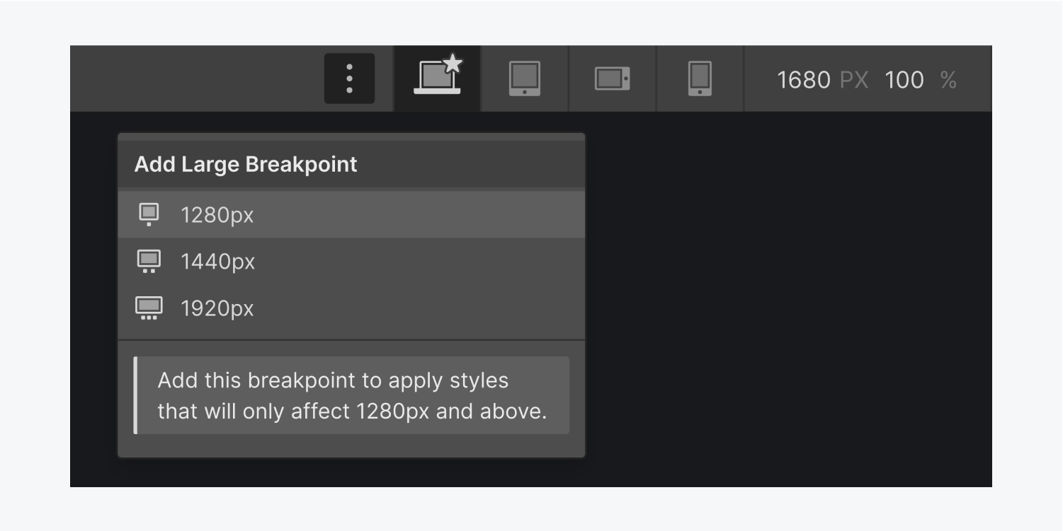
Note: Once added, a larger breakpoint cannot be removed from your site.
The recently added breakpoint will be visible in the top bar and automatically activated. Although you cannot remove larger breakpoints from the top UI bar, you can eliminate all unique styles associated with that breakpoint by switching to that breakpoint and using a combination of Option + click (for Mac) or Alt + click (for Windows) on styles labeled in blue, indicating they are specific to that device.
Adjusting the canvas size
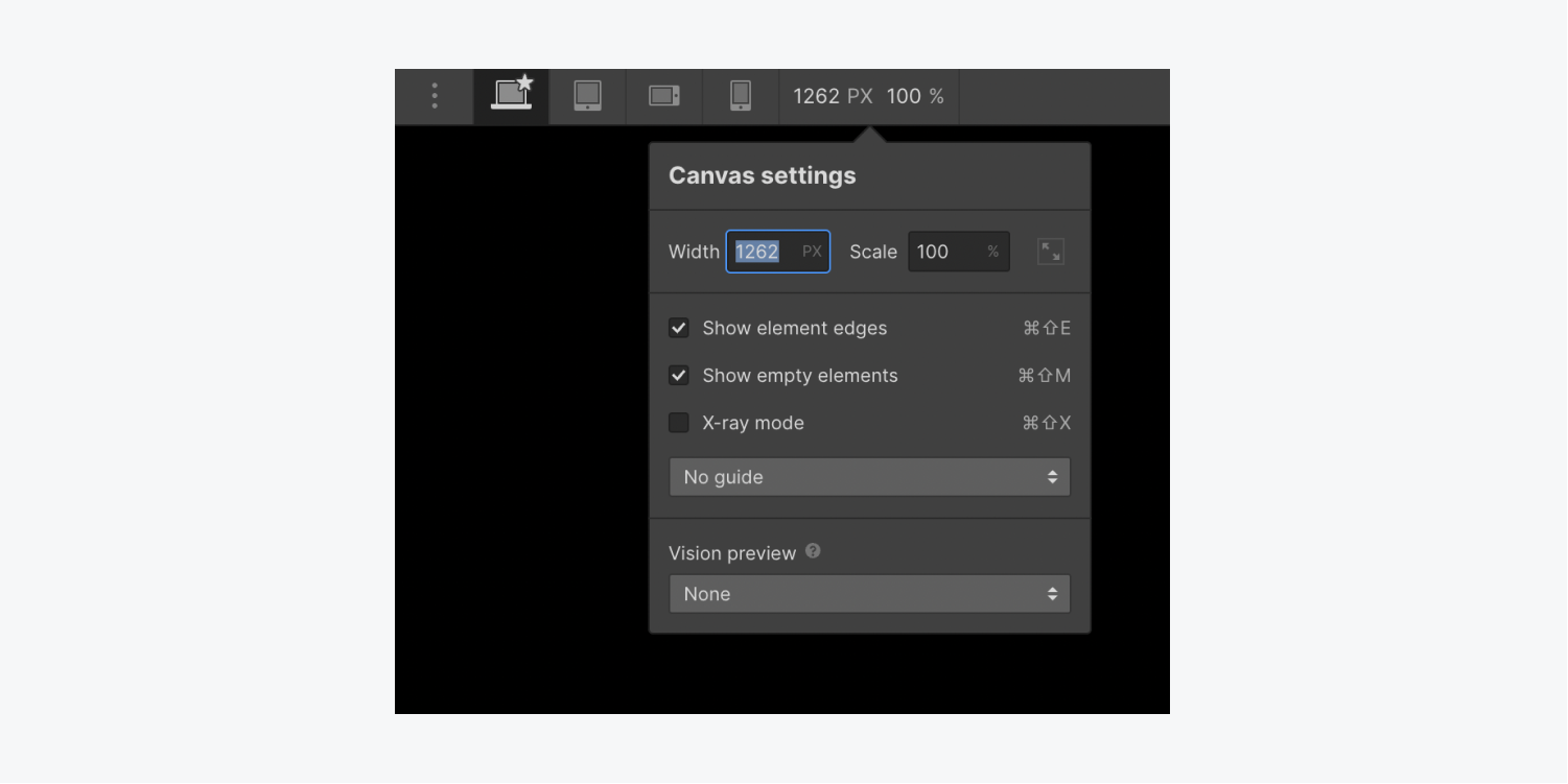
When designing on a laptop or when your browser viewport is narrower than some of the larger breakpoints, the canvas will automatically scale down.
Alternatively, you can manually input values within the canvas settings dropdown.
Overriding styles on breakpoints
At any time, you have the ability to alter the cascading styles for a specific breakpoint by adjusting the values while on that precise breakpoint. By default, all breakpoints will inherit styles from the desktop (base) breakpoint.
However, you have the freedom to override the styles from the desktop breakpoint. For instance, you can modify the body background color on the tablet breakpoint. The background color will remain consistent in the desktop and breakpoints of 1280px and higher, while both mobile breakpoints will display the updated background color. This is because styles implemented on the tablet breakpoint cascade down to smaller breakpoints (mobile landscape and mobile portrait).
With these 7 breakpoint perspectives, you can preview and style your website catering to diverse device sizes.
dimensions.
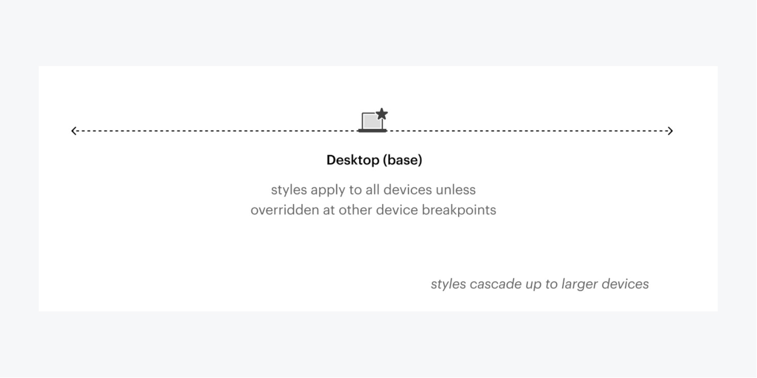
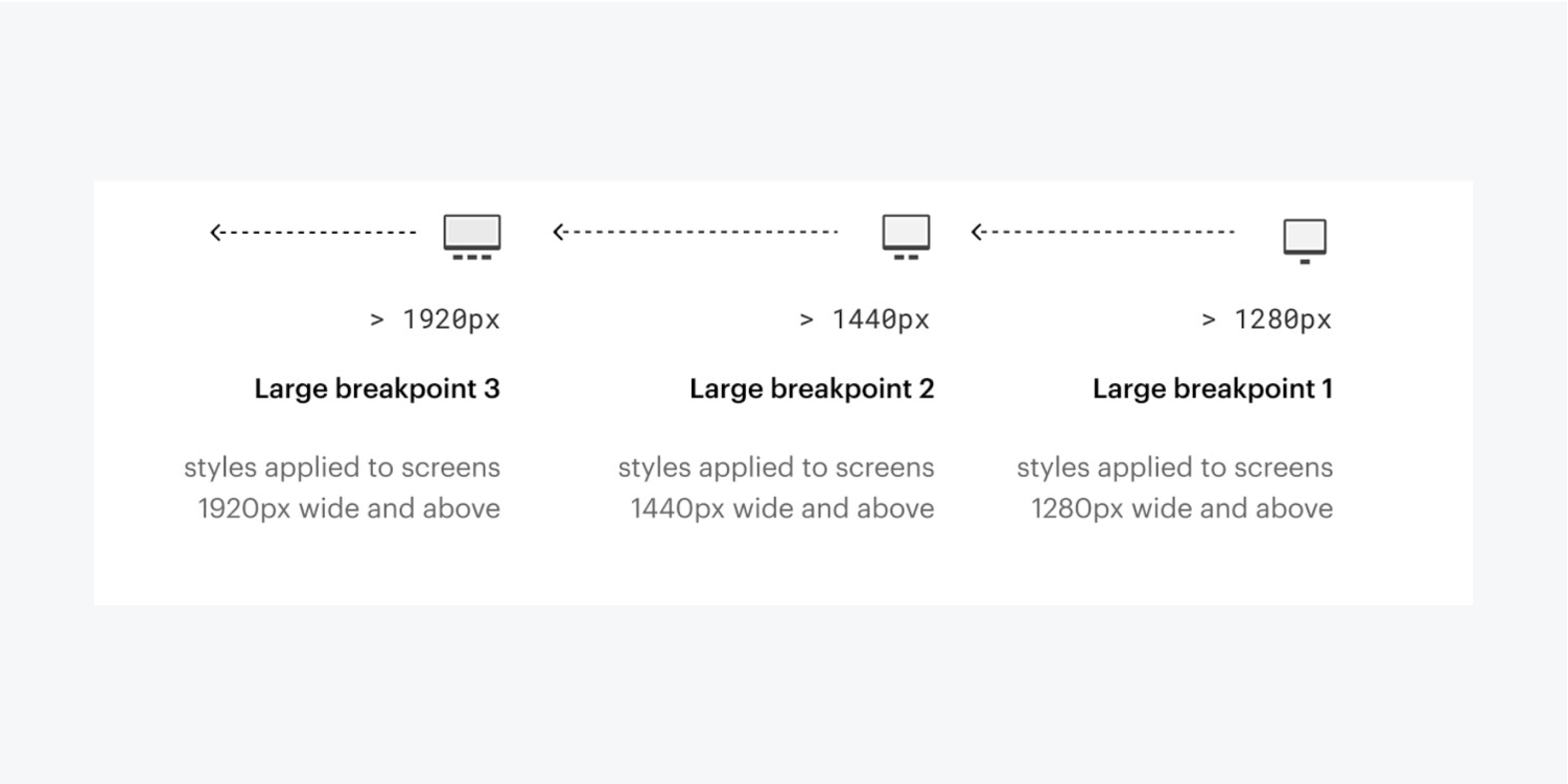
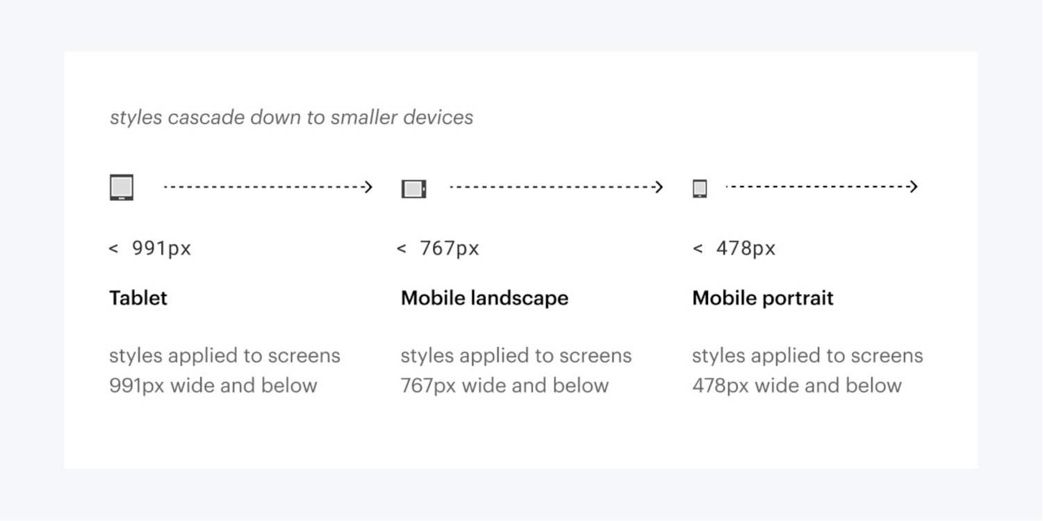
Each perspective is utilized to design elements for a particular viewport range:
- 1920px: designs implemented on screens 1920px wide and above
- 1440px: designs implemented on screens 1440px wide and above
- 1280px: designs implemented on screens 1280px wide and above
- Desktop (base): designs are applicable to all devices unless superseded at other device breakpoints
- Tablet: designs implemented on screens 991px wide and below
- Mobile landscape: designs implemented on screens 767px wide and below
- Mobile portrait: designs implemented on screens 478px wide and below
You have the capability to supersede any textual designs inherited from other breakpoints and forge distinct layouts for each breakpoint.
Below are the guidelines for tailoring breakpoints:
- Designs flow up and down from desktop, so everything to the right of desktop flows downwards (tablet > mobile landscape > mobile portrait) and anything to the left of desktop flows upwards (1280px > 1440px > 1920px)
- Designs set on breakpoints smaller than desktop will take precedence over designs set on the breakpoint above (e.g., designs set on mobile landscape will take precedence over designs set on tablet)
- Designs set on breakpoints larger than desktop will take precedence over designs set on the breakpoint below (e.g., designs set on the 1440px breakpoint will take precedence over designs set on the 1280px breakpoint)
- Superseding a design implies that the design will no longer inherit changes from the breakpoints above (in breakpoints smaller than desktop) or below (in breakpoints larger than desktop)
- Only alterations in the Style panel cascade up or down (an exception is grid edit mode, where you can edit the grid’s styles directly on the canvas, and those will cascade up and down. This also applies to edit mode for Quick Stack.)
- Any variations in the order of elements (on the canvas or in the Navigator) or an element’s settings (from the Settings panel) impact all breakpoints
- Removing elements influences these elements on all breakpoints. You can conceal elements on devices by accessing Style panel > Layout and configuring display to “none.”
Smaller breakpoint instance
In case you establish the width of a div block to 400px on desktop, the width of the div block will remain 400px on all breakpoints unless you supersede styles on another breakpoint.
Assume you adjust the width to 100% on mobile landscape. This will also convert the width to 100% on mobile portrait, but the div block will maintain a width of 400px on desktop, tablet, and all larger breakpoints.
Now, if you modify the width on desktop to 500px, both the mobile breakpoints will still retain the 100% width value. If you eliminate the styling on the mobile landscape, the value will be inherited again from the desktop and now the div block will possess a width of 500px on all breakpoints.
Cascading designs
Breakpoints enable you to define specific styles for various screens. This allows you to personalize the design for each screen, without disrupting it on others.
Design alterations cascade both upwards and downwards (bidirectional cascade). They cascade up commencing from 992px (desktop) and down from desktop to mobile. This signifies that styles implemented on desktop, 1280px, 1440px, and 1920px cascade upwards to larger devices, and styles you initiate on the desktop breakpoint cascade downwards and are applicable to the tablet and both mobile device dimensions. All styles implemented on tablet will be passed down to the mobile breakpoints. You can supersede any styles inherited from a higher breakpoint.
The most effective strategy for responsive design is to initiate designing for desktop, then descend the device spectrum and modify your design as necessary.
Alterations impacting all breakpoints
While customizing your design on specific breakpoints, you may feel inclined to reposition elements, modify their settings, or even erase them. Keep the cascade effect in consideration and ensure to scrutinize all the breakpoints influenced by these changes, not solely the breakpoint you’re currently revising.
Element Configurations
Only modifications made in the Style panel will cascade upwards to larger breakpoints and downwards to smaller breakpoints. Any modifications in the Settings panel, or in any settings modal, will affect the element on all breakpoints, irrespective of the breakpoint you’re currently revising.
Content
If you substitute an image, or the text, or any content on your page while designing on a smaller device, the content will alter on all breakpoint perspectives regardless of the current perspective or device width.
Element Sequence
You cannot rearrange elements on the canvas or in the Navigator panel for a specific breakpoint by shifting elements around. Any reordering of elements like this will affect the design on all breakpoints irrespective of the current perspective or device width.
Need to know: You can alter the order of elements on smaller devices by using flex in the Style panel. You can also alter the position and order of elements that are direct children of a grid on the canvas on any of the breakpoints. Learn more about on-canvas grid controls.
Concealing elements on diverse breakpoints
If you erase an element on any breakpoint perspective, it will be eradicated on all perspectives. Nonetheless, you can mask elements on different perspectives to fabricate distinct layouts by configuring the display to “none“ in the Style panel. Display is a style, hence it will apply to all elements with the same class, and the setting will also cascade downwards to smaller breakpoints.
Note: Although hidden elements are imperceptible on the website, they still exist in the HTML on the published site.
Clearing styles
You can eliminate a designated style value at any time by clicking the blue or pink indicator (text or icon label adjacent to the style) and choose Reset. You can also hold Option/Alt on the keyboard and click the indicator to swiftly remove it.
If you have a style on the tablet breakpoint that is cascading down to mobile breakpoints, clearing that style on tablet will also result in the mobile breakpoints inheriting the style from desktop.
Testing responsiveness and fluidity
In responsive design, elements on the page respond according to the width of a device, or for a desktop computer, the width of the browser’s viewport. You can evaluate how your design will respond by navigating through each breakpoint at the top of the Designer.
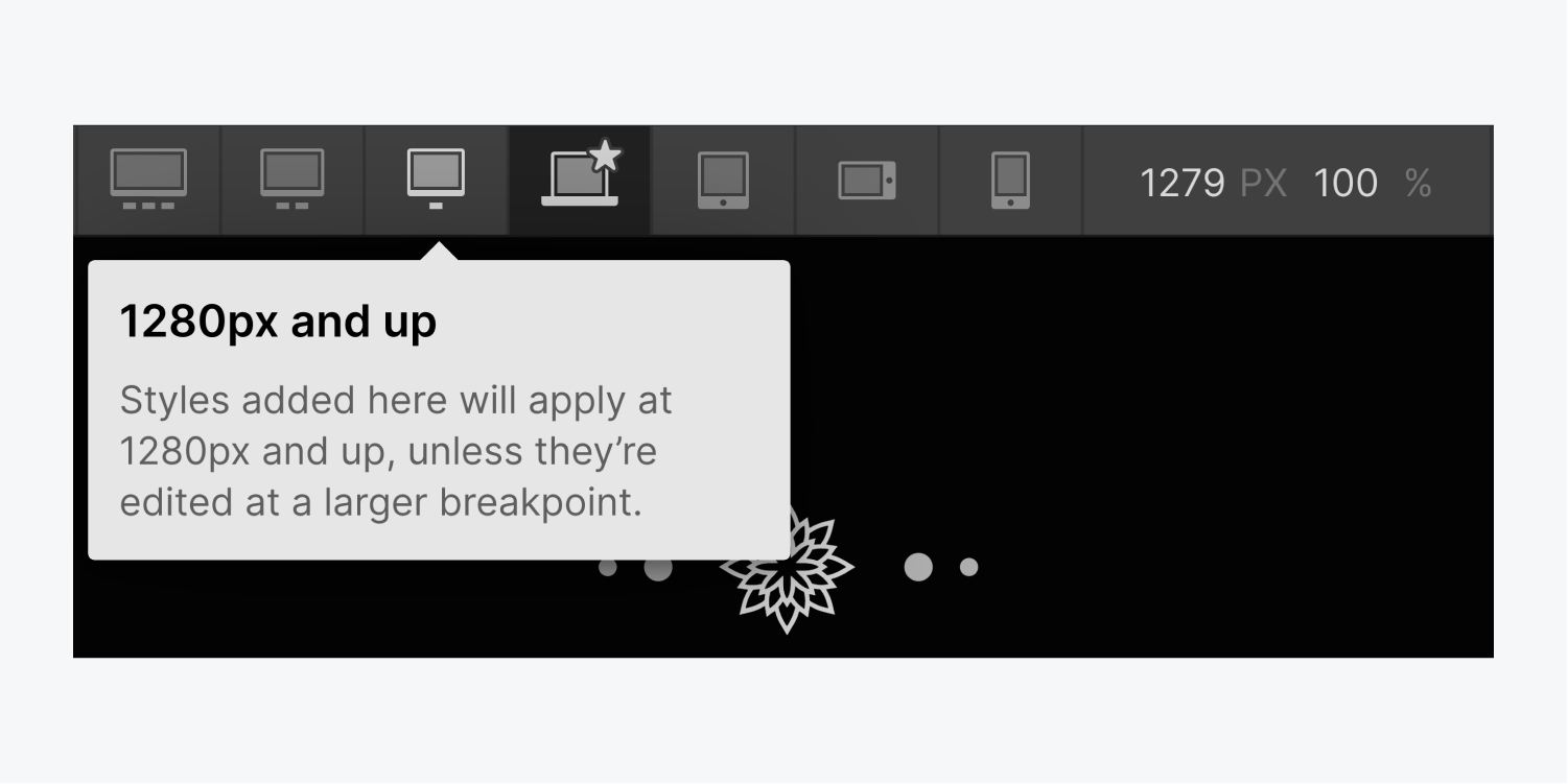
As you adjust the canvas size, prevalent device widths will be visible at the bottom of the viewport.
