The toggle button is a component within the Navigation menu that arranges the navigation links when there’s limited horizontal space, such as on a mobile device. It’s commonly known as the “burger menu.”
The toggle button and its functionality are integrated into the Navigation bar element and can be accessed and customized in various ways. We’ll discuss four aspects of the toggle button:
- Initiating the menu
- Device visibility
- Menu transitions
- Customizing the toggle button
Initiating the menu
By default, the navigation menu toggle appears on tablet breakpoint and below. You can enter preview mode to observe the menu appearing in your navigation bar when you switch to these devices. Clicking the toggle button will expand the navigation menu, and clicking it again collapses the menu.
On the desktop breakpoint, you’ll notice that the navigation links are nested inside the navigation menu element. This menu is the same element shown when the toggle button is clicked—it simply displays the navigation links in a vertical list.
Initiating the menu in the Designer
You can access the navigation menu in the Designer using the following steps:
- Select the Navigation bar or any element within it
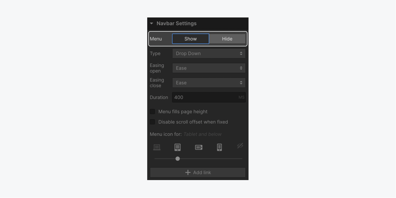
- Open Settings panel > Navigation Settings
- Opt to Show the menu
Device visibility
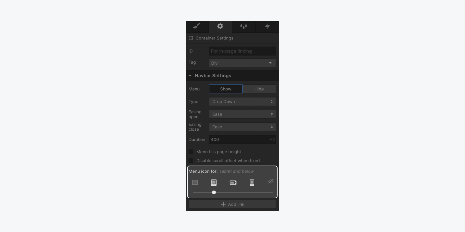
By default, the Navigation toggle button is visible in the tablet breakpoint, but this can be adjusted. The button can be made visible on all breakpoints or hidden entirely. Follow these steps to modify the visibility:
- Select the Navigation bar or any element within it
- Open Settings panel > Navigation Settings
- Utilize the device options slider to determine the initial appearance of the Toggle button
Menu transitions
There are three types of entrance animations available for the menu:
- Slide down
- Slide from the right
- Slide from the left
You can designate the entrance animation in the Settings panel.
Slide down
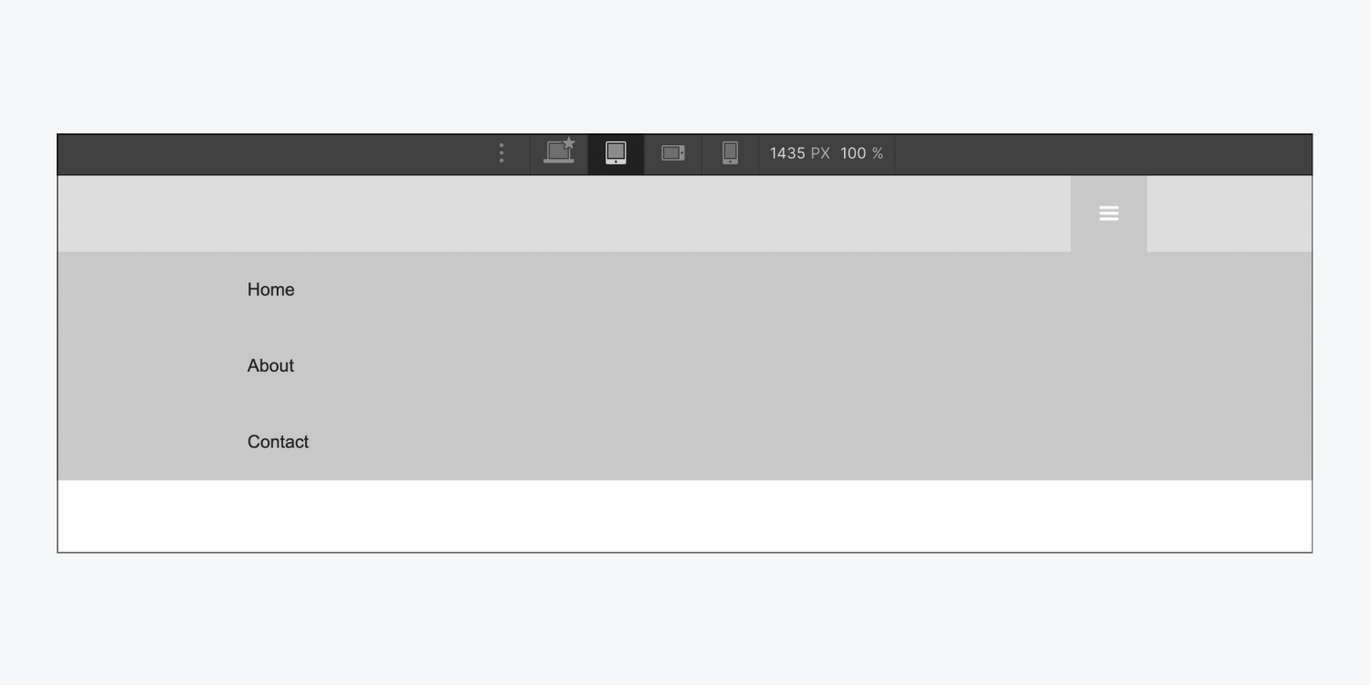
This represents the default menu style. Upon clicking the toggle button, the navigation menu will slide down from the Navigation bar. By default, the navigation menu utilizes the full browser window width.
Slide from the right
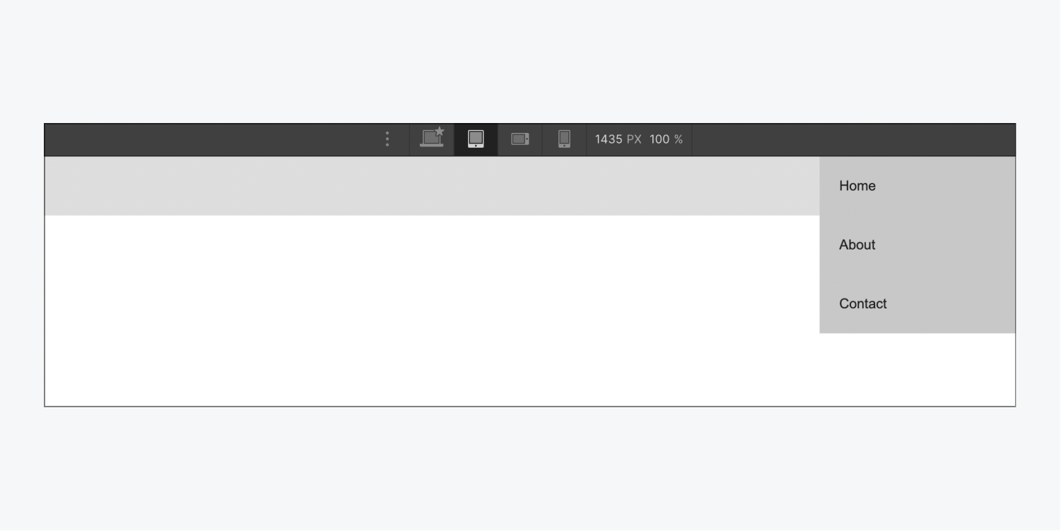
With this menu style, the navigation menu slides in from the right side of the screen upon toggling the button. Note that this style will use the entire height of the browser window.
Slide from the left
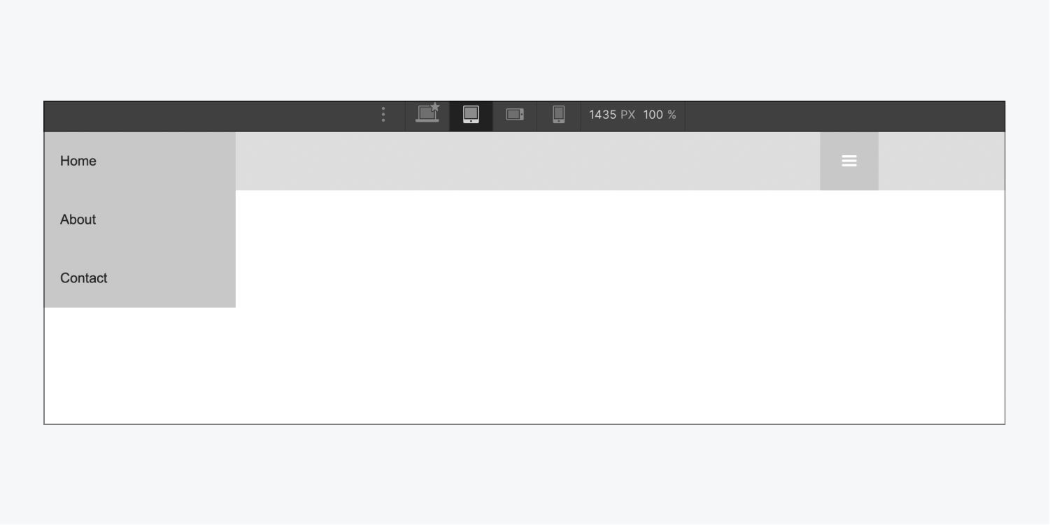
This menu style mirrors “Slide from the right,” except the navigation menu slides in from the left side. It will also occupy the entire height of the browser window.
Menu smoothness and transition
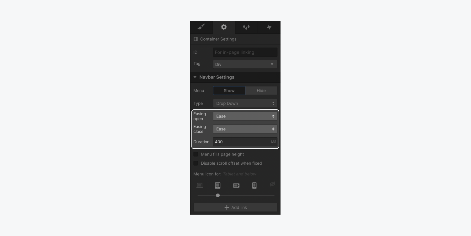
For all these menu styles, you can manage the ease curve used for animating the open and close transitions. Additionally, you can adjust the transition duration.
Customizing the toggle button
You have the flexibility to style any component of the Navigation bar or the navigation menu. Since styles flow down from larger breakpoints, select the highest breakpoint where you’ve enabled the Navigation toggle button and then apply styles.
Customizing the button
WhenIn the tablet layout, you have the option to choose the menu button and modify the button’s background hue.
- Pick the menu button
- Access the Style tab > Backgrounds
- Tap the color swatch to unveil the color picker and select a shade
Personalizing the icon appearance
You can additionally tweak the menu icon using typography configurations. The typography styles will be applied to the icon from its parent component, the menu button.
To edit the size of the menu icon:
- Select the menu button
- Access the Style tab > Typography
- Adjust the Size to resize the menu icon
You can also modify the color of the menu icon by adjusting the font hue.
To modify the color of the menu icon:
- Select the menu button
- Access the Style tab > Typography
- Tap the color swatch to uncover the color picker and select a shade
Remember: The button components are modifiable. The menu icon can be removed and substituted with a customized image or a text element.
Customizing the open state appearance
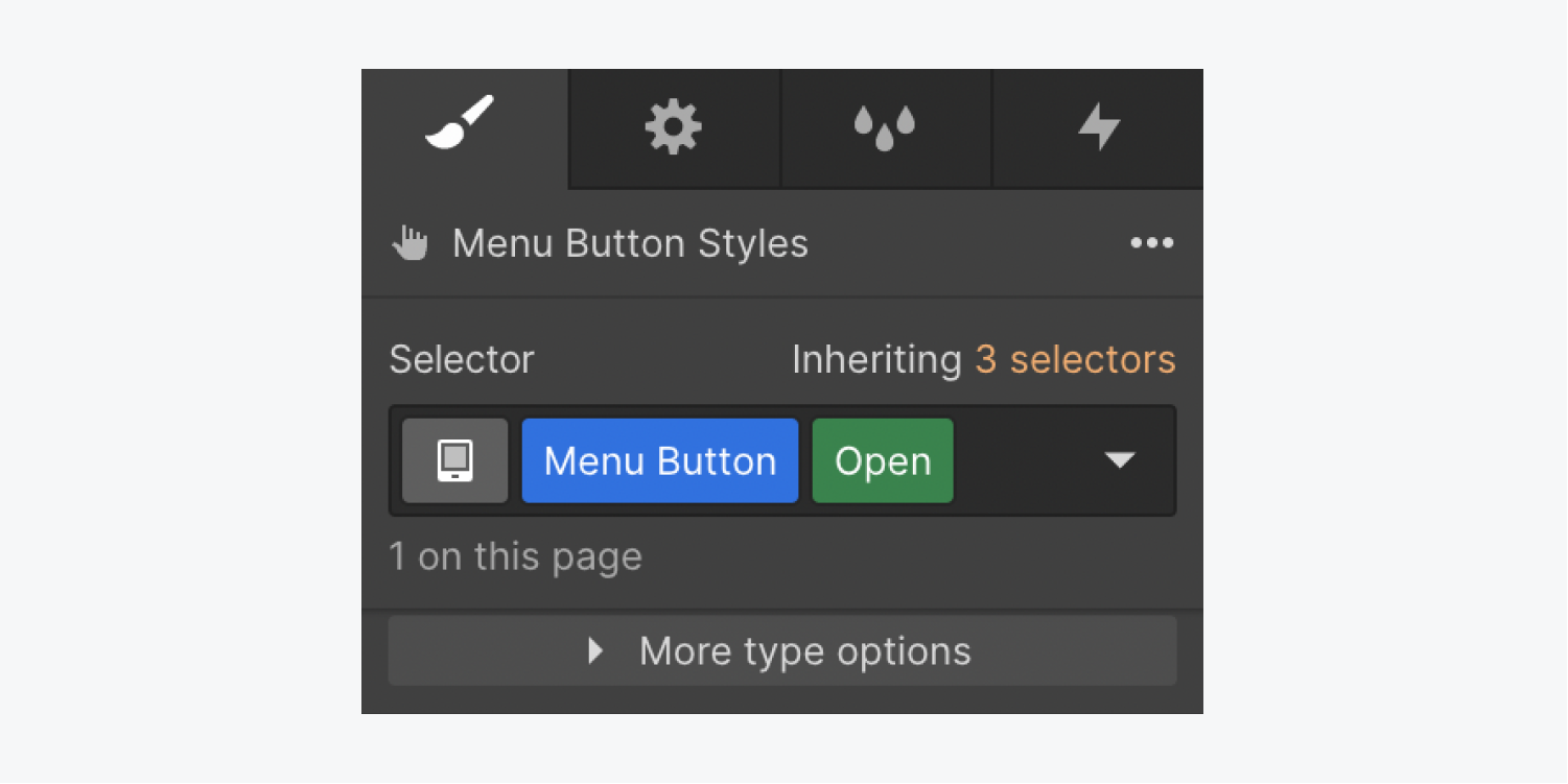
You can tailor the display of the menu button based on the menu state (Show or Hide). If you have the Show menu option enabled, and apply a styling adjustment to the menu button OR assign a class to it, an exclusive “Open” class will be automatically appended in the selector field.
Just like how styling operates on the default state, you can implement background and typography styles on the menu button to alter the background hue and icon hue.
- Include or eliminate Workspace spots and members - April 15, 2024
- Centering box summary - April 15, 2024
- Store a site for future reference - April 15, 2024
