Utilize the carousel to craft dynamic displays showcasing images, text, videos, and more.
Explored in this guide:
- Structure of a carousel
- Generating and transitioning slides
- Incorporating background visuals into slides
- Integrating extra elements into slides
- Customizing configurations
- Enhanced personalization

Structure of a carousel
Upon adding a Carousel to the canvas, you’ll observe that it spans the full width of its parent container.
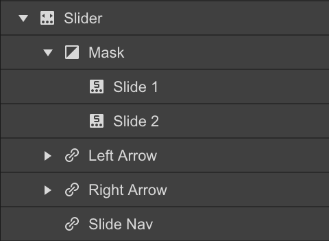
Once the Carousel is placed on the page, you’ll identify 4 primary components:
- The Mask – housing the default slides
- The previous arrow
- The next arrow
- The slide navigation

Generating and transitioning slides
The Carousel is initially equipped with two slides. You can introduce more slides in 3 ways:
- Choose any slide element, access the Element Settings Panel (shortcut: D) and tap + Add Slide
- Right-click on a slide on the canvas and opt for duplicate
- Select the slide on the canvas or navigator and duplicate via copy-paste
Navigate through your slides through four methods:
- Utilize the arrows in the Carousel settings
- Click on the dots in the Slide Navigation directly on the canvas
- Click on the slide in the Navigator Panel
- With the carousel selected, utilize the left and right arrows on your keyboard
You can also access a specific slide through the slide menu in the carousel settings.
Incorporating background visuals into slides
You can drag an image element into a slide or apply a background image to it for easier positioning of additional content later on.
- Elect a slide and create a class
- Include a background image
- Adjust background image size to contain and position to center.
If you wish to maintain consistent styles for other slides, re-use the same class. Additionally, you can introduce distinct combo classes for each slide to override the background image.
Integrating additional elements into slides
Slides, similar to div blocks or sections, can accommodate various components. By placing the carousel within the body, you can insert a container within the slide, followed by adding a heading and paragraph inside the container.

Configuring settings
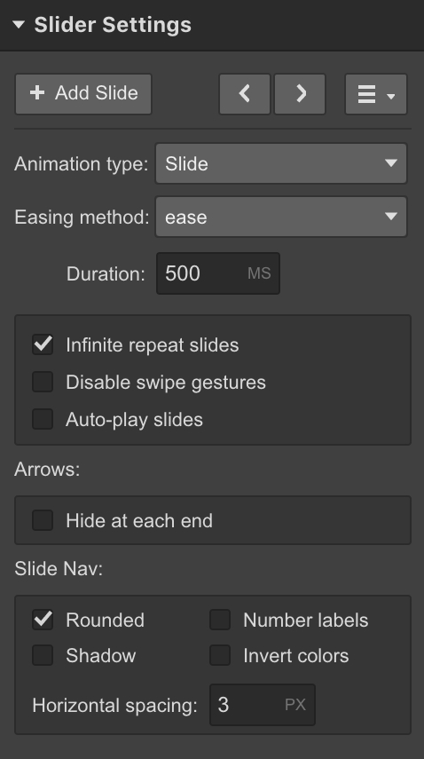
The Settings Panel (D) offers numerous settings to manage the carousel’s functionality, including:

Animation style – determine the slide transition appearance
Easing technique – modify the easing style for slide transitions
Duration – control the speed of transitioning between slides
Swipe functionalities – enable or disable touch swipe gestures, especially useful when slide timing is crucial
Auto play – define the interval for autoplaying and the number of slides before automatic cessation
First and last slide arrows – toggle the visibility of left arrow on the first slide and right arrow on the last slide
Slide nav options – customize the spacing, appearance, and color scheme of navigation buttons
Enhanced personalization
You possess the freedom to style and personalize the carousel however you desire. Here are some common methods for personalization.
Adjusting carousel dimensions
Modify the carousel size by selecting the Carousel and setting a different height in the Styles Panel. Notice the background image also resizes when set to cover.
The previous example adjusts the carousel height using pixel-based height. Alternatively, you can set the height relative to viewport height (vh). Explore various width & height units.
In case you wish to modify the width, you could adjust the slider within a larger or smaller parent element. In this illustration, the slider is positioned akin to a section, thus occupying the entire width of the page.
Customizing arrow icons
By default, the arrows present in the slider will be vertically centered and resemble white arrow symbols. You have the liberty to customize the appearance of these symbols by adhering to the steps below:
- Select the left arrow or right arrow component
- Assign a class to it
- Adjust the font size and font color styles within the style panel. The font size has an impact on the symbol’s size, while the font color determines its color.
Repeat the same procedure for the other arrow as well.
Replacing arrow icons
If you desire bespoke arrow symbols for your slider, you can simply eliminate the icon component inside the left and right arrow components. Afterwards, drag and drop your custom image into these elements.
Professional insights
You can utilize flex configurations for the arrow containers (left arrow and right arrow) to vertically center your custom arrow symbols.
To enhance the hover interaction on the left and right arrow components using a customized image, you have the option to adjust the opacity or utilize filters. Alternatively, you can employ a background image that changes upon hover state.
Styling the slide nav dots
Modifying the style of the slide navigation dots involves a bit more sophistication. You can alter the size of the dots along with the numbers for number labels by updating the font size. Similarly, the color of the number labels can be changed by applying a font color. Yet, if you aim to alter the color of the actual dots or squares, you will need to incorporate some CSS within a custom embed element.
- The class attributed to the dots = .w-slider-dot
- The class attributed to the active dot = .w-slider-dot.w-active
Modifying the color of the slide nav dots / squares
To change the color of the dots, embed the following code snippet within an embed element on your webpage:
<style>
.w-slider-dot {
background: blue !important;
}
.w-slider-dot.w-active {
background: navy !important;
}
</style>
You can disable the rounded setting within the slider settings → slide nav section to switch the dots into squares.

Advanced styling of nav dots / squares
You can even devise custom outlines using borders and other features.
In this instance, we shall generate blank dots for the selected/active state by incorporating the following code:
<style>
.w-slider-dot {
background: #4353FF !important;
border: 3px solid #4353FF !important;
}
.w-slider-dot.w-active {
color: #4353FF !important;
background: none !important;
border: 3px solid #4353FF !important;
}
</style>

We maintain a consistent border for both the active and non-active statuses to ensure uniform icon sizing.
The color styling specifically affects the font color of the numbered label exclusively. Hence, when no background is visible, we must ensure the number remains legible.
Concealing slide elements
If there are sections of the slide you prefer not to utilize in your layout, follow these steps:
- Choose the slide nav component or the arrows
- Adjust the display setting to none
Displaying multiple slides simultaneously
You also have the ability to customize the slider component as a carousel slider, showcasing numerous slides concurrently. Here’s how you can configure a slider to exhibit 3 slides at a time:
- Integrate a slider
- Assign the same class to all slides
- Specify the width within the class as 33.33% on desktop and 100% on mobile
If you wish to differentiate the slides (e.g., distinct background images), you can add a unique combo class to each slide.
Populating a slider with collection items
Currently, sliders cannot automatically populate with dynamic content. However, you may vote for this feature request on the Webflow Wishlist.
As a workaround, you can incorporate a collection list within each slide. Then, limit the displayed item count for each list to show only one Collection item.
Every slide necessitates its distinct collection list. After creating the initial collection list, you can replicate the slide and adjust the “start at” value for each collection list to correspond with the slide number (e.g., slide 1, item 1 / slide 2, item 2).
- Include or eliminate Workspace spots and members - April 15, 2024
- Centering box summary - April 15, 2024
- Store a site for future reference - April 15, 2024
