While working within the Designer, you have the ability to interact visually with components in your project laid out on the design space canvas. This provides a simpler method to engage with elements compared to searching for a piece of code related to an element you intend to modify. Merely clicking on the element directly on the design canvas suffices.
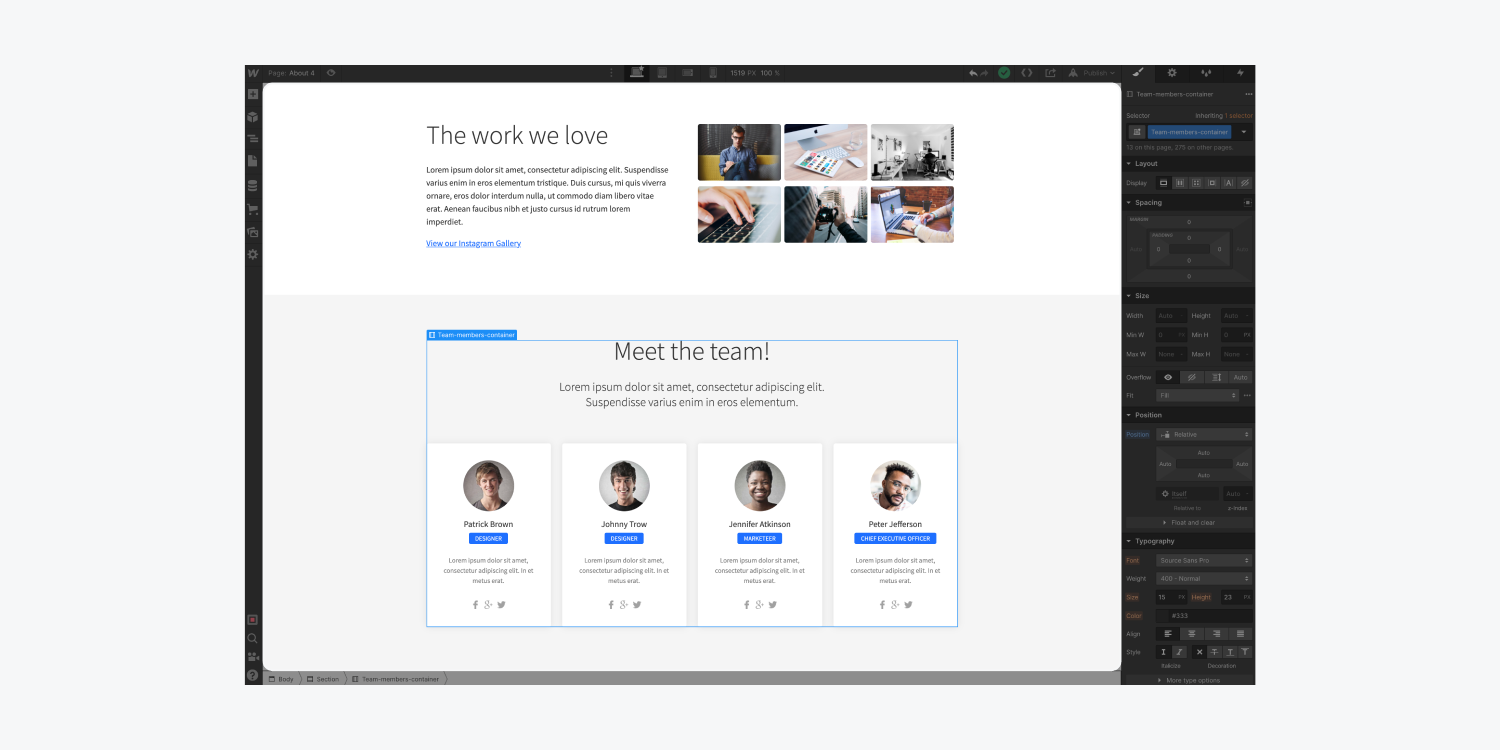
You can also interact with elements on the Design Space through the Navigator and the Navigation bar. However, this article will specifically delve into the design space and the four core methods of interacting with elements on the canvas:
- Selection – opting elements by clicking on them
- Hierarchy – observing and selecting an element’s ancestor
- Movement – relocating an element by clicking and dragging
- Preview – viewing how an element will display on a live website
Selection
To choose an element on your design space, position your cursor over the element and click directly on it.
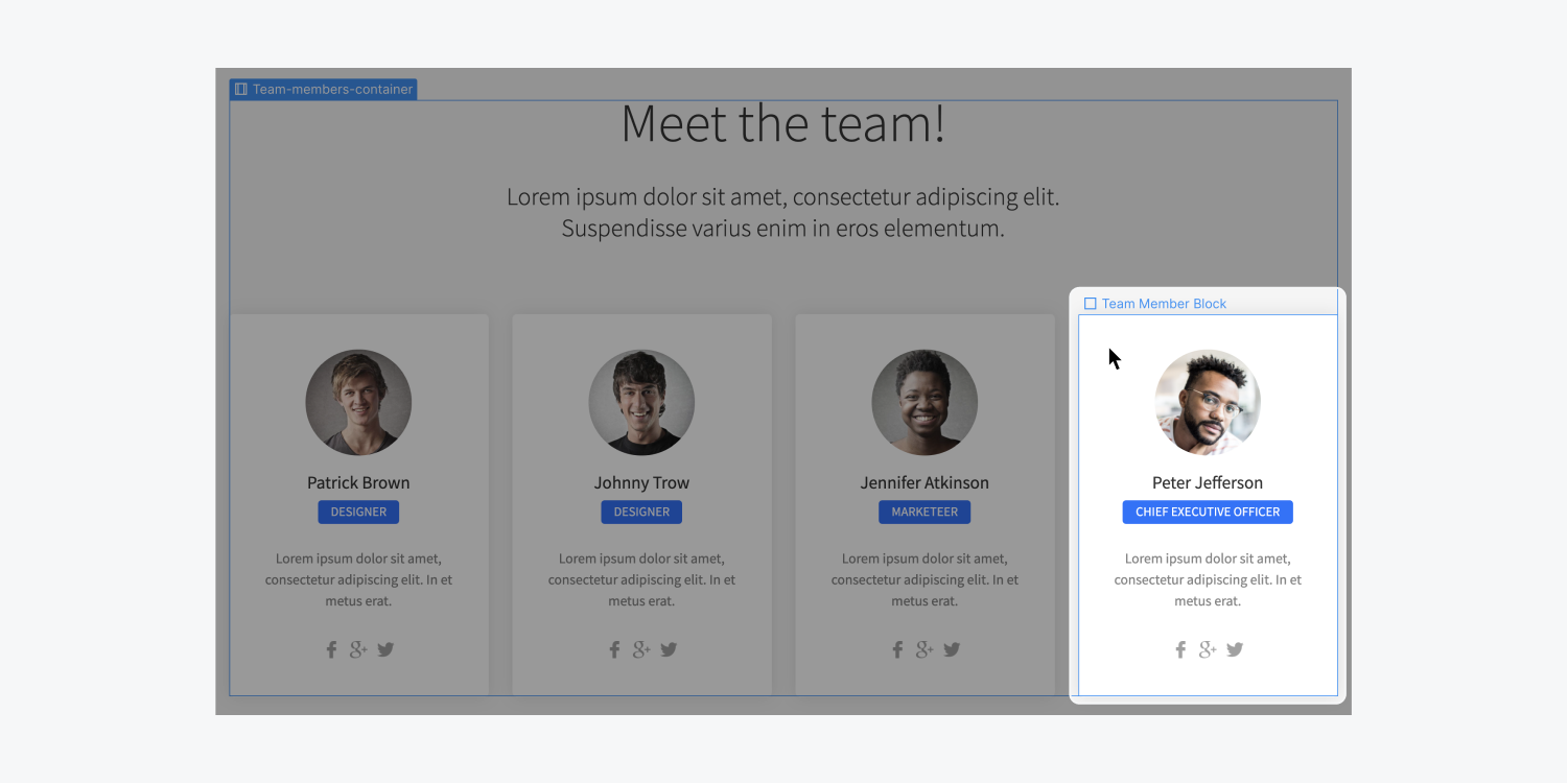
Observe that hovering over elements on the Design Space results in a blue border outlining the edges of each element. This serves to indicate which element you are selecting on the canvas.
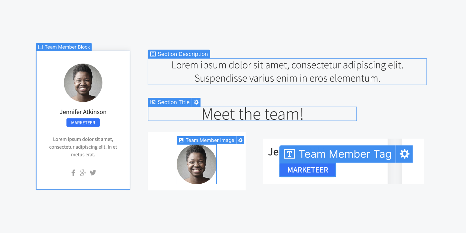
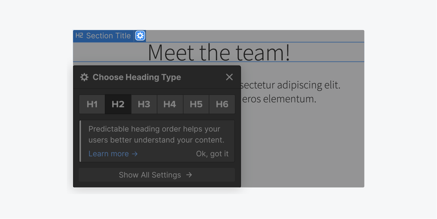
Selecting an element reveals the element label at the upper-left corner of the selected element. For elements offering more setting options, a gear icon appears to the right of the label. Click this icon to access those settings.
Hierarchy
You can examine the structure of an element and choose its parent or ancestor element in various ways:
- Press the label
- Utilize the Navigation breadcrumb bar
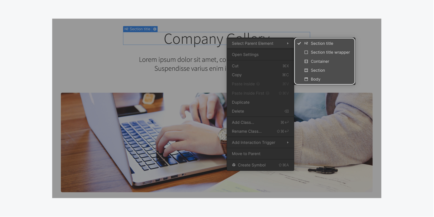
- Right-click the element
- Hit the up arrow on the keyboard
Press the label – upon selecting an element, click its label to view the names of its parent and ancestor elements. To choose the parent element, select its label from this menu. This is beneficial if a child element is nested within a parent element that is challenging to select.
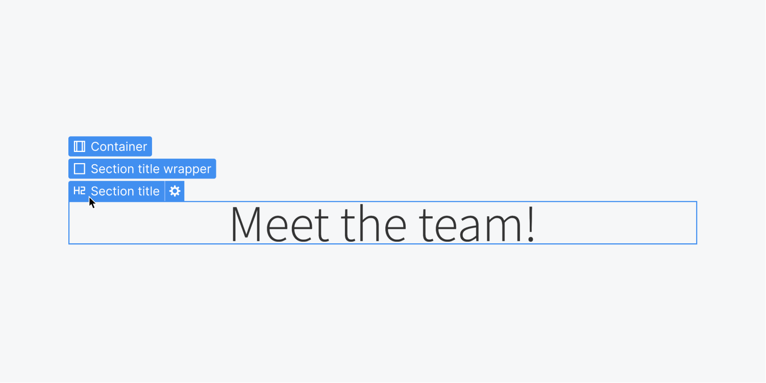
Utilize the Navigation breadcrumb bar – these selections can also be made on the bottom navigation situated directly beneath the canvas.

Right-click the element – you can also access the structure of an element from the context menu that pops up when you right-click on it.
Up arrow on the keyboard – this is the quickest way to navigate to the parent element. Explore other useful shortcuts.
Movement
If you wish to shift an element, merely drag and drop it into the desired position.
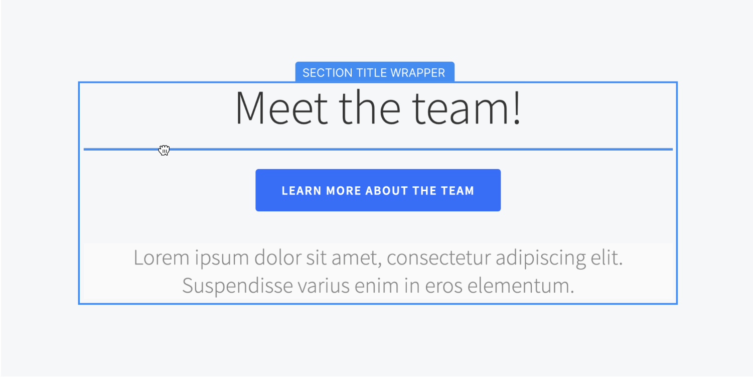
While moving an element, you can visualize where it is being relocated. On the design space, the blue guide shows the element’s position compared to other sibling elements. The orange guide specifies the parent element into which you are moving it.
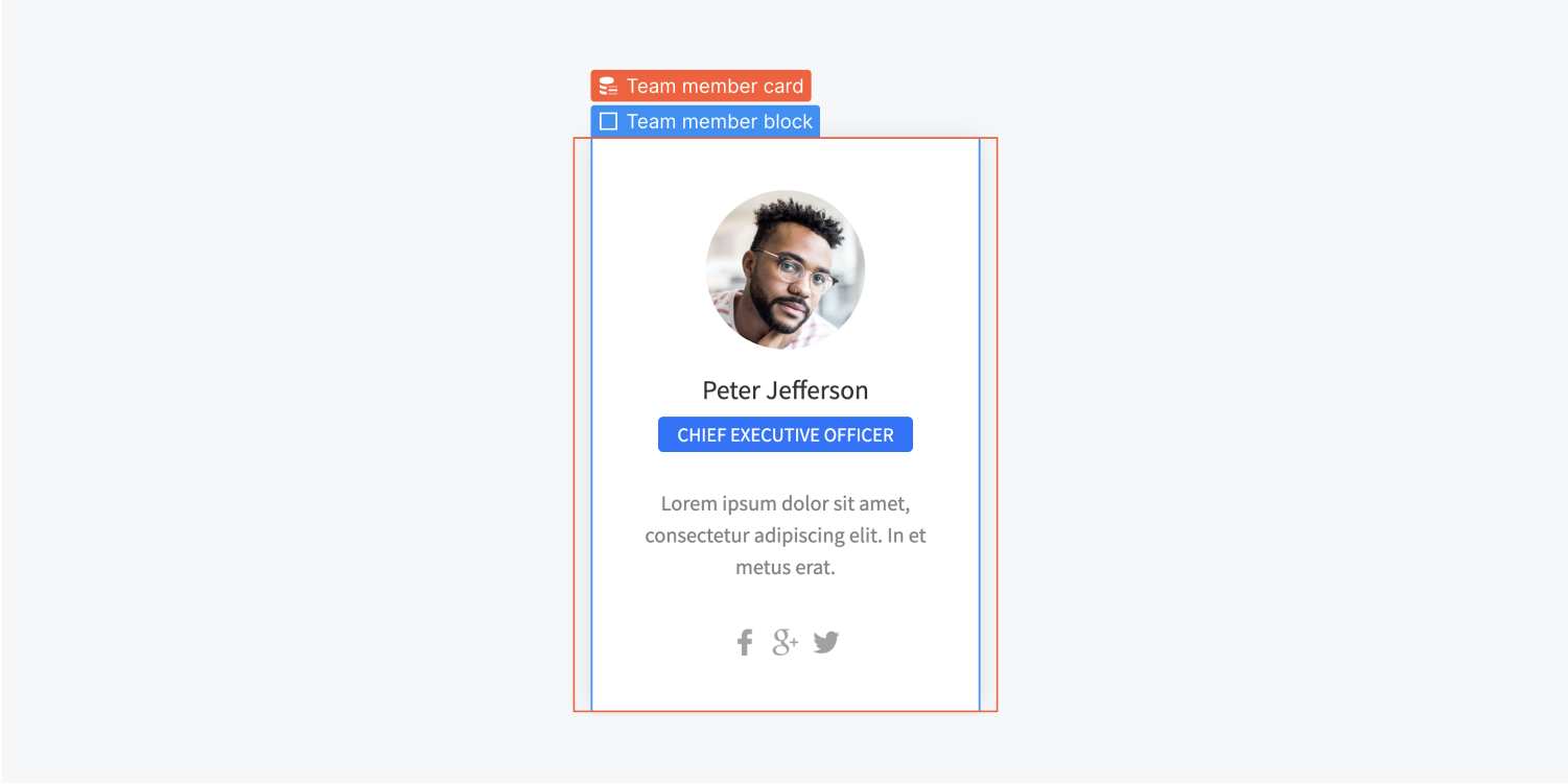
The location of a relocated element relies on the element’s display setting and other attributes. Explore further about the box model and positioning mechanisms in web design.
Preview
Utilizing Preview, you can preview how your elements will be presented on a live site within the Designer interface.

During the preview mode, you can also witness how your animations will function on a live site.
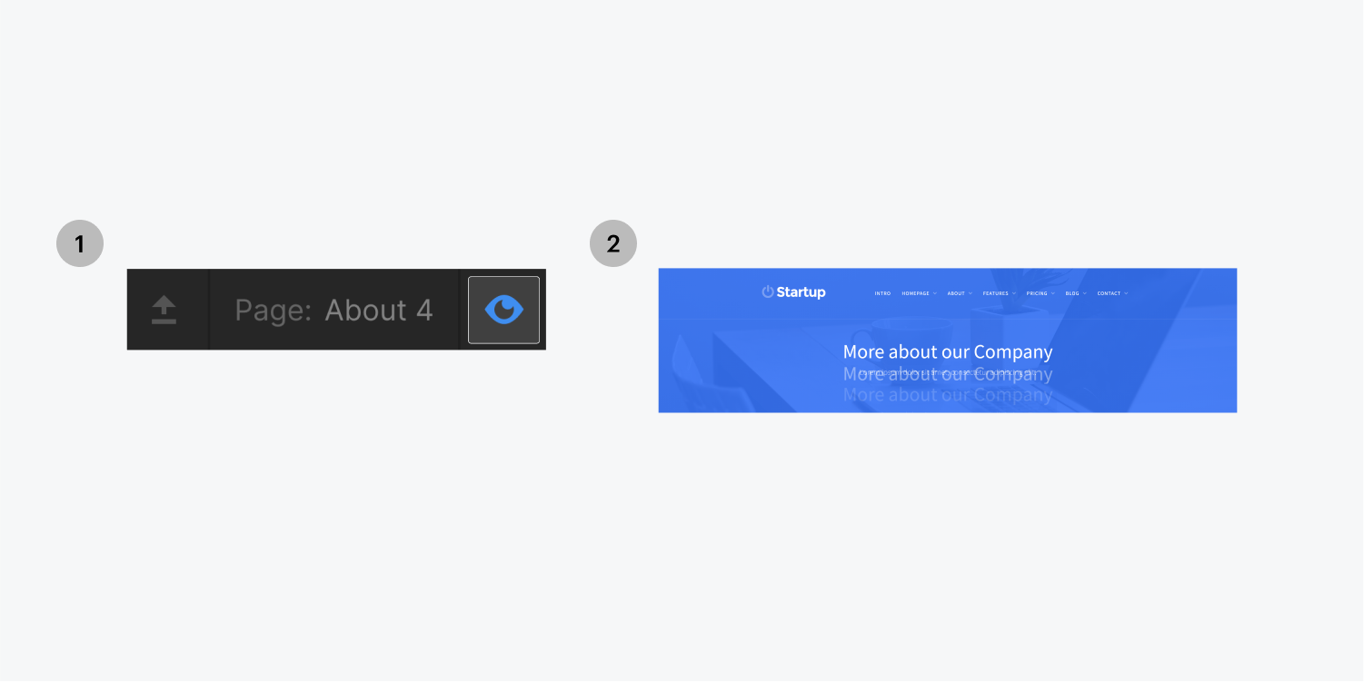
When you activate the preview mode, the Designer interface will be concealed to enable a full-width view of your website. Moreover, you can hide the remaining parts of the Designer interface by selecting the top-left arrow icon, which toggles the visibility of the top bar.

While in preview mode, you’re unable to select or edit elements as you would in the Designer since you are observing a representation of the page as it would appear when published.
Once you finish previewing, you can either click on the Preview icon again to return or simply press ESC.
- Include or eliminate Workspace spots and members - April 15, 2024
- Centering box summary - April 15, 2024
- Store a site for future reference - April 15, 2024
