The color palette is a Collection field that enables you and your colleagues to define a color for each collection item using a color picker. This chosen color can be utilized to customize the background color, text hue, and boundary shading of elements within a Collection List or a Collection Page.
Usual applications
- Design groupings of Collections, such as categories of blog posts, each represented with a distinct color
- Accentuate tags with varied background shades for each tag
- Rotate text hues for labels
- Alternate border shades to emphasize items from the same group
In this tutorial
- Establishing a color palette
- Incorporating colors into the palette
- Designing with the color palette
Establishing a color palette
A color palette can be included in a new or existing Collection. Inside Collection settings, press on New Field and then opt for the Color field.

Incorporating colors into the palette
Now that the color palette is integrated into your Collection framework, you and Collaborators can define a color in the Color field of any Collection item by typing a web color (hex, RGBA, or color name), or using the color picker to select a color.
Designing with the color palette
While assigning a color to a Collection item, you can incorporate that color into your design. Each element in your Collection List or Collection Page will integrate the color value specified for each Collection item.
Collection style settings
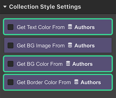
You can link color values to your elements in a Collection List or a Collection Page through the Collection Style Settings in the Settings Panel (D). You can opt for one or more of these choices:
- Retrieve the text hue from your Collection
- Retrieve the background hue from your Collection
- Retrieve the boundary hue from your Collection
You can detach the connection for any of these settings by unchecking the option checkbox.

Varying text hues
If you wish to assign the text hue of an element using the color value specified in the color palette of a Collection:
- Select the element
- Access the Settings Panel (D)
- Choose the Get Text Color From option
- Select the color palette from the field dropdown
Any font color styling set on this element in the Styles Panel will be altered with the color palette value when this setting is selected.
Varying background hues
You can adjust the background hue of an element similarly:
- Select the element
- Access the Settings Panel (D)
- Choose the Get Background Color From option
- Select the color palette from the field dropdown
Any background color styling set on this element in the Styles Panel will be dynamically replaced with the color palette value when this setting is chosen for this element.
Varying boundary hues
To retrieve the boundary hue of an element from a Collection, you must first establish a Border for your element:
- Select the element
- Access the Styles Panel (S)
- Style the Border
- Access the Settings Panel (D)
- Choose the Get Border Color From option
- Select the color palette from the field dropdown
At any moment, you can modify the style and width of the border in the Styles Panel. Nevertheless, the color will be fetched from the linked color palette and it will supersede any color value mentioned in the Styles Panel.
- Include or eliminate Workspace spots and members - April 15, 2024
- Centering box summary - April 15, 2024
- Store a site for future reference - April 15, 2024
