Here, we will delve into each of these measurement units, while also exploring concepts like minimum and maximum values, overflow management, and object-fit property.
Specifically, this lesson will cover:
- Automatic Sizing
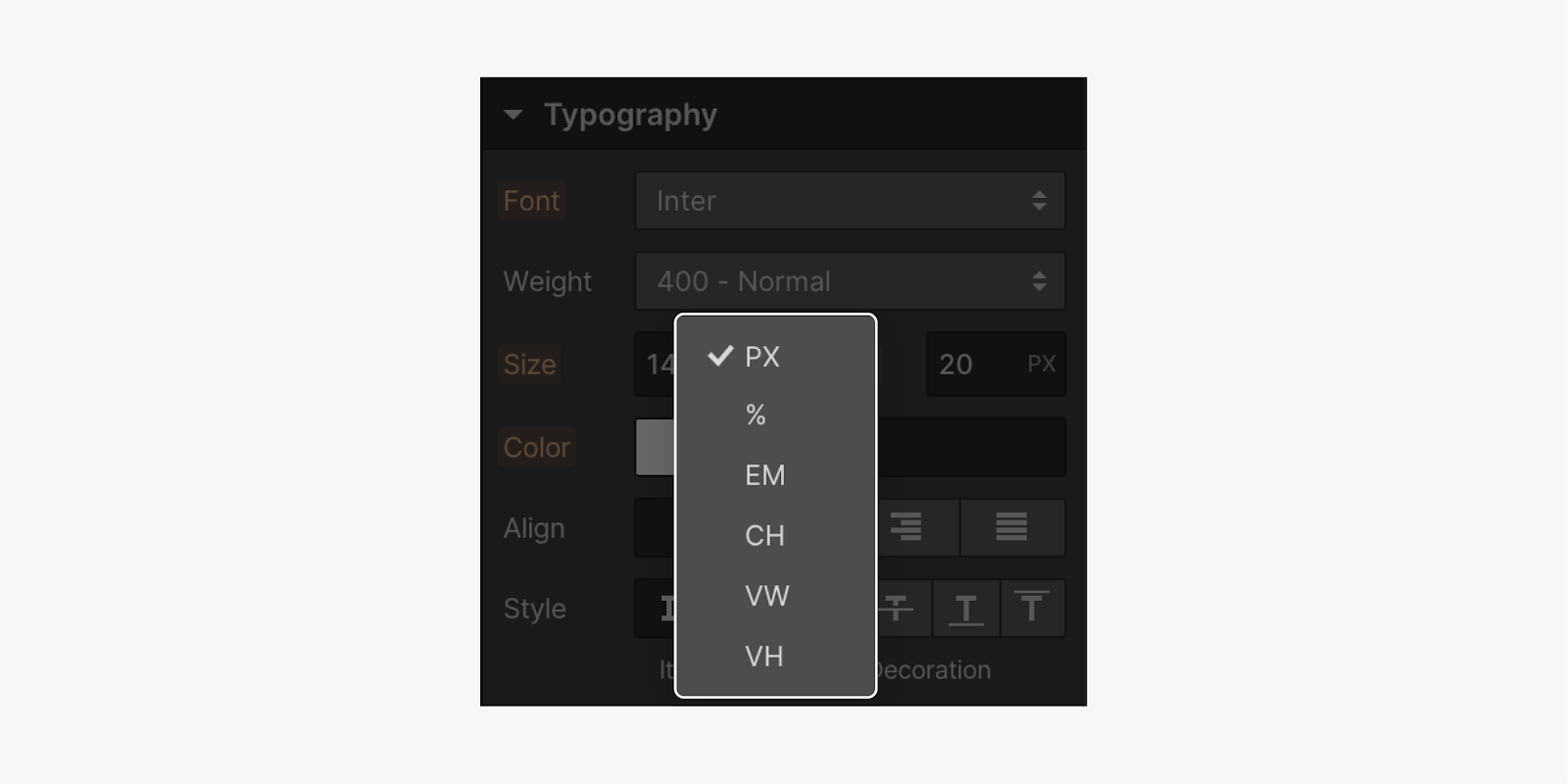
- Pixels
- Percentage Values
- Ems
- Rems
- Viewport-Based Units
- Fractional Units
- Character Units
- Minimum & Maximum Size
- Aspect Ratio
- Overflow Handling
- Object Fit Usage
Automatic Sizing
By default, web elements adjust their size automatically based on their content.
Pixels
Pixel values can scale proportionally, especially when dealing with images and elements set with specific pixel values.

To utilize the default pixel value:
- Enter a numerical value
- Hit the Enter key
Percentage Values
Similar to ems, percentages are relative to the font size of the parent element. For instance, setting a width to 25% within a padded section will allocate a quarter of the space inside the element.
Ems
Ems come in handy when adjusting padding proportionally for text elements. Each browser typically has a default font size of 16px. Ems calculate the font size based on their parent element, scaling the text size accordingly.
For a font size of 16 pixels:
- 1 em equals 16 pixels
- 2 ems equals 32 pixels
- 1.5 ems equals 24 pixels
You can also alter the font size of a paragraph’s parent element, like a Div block:
- Select the parent element
- Adjust the font size (e.g., to 20 pixels) in the Style panel under Typography
With the parent element set to 20 pixels:
- 1 em equates to 20 pixels
- 2 ems convert to 40 pixels
- 3 ems translate to 60 pixels
Rems
Rems are calculated in relation to the HTML font size.
Each rem value is determined by multiplying it with the HTML font size, respecting the user’s browser settings (unless overridden in the code). This approach ensures consistency with individual text size preferences.
Rems reference the root em unit (root ems), aligning with the default font size specified at the HTML level unless modified. Unlike ems, rems do not inherit font properties from individual elements or their parents, instead scaling based on the browser’s font size.
Viewport-Based Units
Viewport Width (VW) measures the width of the browser window, adjusting proportionally with the viewport width.
Fractional Units
Fractional Units (fr) are effective within grid layout properties, such as Quick Stack elements.
If working on a 4-column grid, each column defaults to 1fr — allocating one fourth of the grid space. Adding a column adjusts each fr to 1/5th. The flexibility of these units automatically handles calculations, including column gaps.
Explore more about fractional units.
Character Units
Character units (CH) are ideal for setting the width of elements like paragraphs or headings to control the number of characters per line.
For instance, capping a paragraph’s maximum width at 60ch will adjust the box size to accommodate 60 characters based on the selected font (zero character width). This unit enables precise control over text width, especially for character-based constraints.
Minimum & Maximum Size Constraints
When specifying an element’s width as 50%, it occupies half the space within its parent element (the Section). As the viewport resizes, the element scales correspondingly.
Introducing minimum (e.g., 200px) and maximum (e.g., 500px) width limitations ensures that the element maintains a width range of 200 to 500 pixels, adapting to varying viewport sizes.
A common practice involves setting up full-height sections (e.g., 100vh). However, this approach can cause visual issues when elements start to overflow or clip at the viewport bottom.
Tip: Utilize minimum height properties to eliminate fixed section heights and instead enforce a minimum height of 100vh. This way, the section always spans at least the full viewport height.
For instance, setting a section height at 800 pixels as the minimum height guarantees an 800-pixel height, while accommodating content width adjustments (allowing for vertical expansion if required).
In cases where limiting paragraph width to around 60 characters is desired, individual paragraphs can be configured to enforce a maximum width (e.g., 60ch). This standardizes paragraph width restrictions to approximately 60 characters.
Aspect Ratio Settings
Aspect ratio settings provide predefined and customizable ratios for sizing elements across your site, particularly beneficial for images, videos, and grid layouts that require specific proportions.
There are 5 ratio presets available:
- Auto — adapts dimensions as needed, suitable for flexible layouts
- Anamorphic (2.39:1) — ideal for cinematic experiences requiring wide dimensions
- Univisium/Netflix (2:1) — suited for modern TV and streaming content
- Widescreen (16:9) — optimal for wide layout elements
- Landscape (3:2) — beneficial for slightly-taller web elements
- Portrait (2:3) — ideal for tall layout elements
- Square (1:1) — perfect for balanced layout items
- Custom — offering flexibility to set a customized ratio
Incorporating aspect ratios alongside existing sizing properties like width and height ensures consistency. For example, applying a specific ratio to an element with predefined dimensions will adjust the opposite dimension accordingly. If both width and height values are set prior to the ratio application, the specified dimensions take precedence over the designated ratio.
To preserve element proportions regardless of interior content, setting the Overflow property to hidden can be beneficial.
Tip: In case you have already configured image dimensions and wish to establish a ratio, designate Fit as cover. This will guarantee proper scaling of your image.
Reminder: Elements adjusted using aspect ratios might display differently on smaller mobile screens in portrait mode. This variance occurs due to the discrepancy between the device screen width and the proportional height defined by the ratio. We suggest adjusting the Ratio values or other size-related parameters at various breakpoints to attain your preferred layout. For example, you could set a wide-screen aspect ratio for an image on larger breakpoints and a square aspect ratio for the same image on mobile breakpoints.
Excess
Overflow occurs automatically when the dimensions (width and height) of an element are specified and there isn’t enough space for the content within. By default, overflowing text remains visible. When you choose your element, navigate to the Style panel > Size > Overflow, you’ll notice the initial selection is the visible (eye) icon, indicating that the overflowing text remains visible by default.
Other alternatives for handling overflow include:
- Conceal hides content beyond the element’s boundaries.
- Scroll can display a scroll bar, depending on the user’s OS and browser, enabling users to navigate through Div block contents.
- Auto facilitates scrolling (ensure there’s substantial content for overflow before implementing this)
Object fitting
To utilize object fit, access the Size section within the Style panel:
- Specify dimensions (width and height) for the parent element (e.g., the Div block)
- Assign 100% width and height to the child element (e.g., the image nested inside the Div block)
- Experiment with the fit options: fill, contain, cover, none, and scale down — choose the most suitable one for your project
Important: Ensure that parent elements possess both width and height when dealing with object fit. This is crucial as all object fit settings size content within a parent element; however, object fit is applied to the child of a parent.

