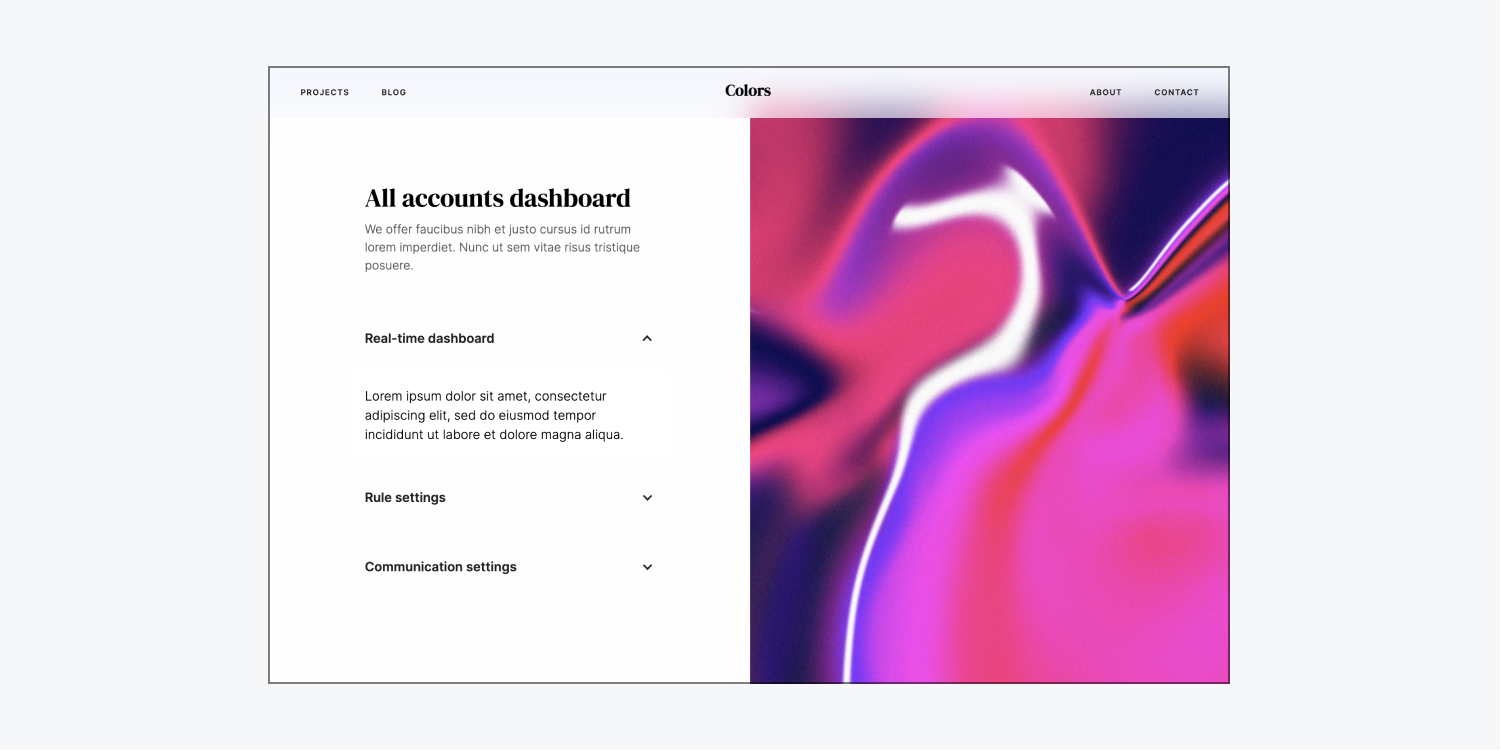
Crafting a personalized accordion involves utilizing a dropdown element and interactions. This tutorial will cover:
- How to insert a dropdown element
- How to customize your dropdown switch
- How to design your accordion
- How to produce your bespoke animation
How to include a dropdown element
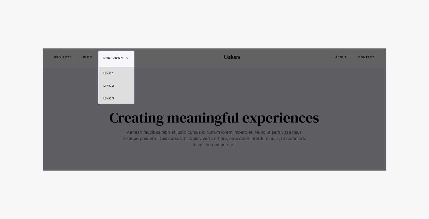
The drop-down element contains default built-in functions that simplify its use as a personalized accordion — it uncovers the drop-down list upon click and conceals it upon clicking a distinct element or part of the page.
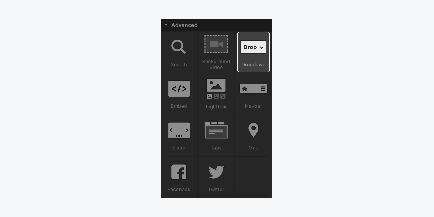
You can integrate a drop-down element into your website by navigating to Add panel (A) > Elements > Advanced and dragging the drop-down element onto the canvas.
How to modify the default drop-down styles
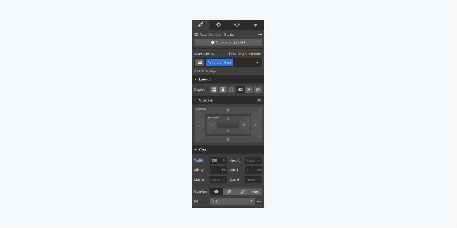
To incorporate the dropdown in your personalized accordion, you must adjust the default dropdown element styles. Particularly, you ought to modify the width to ensure the dropdown occupies the entire space of its parent element (i.e., the element containing the custom accordion).
Bonus tip: Assign a class to your dropdown (e.g., “Accordion item”) for reusability in styling. Explore more about styling using classes.
To adjust the default dropdown styles:
- Choose the parent drop-down element on the Designer canvas (we designated it a class of “Accordion item” in this instance)
- Visit Style panel > Size
- Specify Width as 100%
How to personalize your drop-down switch
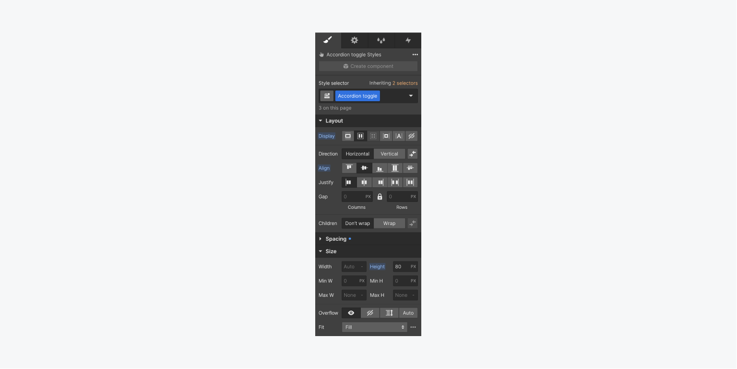
At this moment, you need to personalize your drop-down switch so it completely fills its parent element (i.e., the container) and conceals the content within the drop-down list when the accordion is closed. To accomplish this, tweak the drop-down switch’s display and height properties:
- Select the drop-down switch on the canvas and assign a class (e.g., “Accordion toggle”)
- Navigate to Style panel > Layout
- Set Display to flexbox for full horizontal coverage
- Set Align to center for vertical text centering on your accordion
- Proceed to Style panel > Size
- Define a Height value (e.g., 80px)
How to design your accordion
After this stage, if you test your site and interact with your accordion, you might observe that the accordion unfolds, yet the default content within may overlap surrounding content. This occurs because the default position style for the drop-down list is absolute. While this is the desired behavior for conventional drop-down usage like in menus or navbars, for your personalized accordion, you must alter the default positioning so the nearby content adjusts (e.g., shifts down or up) when the content inside the accordion expands.
To innovate your accordion:
- Choose the parent drop-down element on the canvas (e.g., the “Accordion item”)
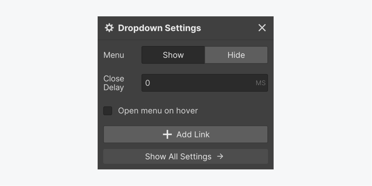
- Select the “cog” icon to unveil Dropdown settings and tap “Show” adjacent to Navigation
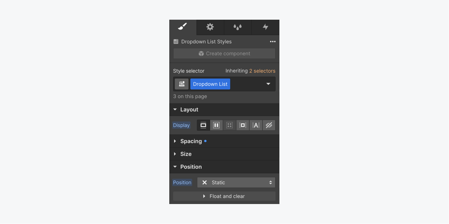
- Choose the List Box option on the artboard
- Navigate to Design panel > Alignment
- Adjust Alignment to fixed
- Pick the ancestor dropdown element (e.g., “Accordion item”) on the artboard
- Go to Design panel > Dimensions
- Set Mask to concealed to mask any content that goes beyond the accordion area
Steps to design your personalized animation
Now, create a unique animation that will handle both opening and closing your custom accordion with these steps:
- Establish initial actions
- Animate the accordion expansion
- Animate the accordion closure
Establish initial actions
Initiate by crafting 2 initial actions (i.e., styles applied to the element before page load) for your accordion.
First, initiate an initial action for your dropdown:
- Choose the dropdown element on the artboard (e.g., “Accordion item”)
- Navigate to Interactivity panel > Element trigger and tap the “plus” symbol to create a fresh element trigger
- Opt for Dropdown expands
- Tap Choose an action under Menu reveals
- Opt for Launch an animation under Personalized animation
- Tap the “plus” symbol adjacent to Scheduled animations
- Assign a name to your custom animation (e.g., “Accordion expands”)
- Tap the “plus” symbol next to Activities to incorporate an action to your animation
- Opt for Magnitude under Various
- Mark the “Set as initial state” checkbox under Timing
- Enter a height value (e.g., 80px) under Magnitude that aligns with the height given to your dropdownswitch (e.g., the “Accordion switch”) in the prior steps
- Tap Save
Following that, initiate an initial action for the switch icon:
- Pick the Symbol inside the dropdown element
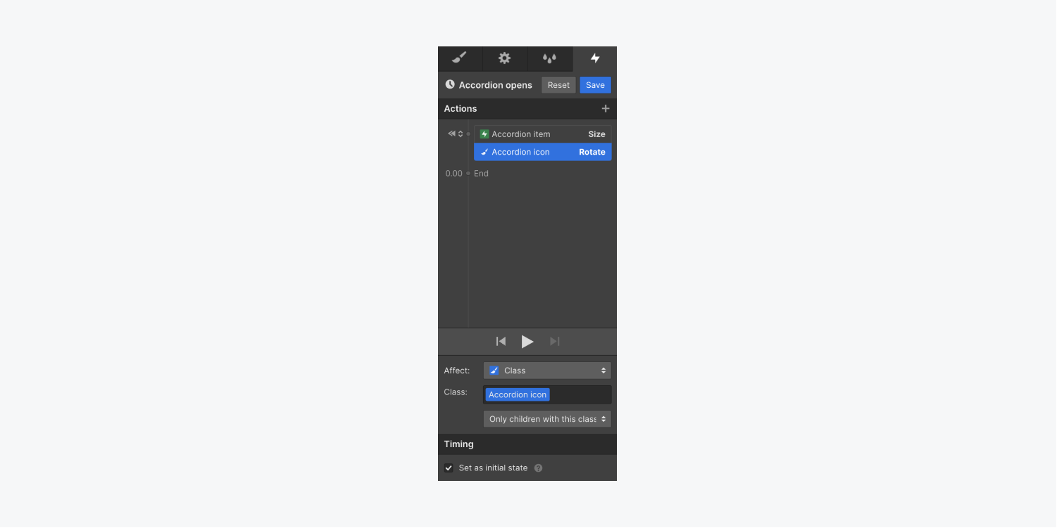
- Head to the Design panel and label your icon class (e.g., “Accordion icon”) — now your animation can influence all instances of the icon
- Select your ancestor dropdown element on the artboard (e.g., “Accordion item”)
- Unfold the Interactivity panel
- Choose the Dropdown expands interaction you crafted in the previous steps
- Tap the “gear” symbol adjacent to the customized timed animation you crafted previously (e.g., the “Accordion expands” interaction)
- Choose the icon (e.g., “Accordion icon”)
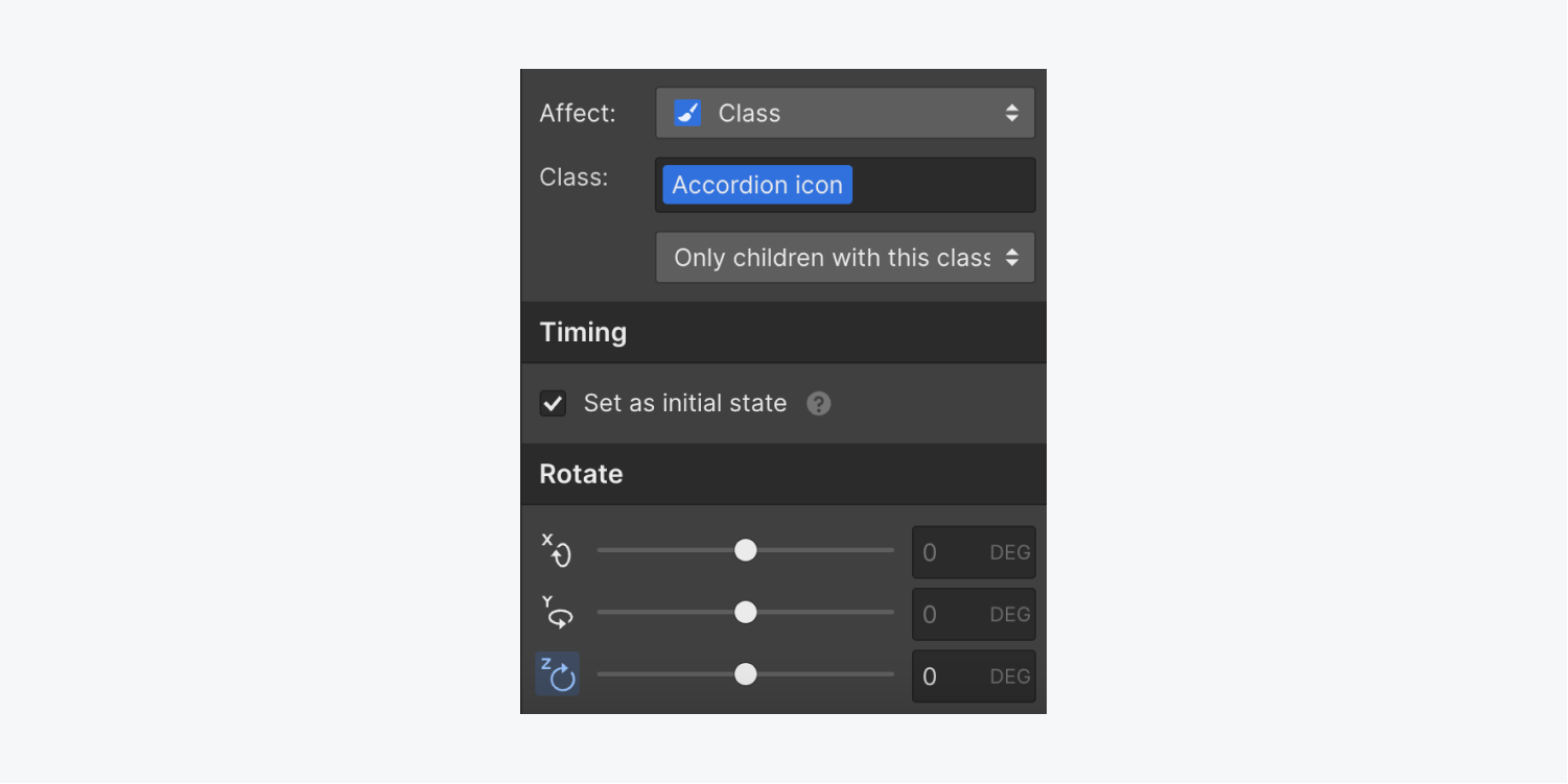
- Tap the “plus” symbol next to Activities to set up an initial action for the icon
- Opt for Rotate under Alter
- Mark the “Set as initial state” checkbox under Timing
- Head to Rotate and dial the z-axis to 0degrees
- Tap Save
Animate the accordion expansion
Next, set up the actions for expanding the accordion that occur simultaneously when the accordion is clicked — the “Accordion item” size will adjust to the content size within it, and the “Accordion icon” will turn 180 degrees.
To alter the size of the “Accordion item” and rotate the “Accordion icon” upon accordion opening:
- Choose the ancestor dropdown element on the artboard (e.g., “Accordion item”)
- Unlock the Interactivity panel
- Select the Dropdown expands interaction you formulated earlier
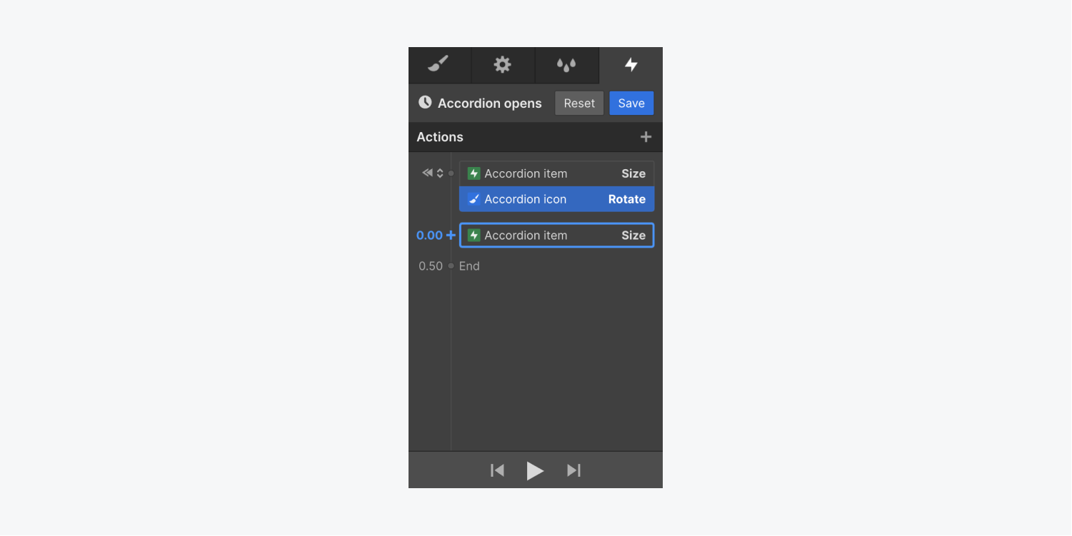
- Tap the “gear” symbol adjacent to the customized timed animationyou fashioned in the prior steps (e.g., the “Accordion opens” animation)
- Tap the “plus” symbol beside Actions to insert an undertaking to your animation
- Opt for Size within Miscellaneous
- Deselect the “Set as initial state” checkbox beneath Timing
- Navigate to Size and input “auto” for the height — this corresponds to the height of your accordion to its content inside
- Pick the icon (e.g., “Accordion icon”)
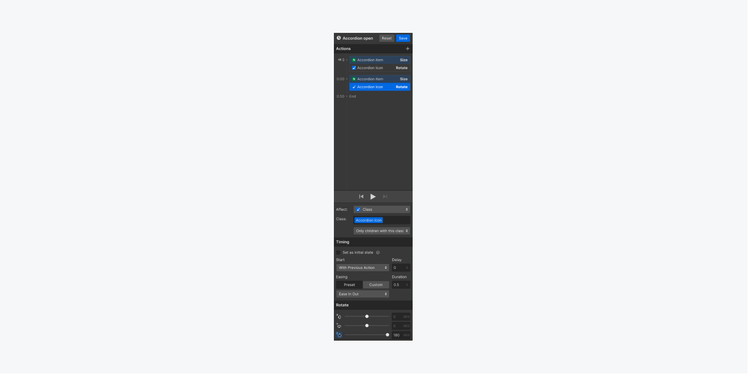
- Tap the “plus” symbol adjacent to the “Accordion item” Size action you just established to append another undertaking at that timestamp — this guarantees that both of these undertakings animate concurrently
- Choose Rotate beneath Transform
- Head to Rotate and adjust the z-axis to 180degrees — this rotates the icon so that it directs upwards when the accordion opens
- Tap Save
Note: You have the option to modify the easement (i.e., the acceleration and deceleration of the animation transition) of each action. Obtain more information regarding interpolation, easement, and smoothing.
Animate the accordion closing
Next, you’ll establish an interaction for the accordion closing. This interaction will contain the undertakings that transpire when the accordion item is pressed a second time or when a visitor clicks outside the accordion item — the accordion item will revert to its initial size, and the icon will rotate back to 0 degrees.
To animate the accordion closing:
- Pick the parent dropdown element on the canvas (e.g., “Accordion item”)
- Reveal the Interactions panel
- Opt for the Dropdown opens interaction you designed in the prior steps
- Tap Select an action beneath Menu closes
- Select Start animation
- Tap the “plus” symbol adjacent to Timed animations to craft a customized animation
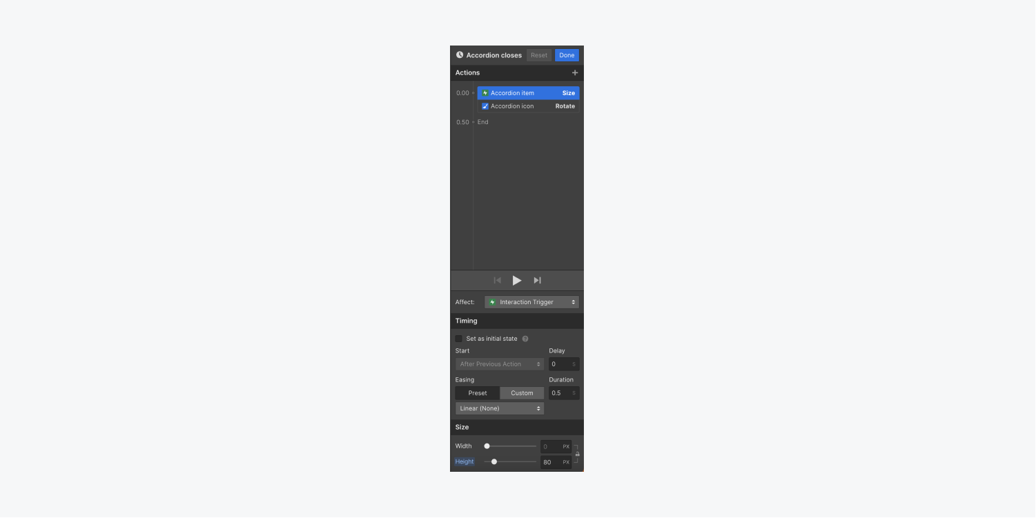
- Assign a name to your custom animation (e.g., “Accordion closes”)
- Tap the “plus” symbol to insert an undertaking to your animation
- Opt for Size beneath Miscellaneous
- Input a height value (e.g., 80px) that coincides with the height you allocated to your dropdown element for its initial state in the previous steps
- Select the icon on the canvas or in the Navigator (e.g., “Accordion icon”)
- Tap the “plus” symbol adjacent to the “Accordion item” Size action you just crafted to add another undertaking at that timestamp — this ensures that both of these undertakings animate concurrently
- Opt for Rotate beneath Transform
- Head to Rotate and adjust the z-axis to 0degrees — this rotates the icon back to its initial position so it directs downwards when the accordion closes
- Tap Save
And that concludes your successful creation of a unique accordion using interactions!
- Include or eliminate Workspace spots and members - April 15, 2024
- Centering box summary - April 15, 2024
- Store a site for future reference - April 15, 2024
