We are here to guide you in crafting a pop-up that is slightly unique — one that is initiated by the user. The user triggers the pop-up animation by clicking a button, revealing a form. (You can always modify the trigger based on your requirements.)
What you will learn in this tutorial:
- Construct a fixed modal
- Integrate a button into your project
- Configure the pop-up trigger
- Organize the pop-up animation
- Configure the closing animation
Construct a fixed modal
To create an overlay for your content, you can follow these 3 steps:
- Develop a pop-up wrapper
- Include a form element
- Create a “close” link
Develop a pop-up wrapper
To insert a Div block as the wrapper for the modal, use the keyboard shortcut A to access the Add panel (or click the plus icon in the top left corner) and drag a Div block element into your project.
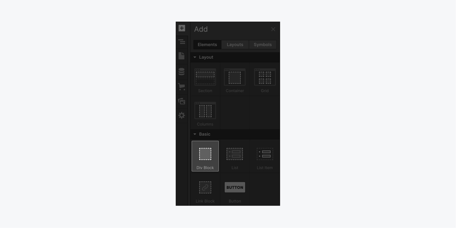
For better organization of your project, position the Div block at the top of the Body element (while not mandatory, this practice aids in organizing elements). Drag the element into the Navigator and place it within the Body element.
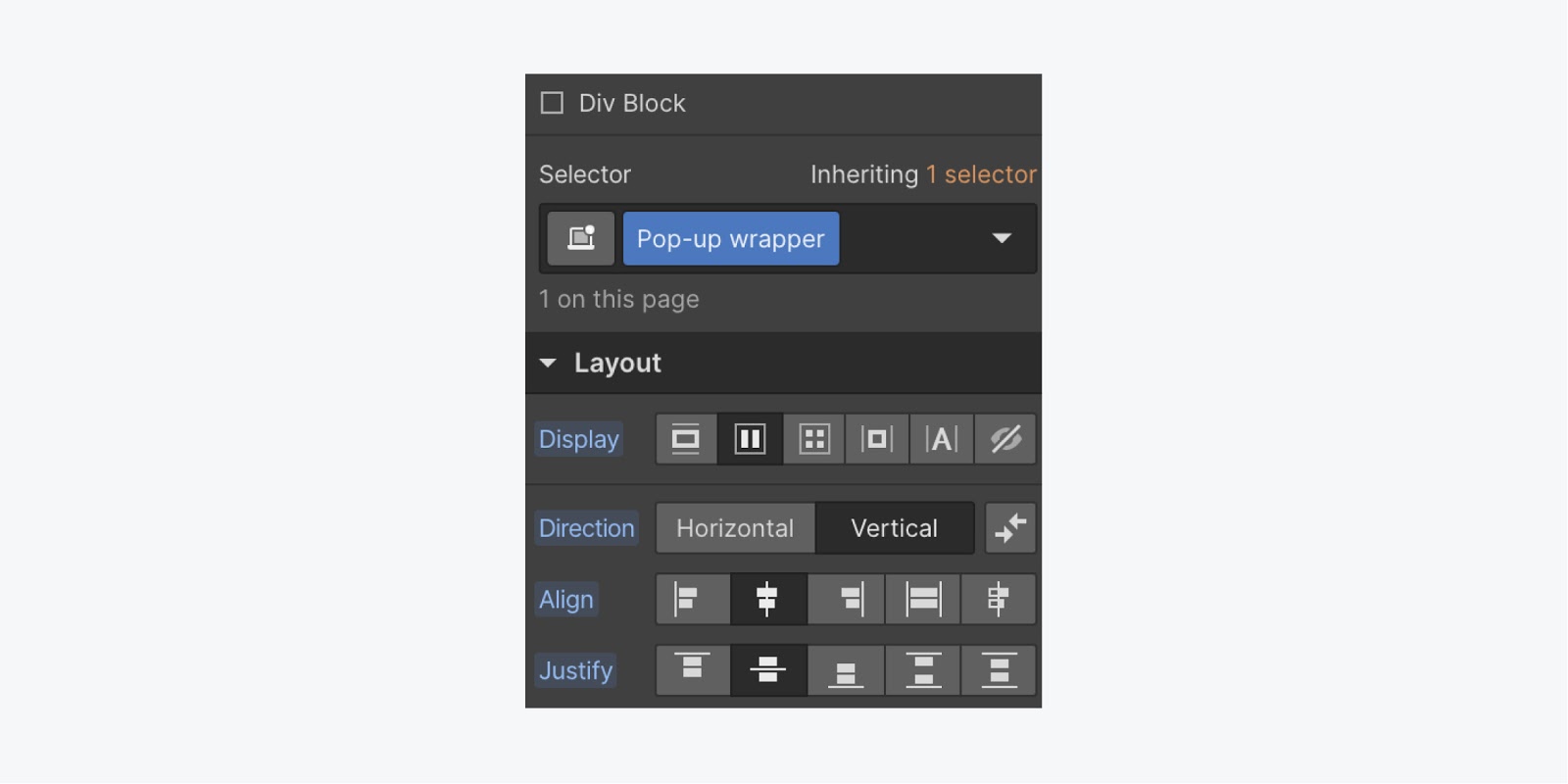
Select the Div block, assign it a class name like “Pop-up wrapper” and define style attributes in the Style panel:
- Display: flex
- Flex layout: vertical, center, center (to center the form vertically)
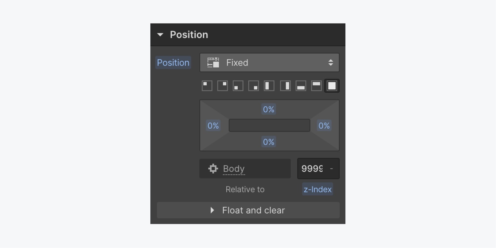
Scroll through the Style panel to configure additional style settings ensuring the wrapper occupies the entire view:
- Position: Fixed, full
- Z-index: 9999 (to place the wrapper above all other elements in the project)
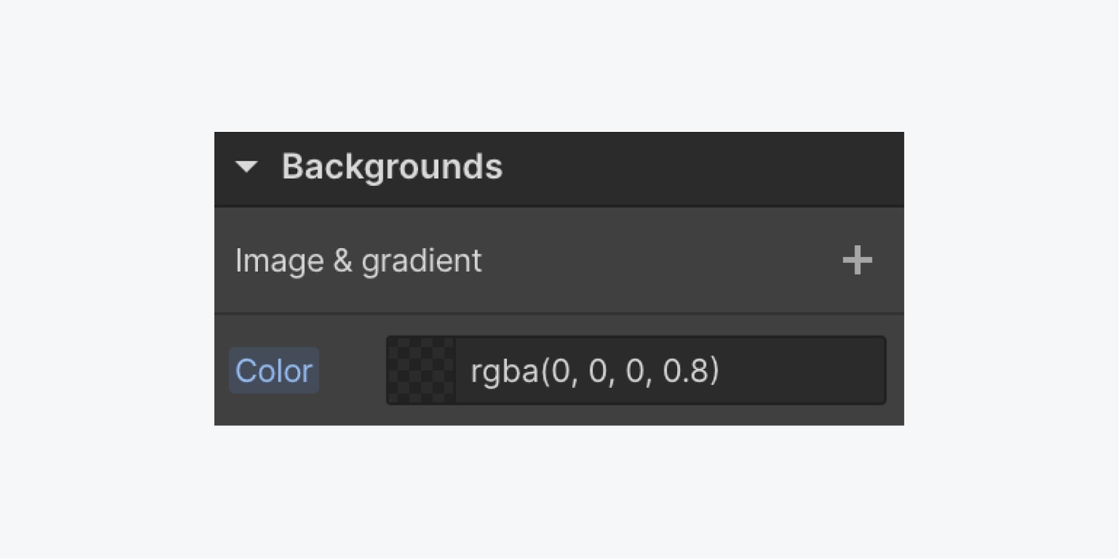
Apply a background color to make the pop-up stand out from the remaining content in your project. Experiment with #000000 and 80% opacity — or any other background color that suits your project.
Include a form element
To have a pop-up with a form, you will require a Form element inside the wrapper.
Select the wrapper, insert a Form using the Quick Find feature:
- Press Command + E (on Mac) or Control + E (on PC)
- Search for “form”
- Choose the Form element and place it within your “Pop-up wrapper” (due to the previous styles on the wrapper, the Form will utilize Flexbox for centering)
- Design your form to suit your project (e.g., restrict max-width to 500 pixels and set width to 100%)
By combining these styles, your form is confined within 500 pixels (max-width) while being responsive across various device sizes (100% width). Learn more about responsive design in Webflow.
Create a “close” link
Next, let’s insert a text link for users to close the pop-up after submitting the form.
To achieve this, drag a Text link in the Navigator to the top of our “Pop-up wrapper” (once again, while not mandatory, this practice aids in organizing the elements).
AndWith the link selected, assign a class name (e.g., Pop-up close) to the link and apply some styling:
- Position: Absolute
- Top: 5%
- Right: 5%
- Bottom: Auto
- Left: Auto
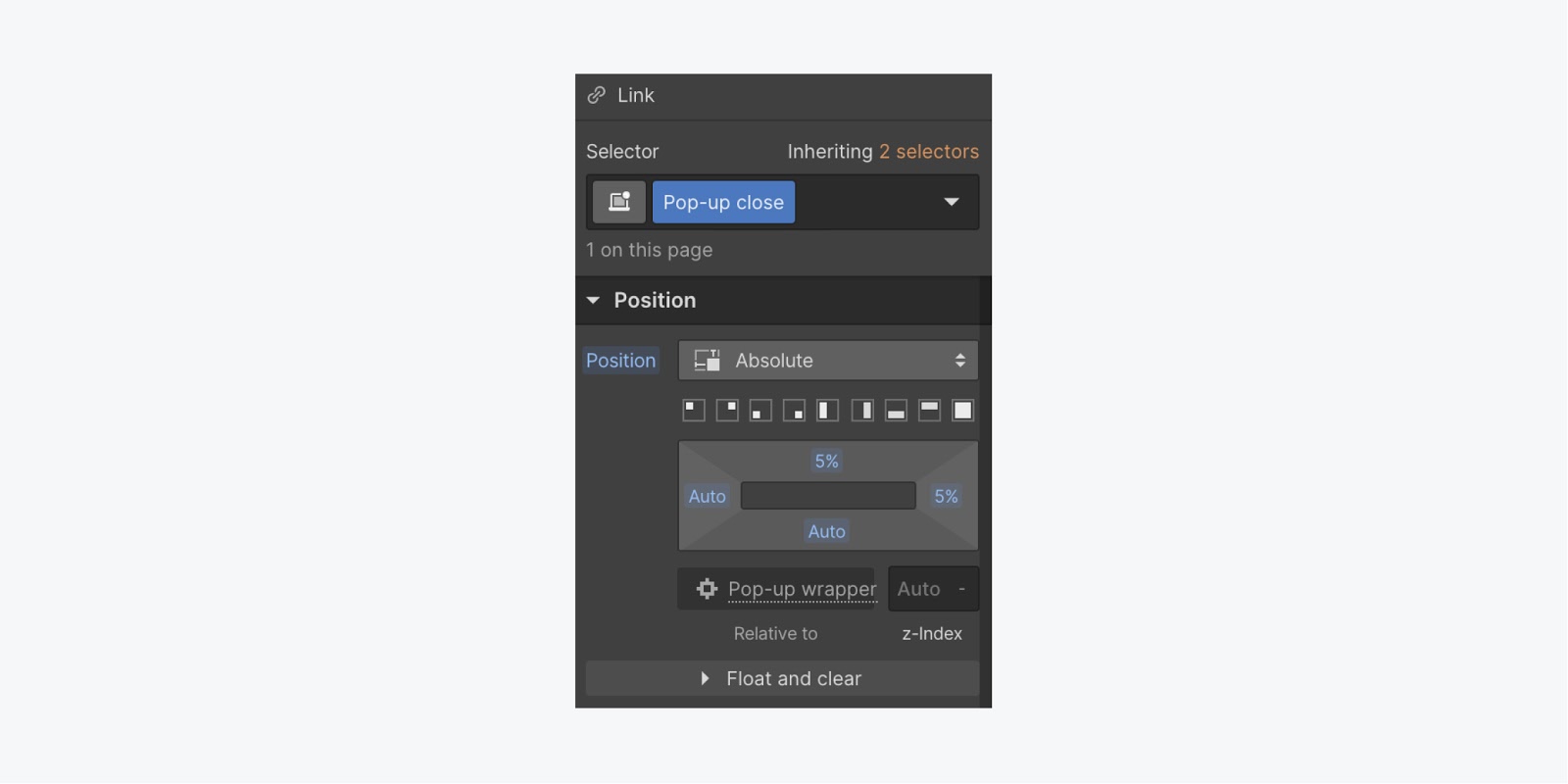
By utilizing this set of styling, you can keep your close link positioned at the top of the pop-up wrapper.
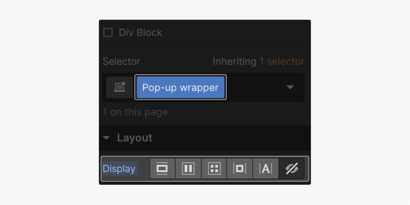
At this point, all the elements for the pop-up have been created. Proceed to change the display style of the “Pop-up wrapper” to None in order to hide it when it’s not in use.
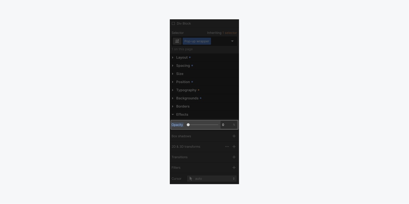
To make the opacity of the “Pop-up wrapper” 0%, which will prepare you for creating a smooth fade-in animation upon interaction.
Insert a button into your project
The final step in your project setup involves adding an element, such as a button, to trigger the pop-up when clicked.
To incorporate a button:
- Press A on your keyboard to access the Add panel (or click the + icon on the top-left of the Designer)
- Drag a Button element to the desired location within your project
Configure the pop-up trigger
With the button added to the project, you can now establish an interaction to trigger the pop-up when the button is clicked.
In the past, interactions involved complex JavaScript libraries that required various tools, plugins, and substantial learning curves in coding. With Webflow, we can visually create our pop-up interaction.
To begin, select the button on the canvas. Subsequently, click the Interactions symbol to unveil the Interactions panel
Within the Interaction panel, click the + icon for Element trigger, then opt for the Mouse click alternative.
Establish the pop-up animation
While Webflow offers a few preset interactions, you will create a customized interaction for unveiling your pop-up. Upon clicking the button, your pop-up will gradually fade-in. To achieve this – under On 1st click – choose the Action dropdown and select the Start an animation option. Subsequently, press the + icon to incorporate our timed animation
You can now assign a name to your animation (e.g., Pop-up) and then select the element you wish to animate.
Note: Ensure you choose the element while the Interaction panel is active.
For this project, choose the “Pop-up wrapper” element from the Navigator. Subsequently, click the + icon beside Actions, then choose Opacity (this will initially set the opacity state).
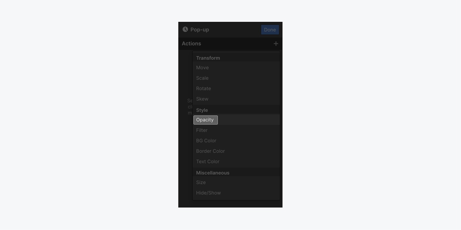
First, let’s consider the timing (notice the timing display at the panel’s bottom). Start by activating the Set as initial state toggle, and assign the value to 0%.
Next, select the + symbol near Actions, followed by choosing Hide/Show (to display the hidden pop-up – its opacity remains concealed). Ensure to set the Display as Flex.
To complete the last task, transition the opacity from 0% to 100%. To execute this, choose the + symbol beside Actions, then opt for Opacity (which auto-adjusts it to 100%).
Finally, click the Done button, and proceed to publish the project. Upon clicking the button now, your pop-up will surface. Although, you cannot close it yet; hence, establish an interaction on the “Pop-up close” link.
Prepare the closure animation
To construct a closure interaction, initially, target the “Pop-up close” link within the Navigator.
Subsequently, introduce the interaction for closing the pop-up once the link is hit.
Follow these steps:
- Click the Interaction icon to unveil the Interaction panel
- Choose the Mouse click option
- From the Action dropdown, select Start an animation
- Then, add your timed animation by clicking the + symbol
- Label your animation (like, Close pop-up)
- In the Interaction panel, highlight the “Pop-up wrapper” element in the Navigator
- Include the Opacity option by selecting the + icon next to Actions
- Adjust the opacity to 0%
- Add another action by selecting the + icon next to Actions, then click Hide/Show
- Opt for None within the Display setting
Finally, click the Done button, then republish the project to test the pop-up.
Excellent job on developing a pop-up with fixed positioning. Well done!
- Include or eliminate Workspace spots and members - April 15, 2024
- Centering box summary - April 15, 2024
- Store a site for future reference - April 15, 2024

