Flexible box model, commonly known as flexbox or flex, provides a way to arrange elements within a container. Flexbox allows for efficient layout control in a single dimension — either vertically or horizontally. It acts as a display property, enabling you to apply flexbox to various elements.
This tutorial will cover the following topics:
- Parent and child elements in flex
- Configuring parent flex properties
- Configuring child flex properties
Parent and Child Elements in Flex
When utilizing flexbox on an element, it is typically applied to the overarching container to manage the arrangement of child elements. A container element employing flexbox is referred to as the “flex parent,” while a direct child element of a flex parent is known as a “flex child.”
You can designate any element that contains other elements as a flex parent. To create a flex parent:
- Select the desired element (e.g., section, div block) on the canvas
- Navigate to the Style panel > Layout > Display
- Click on Flex
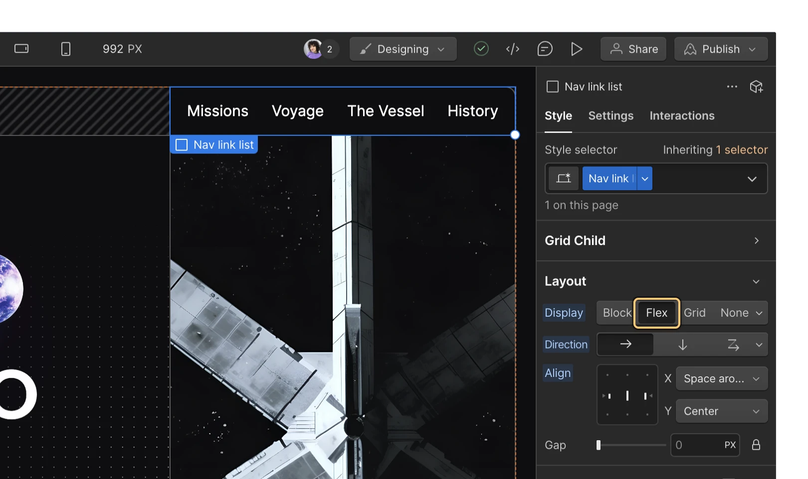
Unlike alternative display settings, activating flexbox on a parent element impacts the layout of its direct child elements. By default, children are aligned to the left and are positioned next to each other horizontally when flexbox is activated on the parent element. Further adjustments to this behavior can be made in the flex parent settings.
Kindly note: Elements set to utilize flexbox do not alter the layout of the children within their direct child elements.
Customizing Parent Flex Properties
Upon applying flexbox to a parent element, a range of layout options become available for both the flex parent and its child elements:
- Direction
- Wrapping
- Alignment
- Spacing
Setting or Reversing the Direction
By default, flex parents arrange their content in a left-to-right horizontal orientation. To modify this direction, select the flex parent and access the Style panel > Layout > Direction, then opt for either horizontal or vertical (each represented by “arrow” icons).
You also have the flexibility to reverse the direction of the flex children within the flex parent. Choose the flex parent, visit the Style panel > Layout > Direction,and click on the dropdownarrow to unveil the Wrapping options. Here, you can select Right to left > Single row or Bottom to top > Single column. This action alters the arrangement of your flex children, switching their positions such that the original first element becomes the last, the second element shifts to the second-to-last position, and so forth. Reversing the parent’s direction can be beneficial for right-to-left layouts or when designing for smaller displays.
Additional information: When reversing the direction of your flex parent, the order of flex children within the document structure remains unchanged. This discrepancy between visual order and DOM order may lead to confusion for website visitors.
Wrapping or Adjusting Wrap Behavior for Flex Children
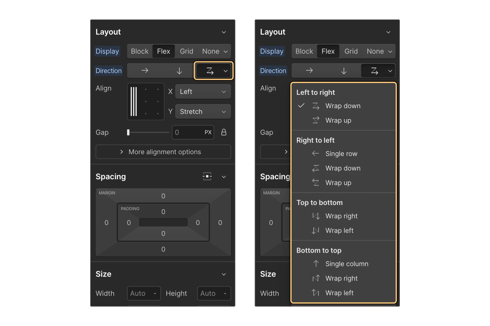
Within the Wrapping menu, you will encounter options that simultaneously control direction and wrapping settings. By default, flex children attempt to fit in a single line, potentially overflowing the parent container. To address this, you can enable wrapping for the children. Choose the flex parent, access the Style panel > Layout > Direction, and click the dropdown arrow to access the Wrap dropdown.
Here, you can select from various Wrap alternatives based on how you wish to organize your content:
- Left to right
- Right to left
- Top to bottom
- Bottom to top
Left to Right
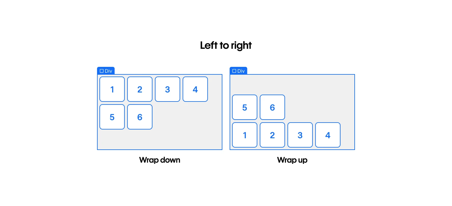
You can horizontally arrange your content from left to right with the following options:
- Wrap down — flex children that would exceed the parent’s width are directed to a new line below
- Wrap up — flex children that would surpass the parent’s width are sent to a new line above
Right to Left
You can horizontally arrange your content from right to left using the following options:
- Single row (no wrapping) — reverses the order of flex children without wrapping any exceeding elements to new lines
- Wrap down — reverses the order of flex children and wraps any content overflowing the parent to a new line below
- Wrap up — reverses the order of flex children and wraps any content exceeding the parent to a new line above
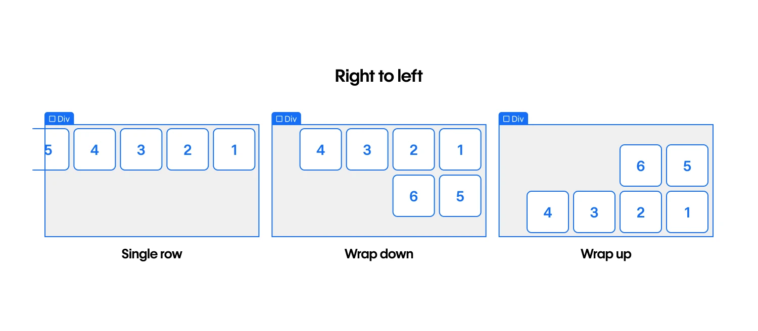
Top to Bottom
You can vertically arrange your content from top to bottom using the following options:
- Wrap right — content that exceeds the parent’s height wraps to a new column on the right
- Wrap left — content that exceeds the parent’s height wraps to a new column on the left
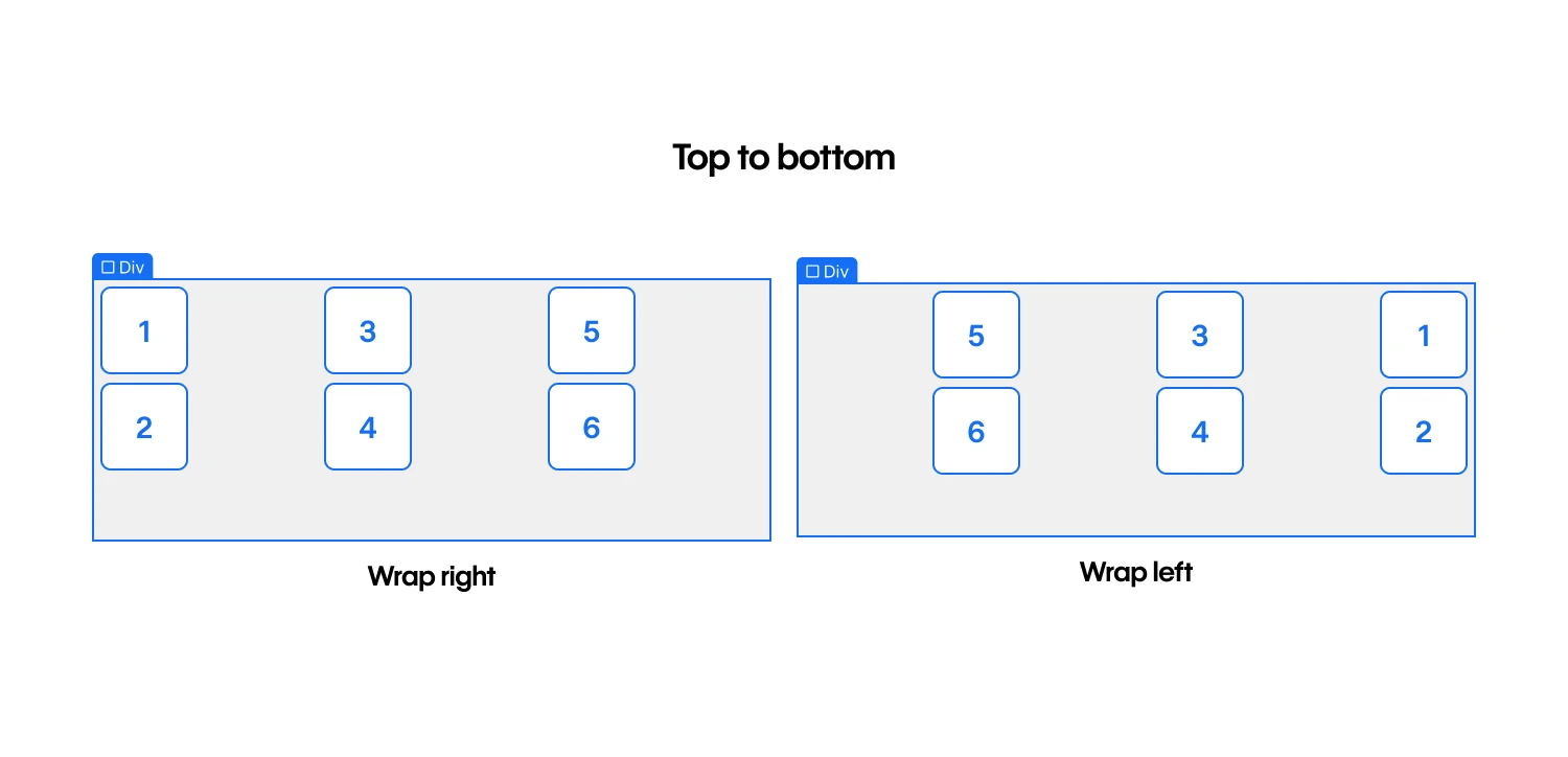
Bottom to Top
You can vertically arrange your content from bottom to top using the following options:
- Single column (no wrapping)— reverses the order of flex children without wrapping them to new columns
- Wrap right — reverses the order of flex children and wraps any content that exceeds the parent’s height to a new column on the right
- Wrap left — reverses the order of flex children and wraps any content that exceeds the parent’s height to a new column on the left
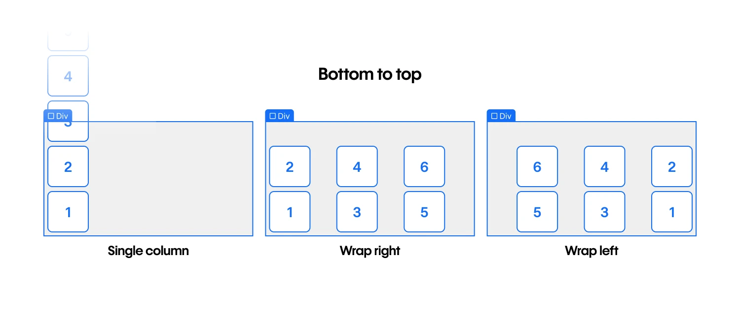
Aligning Flex Children
You can align multiple rows or columns of flex children in the Style panel > Layout > Alignment.
The alignment box (i.e.,The 3 x 3 grid) enables you to swiftly adjust flex offspring inside the flex progenitor. The X and Y axis drop-downs exhibit the value you designate within the align box. Discover more about the align box.
Take note that some alternatives cannot be accessed solely through the align box, but you can reach them using the X and Y axis drop-downs. The aligning choices available in each drop-down vary depending on whether the flex course is horizontal or vertical (i.e., whether you’re aligning rows or columns of flex offspring).
Horizontal orientation
When the flex course is defined as horizontal, the X axis drop-down furnishes the below alignment alternatives:
- Left — flex offspring are aligned to the left of the flex progenitor
- Center — flex offspring are centrally positioned inside the flex progenitor
- Right — flex offspring are aligned to the right of the flex progenitor
- Space between — flex offspring are uniformly spaced from the right and left edges
- Space around — flex offspring are evenly distributed amidst other rows and edges
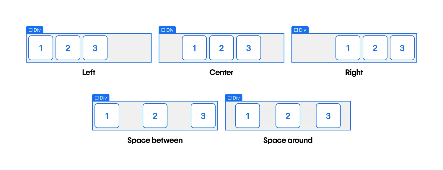
The Y axis drop-down offers these options for aligning horizontal rows of flex offspring:
- Top — flex offspring are aligned to the top of the flex progenitor
- Center — flex offspring are centrally positioned inside the flex progenitor
- Bottom — flex offspring are aligned to the bottom of the flex progenitor
- Stretch — flex offspring stretch to occupy empty vertical space
- Baseline — flex offspring are aligned to their baselines, or the invisible line where text rests on
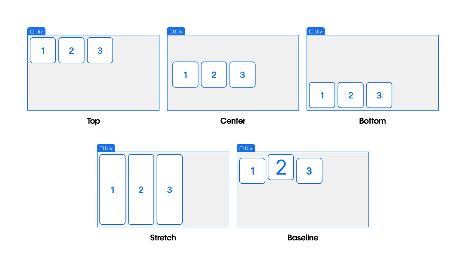
Vertical orientation
When the flex course is set as vertical, the X axis drop-down offers the following alignment alternatives:
- Left — flex offspring are aligned to the left of the flex progenitor
- Center — flex offspring are centrally positioned inside the flex progenitor
- Right — flex offspring are aligned to the right of the flex progenitor
- Stretch — flex offspring stretch to occupy empty horizontal space
- Baseline — flex offspring are aligned to their baselines, or the invisible line where text rests on
Pro tip: Vertical baseline alignment can enhance the legibility of vertical text elements, particularly in languages or layouts where vertical text orientation is common or favored.
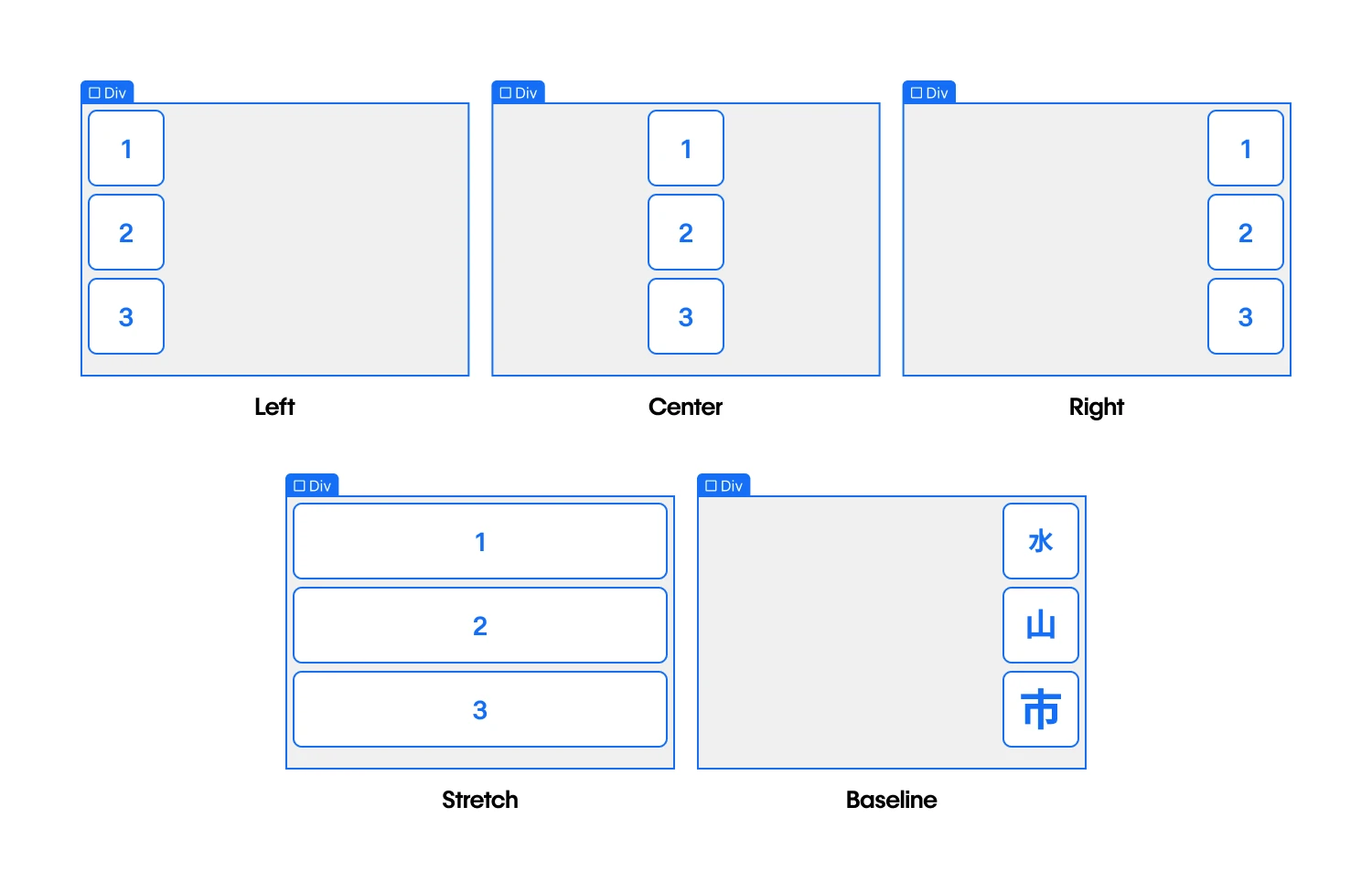
The Y axis drop-down provides these options for aligning vertical columns of flex offspring:
- Top — flex offspring are aligned to the top of the flex progenitor
- Center — flex offspring are centrally positioned inside the flex progenitor
- Bottom — flex offspring are aligned to the bottom of the flex progenitor
- Space between — flex offspring are uniformly spaced from the top and bottom edges
- Space around — flex offspring are evenly distributed amidst other rows and edges
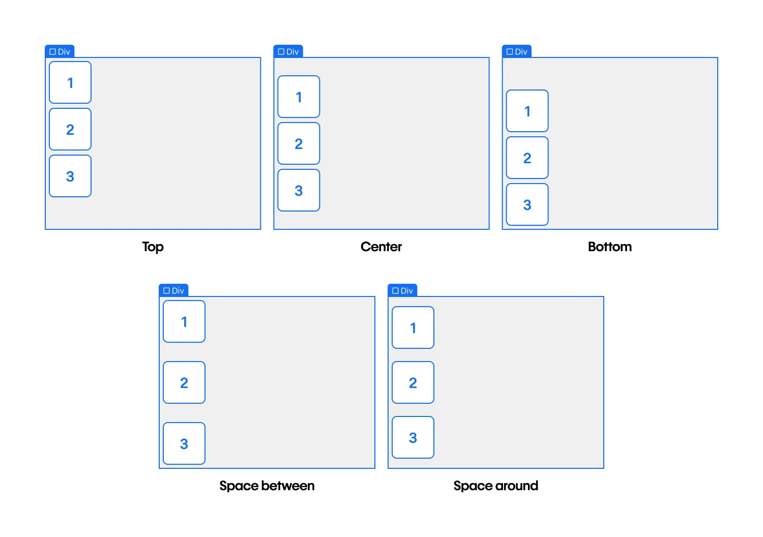
Add gaps between flex offspring
Gaps enable you to define the space between flex child elements without the necessity of adding margin or padding. To modify the gap size between columns and rows, choose the flex progenitor and navigate to Style panel > Layout > Gap.
By default, gaps between columns and rows are synchronized. This denotes that if you adjust the gap size for columns, the gap size for rows automatically aligns to the same value. You can click the “lock” icon to autonomously adjust the gap between columns and rows.
Pro tip: To swiftly increase or decrease gap sizes, drag the Gap slider or press and hold Option (on Mac) or Alt (on Windows) and slide your mouse to the left or right over the columns or rows field.
Flex offspring adjustments
The default arrangement of flex offspring is based on the flex layout settings specified on the flex progenitor. Nevertheless, you can supersede these settings for a flex offspring:
- Size
- Alignment
- Order
Modify the size of a flex offspring
You can fine-tune the sizing of a flex offspring by selecting the offspring, then navigating to Style panel > Flex offspring > Sizing. There are 4 options for sizing:
- Shrink the flex offspring if necessary (to avert overflow)
- Expand the flex offspring if feasible
- Do not shrink or expand the flex offspring
- Customize growth and shrinkage behavior
If all flex offspring are fixed to either Expand if feasible, Shrink if necessary, or Do not shrink or expand, any leftover space after their sizing will be distributed equitably to the offspring set to Expand if feasible.
Shrink if necessary
Shrink if necessary empowers you to size a flex offspring based on its width and height properties (or the content within the flex offspring, if width and height are unspecified). This renders the flex offspring rigid when extra space remains available but enables it to contract to its minimum size when space is deficient.
Expand if feasible
Expand if feasible allows flex offspring to expand if there is available space. This allows the flex offspring to absorb any excess space within the flex progenitor.
Do not shrink or expand
Do not shrink or expand lets you size the flex offspring according to its width/height properties, making it entirely inflexible. The flex offspring is barred from either expanding or shrinking, even in an overflow scenario.
Customize growth and shrinkage behavior
You can also opt to completely customize the growth and shrinkage behavior of an offspring element. This determines the extent to which the flex offspring shrinks or expands relative to other offspring within the flex progenitor.
The Grow value determines the extent to which the flex offspring can expand relative to other offspring when surplus space within the parent element is allocated. If the value is defined as 0, it will not expand beyond necessity.
The Shrink value determines how much a flex offspring can contract relative to other offspring when negative space is allocated. If the value is set to 0, it will not shrink, even in overflow scenarios.
TheBase value establishes the initial size of an element prior to the influence of flex-grow or flex-shrink. You have the option to assign this to a specific dimension (e.g., 20%, 250px, etc.) or to Auto. When set to Auto, the initial size of a flex child will be determined by its width or height — if specified — or by its content. If the base value is assigned a specific dimension, the content or width/height of an element will be disregarded, and the flex child will proportionally share the size with other flex children in the same flex container.
Modify the alignment of a flex child
You can alter the alignment of a flex child by selecting the child, then navigating to the Styling panel > Flex child > Alignment and Order. There are 6 alignment choices available:
- Automatic (the default setting)
- Top
- Center
- Bottom
- Stretch
- Baseline
Tip: You can also utilize automatic margin for aligning flex children.
Reorder a flex child
By default, flex children are displayed in the sequence of their occurrence in the source code (sequence can be viewed in the Navigator). Rearranging flex children becomes useful when adjusting design elements for various screen resolutions.
To modify the default order of a flex child, select the child and proceed to the Styling panel > Flex child > Order. There are 6 ordering options available:
- Maintain current order — retains the flex child in its original position
- First — moves the flex child to the front within the flex container
- Last — moves the flex child to the back within the flex container
- Customize order — enables customized arrangement of multiple flex children by specifying specific order values
You can assign a unique numerical value for custom ordering which dictates the placement of the flex child within the flex container. Flex children sharing the same custom order value will be arranged based on their original placement.
When utilizing custom ordering, avoid utilizing First or Last to designate the first or last child elements. First will assign an order of -1 to the flex child, while Last will assign an order of 1. If using custom ordering, any value greater than 1 will position the flex child after any flex child with an order of Last. Any value less than -1 will position the flex child before any element set to First.
Tip: When altering the order of flex children, remember that their document order remains unaltered. This indicates that the visual sequence and DOM structure of elements may not align, potentially causing confusion for website visitors.
- Include or eliminate Workspace spots and members - April 15, 2024
- Centering box summary - April 15, 2024
- Store a site for future reference - April 15, 2024
