When the guests who navigate your site reach the bottom of the page, encourage interaction with a footer that showcases a second navigation leading to your projects and offers easy access to your social media profiles. Save time on design in the future by converting the footer into a Symbol for repetitive use in your project.
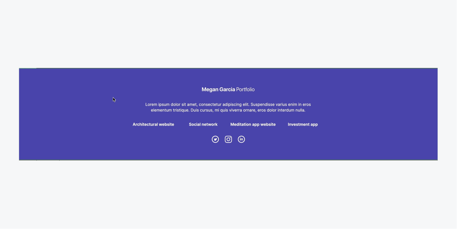
In this tutorial, you will discover how to include a reusable footer for navigation at the end of each page by following these steps:
- Create the structure of the footer
- Style the footer
- Transform the footer into a Symbol
Join in and obtain the resources needed for this tutorial.
Create the footer structure
In our homepage layout, we feature our navigation and 3 Zones, each containing our main image, our client projects, and our contact form.
Let’s introduce a fourth Zone to store our footer:
- Access the Add panel
- Insert a Zone into the Navigator and position it below the existing 3 Zones
We can apply the “Zone” class to our new Zone to maintain the 60 pixels of padding at the top and bottom that we previously styled:
- Open the Style panel
- Click into the Selector field
- Select “Zone” from Existing classes
Include a Container within the new Zone to organize our elements neatly:
- Access the Add panel
- Drop a Container into the new Zone
- Pick the Container and click into the Selector field
- Choose “Container” from Existing classes
Remember: When assigning a class to an element, all styling modifications performed on this element are saved in that class. You can reuse the class on new elements to automatically apply the saved styles from the class you established.
Style the footer
Deliberate visual repetition is a commendable design approach, so let’s incorporate a logo into our footer to echo the logo integrated into our navigation at the page’s top:
- Access the Assets panel
- Drop your logo (e.g., “Logo.svg”) into the Container in your latest Zone
Introduce a Div block to contain your footer content:
- Access the Add panel
- Insert a Div block inside the Container
- Select the Div block and click into the Selector field
- Assign it a class (e.g., “Footer holder”)
- Drag the logo into the “Footer holder” Div block and resize it (e.g., 187 by 27 pixels)

Align the content of the “Footer holder” Div block in the center:
- Select the “Footer holder” Div block and access Style panel > Layout
- Indicate Display as Flex
- Set Direction to vertical and Align to center
Let’s include a Paragraph in the footer and provide some spacing between it and the logo:
- Access the Add panel and insert a Paragraph into the Container beneath the logo
- Select the logo and access Style panel > Spacing
- Add 30 pixels of bottom margin
To prevent the Paragraph from spanning the full width of the Container, let’s set a maximum width restriction:
- Select the Paragraph
- Access Style panel > Size
- Specify the Max W (maximum width) as 600 pixels
- Remove any redundant text from the Paragraph

We will insert lower navigation links into the footer by initially placing a Collection list:
- Access the Add panel and drop a Collection list inside the “Footer holder” Div block below the Paragraph
- Choose “Projects” from the Source dropdown in theSettings for the list of collections popup to connect your Grouping
In order to finalize the lower navigation, we should include a Connection section to a Assembly element:
- Initiate the Incorporate panel and pull a Connection section into any Assembly element
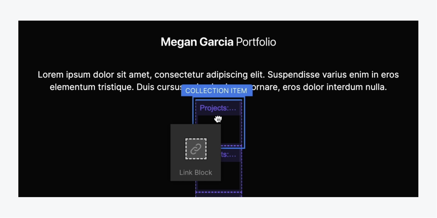
Reminder: A Connection section is similar to a Division element, except it functions as a clickable hyperlink. Explore more about Connection sections.
Let’s introduce a Documentation section within the freshly incorporated Connection section to provide our users with something to interact within our lower navigation:
- Initiate the Incorporate panel and pull a Documentation section inside the Connection section
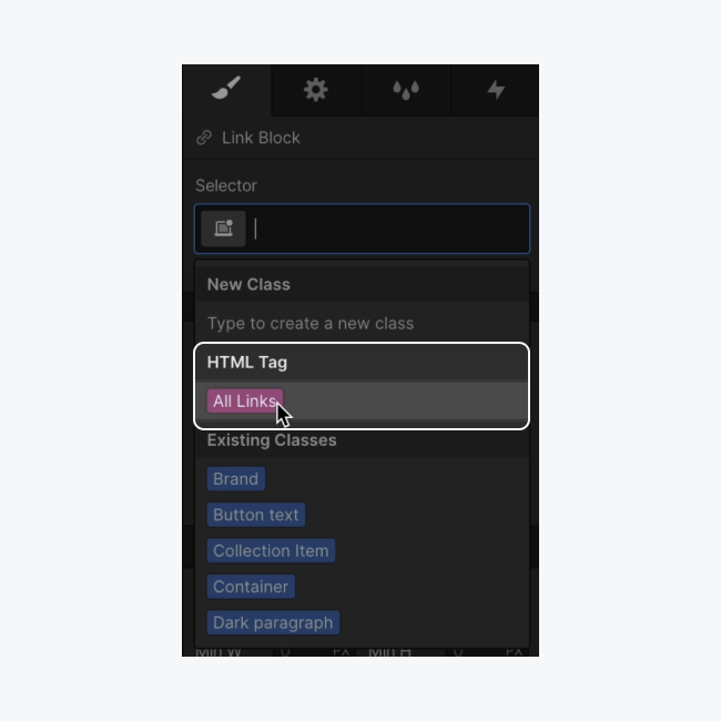
To eliminate the preset hyperlink design, let’s modify the appearance of all our hyperlinks:
- Pick the Connection section
- Launch the Design panel and navigate to the Identifier field
- Select All hyperlinks from HTML tags
Toggle off the preset underline and opt for a distinct hyperlink color:
- Access Design panel > Typography
- Define decoration as “None”
- Click on the palette and set a new shade (e.g., “ivory”)
Let’s associate our Documentation section with our Grouping information to enable the automatic extraction of each project’s titles:
- Choose the Documentation section inside the Connection selection
- Tap on the label’s cog icon to reveal the Documentation section’s configurations
- Tick off “Retrieve text from Projects”
- Unfold the “Pick field” dropdown and designate the field to integrate with the Documentation section (e.g., “Project designation”)
We will utilize Lattice to showcase the project designations in a structured layout:
- Select the Grouping list
- Access Design panel > Arrangement
- Assign Display as Lattice
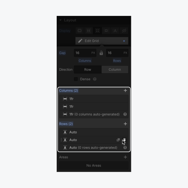
By default, our project designations are showcased in a 2 by 2 format. Let’s distribute our project designations across a single row:
- Select the Lattice and press Modify lattice below Arrangement in the Design panel
- Hit the “delete” symbol next to one row for its removal
- Click the columns “plus” symbol twice to append 2 extra columns
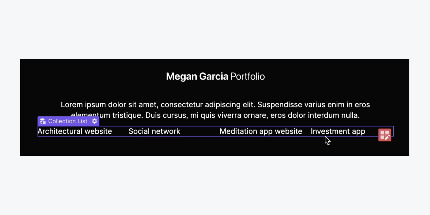
Lets formulate evenly distributed space among the elements within our Lattice:
- Select the Lattice
- Access the Design panel > Arrangement
- Define Align as “Justify elements: center”
Craft a gap between the Statement and the Lattice:
- Pick the Statement
- Define the lower spacing to 30 pixels
Let’s establish an amalgamation category for our footer Segment:
- Select the Segment enclosing the footer
- Launch the Design panel and navigate to the Identifier field
- Post the existing “Segment” category, type in a fresh amalgamation category (e.g., “Footer”)
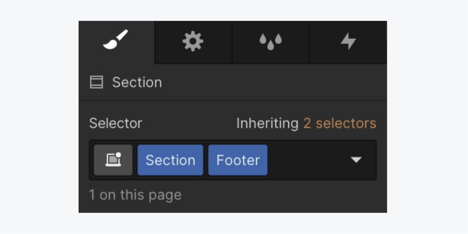
Valuable information: An amalgamation category is a distinct category constructed based on another category. This independent group enables the application of style alterations to the primary category to formulate a unique variant. Delve into more details about amalgamation categories.
Lets modify the “Footer Segment” Backdrop shade:
- Access Design panel > Backgrounds
- Click on the palette and set the shade to the principal brand hue
Let’s include 3 societal networking buttons situated within a wrapper:
- Initiate the Incorporate panel
- Drag a Division element into the “Footer holder” Division element under the Grouping list wrapper
- Access the Design panel and navigate to the Identifier field
- Title the Division element with a category (e.g., “Social wrapper”)
We should introduce Connection sections inside the “Social wrapper” Division element to generate clickable connections:
- Initiate the Incorporate panel and drag a Connection section into the “Social wrapper”
- Launch the Resources panel and insert a societal media Picture into the Connection section (e.g., “Twitter”)
- Select the Connection section, tap into the Identifier field and append a category (e.g., “Social link”)
- Copy and paste the “Social link” twice more for a total of 3 societal media connections
Let’s enhance the 2 supplementary societal link Pictures:
- Click twice on the second social hyperlink Picture and opt for “Substitute picture”
- Pick your fresh social Picture from the Library panel (e.g., “Instagram”)
- Iterate the preceding 2 actions to exchange the third Picture (e.g., “LinkedIn”)
Equally distribute the social hyperlinks and provide them with some space to breathe:
- Choose a “Social hyperlink”
- Unfold the Design panel > Spacing
- Incorporate a left and right margin of 10 pixels
- Pick the “Social wrapper”
- Unfold the Design panel > Spacing
- Incorporate a top margin of 30 pixels
Remark: You can promptly append margin or padding to opposite sides of an element by pressing Option (on Mac) or Alt (on Windows), and dragging one of the margin or padding controls.
Incorporate URLs to each “Social hyperlink:”
- Choose a “Social hyperlink” and tap the cog symbol of the label to open the link settings
- Enter your social channel’s external URL in the URL field
- Redo the previous 2 actions for the 2 remaining “Social hyperlinks”
To make our project links more prominent from the rest of the footer text, let’s modify the weight of the text:
- Choose the Collection list
- Unfold the Design panel > Typography
- Adjust the font weight to a higher figure (e.g., “600 – Semi bold”)
Transform the footer into a Symbol
Let’s convert the footer into a Symbol to facilitate its reuse across our project:
- Choose the Segment that encompasses our footer items
- Right-click the label of the Segment and choose “Establish a Symbol” from the menu
- Assign a name to your Symbol (e.g., “Footer”)
Remark: To promptly generate a Symbol with shortcut keys, select the element you wish to convert into a Symbol, and hit Command + Shift + A (on Mac) or Control + Shift + A (on Windows).

An impressive way to conclude your page with flair and engage your visitors!
- Include or eliminate Workspace spots and members - April 15, 2024
- Centering box summary - April 15, 2024
- Store a site for future reference - April 15, 2024
