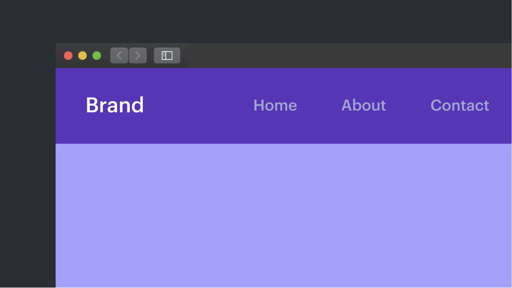
Covered in this instructional session:
- Include a menu
- Customize a menu
- Comprehend the dropdown button in a menu
- Utilize a menu on multiple pages
- Affix the menu to the top of a page
- Incorporate a dropdown into the menu
Include a menu
To insert a menu:
- Launch the Insert panel > Elements
- Drag a Menu from the Advanced category onto the Webflow canvas
You have the flexibility to position the menu wherever you wish on your website — there is no definitive right or wrong way to do this. Since the menu is self-contained, you can relocate it as needed.
Your menu functions as a container that centrally aligns a collection of elements on the page.
- Brand: The brand placeholder is a link block situated on the left of the menu. Here, you can insert a logo, text, or any other brand symbol.
- Navigation menu: The navigation menu is positioned on the right side of the menu. It serves as a parent element encompassing all the navigation links.
- Navigation links: These are text links with predefined padding and other styles. Typically, they are linked to various pages or sections of your website.
- Dropdown button: Initially hidden in desktop view, the dropdown button becomes visible at the tablet breakpoint and below. It grants access to the navigation menu (and the navigation links) when horizontal space is limited, such as on a mobile device. Discover more about the menu dropdown button.
Configuring the brand logo
Let’s incorporate a logo in our menu.
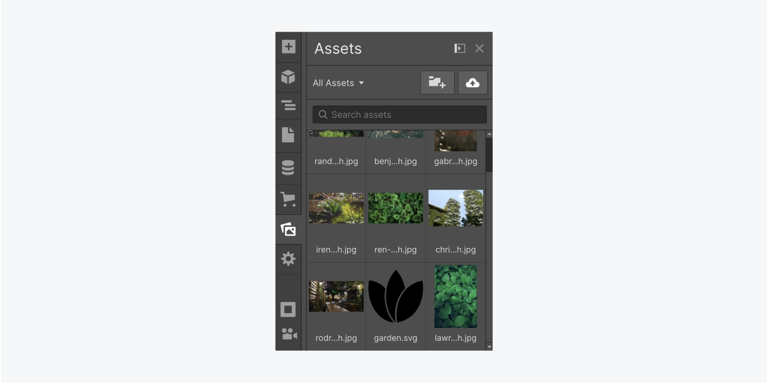
Navigate to the Assets panel in the left sidebar of the Designer area where you can upload and manage assets. Click the “cloud” icon in the top right corner and select the file(s) to upload. You can then drag your logo image into the Brand link.
Linking the brand logo to the homepage
It’s conventional for a brand image or logo to link back to the homepage. To achieve this:
- Choose the Brand link
- Access the Element settings panel > Link settings
- Opt for Page as the link type
- Expand the Page dropdown and select “Home”
Additionally, you should assign a role and aria-label to the logo link to explain the link’s purpose to website visitors who navigate using a screen reader or other assistive technologies:
- Select the Brand link
- Access the Element settings panel > Custom attributes
- Click the “plus” icon
- Input “role” in the Name field and “navigation” in the Value field
- Click the “plus” icon
- Enter “aria-label” in the Name field and a descriptive value for the logo link’s purpose (e.g., “Back to homepage,” “Back to main,” etc.) in the Value field
Discover more about creating custom attributes.
Incorporating navigation links
The secondary element of the menu is the navigation menu. This element houses our navigation links. By default, the menu contains 3 navigation link placeholders that are modifiable, removable, or addable.
To introduce additional navigation links:
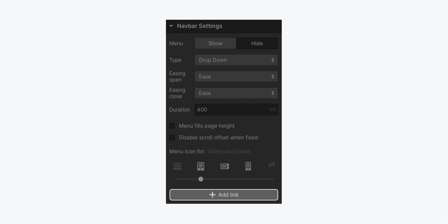
- Select any element within the Menu
- Access the Element settings panel > Menu settings
- Click Add link
Another method to insert navigation links is to duplicate and paste a navigation link that already has a class assigned to it. This is a fantastic time-saving approach when styling multiple navigation links. Follow these steps:
- Clear all but one navigation link
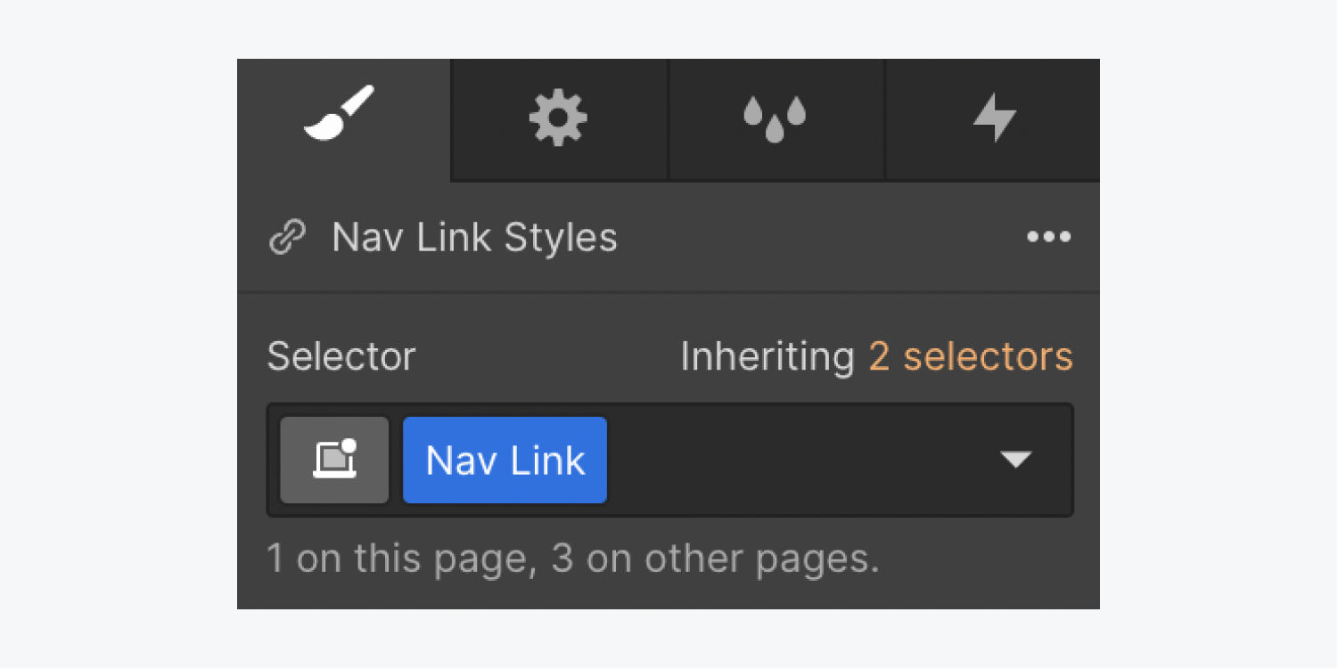
- Access the Style panel > Selector field and attach a class to the navigation link
- Duplicate and paste the navigation link as needed
Upon duplicating this navigation link, the class is automatically applied to each new instance pasted. You can modify the text inside the navigation link by double-clicking it.
Linking navigation links
To attach each navigation link to a distinct destination:
- Choose the navigation link
- Access the Element settings panel > Link settings
- Pick a link type
Important: The File link type is only accessible on select premium Workspace or Site plans.
Design a top navigation bar
The top navigation bar component provides ample flexibility for customization.
Within this segment, we’ll emphasize three key aspects that empower us in managing its appearance:
- Dimensions of the navigation bar and menu
- Customizing navigation links
- States of navigation links
Dimensions of the navigation bar and menu
The navigation bar lacks predefined measurements for width or height. These parameters can be altered within the Styling panel.
Navigation bar width
Placing the navigation bar within body, section, or another element extends its width to match the encompassing element. To restrict the horizontal space occupied by the navigation bar, set a width directly or adjust the width of the parent element while centering the navigation bar using auto margin. Introducing margin to the navigation bar (coupled with a max width or auto width) alters its positioning in relation to neighboring elements.
Navigation bar height
The height of the navigation bar corresponds to its contents — either the brand logo’s height or the navigation links’ height. Modifications to the navigation bar’s height can be made by:
- Assigning a height value to the navigation bar
- Incorporating top and bottom padding to the navigation bar itself
- Incorporating top and bottom padding to the elements within the navigation bar
Adjusting padding on navigation links by modifying the top and bottom padding properties. The sizing of links and the navigation bar adapts accordingly. Introducing margin achieves a similar effect.
Alternatively, modify the navigation bar’s padding for consistent adjustments. Augmenting padding increases the height by inserting additional space between the navigation bar and the container housing its elements.
Handy tip: For simultaneous adjustments to margin or padding on corresponding sides of an element, utilize Option + Drag (Mac) or Alt + Drag (Windows). Learn more about margin and padding.
Menu height in navigation bar
Similar modifications can be applied to the dropdown menu that emerges upon selecting the navigation menu on smaller breakpoints. Access the dropdown menu by opting for the navigation bar in tablet view and selecting Menu > Show within the Element settings panel.
Adjusting the height of navigation links on touch-enabled devices ensures adequate tap target size for fingertip interactions. Explore further on the navigation bar’s menu button.
Customizing navigation links
Utilizing classes simplifies the customization process. Classes save styling details applicable to numerous elements site-wide. Upon commencing styling, a class is automatically generated and applied to the selected element, preserving all style adjustments. Alternatively, create a class manually beforehand — without applying styles — by typing a class name into the Selector field within the Style panel.
Access the Selector field through three methods:
- Select the Selector field within the Style panel
- Press Command + Return (Mac) or Control + Enter (Windows)
- Right-click the element and opt for Add class in the context menu
Applying the same class to all navigation links ensures consistent style modifications across the entire navigation bar.
States of navigation links
Differentiate interaction states of navigation links through visual cues, such as altering appearances in various states like default and hover states. To access the States menu, select a navigation link, navigate to the Style panel > Selector field, and click the dropdown menu (available if a class is already assigned to the navigation link). Learn more about states.
A simple method to indicate a hover state on a navigation link is by changing the color on hover, either the background or text color. Follow these steps to add a background color to a navigation link in the Hover state:
- Access the Style panel > Selector field
- Assign a class to the navigation link if not already applied
- Open the Selector field dropdown
- Select Hover
- Navigate to Style panel > Backgrounds and set the background color by clicking the color swatch
The defined background color will be visible when a user hovers over the navigation link.
Implement the same class across all navigation links to synchronize changes for all links within the navigation bar.
Unraveling the functionality of the menu button within the navigation bar
The menu button resides within the navigation bar, organizing navigation links when space is limited, typically on mobile devices, also known as a hamburger menu. This element and its functionality are integral components of the navigation bar, configurable in various ways.
By default, the navigation menu button appears on tablet breakpoints and below. During preview mode, observe the menu within the navigation bar upon switching to these devices. Clicking the menu button enables expansion of the navigation menu. Clicking theThe menu toggle once again collapses the navigation menu.
Within the desktop breakpoint, you’ll observe that the navigation links are nested inside the navigation menu element. This specific navigation menu element functions the same way, displaying navigation links in a vertical format when the menu toggle is activated on smaller breakpoints.
Initiate the menu within the Designer
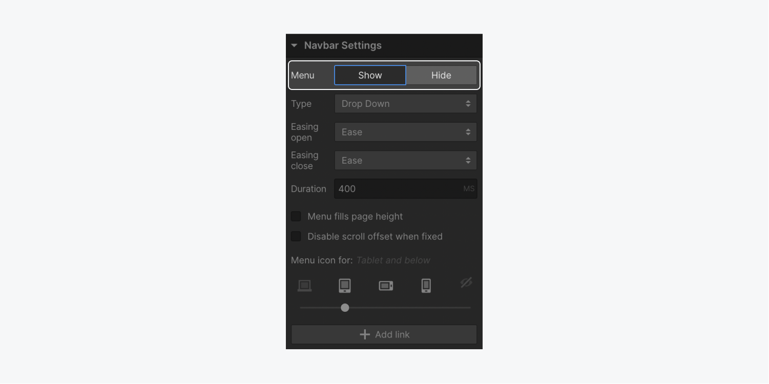
To reveal the navigation menu within the Designer, follow these steps:
- Choose the Navbar or any element contained within it
- Access Element settings panel > Navbar settings
- Select Menu > Show
The Designer will automatically switch to the tablet breakpoint to unveil the navigation menu.
Modify button visibility for distinct breakpoints
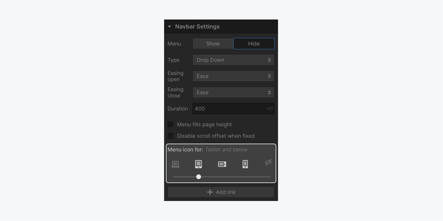
Initially, the navbar menu button is visible within the tablet breakpoint, but you can alter this behavior to make the button visible on all breakpoints or none at all:
- Click on the Navbar or any contained element
- Access Element settings panel > Navbar settings
- Utilize the device options slider to determine when the menu button is initially displayed
Reutilize a navbar across multiple pages
Transforming a navbar into a component is advantageous as it allows you to use the same navbar design across various pages. By converting the navbar into a component, you can efficiently reuse and modify all instances of the navbar.
To create your navbar component:
- Select the Navbar on the canvas
- Right-click on the Navbar and select Create component
- Assign a name to the component and click “Create”
Once the component is established, you will be directed to the editing mode for the primary component. Any alterations made to the main component will automatically reflect across all instances of that component. To customize the main component, double-click on any component instance. Find more information about components.
Reusing the navbar design
Given that our navbar now exists as a component, it becomes feasible to reuse the navbar design on any section of our site.
Initially, access the Components panel, then drag and drop the navbar component onto any page within your site. Similar to other elements, you can position the component directly on the canvas or within the Navigator for precise placement.
Upon selecting an instance of a component, the component will be highlighted and displayed in green. Navigate to the Components panel to track the total count of times the navbar component has been utilized within your website.
Affixing the navbar to the top of a page
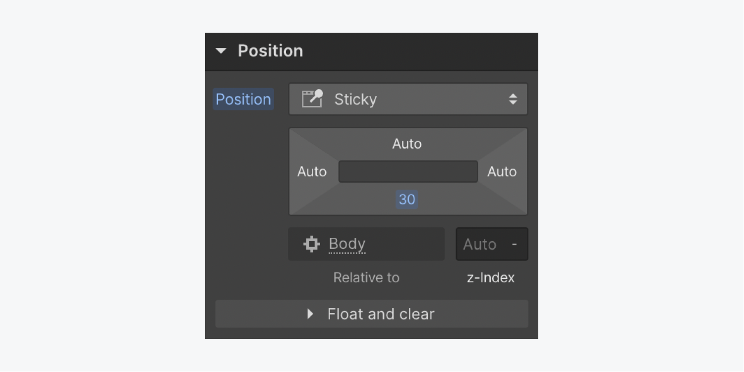
The first step is to confirm that the navbar is a direct child of the body element. This approach ensures that the navbar stays fixed at the top while scrolling. Sticky positioning enables the navbar to remain fixed at the top as other content scrolls, and when you scroll back to the top, the navbar reverts to its original position at the top of the page.
To implement sticky positioning for the navbar:
- Choose the Navbar
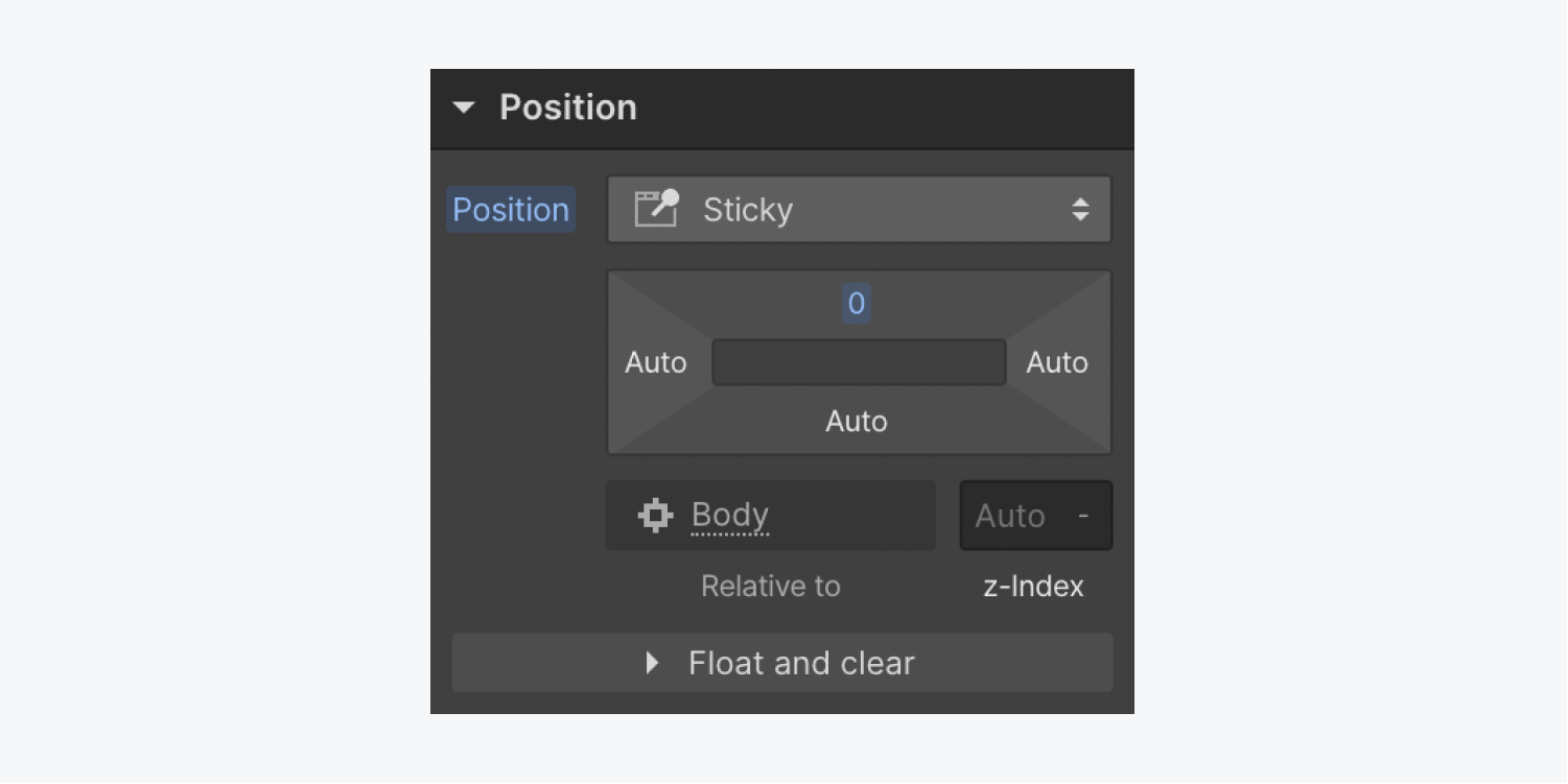
- Access Style panel > Position
- Opt for sticky from the position dropdown
- Specify a top value of 0 pixels to maintain the fixed positioning of the navbar at the top during scrolling
- Incorporate a higher z-index value (e.g., 2147483647, commonly recognized as the highest z-index value supported by most browsers)
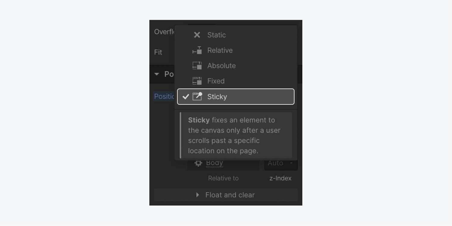
Note: Ensure at least one side of the sticky element has a specified value to ensure proper functionality of the sticky positioning.
Differentiate between position fixed and sticky
Position fixed removes the element from the document flow, causing the navbar to hover above the entire page. This behavior is undesirable when the navbar remains in its original position since it may overlap other elements. The aim is for the navbar to remain fixed and above other elements only during scrolling.
Conversely, position sticky retains the element within the document flow unless the element’s initial position scrolls out of view. Consequently, the navbar remains in place without intersecting adjacent elements, transitioning to a fixed position as you scroll past it.
Resolve issues related to position sticky
Occasionally, position sticky may fail to function even after configuring it to sticky and specifying a distance value for one side of the element. Various reasons might account for this issue:
- Position sticky may not function properly if the overflow property is set to hidden, scroll,
- Either automatic or manual on any of the ancestors of the element
- If any ancestor element has a specified height, the sticky positioning may not function properly
- Position: sticky is still unsupported by many browsers — check which browsers support position:sticky
If the distance value for the position is set on a side unaffected by scrolling, sticky positioning might not work as expected. For instance, setting the distance on the left or right while vertically scrolling through the page will prevent the element from sticking.
Similarly, setting a distance to the bottom instead of the top might hinder the sticky functionality, especially if the element is aligned to the top of the parent container as the first element or aligned using flex or grid properties.
Include a dropdown in the navigation bar
A dropdown menu is a predesigned navigation feature that can be integrated into almost any section of a website. Typically, a dropdown component is found within the navigation bar of a website.
In Add panel > Advanced, you can position the dropdown feature in your site as needed.
Dropdown configuration
The dropdown list remains hidden until the dropdown is activated by a click. To display the list, navigate to the Element settings panel and select Menu > Show. For additional details on the dropdown feature, refer to the source.
By default, the dropdown list unveils when the toggle is clicked, but you can modify this behavior to reveal the list when the user hovers over the toggle by activating the Open menu on hover option. Furthermore, adjust the close delay period (the time it takes for the list to retract after the hover) in milliseconds.
That concludes the setup of a navigation bar featuring a dropdown menu. Great job!
- Include or eliminate Workspace spots and members - April 15, 2024
- Centering box summary - April 15, 2024
- Store a site for future reference - April 15, 2024
