The shopping cart module enables you to include a cart feature in your project. You have the option to modify the appearance and style of the cart button, which not only allows online customers to access their cart but also provides them with a quick summary of the number of products in their cart along with the total amount.
You also have the ability to personalize and design the cart itself. This is where online shoppers can manage the contents of their cart and proceed with their purchases when they are ready.
Topics covered in this guide
- Introduction to the cart module
- Understanding the cart button
- Exploring the shopping cart
Introduction to the cart module
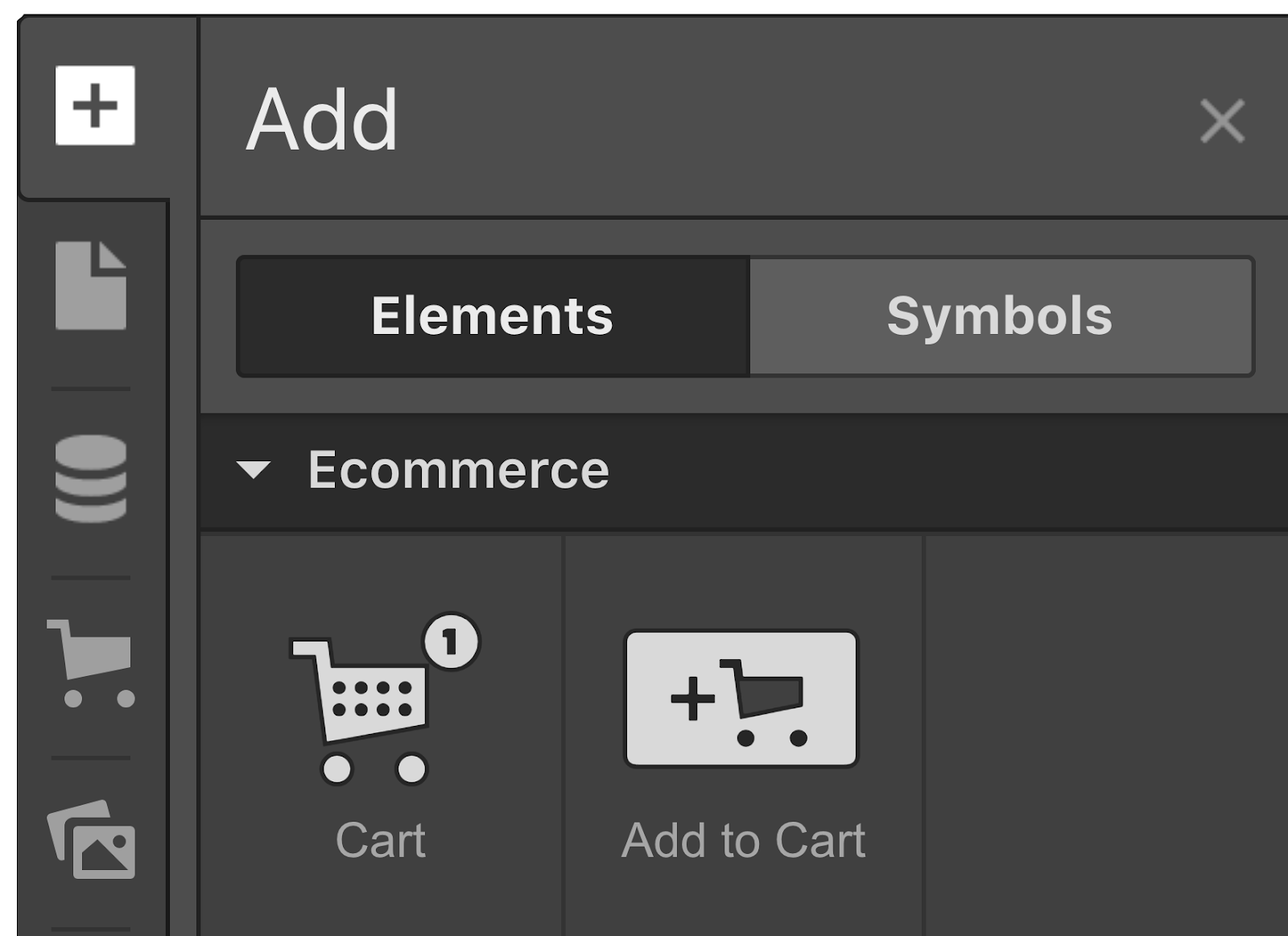
You can incorporate a cart module either via the add panel or by utilizing Quick find (CMD/CTRL+E).
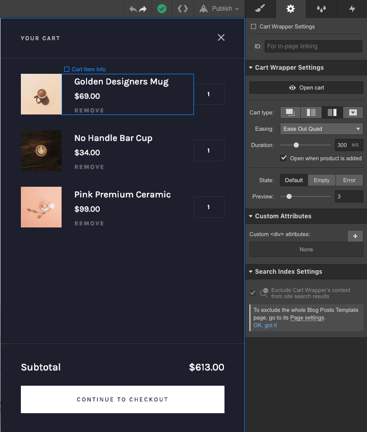
wrapper Form. The container for the form holds the list of items in the shopping cart, the individual cart items, and the actions for completing the purchase. You have the flexibility to personalize and design these containers and their corresponding elements. Additionally, the shopping cart features messages for when it is empty or encounters an error, which are also customizable.
Important information: Certain items cannot be deleted from the shopping cart to maintain its functionality.
Items in the Cart
This section displays a list that is linked to the products collection and showcases the items that have been added to the shopping cart. With some exceptions, you can modify the layout and appearance of these cart item listings.
Individual Cart Items
This section exhibits the total amount for the items in the cart. You can replicate this container and customize it to display the total number of items as well.
Useful tip: Any hyperlink within the cart item section can be linked to the total amount or quantity through the settings available in the Element panel.
Purchase Actions
The Purchase Actions container enables users to finalize their orders. By default, it includes the Checkout button and the Web payments button, both of which you can tailor in the Element settings panel. You also have the option to incorporate a PayPal button from the Add panel.
Note: In case your store exclusively uses PayPal, the Checkout button within the shopping cart will be automatically hidden on the live site, as the PayPal checkout involves a distinct page.
Find out more about Web Payments and PayPal checkout.
Settings for the Shopping Cart Wrapper
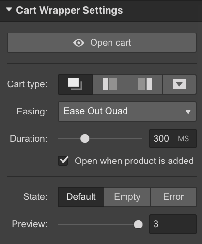
To modify and personalize the shopping cart, select the cart on the design canvas, then access the cart from the Cart wrapper settings in the Element settings panel (D). Here, you can select the type of cart, the transition and duration of the opening and closing animations, and the number of items displayed in the cart preview. You can also specify if you want to automatically open the cart when a new product is added to it. Additionally, you can style the different states of the cart separately.
Access the Shopping Cart
Open or close the shopping cart to view and make changes to the cart wrapper.
Kind of Cart
Select from the available types of shopping carts:
- Modal (default) — to display the cart as a popup in the center of the page
- Sidebar-left — to show the cart in a left sidebar
- Sidebar-right — to show the cart in a right sidebar
- Dropdown — to open the cart as a dropdown directly beneath the cart button. With this cart style, you can also specify the alignment of the cart to the left or right of the cart button. You can determine whether the cart triggers to the left or right when clicked or hovered.
Transition style
Choose the transition style, the way in which animations are executed when the shopping cart opens and closes. The default transition is “Ease out quad.”
Duration of Animation
Set the duration of the animation in milliseconds (ms). The default duration is “300ms.”
Auto-Open upon Product Addition
Mark this checkbox if you prefer the shopping cart to automatically open each time a new product is added to the cart.
Status
Switch between the various states of the shopping cart to customize and adjust each of them.
- Default — to view and style the shopping cart when it contains items. You’ll see sample items in the Designer, simplifying the styling of the default shopping cart state.
- Empty — to view and personalize the appearance of the shopping cart when it’s devoid of items.
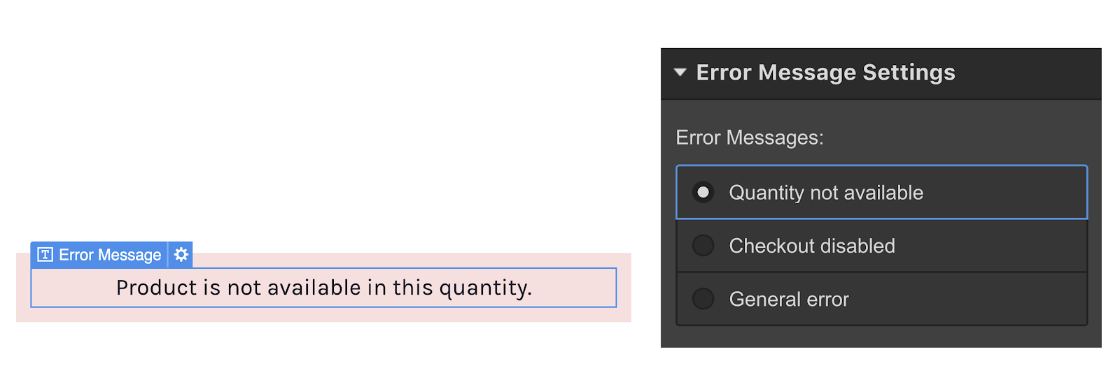
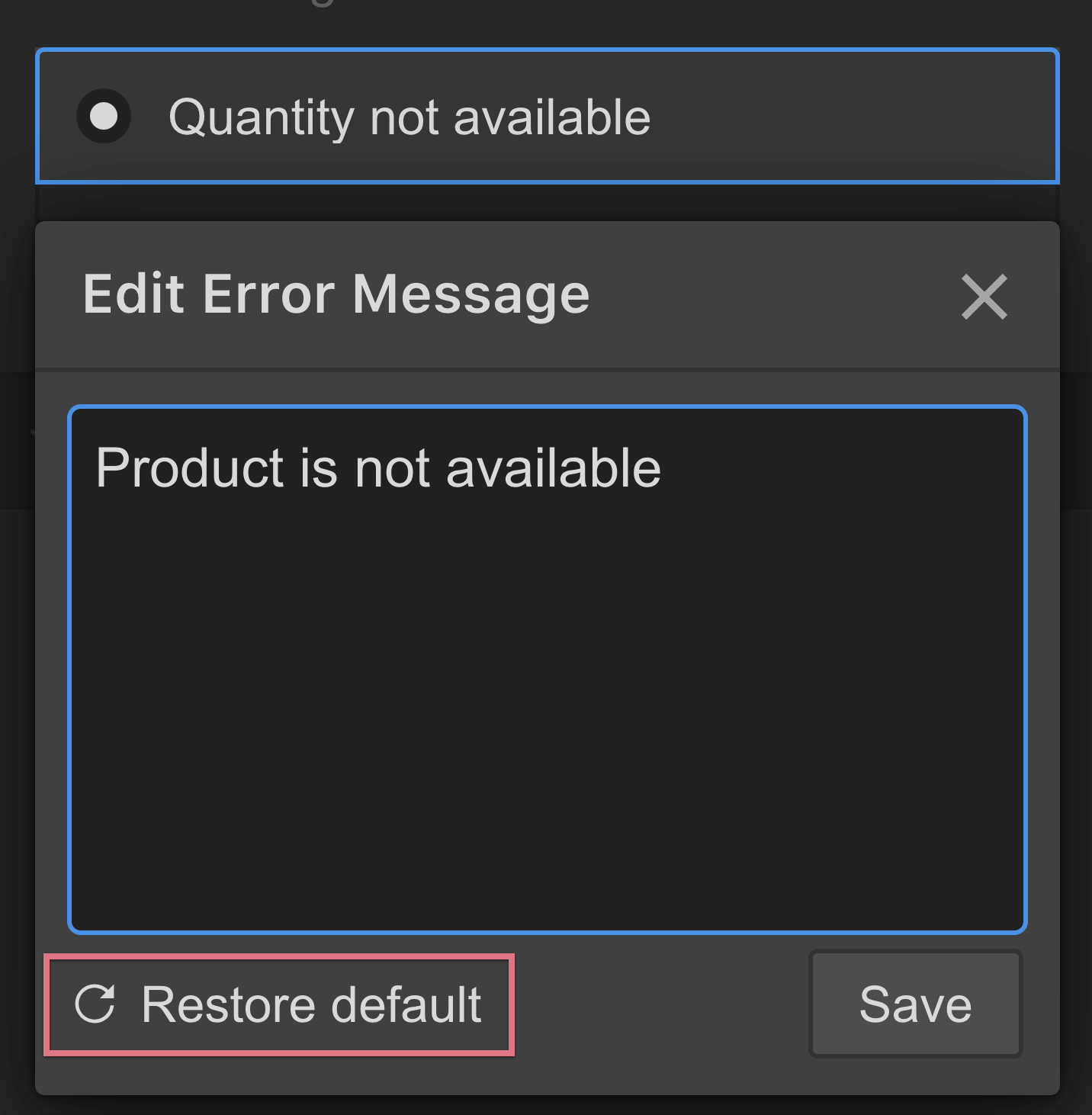
- Error — to view and personalize error messages that might appear during checkout failures. Choose the Error message block to access its settings. Click on the pencil icon that appears next to the message in the setting to edit it.
You can revert to the default error messages from the error message editor.
Preview Selection
Determine the number of items visible in the shopping cart. Options include displaying a single item or up to 15 items. The default setting is “3” items.
