The visual effect of parallax gives an impression of depth and dimension. By moving elements on screen at varying speeds, this effect is achieved. Implementing animations with a parallax effect serves multiple purposes, enhancing user engagement by showcasing mechanisms or emphasizing the structure of a product. It can also create an engaging visual experience that encourages visitors to explore your site further. Webflow’s latest Interactions 2.0 simplifies the integration of such animations on your website without requiring any coding.
Here, we will cover:
- Establishing the initial setup
- Defining the animation
- Setting up the scroll animation
- Previewing the animation
- Incorporating additional animations
- Disabling the animation on specific devices
Pro tip — Depth Illusion
To create a realistic 3D environment, adhere to principles of depth perception. Factors like element size, position, shadow distances, and even blur effects contribute to simulating depth and field.
Initiating the Setup
Step 1. Insert a Section
Begin by adding a Section element to the canvas from the Elements panel on the left. Position it below the visible area and above other sections.
Step 2. Adjust the Section
Select the section and add top and bottom padding in the Style panel. Also, set the overflow to hidden to contain the content within the section boundaries.
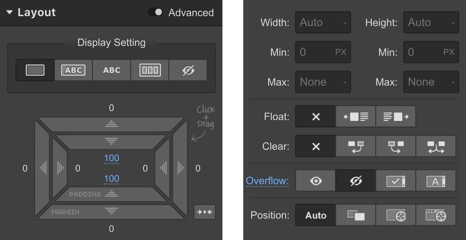
Step 3. Insert a Container
Drag a Container element from the Elements panel into the section. Set its height to 1200px and make its position relative. This setup allows precise positioning of images within the container.
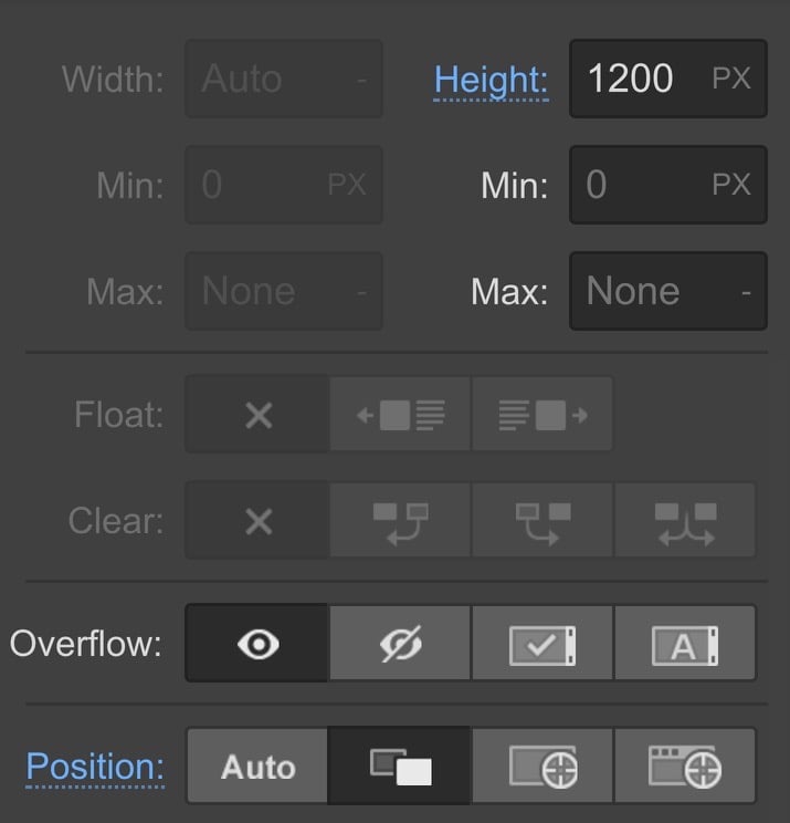
Step 4. Import the Images
Select images from the Assets panel and place them into the section. Adjust image dimensions to create a sense of 3D space effectively.
Additional info
You can modify the image width in the image settings modal. Access it by double-clicking the image or clicking the cog icon next to the image label. Alternatively, use the Element Settings panel on the right design side by selecting the image and pressing D on your keyboard.
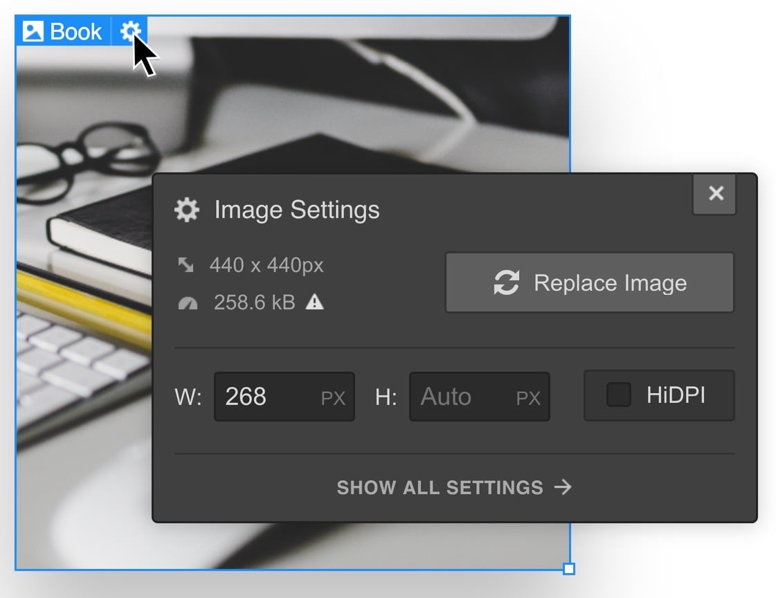
Adjusting image dimensions in the image settings cascades changes across various device breakpoints. For unique sizes on specific devices, adjust the width via the Style Panel.
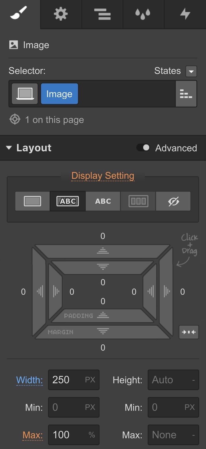
Step 5. Enhance Image Styling
Apply a drop shadow to each image. Ensure consistent shadow angle across all images. Adjust the color, opacity, distance, blur, and size/spread of the shadow to create visual depth.
Step 6. Position the Images
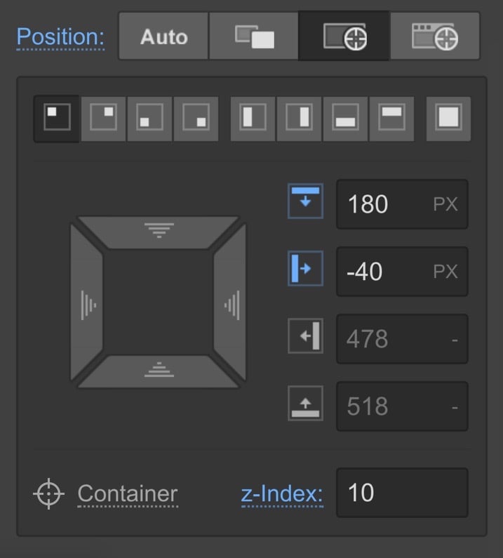
Set the position of each image to absolute. Adjust image positioning by manipulating position values through the UI or manual input. Define a z-index to control layering – images with higher z-index appear closer and overlap backgrounds.
Animation Definition
Understanding the animation is crucial for identifying the event and response required to achieve the desired outcome.
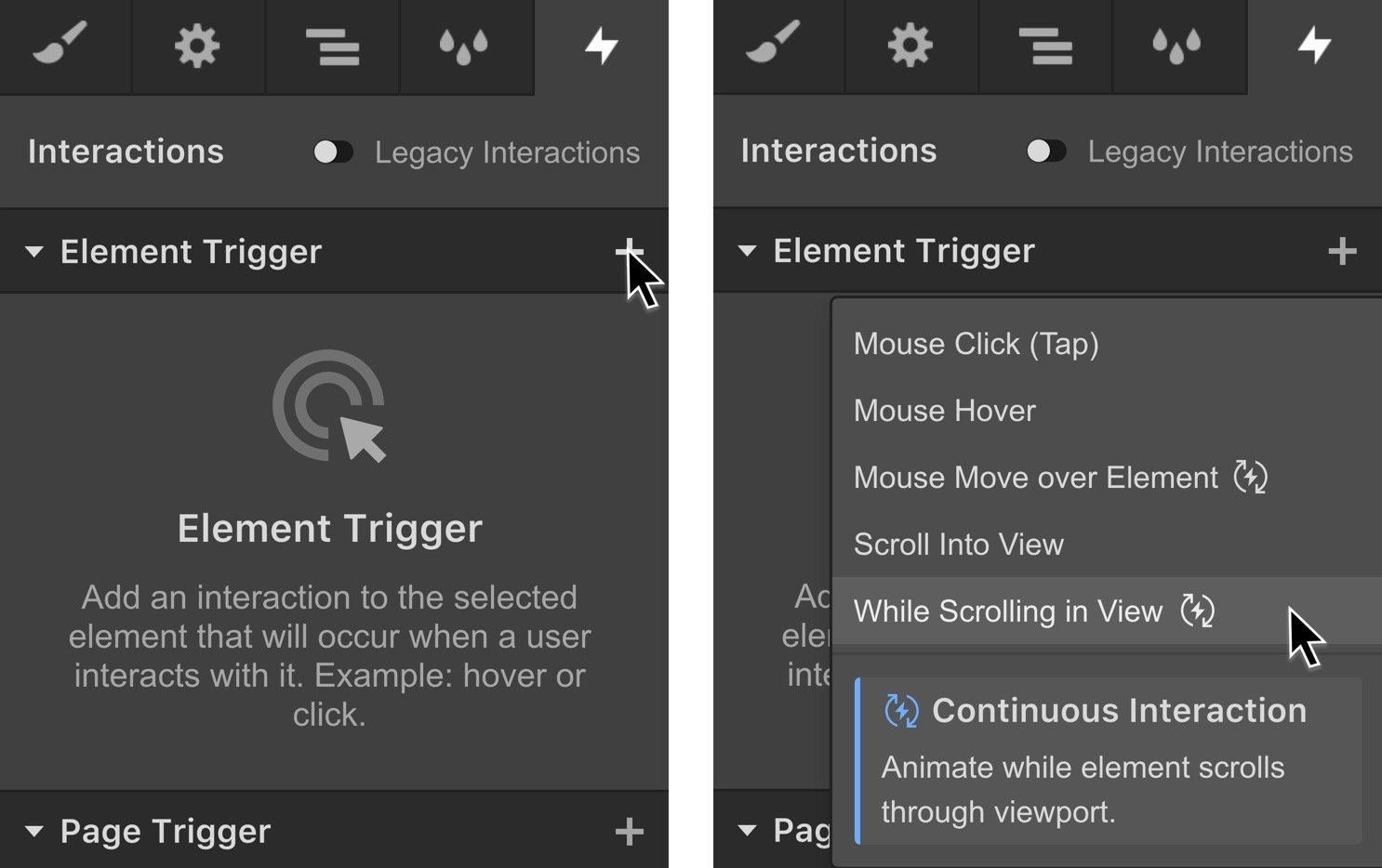
In this animation, images are meant to animate as the section scrolls into view. Thus, the event is an element trigger of while scrolling in view, triggering an on scroll animation as the response.
Step 7. Define the Event
Begin creating the interaction by selecting the section containing the images. Utilize the Interactions panel to set an element trigger of while scrolling in view.
Step 8. Configuration of the Event
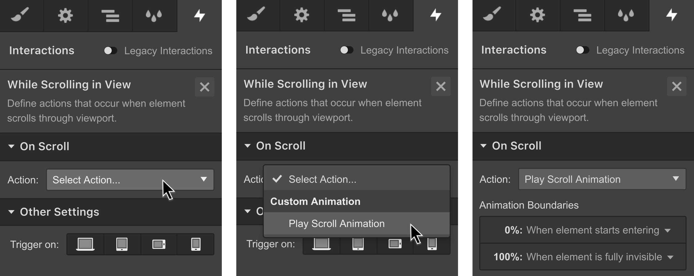
Select to initiate scroll animation. Adjust animation boundaries if necessary to control when the animation starts and ends. By default, the animation commences as the section enters the viewport and ends upon its exit. For this tutorial, stick to the default settings.
Describe the scroll animation
Clarifying your objective can assist in pinpointing the tasks that need to be established. At this juncture, the goal is to change the speed of the images. Those located in the forefront should seem to be in motion at a higher velocity than those in the background while scrolling through the segment. Hence, you will be designing a scroll act with shift for each image. Subsequently, determine the location of each image on the y-axis at the commencement and end of the animation.
Step 9. Create the scroll animation
Prior to initiating the animation, let’s discuss the concept of smoothing. Smoothing, or damping, eases and refines the imminent velocity towards the accurate position on the animation timeline. The smoothing value can be adjusted within scroll animations. For this guide, you may retain it at 50%.
Now, generate a new scroll action
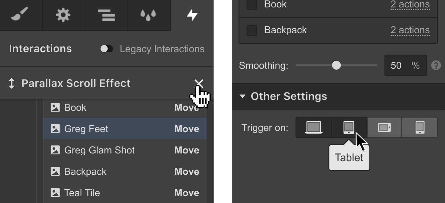
Choose the image with the maximum z-index and appears nearest to your perspective. Introduce a scroll act of shift to modify how the image moves during the animation. Two crucial frames or occurrences of the image are included in the animation timeline. One is configured at 0% – the animation’s commencement, and the other at 100% – the animation’s conclusion. Opt for the first keyframe at 0%. In the shift transformation settings, lower the image’s position by specifying its location on the Y-axis as 1000px. This will represent the image’s position as the segment initially scrolls into view. Earmark the second keyframe in the animation timeline, and elevate the image by pinpointing its location on the y-axis to -1000px. This will denote the image’s position as the segment scrolls out of view. Select the image with the lowest z-index and positioned furthest back within the segment. Integrate a scroll action of shift. Two new keyframes are appended to the animation timeline for this fresh image, one at 0% and another at 100%. Select the keyframe at 0% for this new image. In the shift transformation settings, elevate the image by specifying its location on the Y-axis as -352px. This image will start traveling from this location as the segment scrolls into view. Select the keyframe at 100% for the corresponding image and adjust the location on the Y-axis to 352px. This image will descend to this position as you progress down the page. If you’ve modified the easing preference for the previous actions, ensure you apply the same easing to all actions. Select a different image in the foreground. Include a scroll action of shift. For the first keyframe, lower it. Specify a Value of 300px. For the second keyframe, elevate the image. Now set a value such as -500px. This will result in the image traversing a span of 800px, which is slower than the nearest image and faster than the farthest one. Foresee the animation in preview mode of the Designer or live on the canvas by toggling live preview on. At present, the parallax effect is more evident, and you’ve developed what seems like an additional level of depth within this animation. Modify the positions or easing to achieve the intended outcome. Continue appending scroll actions to each image you wish to animate throughout this scroll animation sequence. Ensure you adhere to this systematic pattern to formulate a coherent parallax scrolling animation: elements in the foreground (those with higher z-index) seem to be moving at a faster speed than those in the background (those with lower z-index). You have the option to deactivate this animation on mobile devices. Close the animation timeline by selecting the X beside “Parallax scroll effect”. Then within other settings, deactivate the devices where you prefer not to trigger this interaction. While establishing the images’ positions on the y-axis, you are concurrently establishing the motion velocity. That’s because when navigating through the segment, the initial image moves from a y-position of 1000px to a y-position of -1000px – a distance of 2000px. The subsequent image covers a shorter distance of 704px as it transitions from a y-position of -352px to a y-position of 352px. It appears there are three planes or tiers of depth in that segment: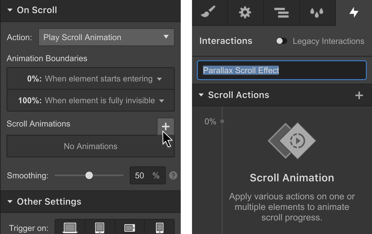
Step 10. Perform a shift action
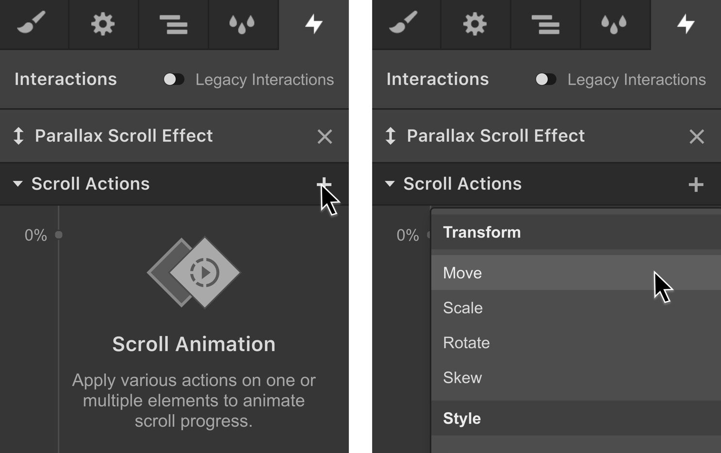
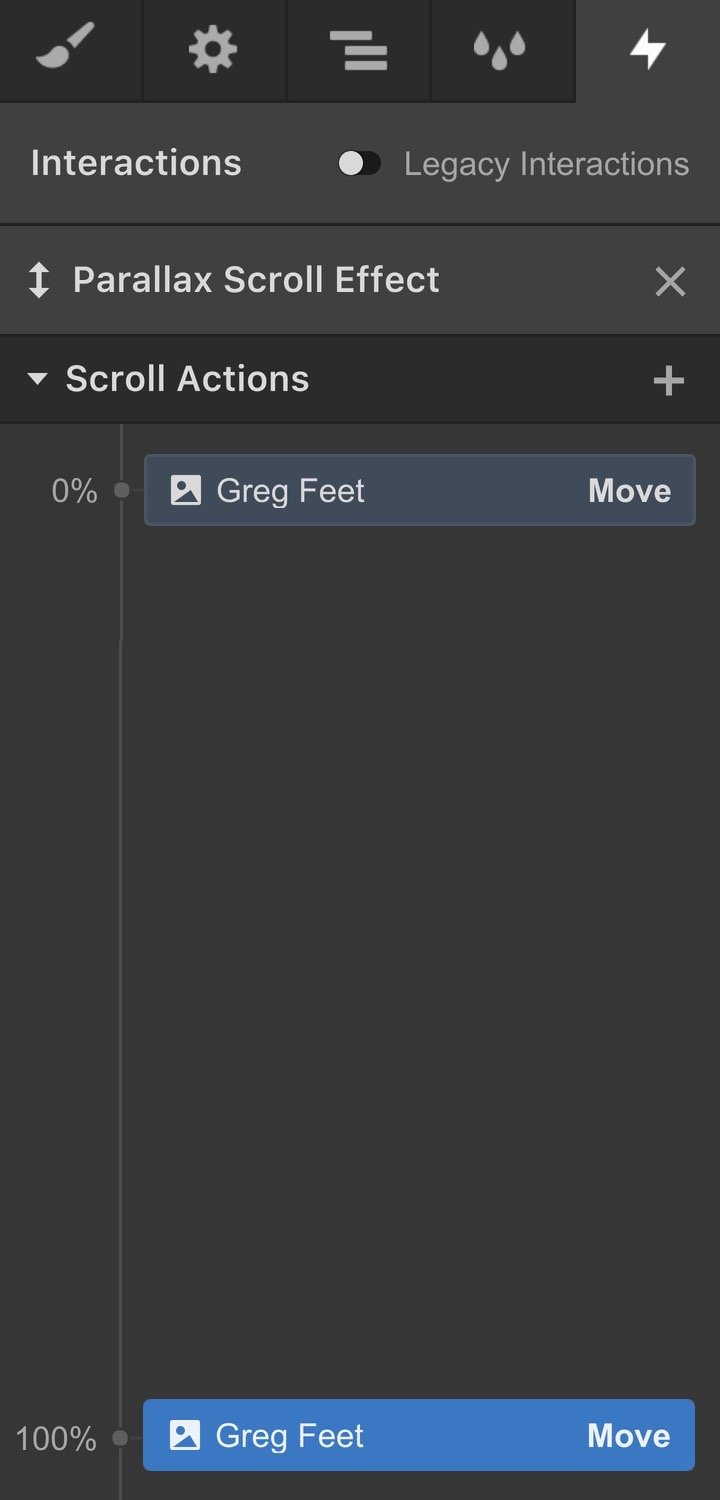
Step 11. Establish an initial position
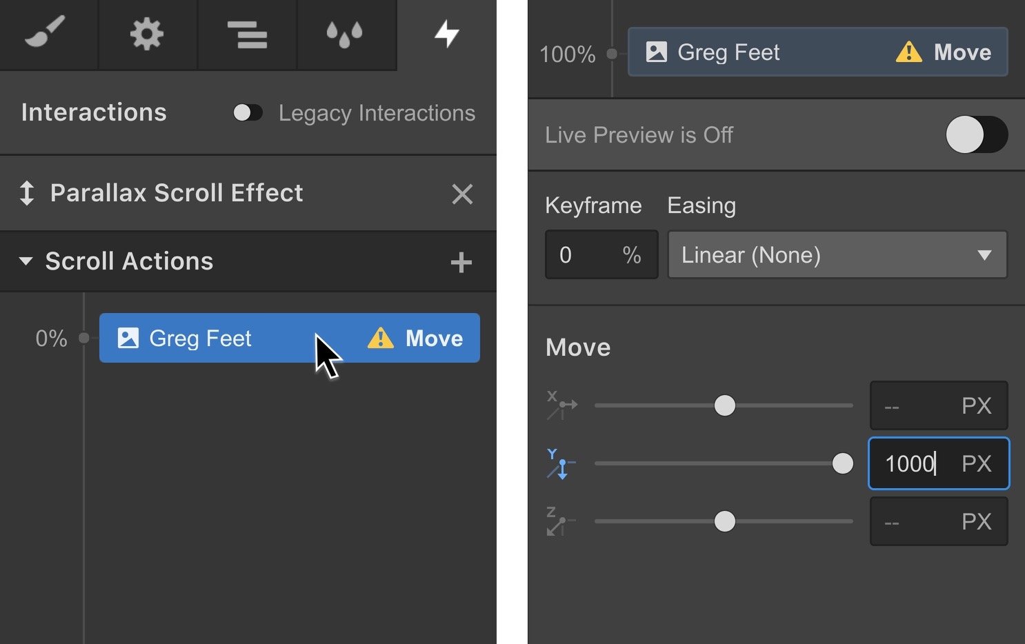
Step 12. Decide on a final position
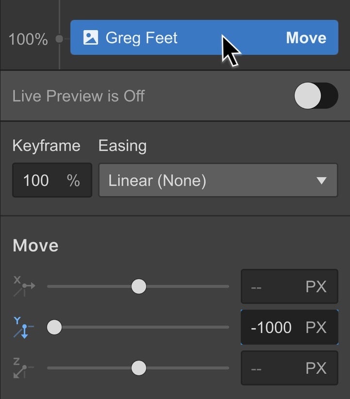
Step 13. Establish a secondary action
Determine the primary position
Designate the ultimate position
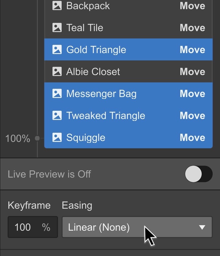
Step 14. Build a third animation
Preliminary view of the animation
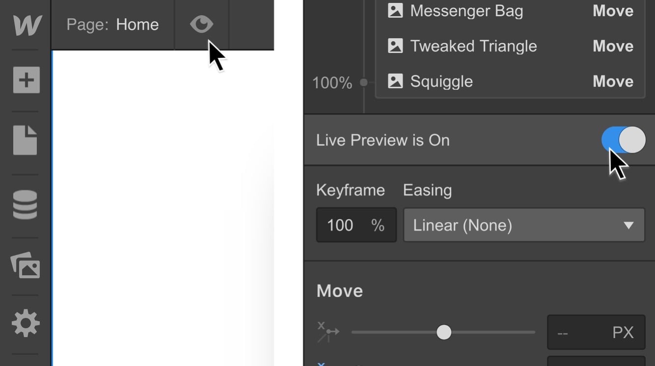
Incorporate additional animations
Disable the animation for gadgets
Functional Intel — Velocity of Motion
- Include or eliminate Workspace spots and members - April 15, 2024
- Centering box summary - April 15, 2024
- Store a site for future reference - April 15, 2024
