- Base color
- Primary shade
- Secondary shade
- Hover effect
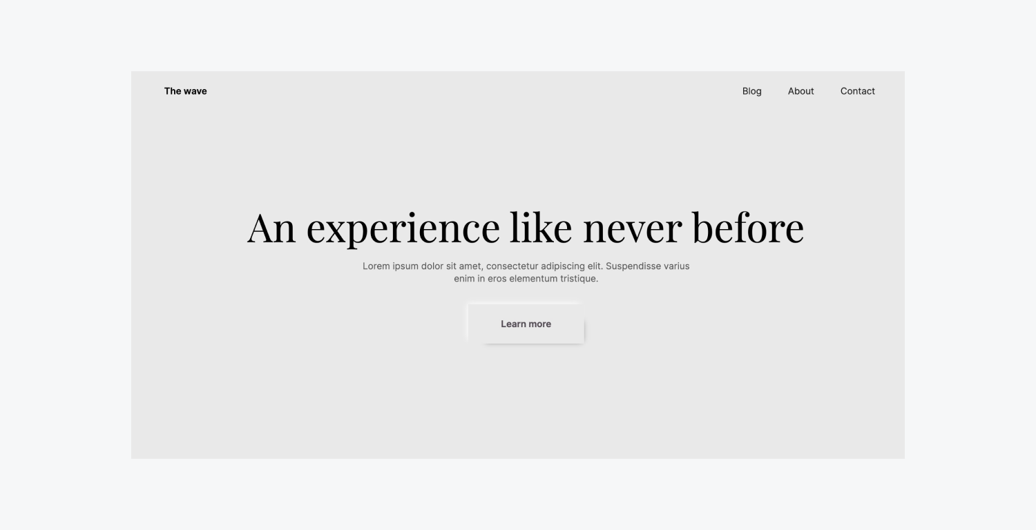
Base color
When designing a soft UI styled button – you aim to ensure the base color of the button aligns with the background color of the container. For instance, we will synchronize the default background hue of a Button component with the top section in our project.
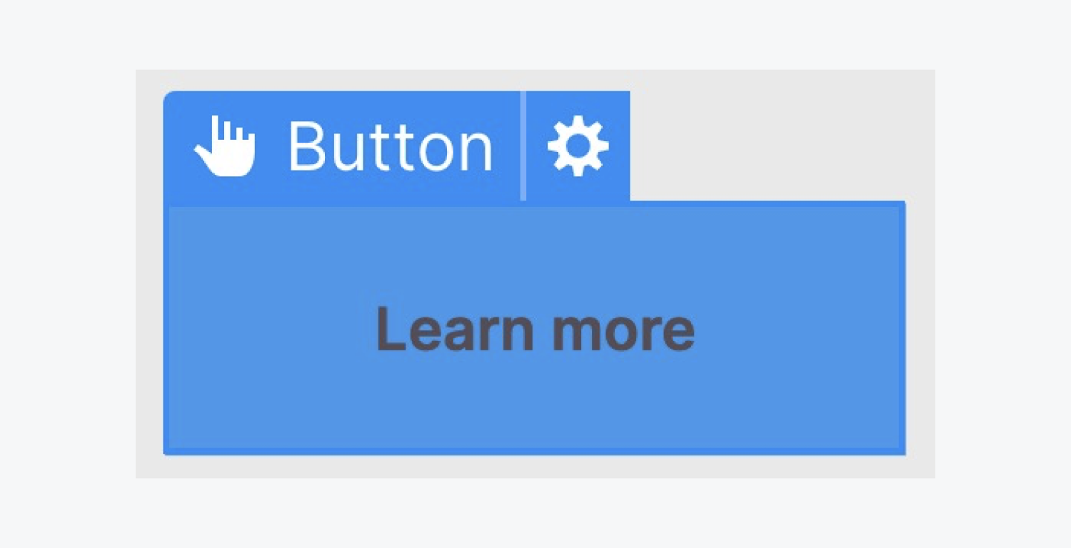
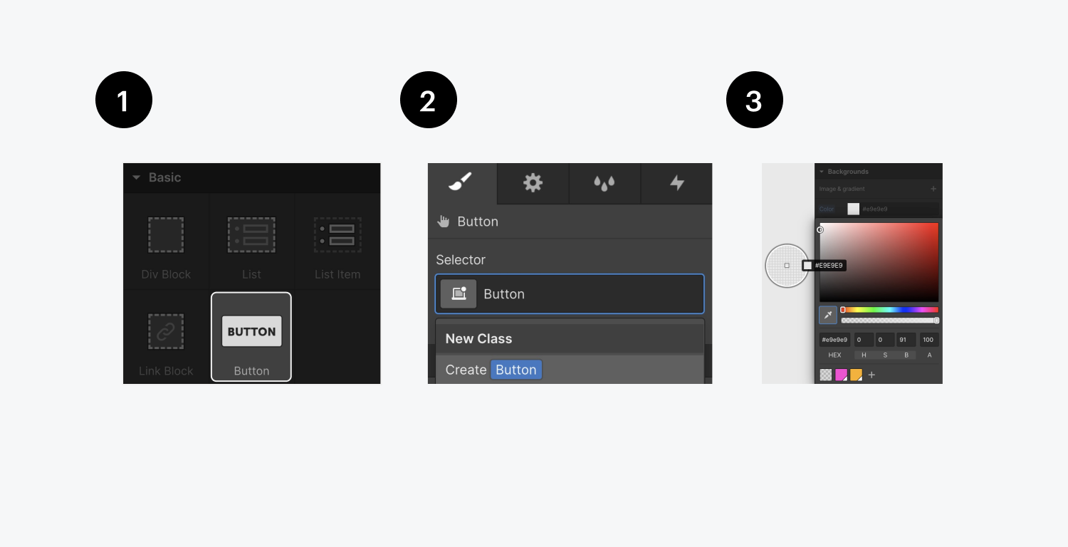
To synchronize the background tones:
- Introduce a Button element into your workspace
- After selecting the Button, assign a class name in the Selector field (e.g. “Button”)
- In the Style panel, utilize the eyedropper to pick the color of the section and apply it to the Button’s background
Now, you have a button that matches the background color of your top section.
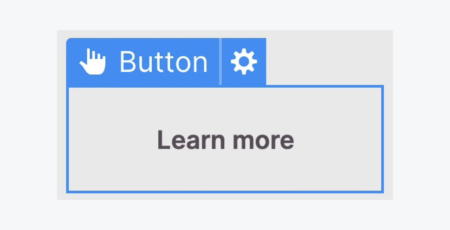
Base design completed. Next, let’s enhance the button’s appearance by crafting the primary shadow (the shadow at the bottom-right corner of the button).
Primary shade
We shall introduce a shadow effect at the bottom-right edge of the soft UI button. Moreover, you have the flexibility to adjust the shadow settings to achieve the desired visual effect.
To introduce the initial shadow:
- With the Button selected, click the plus icon beside Box shadow in the Style panel
- Tailor the Box shadow settings to suit your design (e.g. modify the Distance, Blur, Size, and Color)
Opting for a darker shade for the initial shadow (e.g. #000000 or black) and then decreasing the opacity of the darker hue (e.g. adjusting the opacity to 80%) allows the shadow to blend seamlessly with the background color, resulting in a more lifelike effect.
Secondary shade
Let’s introduce another shadow, but this time, we will alter the angle to the opposite side (to create an offset from the first shadow). Besides, given that the first shadow is dark, we will use a lighter hue for the second shadow (e.g. #ffffff or white).
To create the second shadow:
- With the Button selected, once more, click the plus icon beside Box shadow in the Style panel to generate a second shadow
- Adjust the Box shadow settings to a lighter hue (e.g. #ffffff or white)
Nota bene: if your background hue is white, this technique may not be effective. Soft UI buttons necessitate a shadow that is darker than the background on one side and lighter than the background on the other side.
Hover animation
Transitions play a key role in producing a seamless animation when transitioning between different states of an element.
Our objective in this instance is as follows: we aim to modify the shadows slightly when the button is hovered over to mimic a lifted appearance.
Hover state
By selecting our Button, we will navigate to the Hover state.
This can be accomplished in two simple steps:
- Click the drop-down arrow in the Selector section
- Choose the Mouseover effect
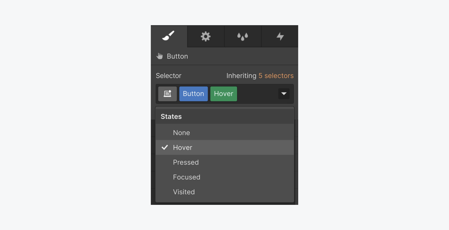
After that, navigate to the Shadow properties (while in the Mouseover effect) to customize both the initial and secondary shadows.
Expand the shadow size, and fine-tune all shadow attributes to achieve a hover effect that gives the appearance of a lifted button.
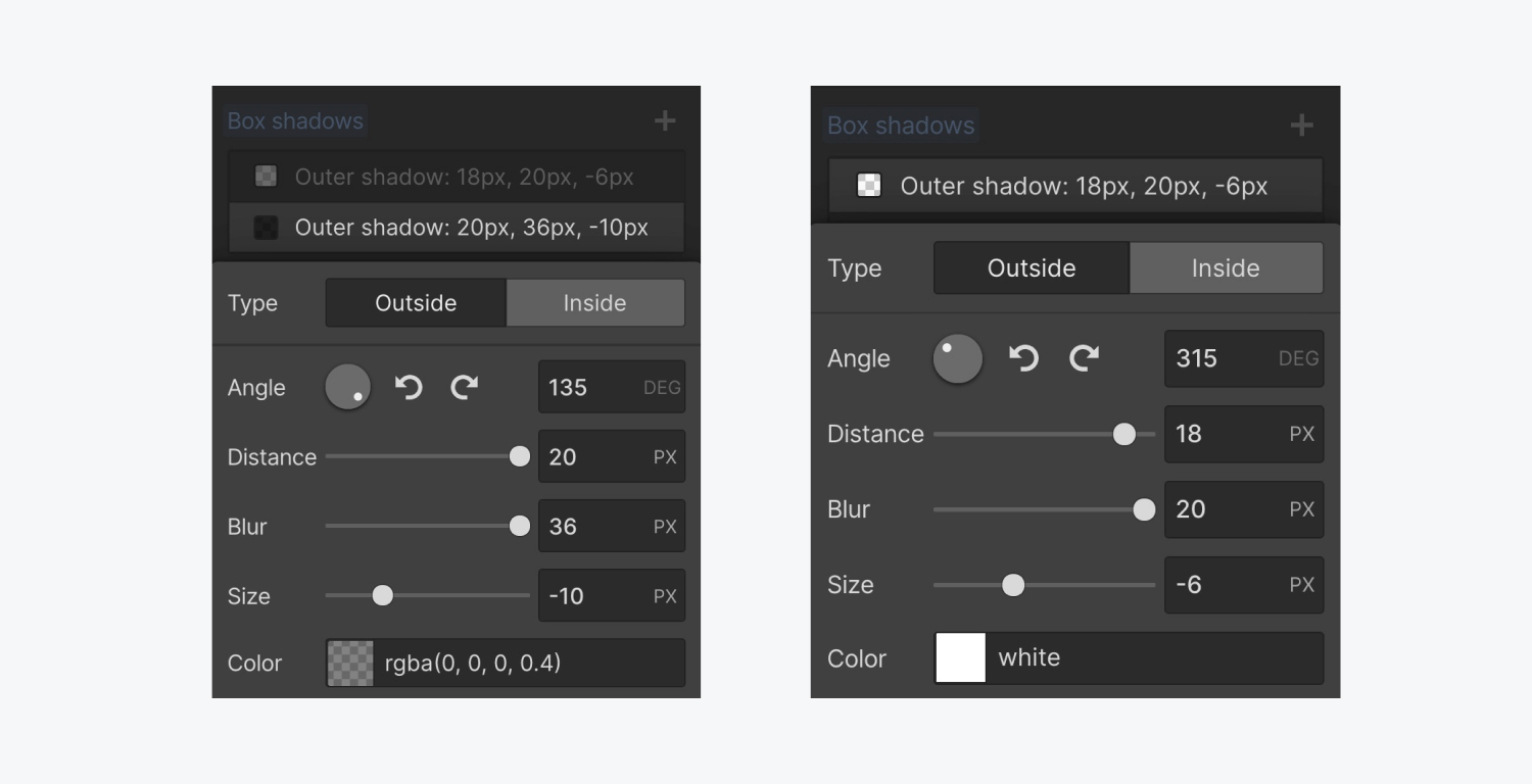
Press the Esc key to revert to the Normal state and preview the Mouseover effect on the design canvas.

Smooth Transition
To ensure a seamless and gradual animation, let’s set up a transition.
With the neumorphic button chosen, access the Transitions segment within the Styling panel. Introduce a Box-shadow transition (as that’s the element we wish to animate), and specify the duration of the animation.
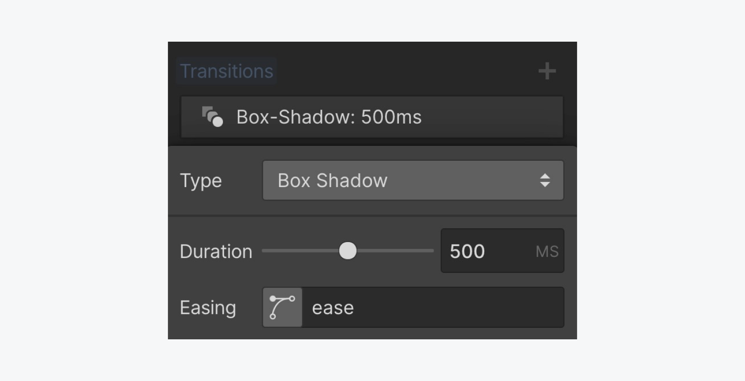
That concludes the process! You have now successfully created a neumorphic button in Webflow.
- Include or eliminate Workspace spots and members - April 15, 2024
- Centering box summary - April 15, 2024
- Store a site for future reference - April 15, 2024

