Webflow includes a built-in feature for setting up play/pause buttons for background videos, giving you the flexibility to let your site visitors take charge of pausing or playing your background video content.
Useful tip: Autoplaying a video without an obvious method to pause it is one of the top 10 reasons site visitors will leave your site without completing their tasks. Providing clear video controls can help reduce the bounce rate of your site visitors.
During this tutorial:
- Steps to incorporate a play/pause button
- Ways to design a play/pause button
Steps to incorporate a play/pause button
The setting for Enabling play/pause button is turned on by default for all fresh background videos added post June 2022. For background videos added before June 2022, you will have to manually enable this setting.
To add a play/pause button to an existing background video:
- Choose the Background video within the canvas
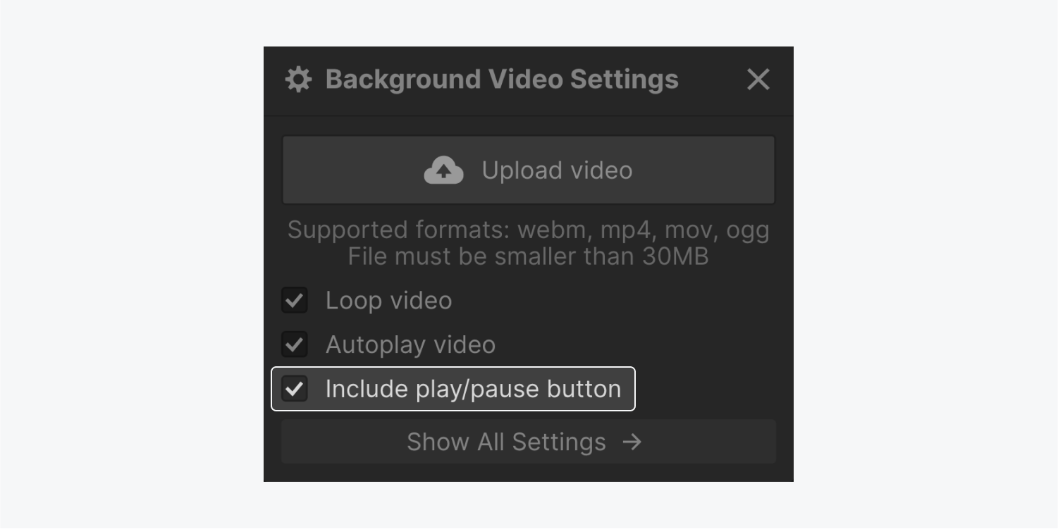
- Double-click on the Background video or press Enter/Return to open the Background video settings
- Tick the checkbox for Enabling play/pause button
Note: It’s highly recommended to keep the Enabling play/pause button setting active to meet accessibility requirements and ensure a smoother experience for your site visitors. Moreover, if you deactivate this setting, visitors with Reduction in motion preference activated in their OS settings will not be able to play your background video.
Ways to design a play/pause button
Once the Enabling play/pause button setting is activated, you have the liberty to customize the play/pause button as per your preferences.
Aligning the button
As a default setting, the Play/pause button is configured with position: absolute, in relation to the first parent element that is not static (in this scenario, the Background video element). This implies that it will remain nested within the Background video element and will appear above any elements not set to position: absolute. Gain further insights about position: absolute.
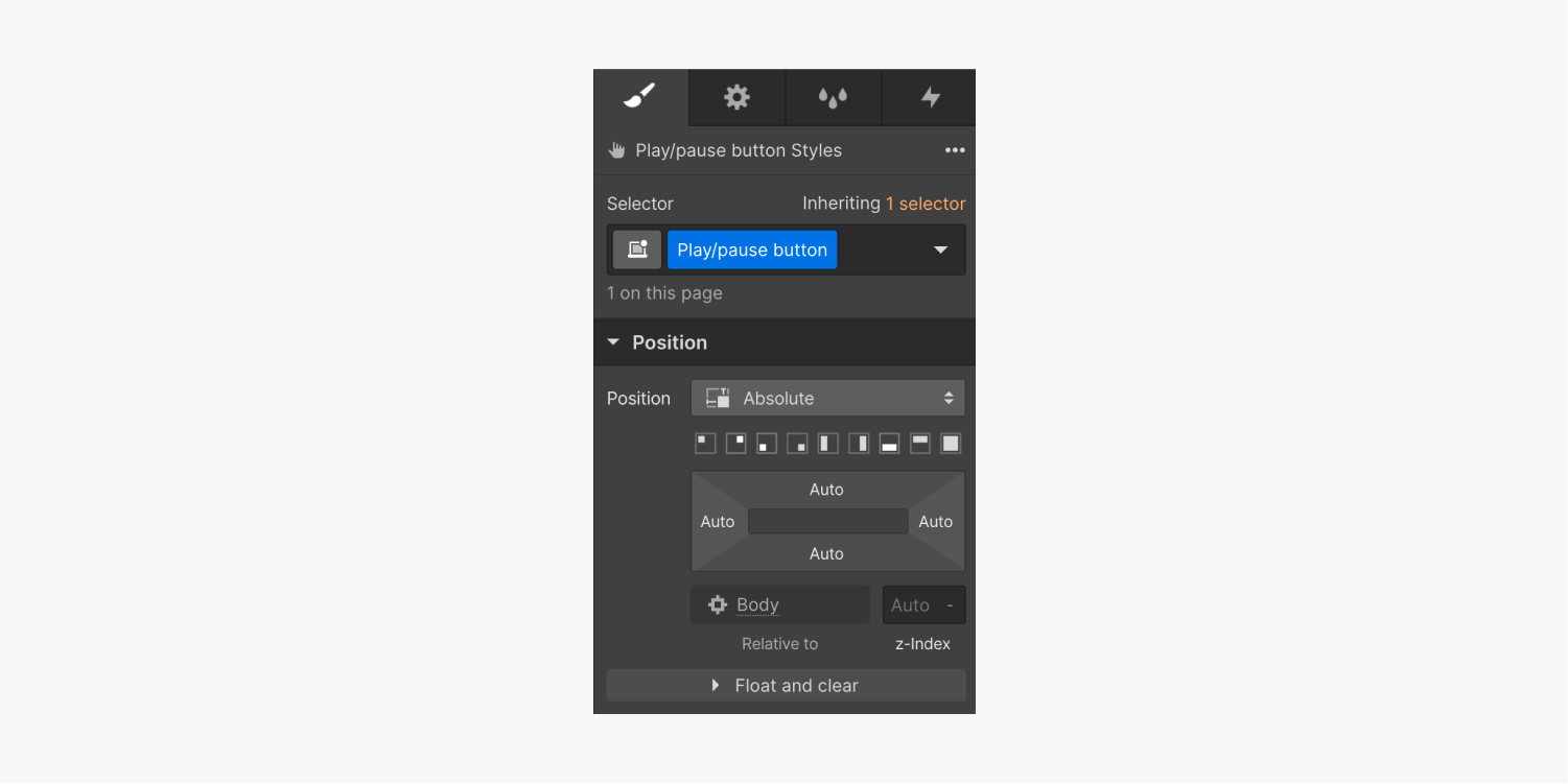
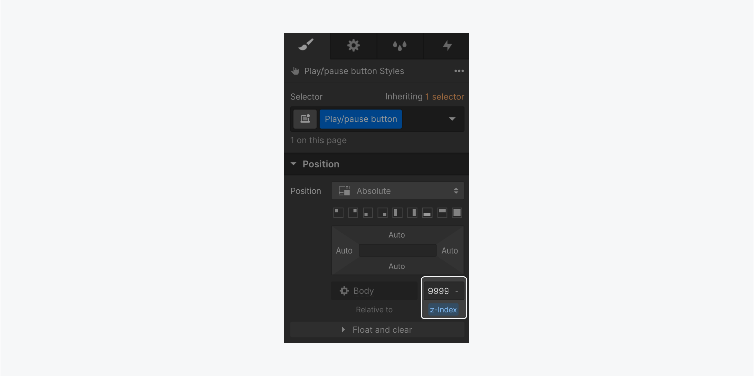
To ensure the play/pause button always remains on top of the Background video, you can select the Play/pause button element and assign it a Z-index value. The default Z-index value for any element is 0, so any value higher than 0 will position an element on top. You are free to use an extremely high Z-index value, for example, 9999. Learn more about z-index values.
Customizing button icons for different states
The play/pause button possesses two states: Play and Pause.
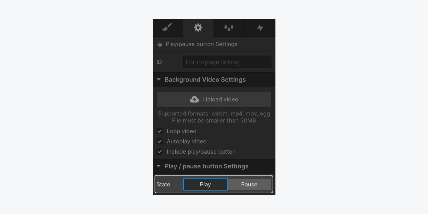
The play/pause button comes with default icons and pre-set alt text for the Play and Pause states, but you have the option to upload any image of your choice.
Note: When you replace the default icons, remember to include alt text for your images so that all users navigating your site understand the function of those buttons. For instance, you could use “Play video” as alt text for the image in the Pause state, and “Pause video” as alt text for the image in the Play state.
To swap the default icons:
- Access the Asset panel and click the “cloud” icon to upload the images you prefer to use
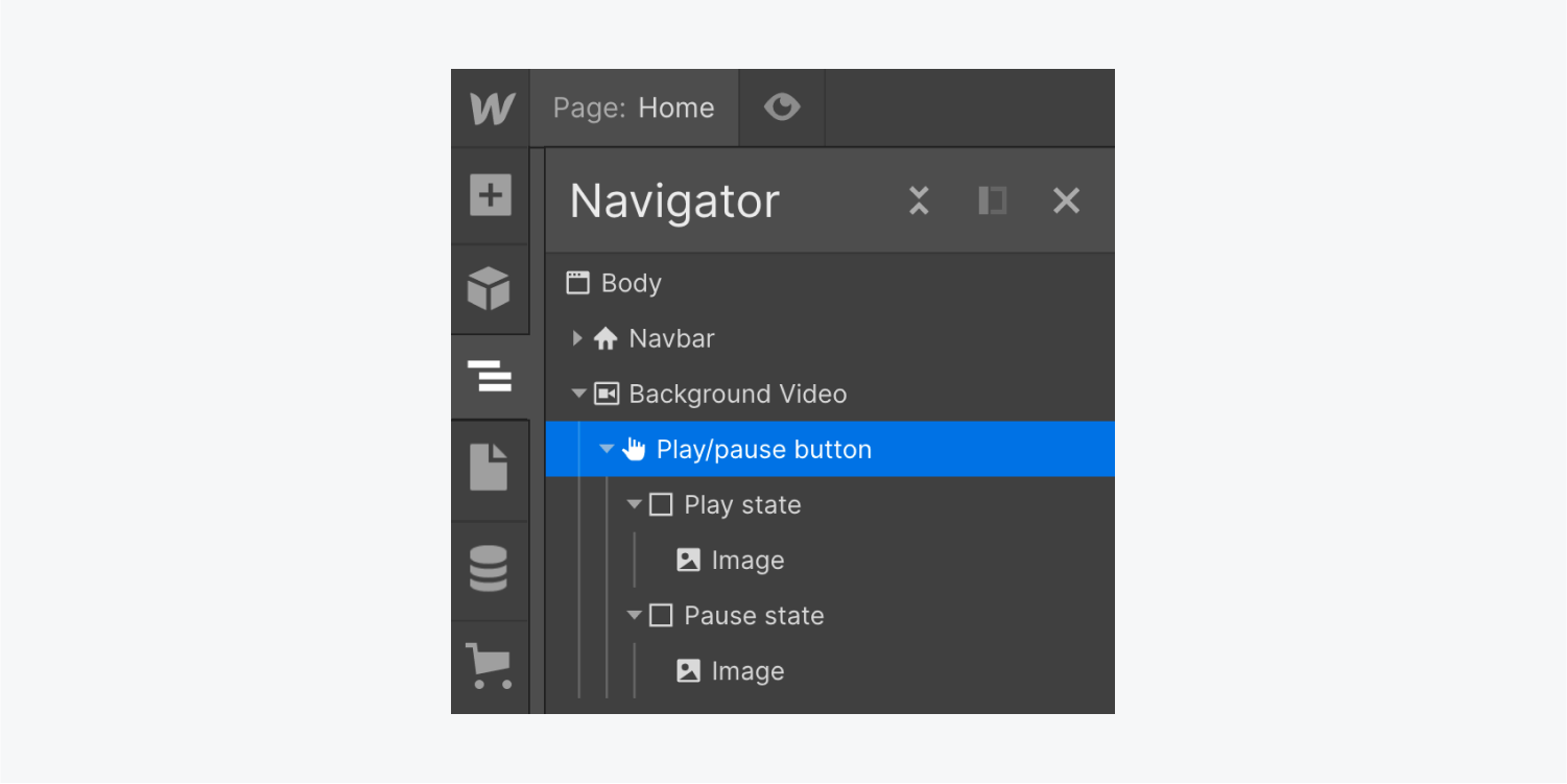
- Select the Play/pause button on the canvas or in the Navigator panel
- Choose the state you want to customize (e.g., Play or Pause) within Settings panel > Play/pause button settings
- Pick the image you wish to utilize from the Asset panel and drop it into the element matching the current state (e.g., Play state or Pause state)
- Erase the default image from within the state element
You have the option to utilize pictures or symbols with varied dimensions compared to the regular pictures. You can adjust the size of your pictures depending on the container element (for instance, the Start/stop key).
To adjust the size of your pictures depending on the parent element:
- Pick the Start/stop key on the drawing board or in the Locator section
- Press the status you wish to design (for example, Initiate or Hold) in the Configuration panel > Start/stop key settings
- Select the picture within the component that corresponds to the current status (like Initiate status or Hold position status)
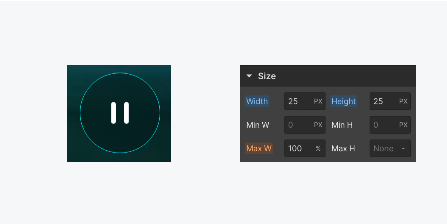
- Unfold Design panel > Size and define the picture’s breadth and height to 100% to ensure the picture covers 100% of the container element (like the Start/stop key)
- Pick the Start/stop key
- Unfold Design panel > Size and set breadth and height to your preferred size
- Unfold Design panel > Spacing and modify padding as needed
Remark: If you are utilizing SVG files for your key icons, you must provide explicit dimensions for your picture instead of relative percentage-based units. Otherwise, your pictures will decrease to 0 pixels because the container element of the picture (like Initiate status or Hold position status) does not use absolute units for its dimensions.
Designing key outlines
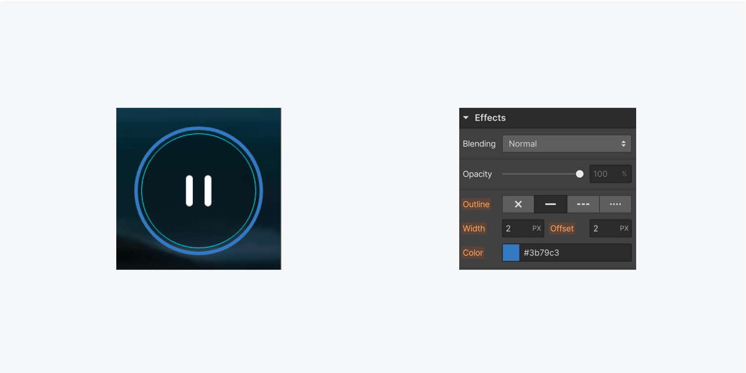
The Start/stop key comes with a default Engaged (keyboard) style featuring an indigo offset outline, however, you are able to customize this outline as needed.
For site visitors navigating your site using a keyboard, this outline indicates when the Start/stop key is active (in other words, when they are engaging with the key). This outline will not display to visitors who use a mouse or touchscreen interaction with the Start/stop key. Find out more about outlines.
To personalize the outline on the Start/stop key:
- Choose the Start/stop key on the drawing board or in the Locator section
- Open Design panel and assign a class to the Start/stop key
- Tap the menu in the Selector field to unveil the Conditions options
- Opt for the Engaged (keyboard) status
- Scroll to Design panel > Effects and edit the outline, breadth, offset, and/or color settings as desired
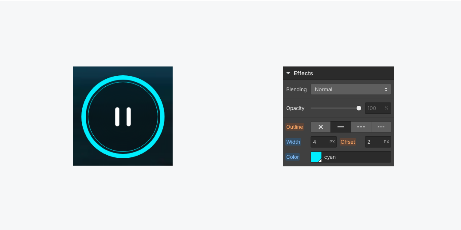
You also have the freedom to make any other design adjustments to your key (like the border, background, backdrop filter, etc.).
Expert tip: Assign classes to your pictures and the Start/stop key to conveniently apply your styles consistently across statuses. Discover more about utilizing classes to retain design details across components.
- Include or eliminate Workspace spots and members - April 15, 2024
- Centering box summary - April 15, 2024
- Store a site for future reference - April 15, 2024

