When utilizing the columns element, achieving equal heights for all columns can be challenging, especially when each column contains varying content. While setting a fixed pixel height is a possibility, it may lead to reflowing issues. Here we’ll explore how to establish uniform size layouts using flexbox.
Within this instructional session
- Establishing the layout
- Adjusting the parent to flex and aligning the children for stretching
- Determining column width
- Applying the auto margin technique
Prior to commencing
To replicate the initial arrangement seen in the video, insert a div block onto your page. Populate it with some content: a heading, a paragraph, a button. Duplicate the div block twice to obtain 3 div blocks each with content. Modify the content as needed.
Establishing the layout
For instance, assume we already have three div blocks with content on the page, each sharing identical class names and styles. We will introduce a container to the page, assign it a class, and insert these three div blocks within it.
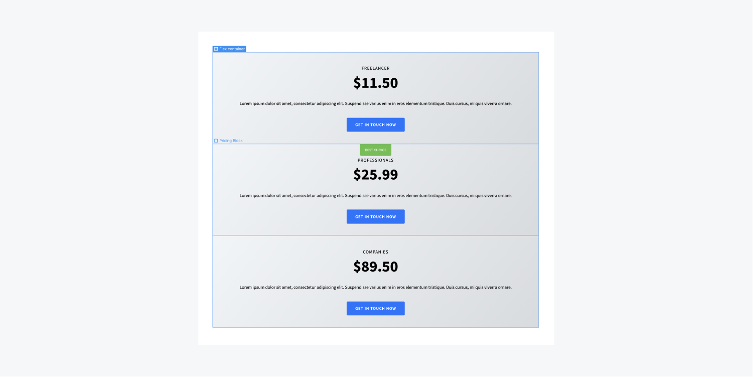
Adjusting the parent to flex and aligning the children for stretching
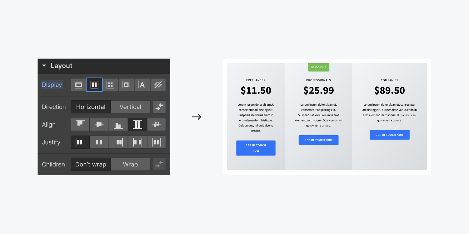
Once the three div blocks are nested within the container, we can change the container’s display setting to flex.
The default flex settings are configured to Direction: Horizontal,Justify: Start, and Align: Stretch, precisely meeting the requirements for uniform height.
Determining column width
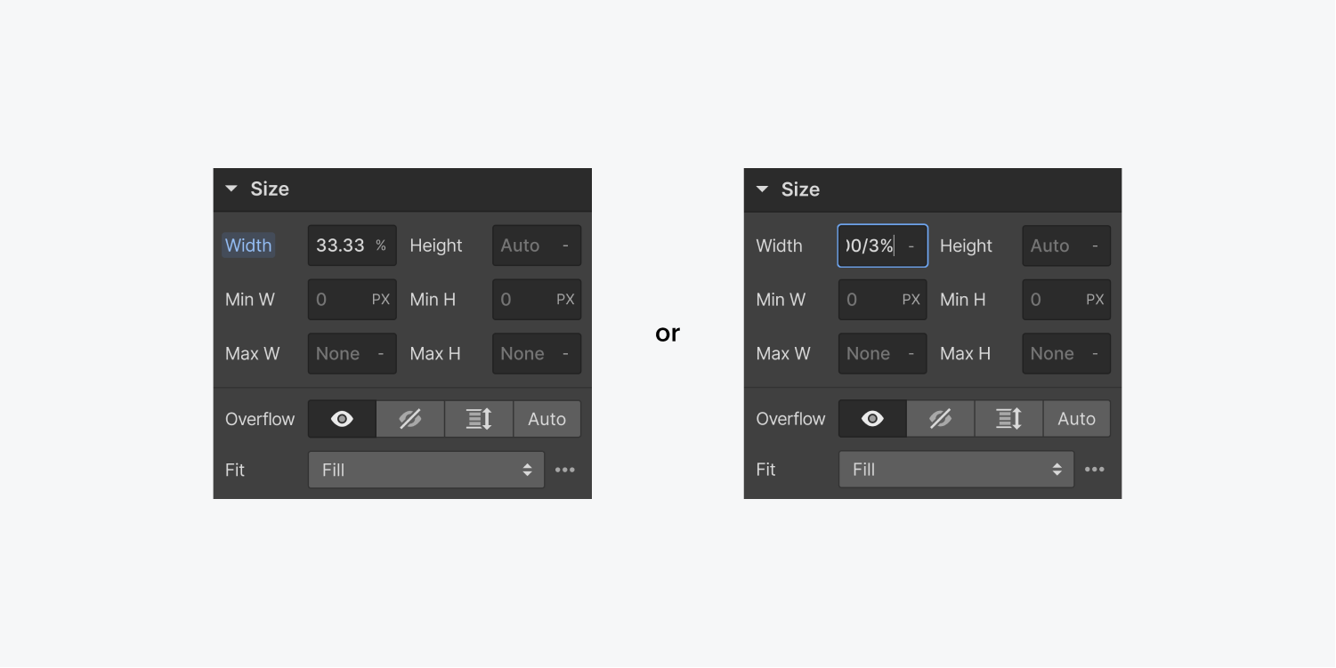
However, note that the divs’ widths are not uniform. You can achieve uniformity by setting the div blocks’ width to 33.33% (alternatively, you can perform calculations like 100/3%, then hit enter). Alternatively, you can designate the div blocks’ flex child settings to Expand.
Auto margin technique
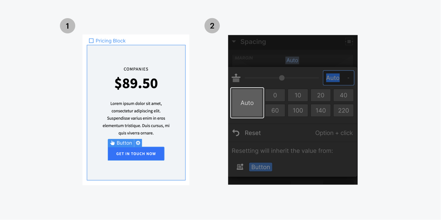
In this scenario, we aim to align the content within the divs uniformly. This can also be achieved using flexbox configurations.
- Choose one of the divs
- Modify its display setting to flex
- Configure the Flex layout to Vertical
- Select the button
- Adjust its top margin to auto
Consequently, the button’s margin will automatically adapt, leading to uniform alignment of all three buttons.
- Include or eliminate Workspace spots and members - April 15, 2024
- Centering box summary - April 15, 2024
- Store a site for future reference - April 15, 2024
