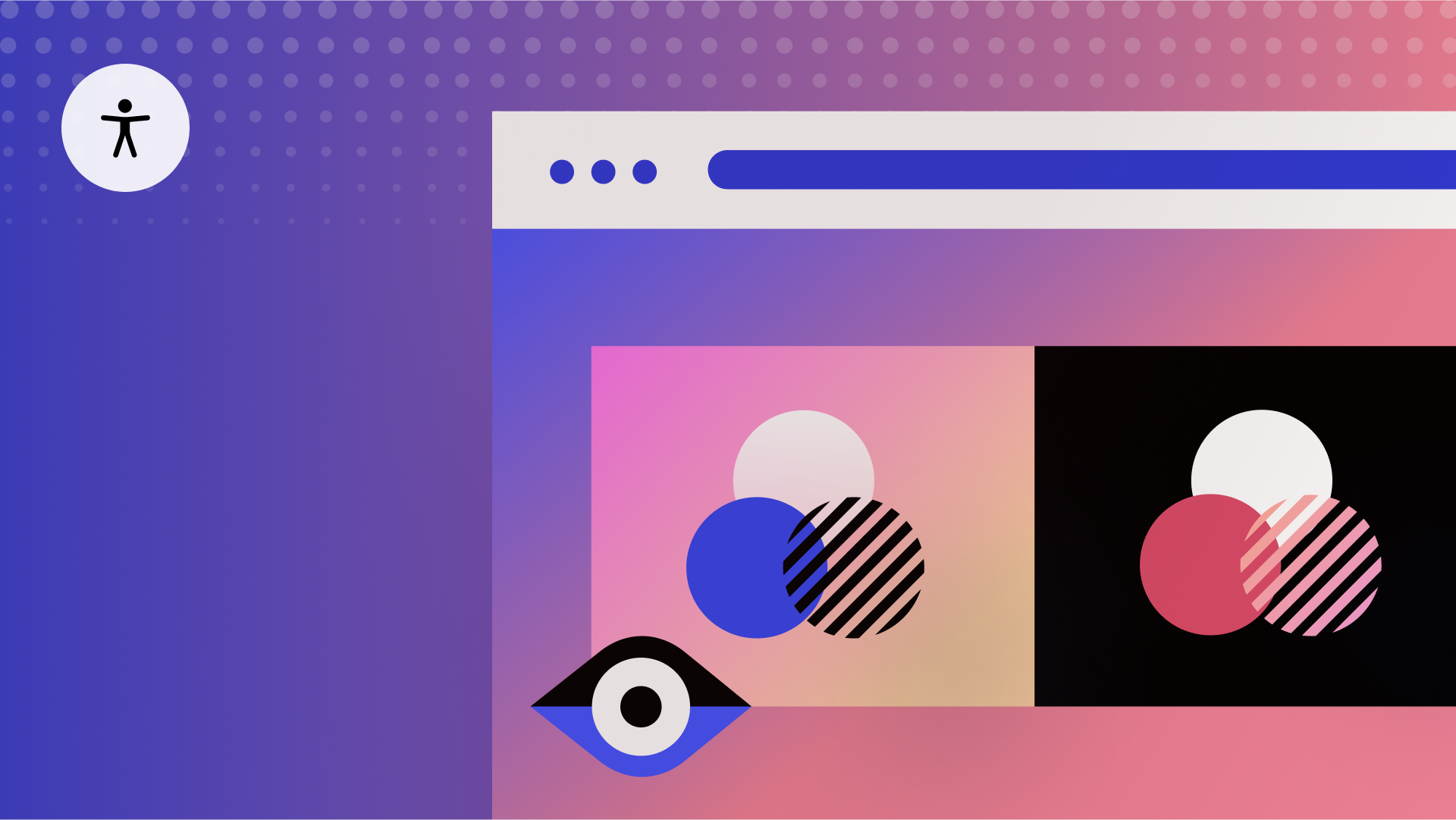
For those without visual impairments, it may be challenging to envision how your design is perceived by others. Employ Webflow’s Visual preview during your design process to estimate how individuals with visual impairment may perceive your design—ensuring they receive vital information.
Important: Visual preview is not supported in Safari. Instead, you can utilize Visual preview with Firefox and Chrome browsers.
This tutorial will cover:
- Methods to access Visual preview
- Techniques to steer clear of color-dependent UI
- Ways to replicate color vision deficiencies
- Strategies to assess design legibility
Prior to delving into the tutorial, bear in mind that the following instances are mere approximations. Numerous elements impact how individuals perceive your website:
- Your individual vision
- Your lighting conditions
- Your screen adjustments
- Your operating system
- And more.
Overall, it’s crucial to consider best practices that are not solely reliant on your unique vision or hardware setup.
Methods to access Visual preview
You can open Visual preview options by selecting Canvas settings at the top of the Designer.

Choose the form of visual impairment to preview from the bottom of the Canvas settings dialogue.

You can select from:
- Red-green color blindness (Green weak, Green blind, Red weak, and Red blind previews)
- Blue-yellow color blindness (Blue weak and Blue blind previews)
- Full spectrum color blindness (Color weak and Monochrome previews)
- Focus impairment (Blurred vision preview)

The chosen visual impairment is denoted by an icon on the right side of the Canvas settings.

To cease previewing your design from a visually impaired perspective, revisit Canvas settings and switch the Visual preview to None.
Avoiding color-dependent UI
Imagine you’ve crafted an interface where green signifies a functioning system, while red indicates malfunctioning.

Let’s utilize Visual preview to observe how this interface looks with varying visual impairments:
- Access Canvas settings from the top of the Designer
- Expand the dropdown menu below Visual preview and opt for a visual impairment preview (e.g., Green blind and Red blind)

After employing Visual preview, it’s evident that the green and red colors do not have distinct contrasts. This demonstrates the drawback of relying solely on color for conveying information—it’s less effective compared to incorporating a symbol (e.g., “x” or a “checkmark”) to indicate system status.

Financial monitoring applications excel in this strategy. They might incorporate color but solely as a supporting element to their primary concept, which is communicated through an upward or downward arrow indicating stock price rise or fall. (Alternatively, they might use a plus or minus sign.)

There’s a prevalent misunderstanding that using colors in your interface is prohibited. For instance, you can employ red and green hues in your design, but it’s imperative not to depend solely on color for communicating crucial data to your website visitors. Instead, ensure that text, shapes, and symbols also play a role in conveying meaning alongside your color selections.

Ways to replicate color vision deficiency
For an illustration on how individuals with color blindness might interpret your layout, the subsequent example, while less practical, serves as an insightful demonstration of the consequences when critical content heavily relies on color contrasts.
The intended data should be prominently displayed within the visuals.


Under color blindness simulations, the numbers become indistinct.


Consequently, it’s crucial to routinely verify that the content within your visuals remains visually accessible across various vision impairments.
Assessing design readability
Additionally, you should evaluate the legibility of your design. We will showcase examples that highlight readability challenges with:
- Delicate font choices
- Typography scaling during browser enlargement
- Obscure user interface elements
Delicate font choices
For instance, a paragraph using a delicate font might appear acceptable at first glance to you. Nonetheless, when you approximate its visibility to someone with blurred vision, the fragile font becomes illegible — almost vanishing entirely.
If you want to enhance the unreadable text block, you may opt for a more readable, broader font (for example, a wider style on the font).

After changing the font to a broader one, when you revisit the Vision preview and visualize how the updated text block appears to someone with obscured vision, it becomes easier to read.
Typography scale when browser zoomed
Narrow fonts, or even slender UI components, might sometimes be too petite to view comfortably. Numerous individuals adjust their browser to a larger zoom percentage for a more readable browsing experience.
Thus, it’s vital to be conscious of how VW (viewport width) relative units are used in typography—particularly for your essential content.
The aim of using VW in typography is to enable text to scale according to the viewport width. In the subsequent example, all text enlarges (or shrinks) based on the width of the viewport as it is scaled, which is the anticipated behavior.

However, using VW for typography can pose challenges when users zoom in their browser to amplify the scale and enhance text readability.
For instance, if VW is used for typography, while other elements scale as the browser is zoomed (e.g., images enlarge), the text size remains constant. This occurs because VW-based typography dynamically adjusts based on the viewport width, which isn’t affected by browser zoom.


To enable your text to scale up with an increased browser zoom, set your typography size to employ EMs, REMs, or pixels. (This is especially crucial for your significant content.)
Find out more about typography unit measures.
Vague UI
Ensuring that your user interface is accessible is paramount. In the subsequent illustration, if you turn on blurred vision in Vision preview, the necessary action for your site visitor may not be readily discernible.

If you disable the blurred vision preview and zoom in, you will observe a minute, slender ‘x’ intended for closing the intrusive popup. This serves as an excellent example of design decisions not only resulting in poor user interfaces but also creating illegible or impractical user interfaces.

In addition to the previously mentioned considerations, elevate your accessible design even further by enrolling in the comprehensive accessibility course and delving deeper into enhancing your site’s accessibility.

- Include or eliminate Workspace spots and members - April 15, 2024
- Centering box summary - April 15, 2024
- Store a site for future reference - April 15, 2024
 EN
EN  ZH
ZH  ZH_CN
ZH_CN  KO
KO  JA
JA