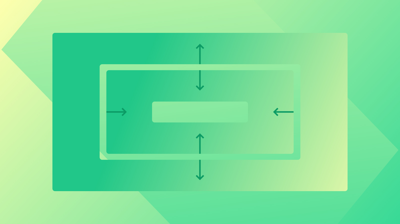
You have the ability in the Style panel to specify whitespace (margin and padding) both internally and externally for every element.
Throughout this tutorial, you will grasp:
- Techniques for incorporating whitespace to an element
- Approaches for modifying whitespace units
- Utilizing negative margin effectively
- Applying auto margin for horizontal centering of an element
- Detecting and fixing margin issues between neighboring elements
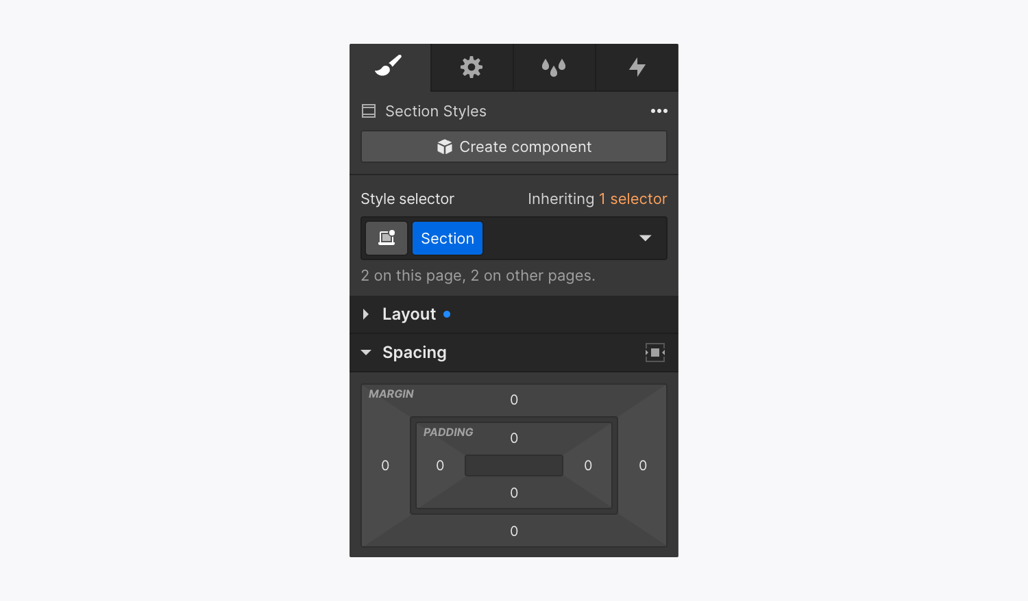
Ways to infuse whitespace into an element
Whitespace serves as the visual breathing room outside (margin) or inside (padding) an element’s boundary — you have the option to adjust the whitespace individually on different sides, as pairs of sides, or all sides simultaneously.
Integrating whitespace on individual sides
When you want to add margin or padding to just a single side of an element:
- Select the element directly on the canvas
- Drag the padding or margin controller on the side you wish to modify
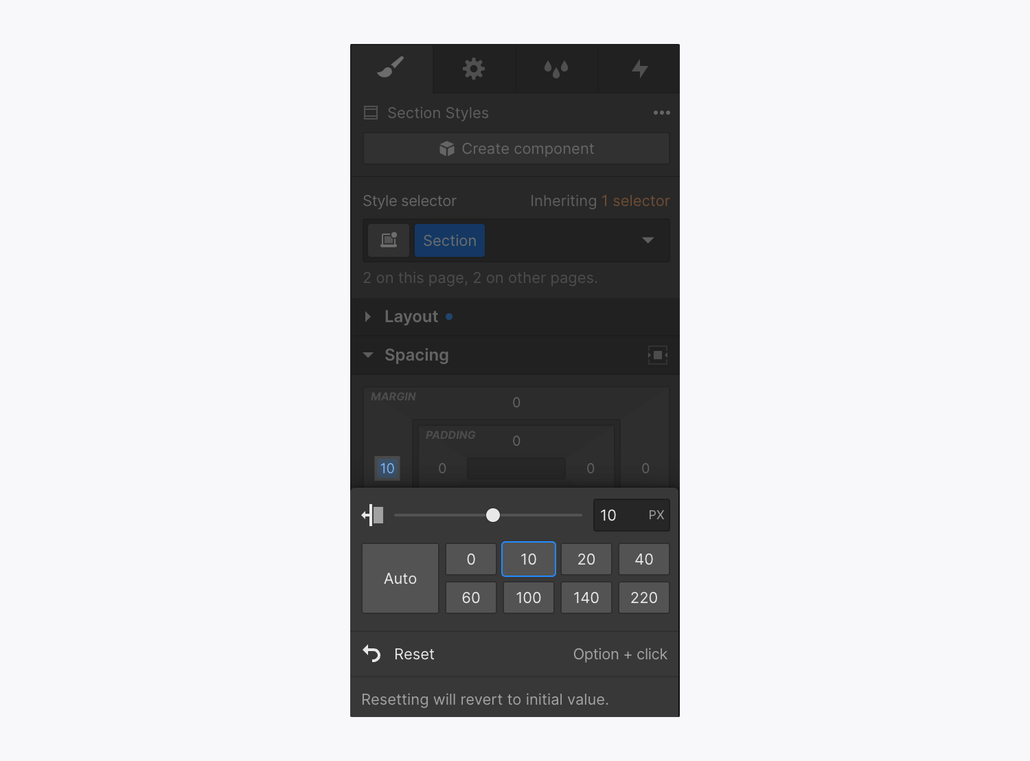
You can also pick from predefined whitespace values or manually tweak padding and margin:
- Select the margin or padding controller
- Choose a predefined whitespace value by clicking or input a custom value
Integrating whitespace on complementary sides
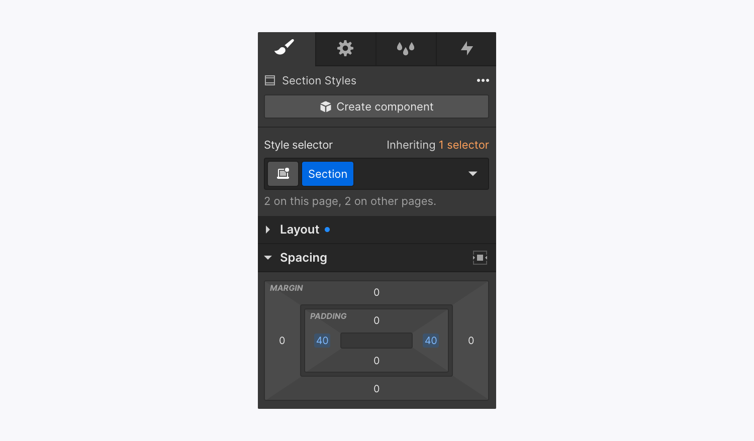
To alter the spacing on complementary (opposite) sides:
- Hold Option (on Mac) or Alt (on Windows)
- Adjust one of the margin/padding controllers, select a predefined whitespace value, or insert a custom value
Integrating whitespace on all sides collectively
You can uniformly apply the same value to all sides of an element by pressing Shift and adjusting the padding/margin on a single side. Alternatively, when holding Shift, click the whitespace controller on one side, choose a predefined value or input a custom value.
Different options for modifying whitespace units
By default, the unit used for whitespace is pixels (px), but you can switch it to any of the units displayed in the unit’s menu. To access this menu, click on any whitespace controller and select the appropriate unit to the right of the input field (e.g., PX, %, EM, VW, or VH).
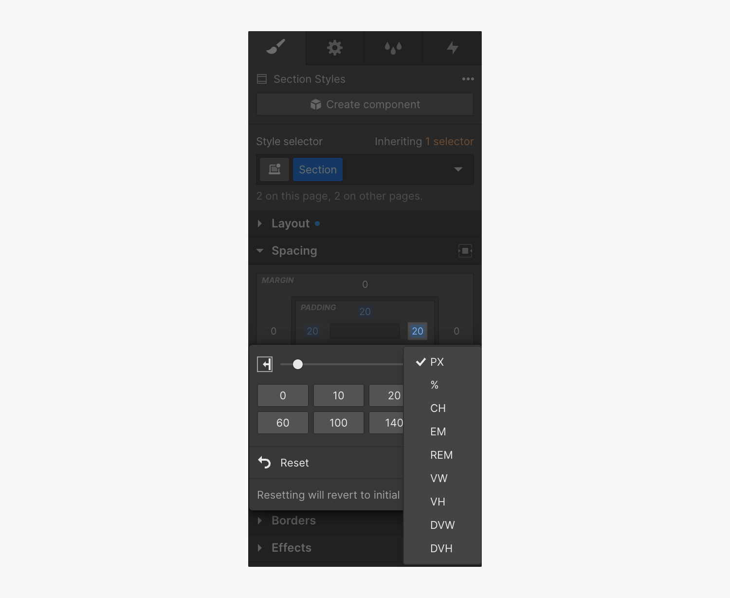
You can also input the value and unit manually in the input field. Should you wish to employ the same unit for all sides, click the whitespace controller for one side, press Shift, input the unit desired, and hit Enter.
Discover more about input values and units.
Clearing whitespace values
Erase whitespace value on any side by selecting the blue value on the controller while holding Alt (on Mac) or Option (on Windows).
Leveraging negative margin
Introducing negative margin to an element shifts it from its default position on the page. The use of a negative value (e.g., -100) allows for element overlap.
Utilizing auto margin for horizontal centering of an element
The auto margin setting proves to be a useful layout method to align flex items precisely. For instance, when dealing with multiple buttons within a parent element utilizing flex, you can implement auto margin on the right and left sides to position those buttons at the center of the parent element, distributing the remaining space evenly between them.
Horizontal centering of an element can be achieved by utilizing the Center element button in the Style panel > Whitespace. This button configures the right and left margins of the element to auto, maintaining the display property unaltered. The margin will automatically occupy the available space.
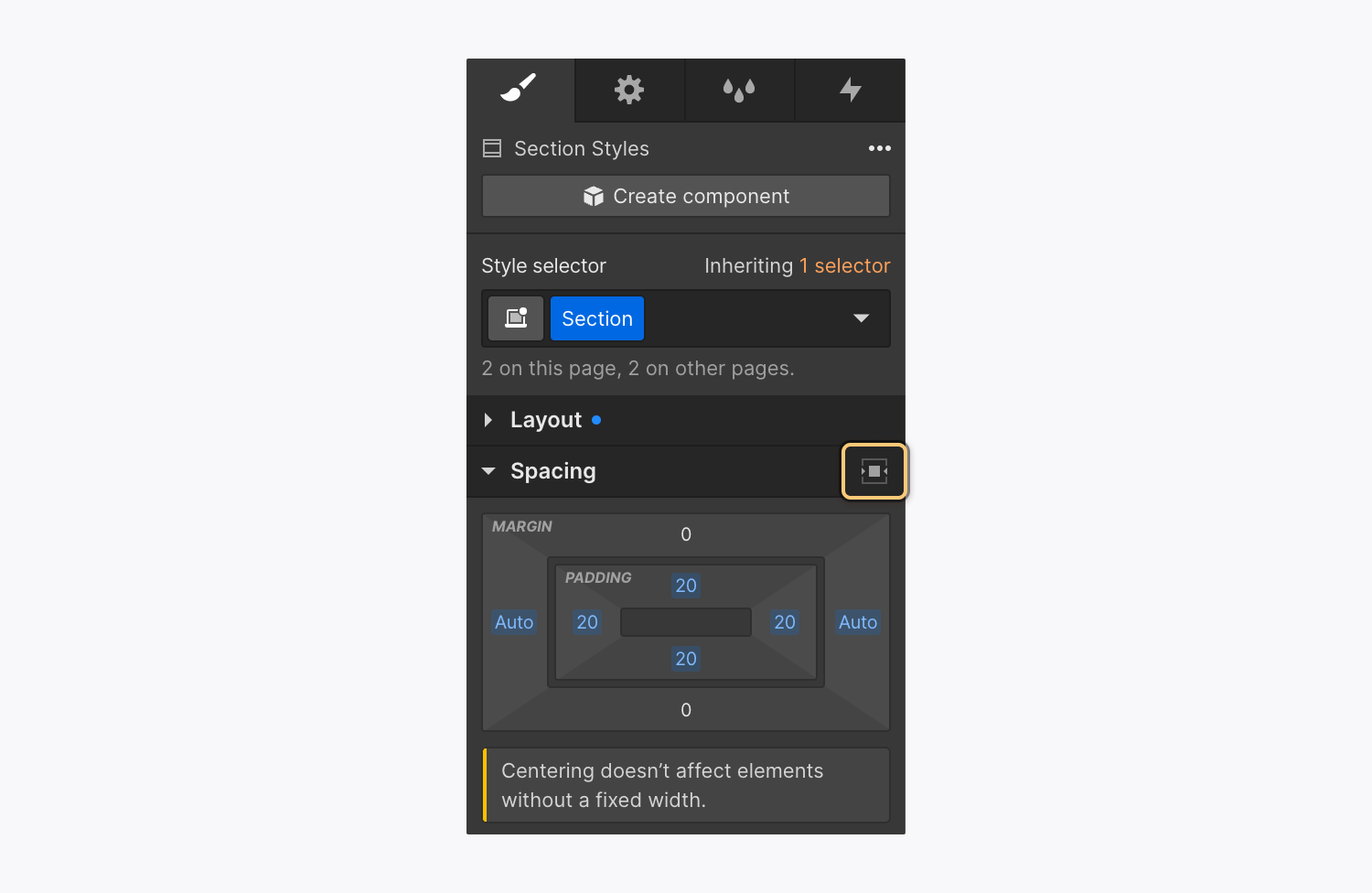
Learn more about the auto margin technique with flex.
Reminder: Elements utilizing inline (inline-block) display properties cannot be centered using the Center element button (auto margin) due to the absence of horizontal space in an inline setting.
How to resolve margin issues between neighboring elements
Certain scenarios result in adjacent element margins combining to create a unified margin. This is referred to as margin collapsing and can lead to confusion as it may be overridden in some cases and not in others. Margins of neighboring grid children do not collapse.
A common problem arises when footer content is not visible in the Designer and is inaccessible. This often occurs when a Navbar is positioned absolutely, pushing content beyond the Body element at the page’s bottom. To prevent this, avoid adding top margin to the initial element on your page if it lacks a fixed position. Instead, add top padding to the Body element.
- Include or eliminate Workspace spots and members - April 15, 2024
- Centering box summary - April 15, 2024
- Store a site for future reference - April 15, 2024
