A banner functions as a call-to-action and is a method to attract visitors’ attention to crucial announcements on your site. You can position banners anywhere and design them according to your preferences, but this tutorial guides you through the layout and animation of a typical announcement banner — one that emerges from beneath the navbar when the page loads. We’ll also demonstrate how to animate the banner to alter its color after the sliding animation.
Throughout this tutorial, you’ll understand:
- How to design a banner
- How to incorporate and design the banner text
- How to conceal the banner before animation
- How to integrate interactions to animate the banner
- How to implement interactions to modify the banner colors
How to design a banner
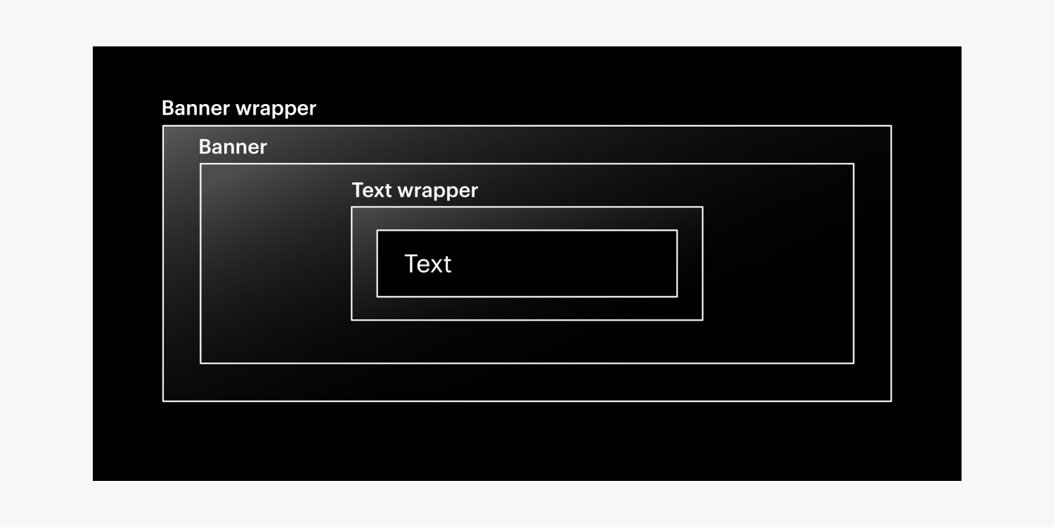
To lay out the structure of the banner:
- Drag a Div block from the Add panel onto the Webflow canvas
- Add a class to the Div block (e.g., “Banner wrapper”)
- Include another Div block within the banner wrapper
- Assign a class to the second Div block (e.g., “Banner”)
- Access Style panel > Backgrounds and click the swatch to set the banner’s background color
How to incorporate and design the banner text
To insert text into the banner:
- Insert a third Div block inside the banner
- Apply a class to the third Div block (e.g., “Text wrapper”)
- Open Style panel > Size and designate a Max W (e.g., 980 pixels)
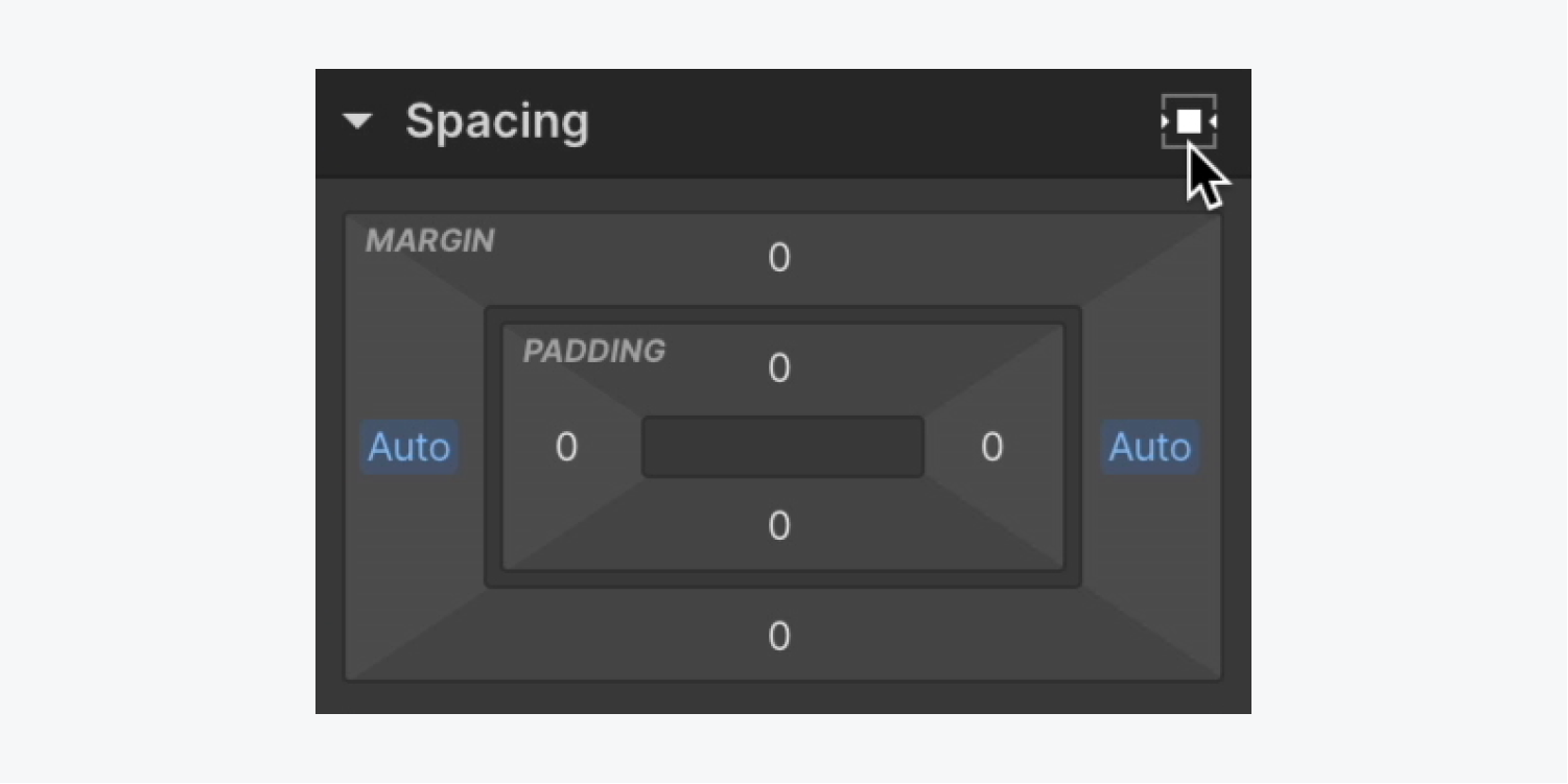
- Access Style panel > Spacing and adjust the margin on both sides to auto
Find out more about auto margin in our Spacing tutorial.
To insert and design the banner text:
- Drag a Paragraph from the Add panel into the text wrapper
- Open Style panel > Typography
- Tap the color swatch in color to modify the text color
- Tap center in align to align the text
- Access Style panel > Spacing and alter the bottom margin to 0
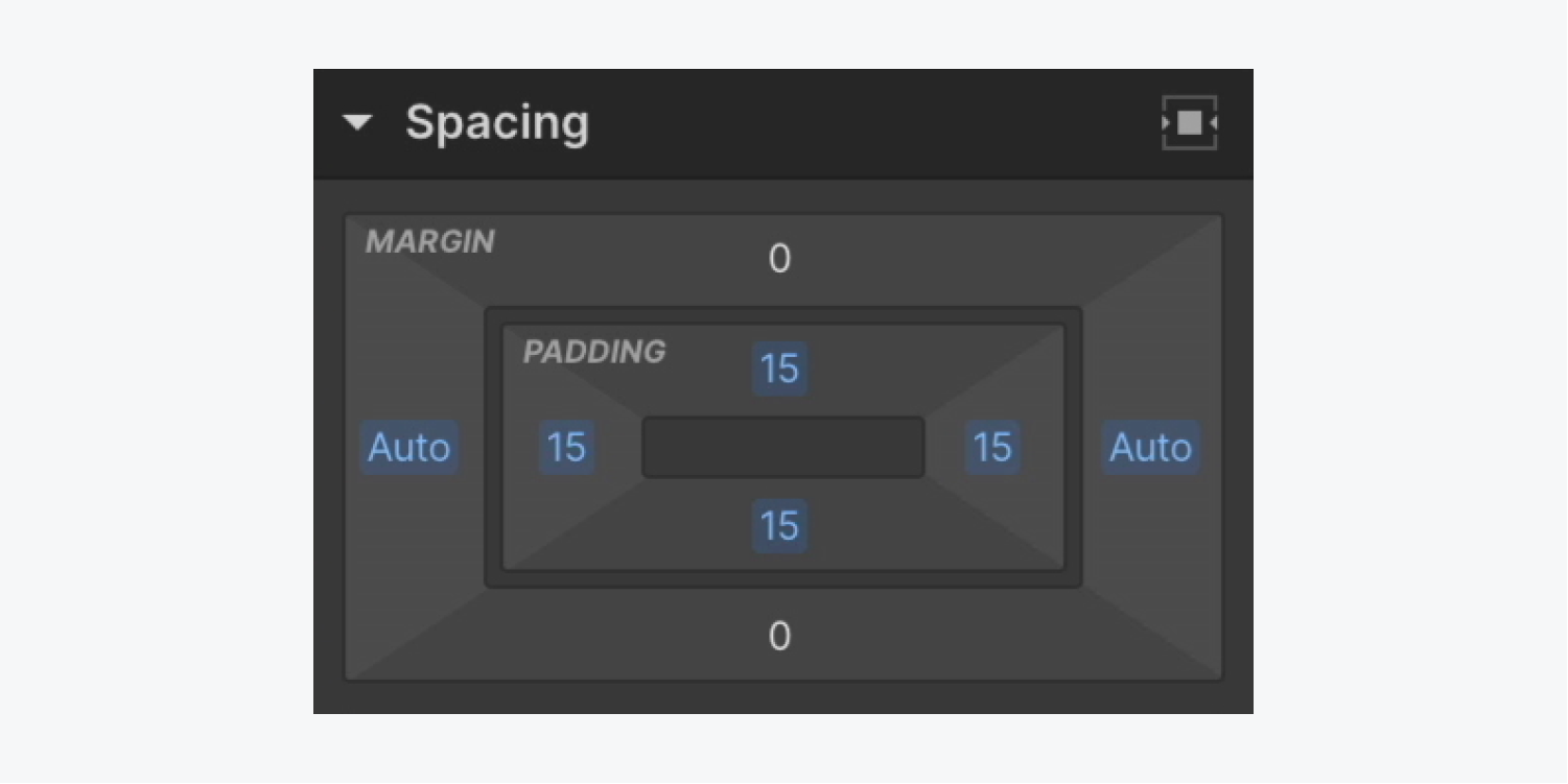
- Include padding on all 4 sides (e.g., 15 pixels)
Good to know: To simultaneously increase or decrease the margin or padding on all 4 sides of an element, use Shift + mouse drag (on Mac) or Shift + mouse drag (on Windows).
Note: You can insert any element (e.g., Text link, Image, Button, etc.) in the banner.
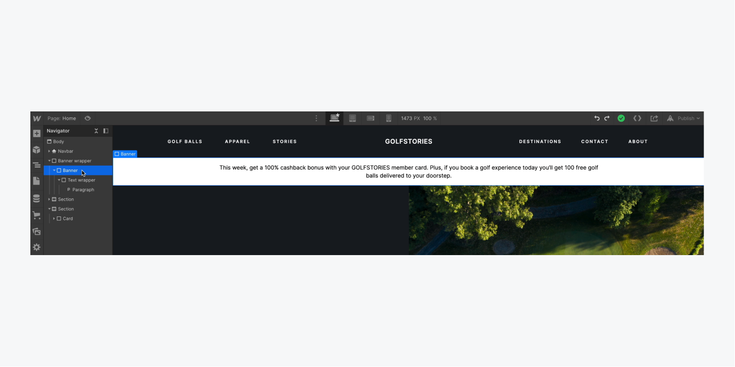
How to conceal the banner before animation
To make sure the banner remains hidden before the animation commences:
- Select the banner wrapper
- Access Style panel > Size
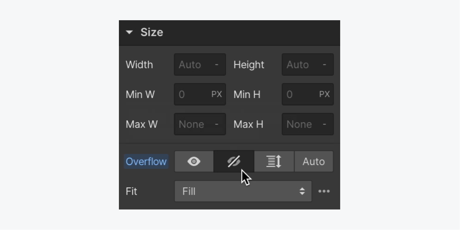
- Adjust Overflow to hidden
Learn more about Overflow: hidden.
How to integrate interactions to animate the banner
To establish the initial state where the banner is not visible:
- Select the banner and open the Interactions panel
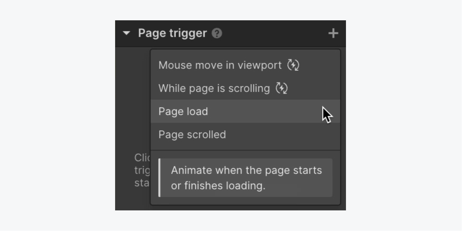
- Tap the “plus” icon on the right of Page trigger and choose Page load
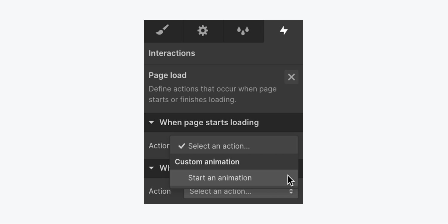
- Tap the Action dropdown menu in When page starts loading and opt for Start an animation
- Tap the “plus” icon on the right of Timed animations and name it (e.g., “Banner slide in”)
- Tap the “plus” icon on the right of Actions and select Transform > Move
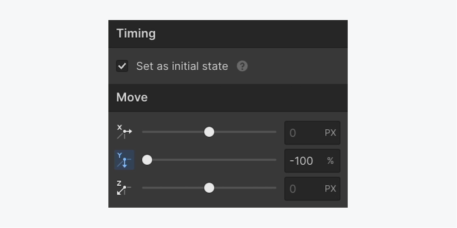
- Set the Y axis to -100% in Move
- Tick the Set as initial state checkbox in Timing
You have the option to craft the fully loaded state of the banner in the Interactions panel animation as follows:
- Choose the “plus” icon at the right side of Actions and opt for Change > Adjust
- Position the Y axis to 0% in Change
Deepen your understanding of Interactions through our Triggers and animations tutorial.
To have more influence over your animation, it’s possible to modify its speed or postpone it after the page has finished loading.
To vary its pace:
- Uncover Timing > Transition
- Select personalized to tweak the transition curve
To hold off the animation post page load:
- Access Timing > Beginning
- Create a deferment (e.g., 0.2 seconds)
Learn more about transition in our Transformation, ease, and smoothing workshop.
Methods for introducing interactions to change the banner shades
In the Interactions panel animation, you can adjust the banner’s background color post its entry:
- Single out the banner
- Tap the “plus” icon at the right of Actions and select Design > Background color
- Select the palette and opt for a color in Interactions > Background
- Define a wait (e.g., 2 seconds) in Timing > Beginning
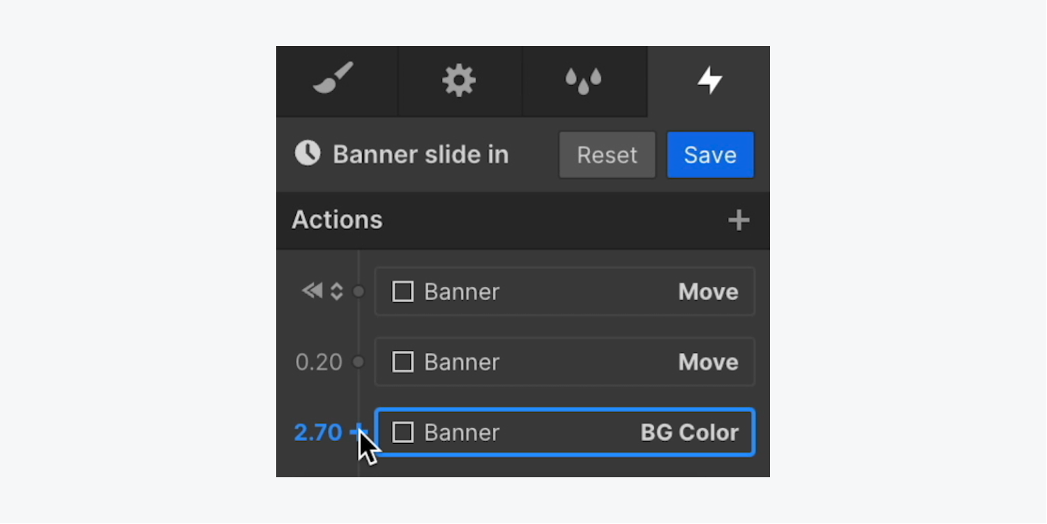
In the Interactions panel animation, you also have the capability to change the text color concurrently with the background color alteration:
- Pick the Paragraph
- Press the “plus” symbol located next to the BG color adjustment and pick Design > Text color
- Select the palette and choose a new text hue in the Interactions > Typography
