You have the ability to modify the Button component in your projects in a variety of ways.
Within this tutorial
In this tutorial, we’ll discuss four instances of advanced design:
- Button Positioning
- Clear Backgrounds
- Mouse-over Effects and transitions
- Container Shadows
Button Positioning
If you have multiple buttons sharing the same horizontal area, they might seem tightly packed together. You can insert padding on both sides to introduce spacing between them. Holding down the Alt key while adjusting the padding will widen the space on both sides of the button.
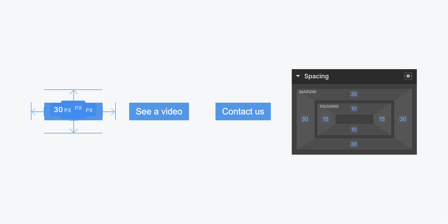
However, when other occurrences of this button are aligned to one direction, such as the left side, applying padding on both sides of the button will move them away from the left side alignment.
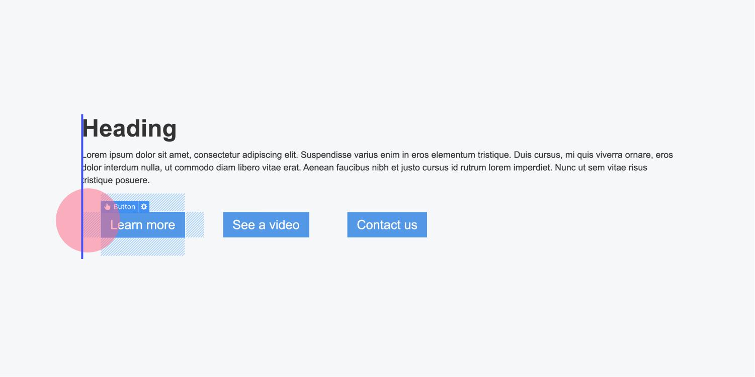
To counter this, you can take the following steps:
- Include a section block from the Insert panel
- Transfer existing buttons into the section block
- Assign a class name to the section block
- Apply a negative value to the left padding on the section block, equivalent to the padding added to the buttons (e.g., if there is a 20px left and right padding on the button, you should apply -20px left padding to the section block)
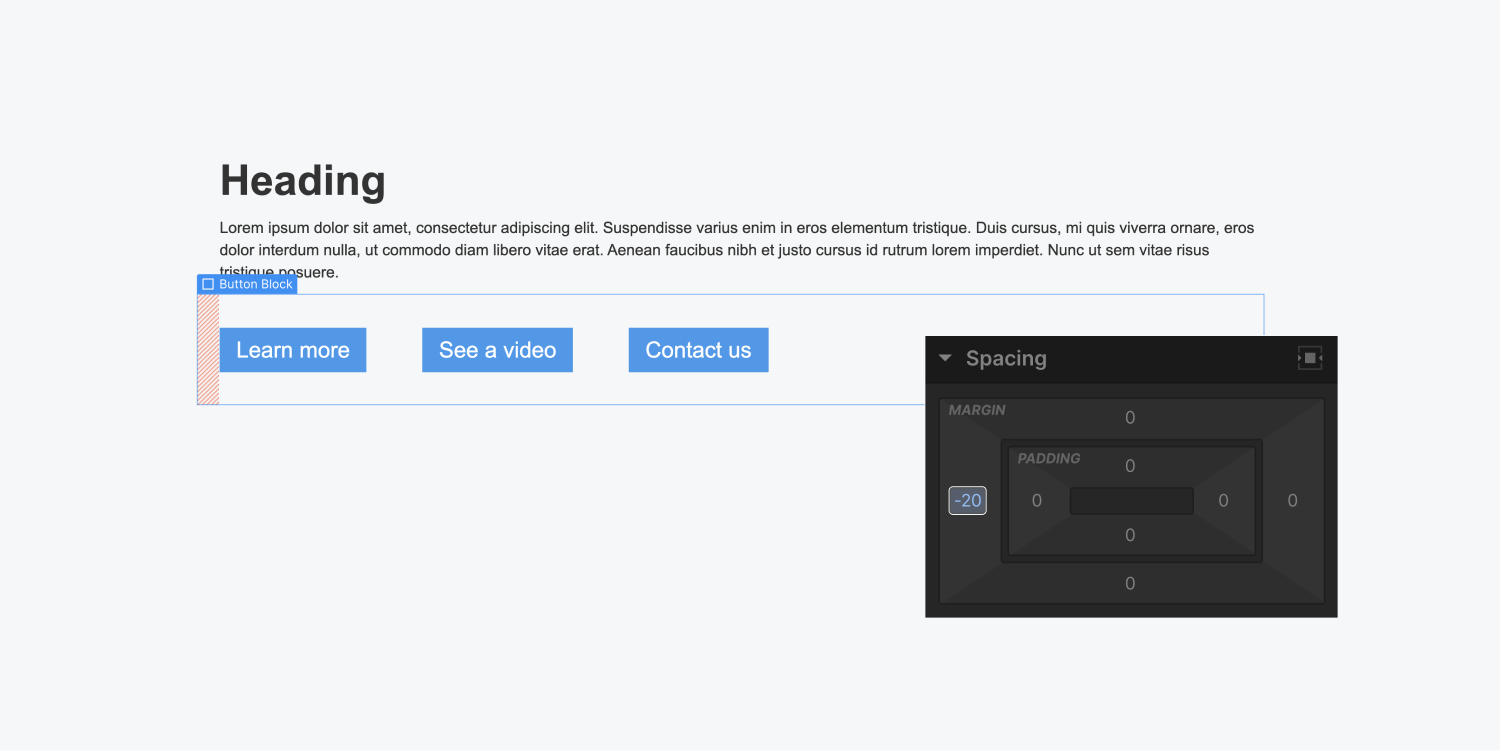
This method will maintain the alignment of left-aligned buttons along the left side. If there are buttons aligned to the center, the negative padding will not affect them.
Clear Background
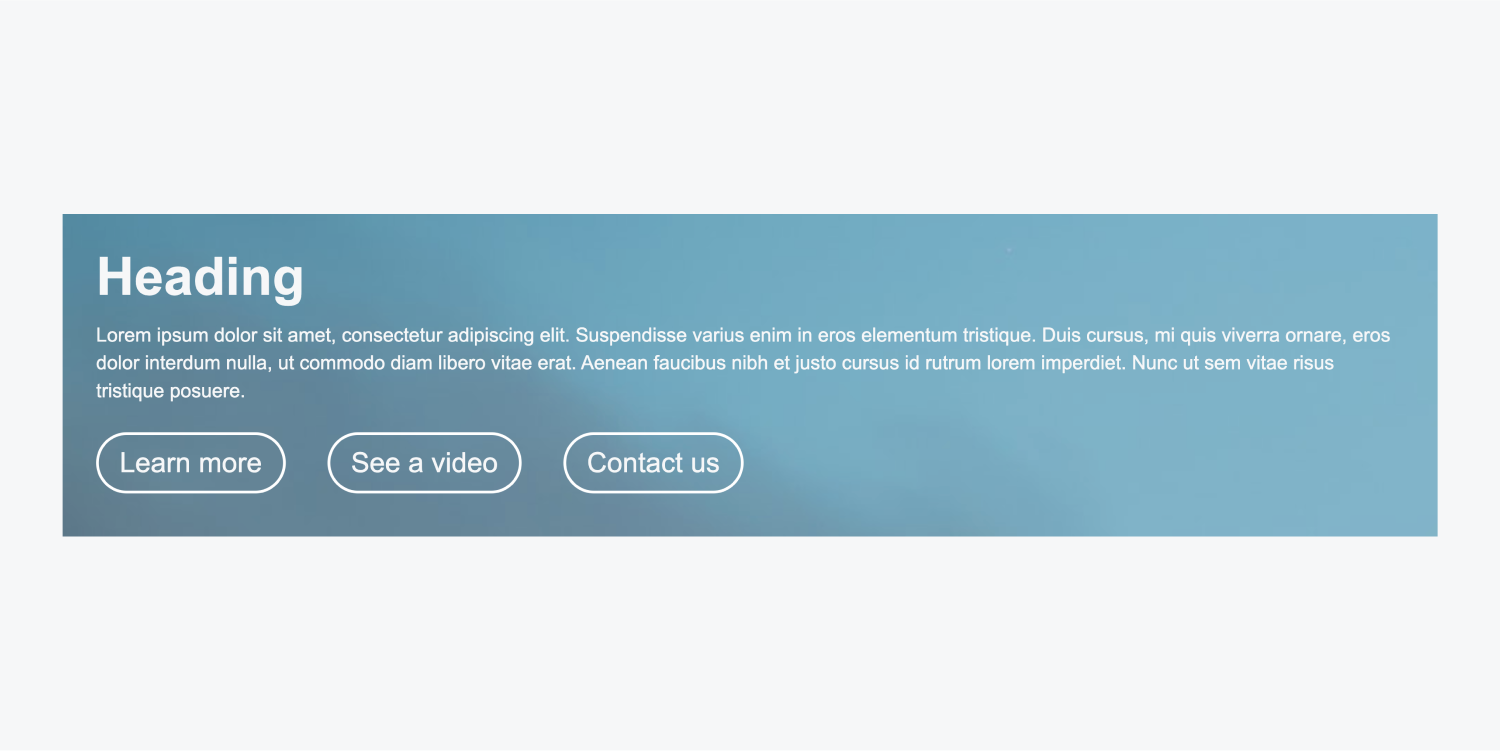
You can set a transparent background for buttons and differentiate them in other ways. For instance, you can include a solid color border.
The default background color is blue. You can modify the background color, transparency, and borders to your liking. Here’s how to create a button with a transparent background and a border:
- Insert a button and assign it a class name
- Adjust the opacity to 0% for the background color
- Include a 1px solid border and set the color to white
- Add border radius (a large radius, e.g., 500px, will generate a pill-shaped button)
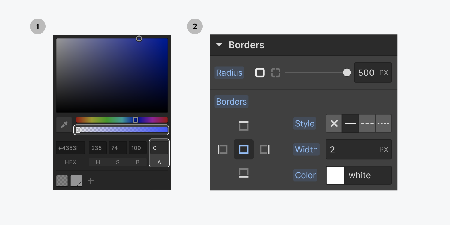
Mouse-over Options
By default, buttons do not possess special styles for hovering. By navigating to States and selecting the Hover state, you can define a completely different background color. For instance, you can even alter the opacity of the background color.
You can add various styles on hover, such as moving the button upwards by applying a transform – move.
Discover more:
Container Shadows
It’s common practice to include shadows when interacting with buttons. Box shadow styles offer a substantial level of control over these shadow effects.
Learn more:Utilizing box shadows
- Include or eliminate Workspace spots and members - April 15, 2024
- Centering box summary - April 15, 2024
- Store a site for future reference - April 15, 2024
