Enhance the experience of your homepage by showcasing a compilation of customer projects from your CMS Collection data, which can be effortlessly updated in the future. Delight your visitors with a consistent layout, visual patterns, and flow in your design — and pave the way for success by establishing a Heading hierarchy.
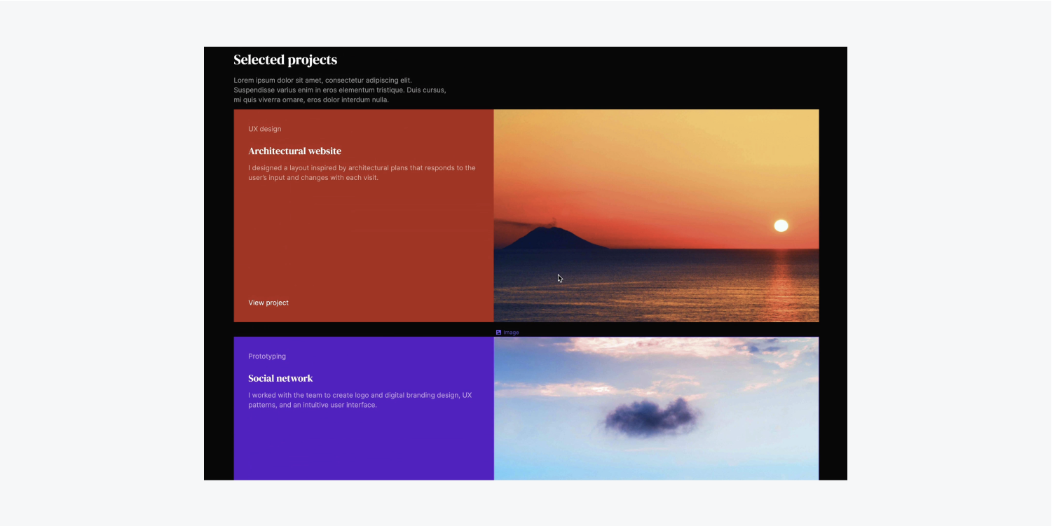
Within this tutorial, you will master the incorporation of a CMS Collection into your project and the integration of its data into your visual design utilizing the following steps:
- Establish the framework
- Generate a CMS Collection
- Include a CMS item
- Import projects from CSV
- Develop the design
Follow the instructions and access the resources for this session.
Establish the framework
Let’s introduce a Segment to exhibit customer projects on the homepage:
- Access the Navigator
- Expand the Add panel
- Drop a Segment into the Navigator and position it below the existing Segment
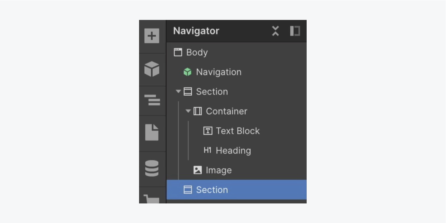
Let’s apply the existing “Segment” class to our new Segment to retain the 60 pixels of top and bottom padding previously styled:
- Access the Style panel
- Enter the Selector field
- Select “Segment” from Existing classes
Insert a Heading into our latest Segment and assign it as H2 since the initial, top-tier Heading is marked as H1:
- Launch the Add panel
- Drag a Heading into the fresh Segment
- Designate H2 as the heading type
Modify the H2 text by double-clicking and entering the preferred heading (e.g., “Chosen projects”)
Let’s duplicate the “Heading” class on the H2 to produce a new alternative heading class with distinct styles:
- Access the Style panel
- Enter the Selector field
- Select “Heading” from Existing classes
- Click the “Heading” class and opt for Replicate class from the dropdown
- Revise the class name (e.g., “Secondary heading”)
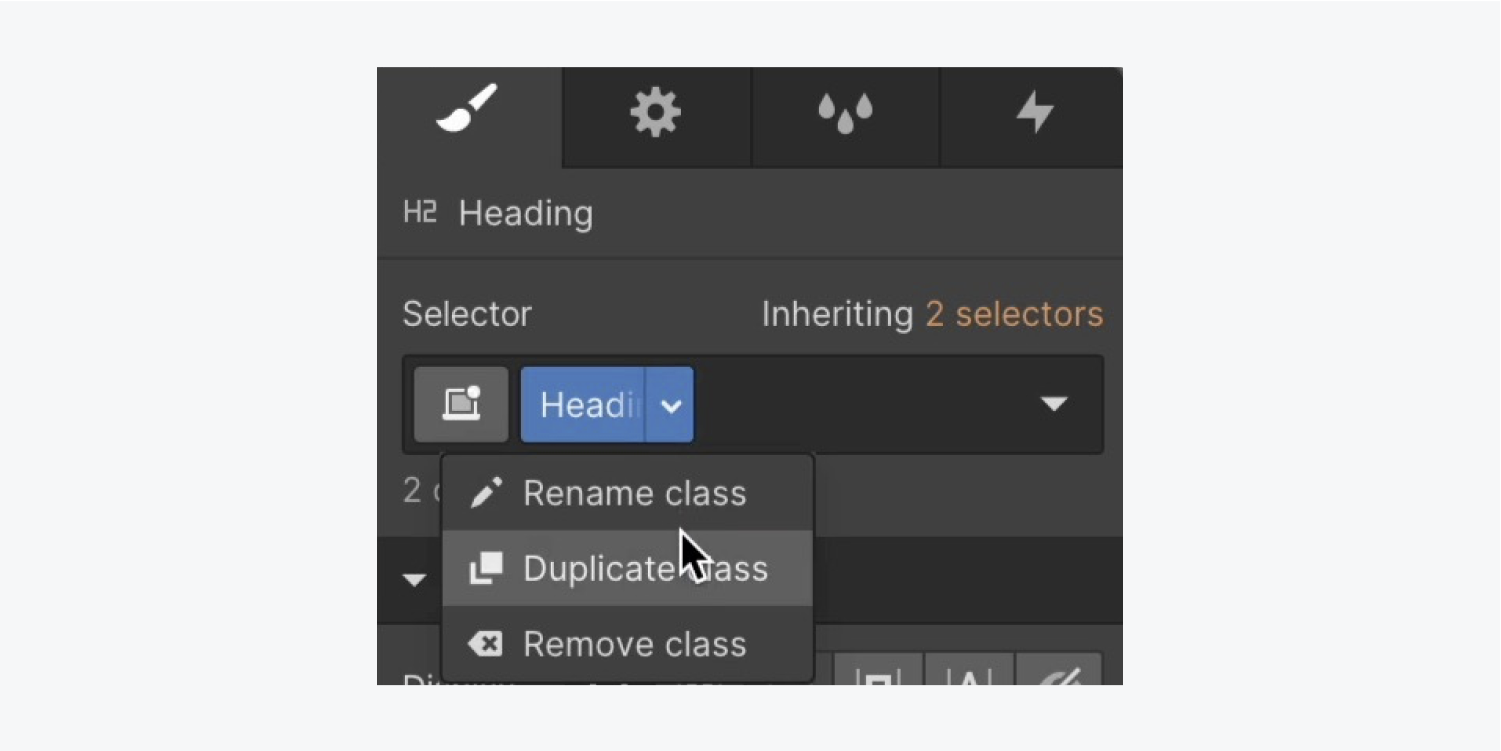
Refer to the guidance on duplicating classes.
Since the H2 should be smaller than your H1 for visual hierarchy purposes, let’s reduce the font size on the new “Secondary heading” class:
- Access Style panel > Typography
- Adjust the font Size to 28 pixels
To confine your H2 neatly within the new Segment, introduce a Container to the fresh Segment and nest the H2 within the Container:
- Expand the Add panel
- Drop a Container into the recent Segment
- Select the “Secondary heading” and place it inside the Container
- Choose the Container and go to the Selector field
- Select “Container” from Existing classes
Note: When you assign a class to an element, all style adjustments made on that element are saved within that class. You can utilize the class on other elements to instantly apply the saved styles.
Insert a Paragraph into the Container and assign it a narrower maximum width:
- Open the Add panel
- Under “Secondary heading”, drag a Paragraph
- Access Style panel > Size
- Set Max W to 450 pixels
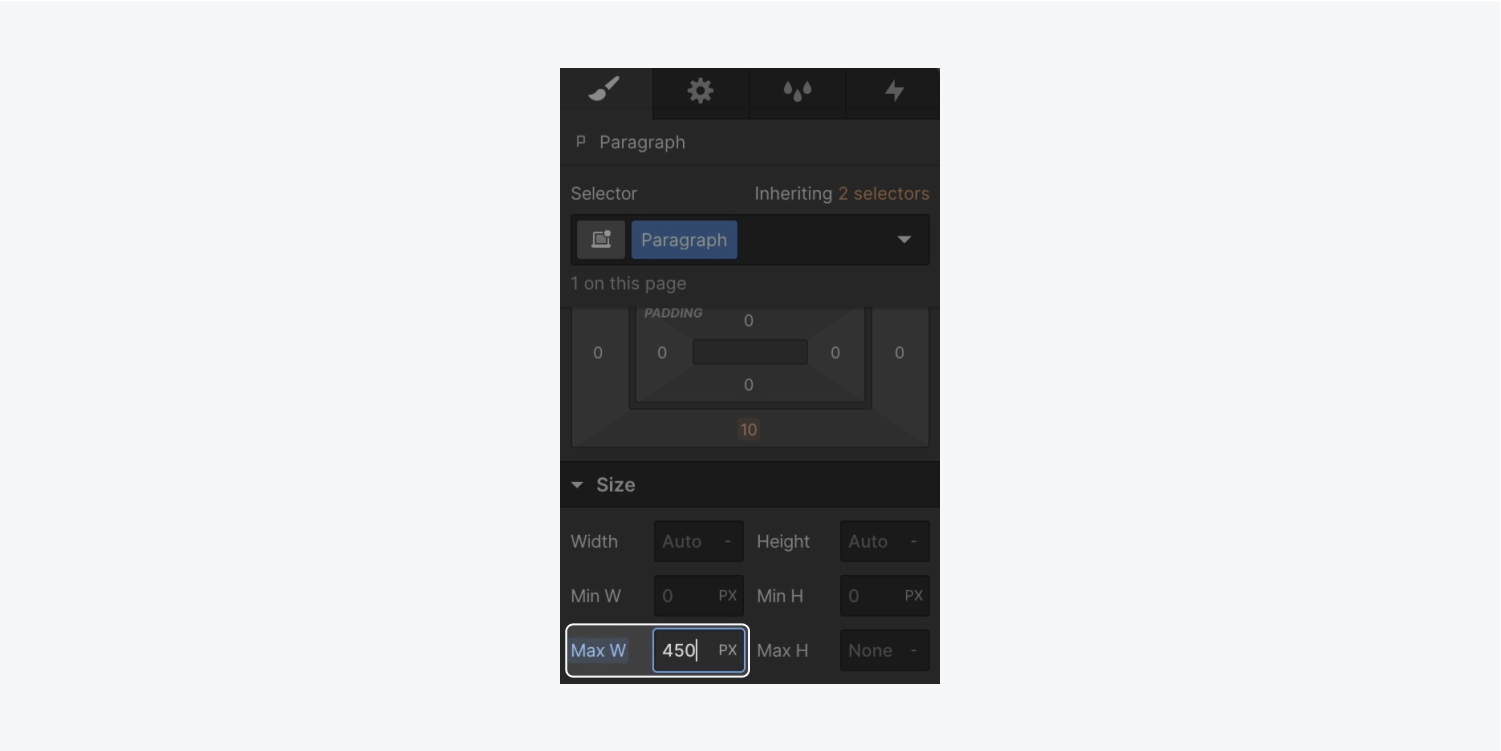
Minimize the space between the “Secondary heading” and the Paragraph:
- Select the “Secondary heading”
- Expand Style panel > Spacing
- Decrease the bottom margin to 15 pixels
Also, adjust the opacity of the Paragraph:
- Select the Paragraph
- Open the Style panel > Typography
- Access the color picker and adjust the opacity to 60
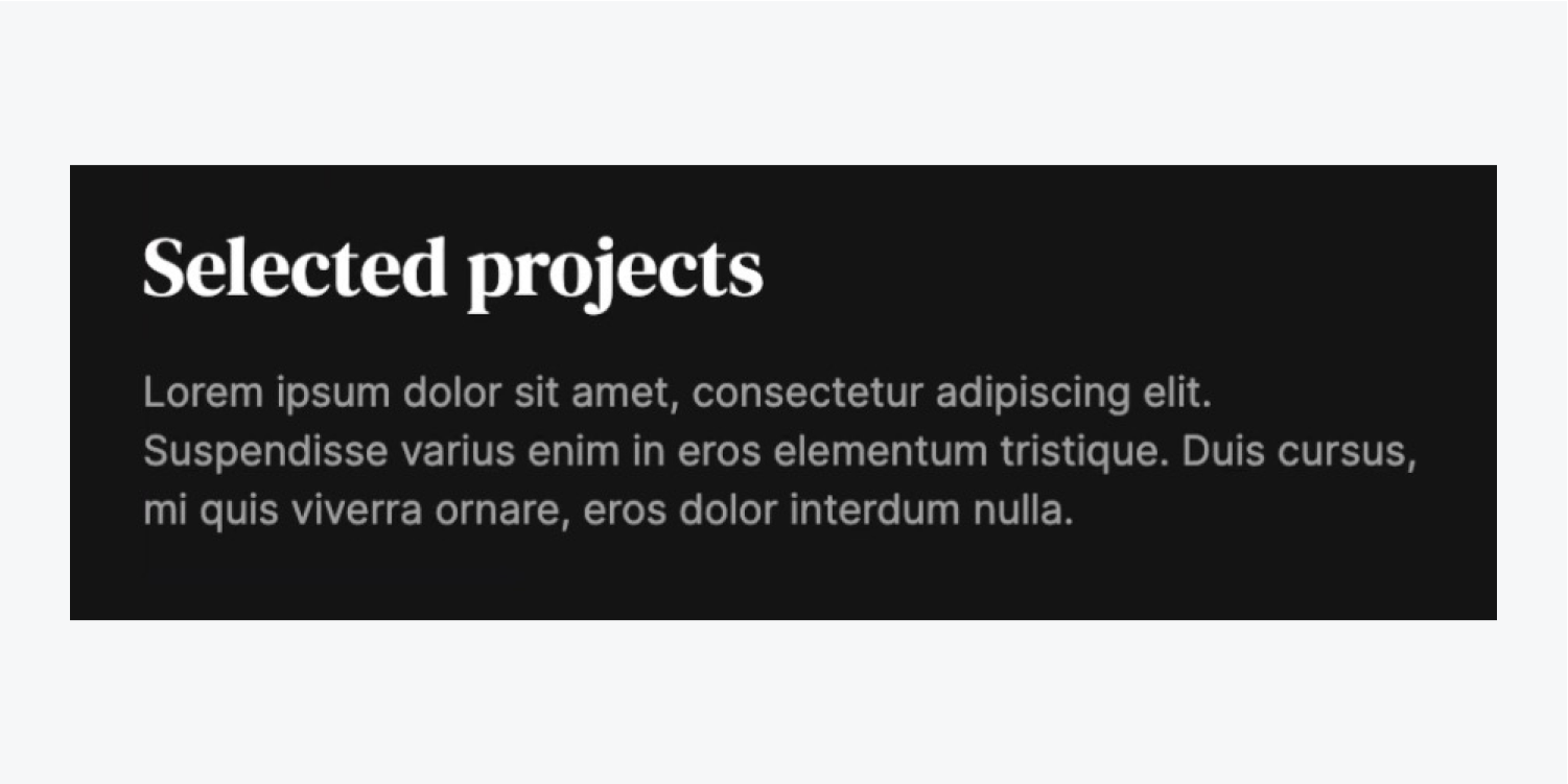
Information: Embed accessibility by utilizing the contrast checker for making color selections that are more accessible.
Let’s delete the 20-pixel top margin from our “Secondary title” to ensure consistent spacing among components:
- Choose the “Secondary heading”
- Access Style panel > Spacing
- Adjust the top margin to 0 pixels
Construct a CMS Collection
A CMS, known as a content managing system, allows us to configure a database for organizing various data types visually. This data, comprising client undertakings, blog entries, or menu listings, can significantly support the design process.
By linking segments of our design to our dataset (using placeholders), we streamline the process of creating designs that reflect our Grouping standards.
Introduce a Grouping Collection into our venture and formulate the layout to organize our data:
- Open the Grouping panel positioned on the Designer’s left side
- Click on the “Establish Grouping Collection” option
- Assign a name to your Grouping (e.g., “Tasks”)
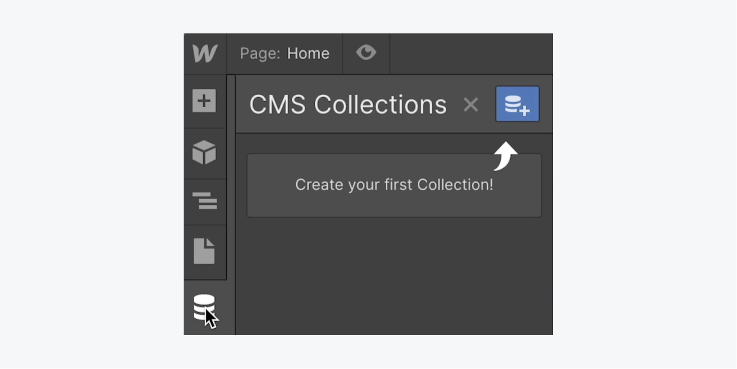
Since each Grouping item contains the information for each client project that you plan to exhibit, you should define fields for all data categories you wish to monitor.
Let’s append our initial Grouping field to the Grouping:
- Click on “Title” underneath Essential details in Grouping fields
- Modify the default text (e.g., “Task title”)
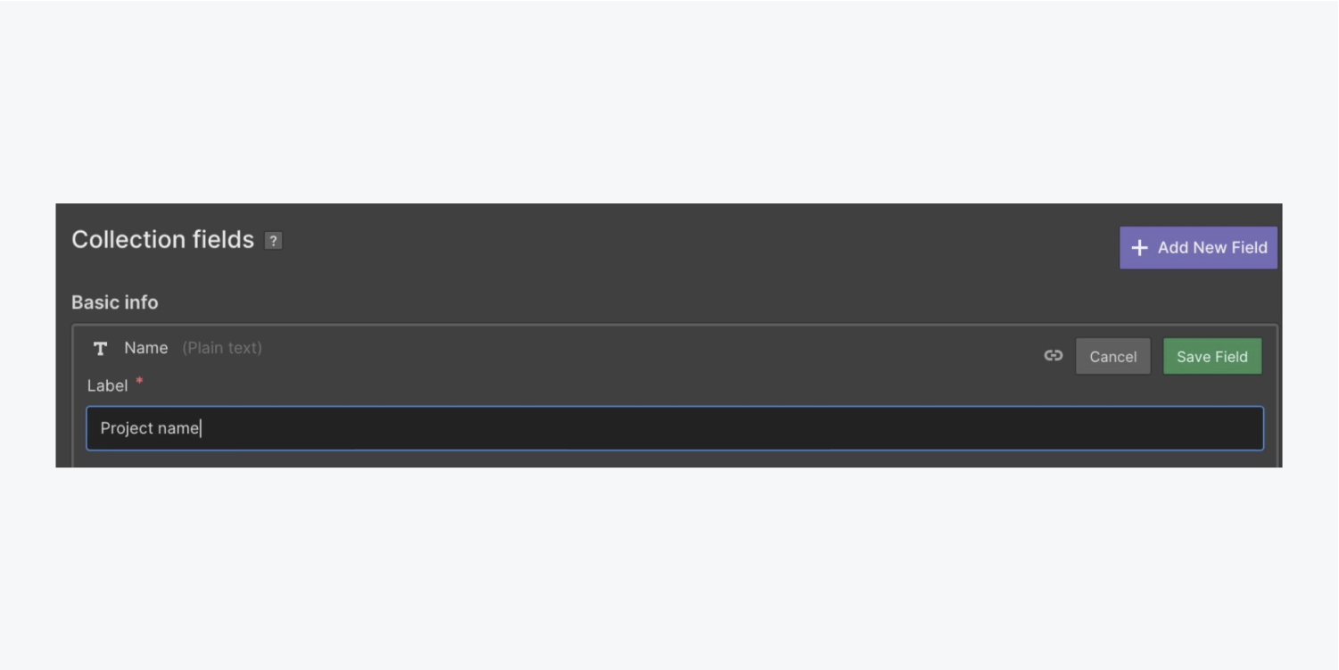
We will include an additional 8 personalizedGrouping fields, each destined to hold unique data related to:
- Patrons
- Task illustration
- Task shade
- Task category
- Task period
- Patron identity
- Task reference
- Various task illustrations
Let’s integrate the “Patrons” Grouping field, encompassing a succinct overview of the client:
- Click the Incorporate new field option
- Select Plain text as the Field category
- Append a Title (e.g., “Concise task description”)
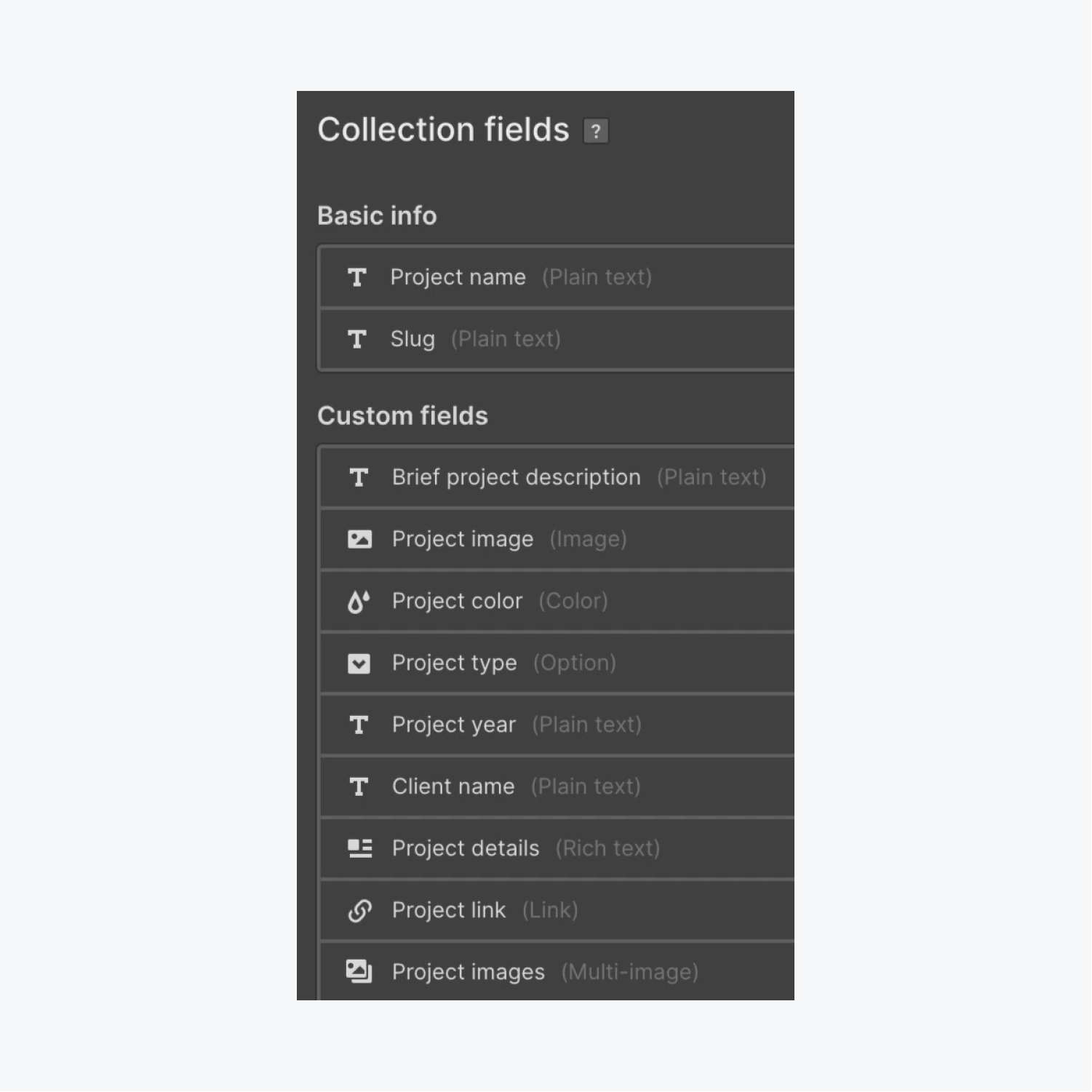
Hit the “Generate collection” button to produce and store this assortment.

Include a CMS item
Once the “Generate collection” button is pressed, a database is initialized where you are able to append a fresh project:
- Utilize the “New project” option to produce your primary project within your Collection

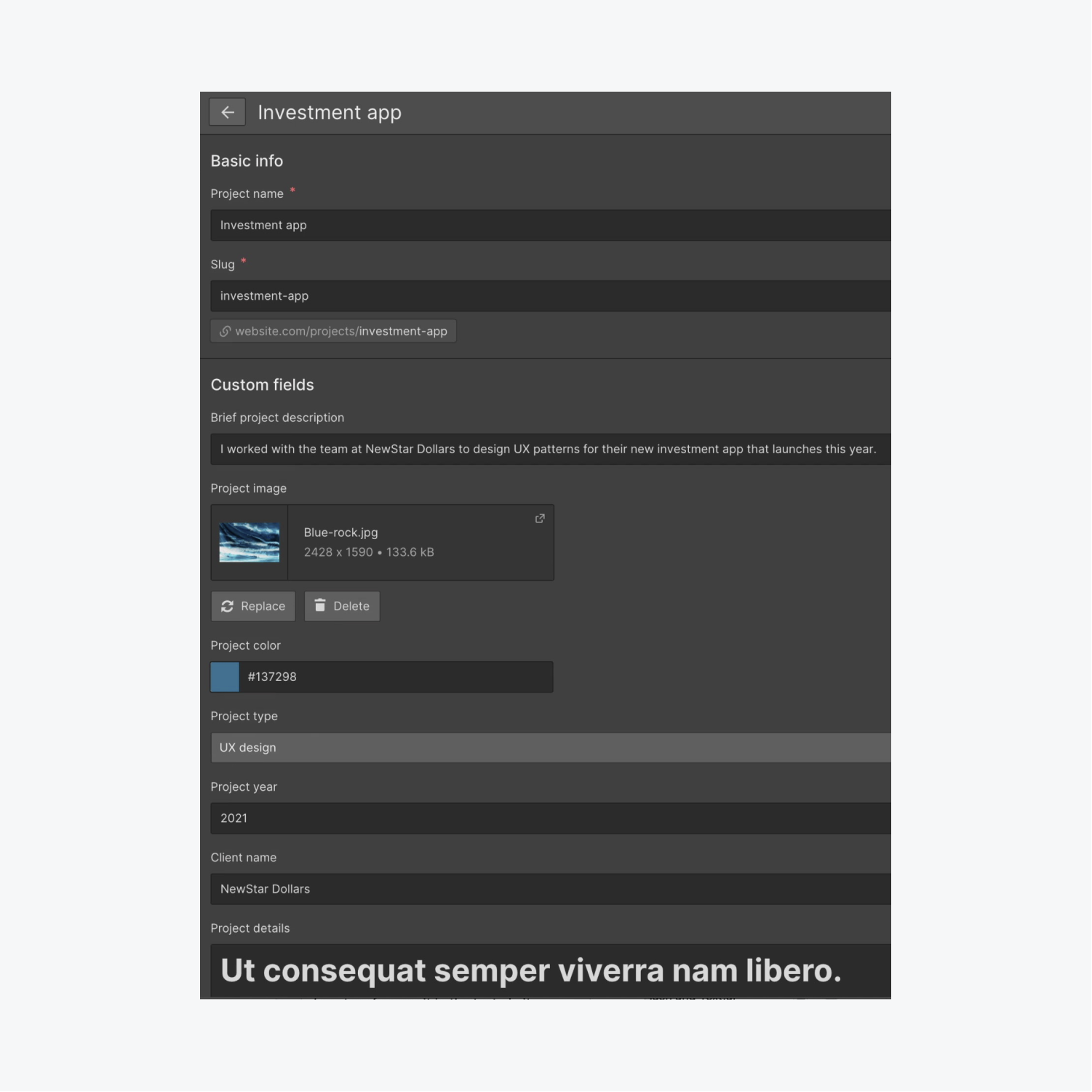
We should input details into the Collection fields we set up, which then appear in the corresponding project within our Collection:
- Assign a name to the project in the “Project name” section (e.g., “Finance app”)
- Attach a summary to the “Short project description” area (e.g., “I collaborated with NewStar Dollars to devise UX designs for their upcoming finance app.”)
- Drop an Image into the “Project image” slot (e.g. “Green-mountain.jpg”)
- Paste the “Project color”(e.g., “#6789ab”)
- Opt for the “UI design” preference from the “Project type” dropdown
- Include a “Project year” (e.g., “2022”)
- Add a “Customer Name” (e.g., “NewStar Dollars”)
- Type or paste content into the “Project details” section (this can be placeholder text like Lorem Ipsum)
- Integrate a “Project link” (e.g., “yahoo.com”)
- Gather various Images into “Project pictures” (e.g., “Green-blue-shade.jpg,” “Green-red-shade.jpg,” “Green-valley.jpg,” and “Color-splash.jpg”)
- Hit “Generate” to record the new CMS item

Bring in projects from CSV
You have the option to manually enter this data for each additional project you wish to generate, but there exists a quicker method to achieve this.
If you possess all your desired data for the CMS Collection in CSV (comma separated value) form, you can directly import it into your Collection. To prevent making duplicate projects, it’s prudent to arrange the CSV file and eliminate the “Finance app” project you manually included during the preceding processes:
- Access the “Client projects.csv” file and erase the fifth row (e.g., the “Finance app” project)
- Save the “Client projects.csv” file

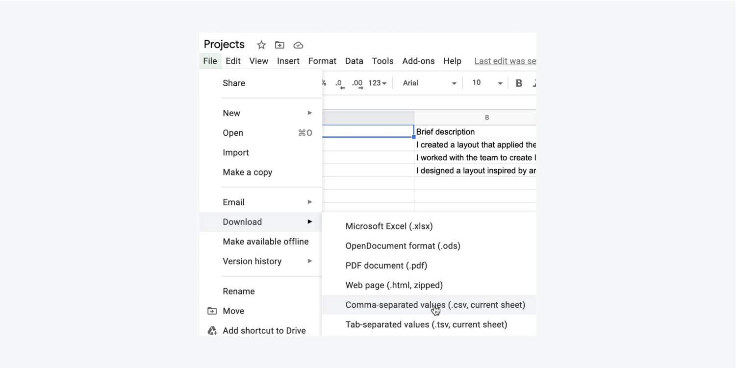
Now that the CSV file is prepped, let’s import its contents:
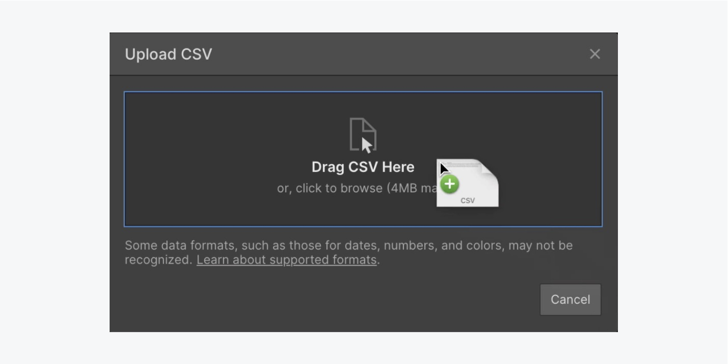
- Access your “Projects” CMS collection in Webflow
- Click on “Import” and drag your CSV file (e.g., “Client projects.csv”) into the Upload CSV overlay

Declare that the upper row in the CSV serves as the header and click on “Continue.”
Associate each of the field kinds to the material in your CSV:
- Press the dropdown beside “Brief description” and select “Map to existing field”
- Hit the “Select field” dropdown and opt for “Brief project description”
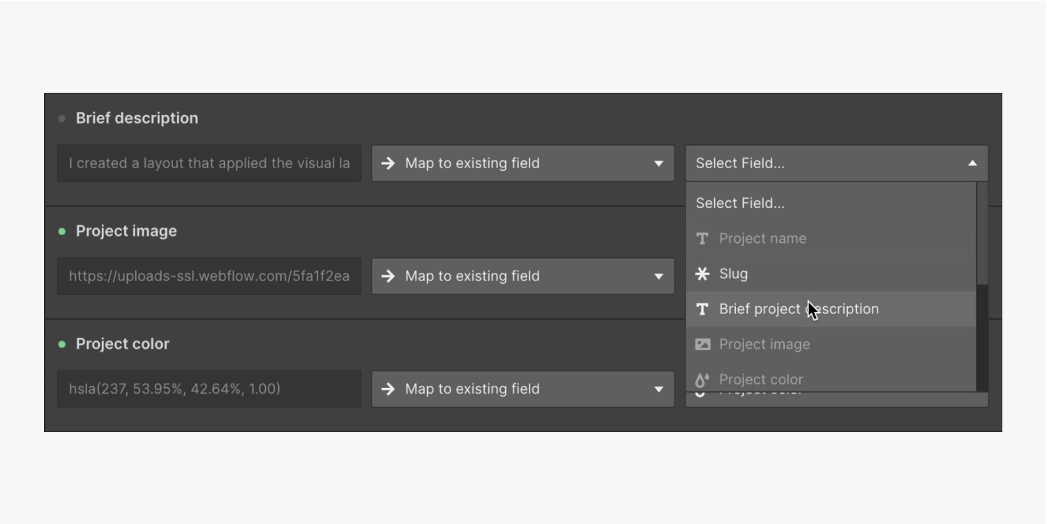
Reminder: In certain cases, fields might not align automatically with your imported CSV content if the CSV field isn’t phrased precisely as in your Collection. In such instances, you can manually align your fields. Find additional information regarding importing Collection items.
Redo the previous 2 steps to align the remaining “Project type” and “Link to project” fields.
After aligning all fields, hit “Import 3 projects” to bring in all your CMS content and tap on “Close” once the process finishes.
Reminder: Simply tap on the “pin” symbol on the top right of your Collection to get a preview of specific fields you’ve configured for your Collection data.
Develop the layout
Shut down the Collection to go back to your homepage and embark on designing with the data you’ve included.
We will utilize a Collection list to store that data, and we’ll configure it to refer to the “Projects” Collection you recently established. Let’s embed a Collection list onto your page:
- Uncover the Add panel
- Scroll through to CMS
- Drop a Collection list into the Container and underneath the Paragraph
Once you insert a Collection list into your page, placeholder Collection items automatically pop up. To integrate your data into the placeholder Collection items, you initially need to connect the Collection list with your Collection:
- Select “Projects” (your Collection) as the Source in the Collection listsettings prompt
Let’s insert components into our Collection list kicking off with a Heading:
- Launch the Add panel and drag a Heading into any of the Collection items
- Transform the Heading into an H3 respecting the heading hierarchy
We will witness “Heading” replicated four times on our page — one heading for every Collection item. Let’s bind the Heading with the data in our Collection and observe our distinct information manifest:
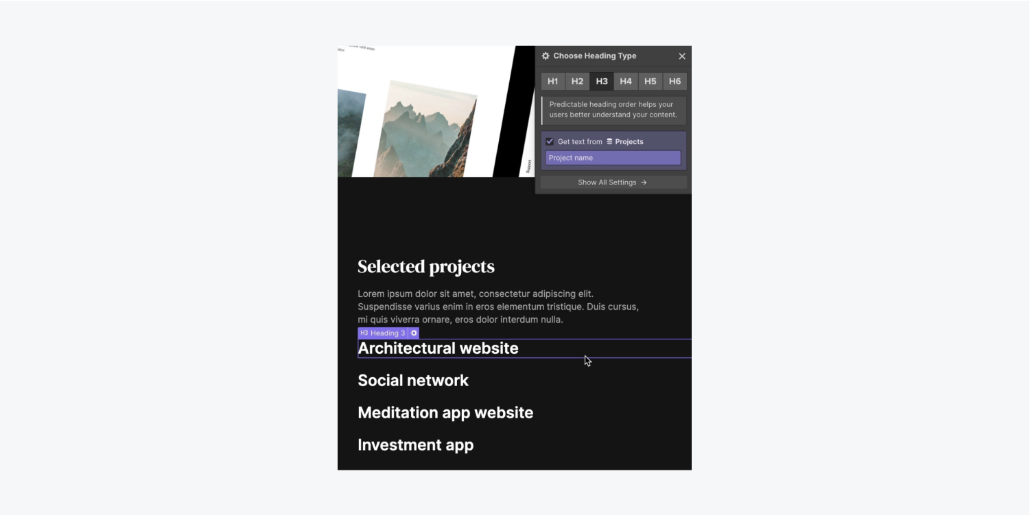
- Press the settings of the Heading located under the cog icon
- Tick “Retrieve text from Projects”
- Uncover the dropdown “Select field” and opt for the field to associate with the Heading (e.g., “Project name”)
Add a Paragraph inside the Collection list and associate it with our Collection data:
- Access the Add panel and drag a Paragraph into any of the Collection items below the Heading
- Tick “Retrieve text from Projects”
- Launch the dropdown “Select field” and opt for the field to connect with the Paragraph (e.g., “Brief project description”)
Integrate a Text block within the Collection list and tie it with ourAggregation information:
- Initiate the Include panel and drag a Text module into any of the Collection objects above the Header
- Verify “Obtain text from Projects”
- Initiate the “Choose field” dropdown and opt for the field to associate with the Text module (e.g., “Project category”)
Include another Text module into the Collection lineup — but this time we will not connect it to our Aggregation information:
- Initiate the Include panel and drag a Text module into any of the Collection objects beneath the Text
- Double-tap the Text module to modify the predefined text (e.g., “Investigate project”)
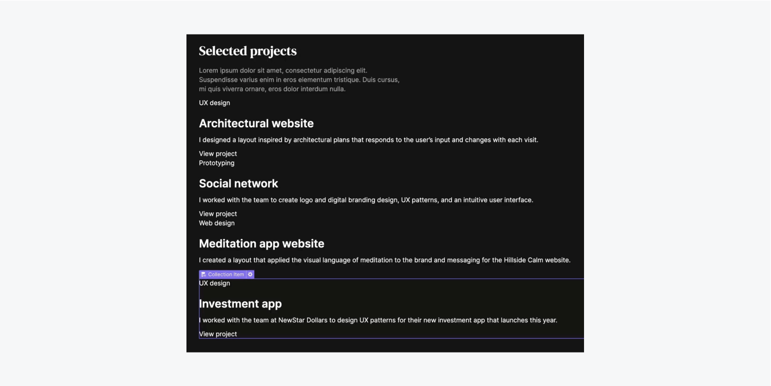
Indication: Upon altering any single Collection object, it influences all remaining Collection objects in the identical Collection lineup. Find out more about Collections.
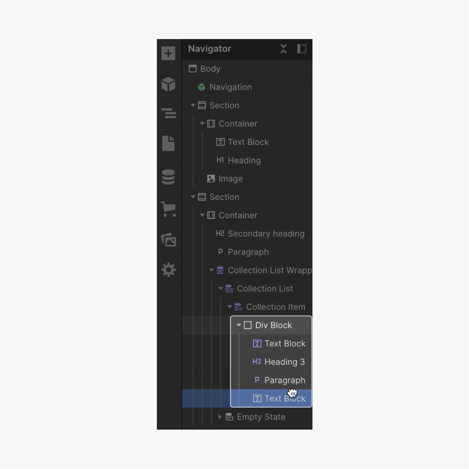
Let’s enhance the appearance and introduce a Block divider to accommodate the 4 elements we previously inserted:
- Pick the Collection object
- Initiate the Include panel and drag a Block divider into any of the Collection objects above the initial Text module
- Move the Text module, Header, Text, and last Text module into the Block divider
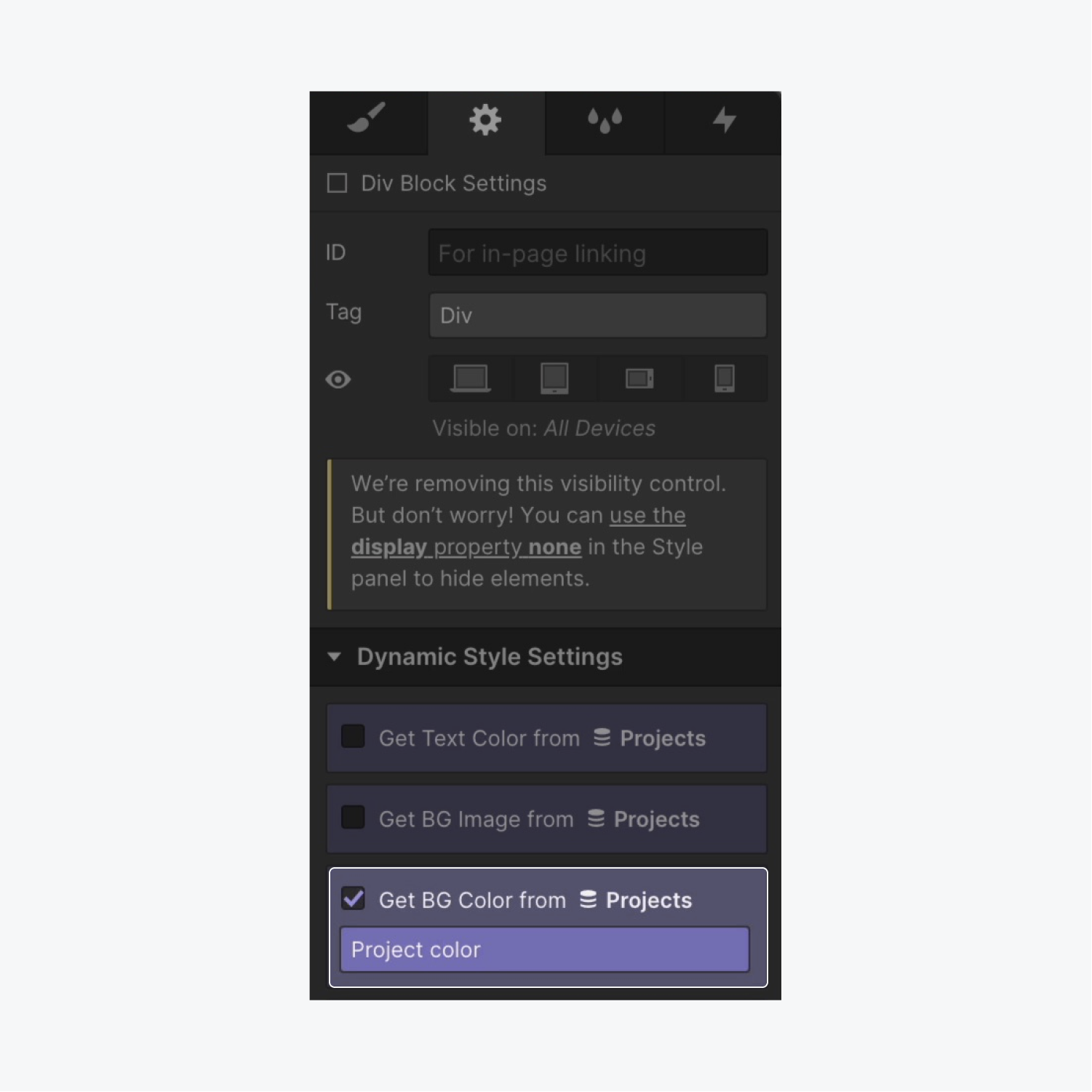
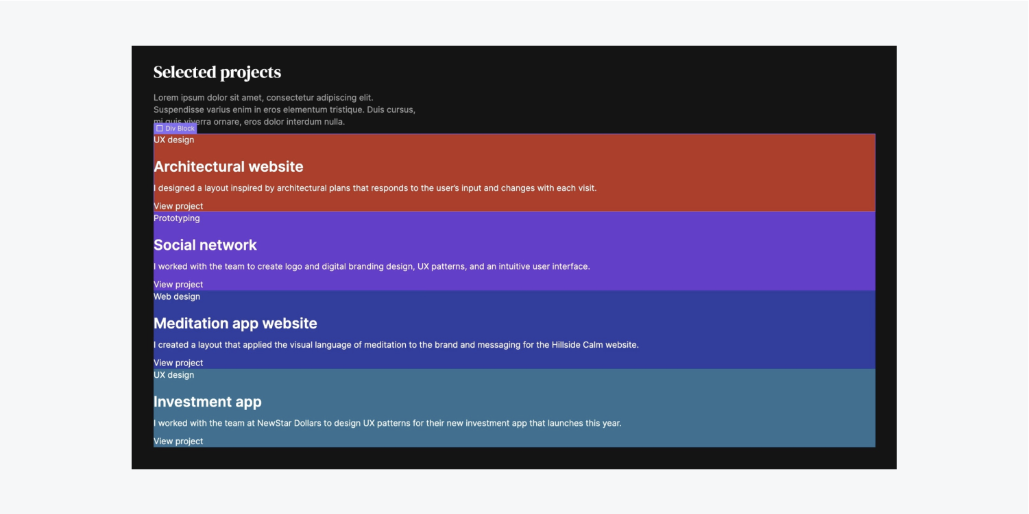
Let’s style our Collection objects according to each object’s information from our Collection. In this instance, we’ll adjust the background shade on the Block divider to utilize the color from our Collection:
- Choose the Block divider and open the Element configurations on the right of your screen
- Verify “Obtain BG Color from Projects”
- Enter the “Choose field” dropdown and select “Project shade”
Let’s introduce space between each Collection object and incorporate some spacing:
- Pick a Collection object
- Initiate Design panel > Void
- Incorporate undermost spacing of 30 pixels
Incorporate an Art piece to the Collection object:
- Drag an Art piece from the Include panel into the Collection object beneath the Block divider
- Verify “Obtain image from Projects” in the Art piece settings modal
- Initiate the “Choose field” dropdown and opt for the field to associate with the Art piece (e.g., “Project image”)
Let’s utilize CSS lattice on our Collection object to arrange them in a more aesthetically pleasing manner:
- Choose the Collection object — the root element of both the Block divider (containing all the data within it) and the Art piece
- Initiate Design panel > Layout
- Arrange Manifestation to Lattice
By default, the Lattice presents 4 sectors — 2 columns and 2 rows. Let’s retract the lower row to design a 2-by-2 lattice:
- Right-click the lower row and opt for “Remove row”
Let’s eliminate the void between the lattice cells to create a parallel design:
- Tap “Concluded” to complete the adjustment of the Lattice
Indication: While your Lattice is chosen, you can also regulate the gap between lattice cells by selecting Edit lattice under Layout in the Design panel.
Let’s push our text farther from the edges of our Block divider and incorporate some padding:
- Pick the Block divider and unveil Design panel > Void
- padding to 30 pixels on all boundaries
Indication: You can promptly contribute margin or padding to all boundaries of an element by holding Down, and pulling one of the margin or padding controls.
Select the Block divider and bestow it a distinct classification instead of its inherent “Block divider” category (e.g.,“Details of the assignment”)
Let’s utilize Flexbox on our recently rebranded “Description of the assignment” Container to enable us to organize our content in a horizontal or vertical manner — for this illustration, we are going to opt for a vertical layout:
- Pick the “Description of the assignment” Container
- Access the Design panel > Layout
- Change the Display setting to Flex and adjust the Direction to Vertical
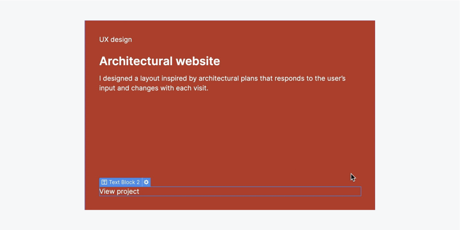
Additionally, let’s utilize Flexbox to assist us in positioning the “View project” Text container towards the very bottom of the “Description of the assignment” Container (its parent element):
- Choose the bottom Text container
- Open the Design panel > Spacing
- Change its top margin to Auto
Choose the H3 Title and assign a class as well as some styling:
- Select any H3 Title within your Group item
- Enter the Selector area and allocate a class (e.g., “Preview of project name”)
- Access the Design panel > Typography and modify its font (e.g., “DM Serif Display”)
- Adjust its weight to 400
- Reduce the font size to 20 pixels
Let’s decrease the transparency of the upper Text containers:
- Pick any upper Text container within your Group item
- Open the Design panel > Typography
- Click on the color picker and reduce the opacity to 63
Select the Text section within your Group item and iterate the prior 2 actions to also diminish its transparency to 63.
Access the Selector area and rename the default class of the Text section (e.g., “Preview of project type”).
Also, tweak the appearance of our Grid to refine the layout:
- Pick the Group item
- Press “Modify grid”
- Adjust the FR (fraction units) of the Grid to .8FR
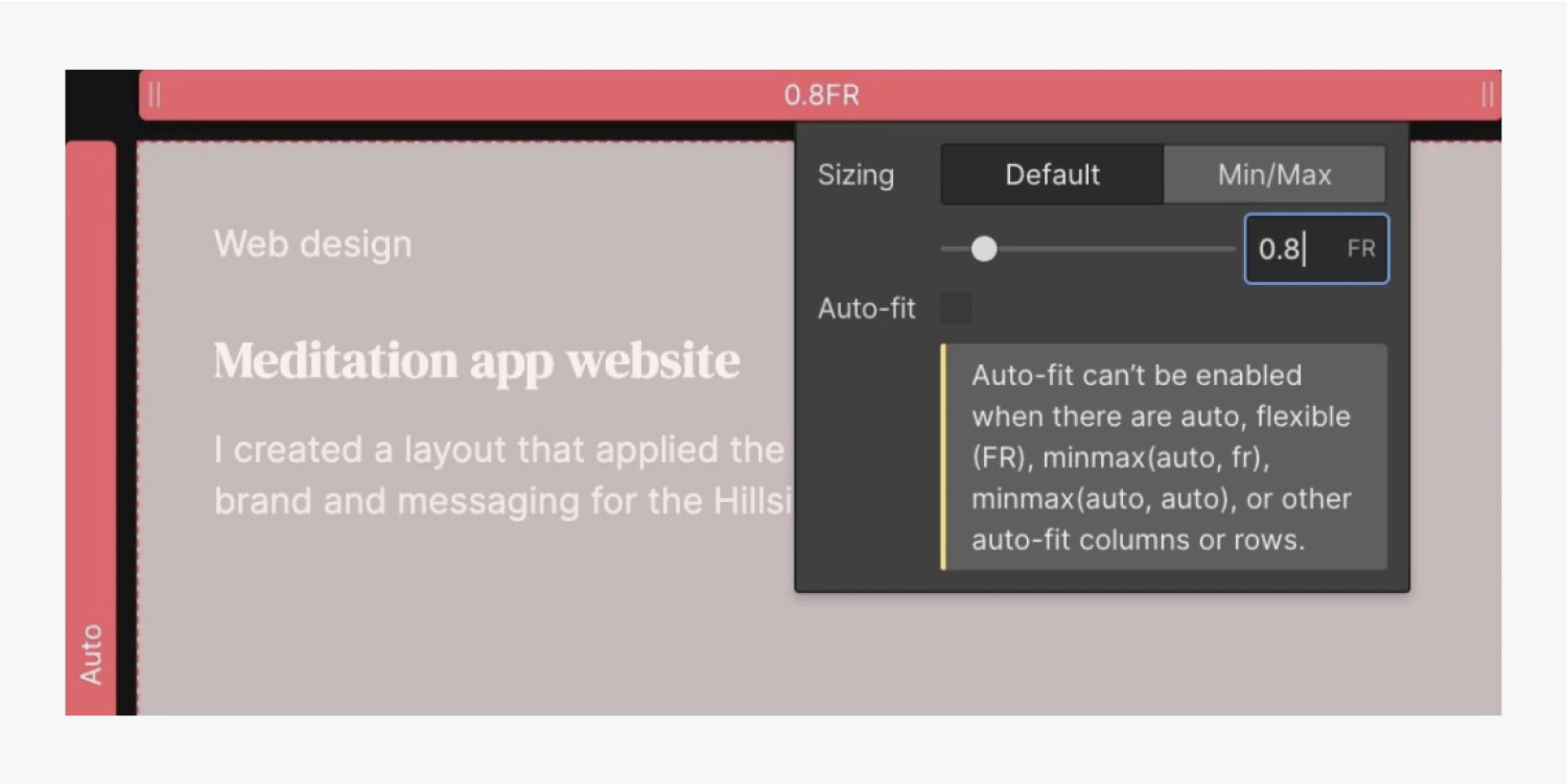
Reminder: You can precisely adjust the FR units of your Grid by clicking onto the row or column header of the grid cell and inputting your specific FR value.
Lastly, ensure proper organization of classes and assign a class to the bottom Text container (e.g., “Text for button”).

Excellent job — showcase those projects you have!
