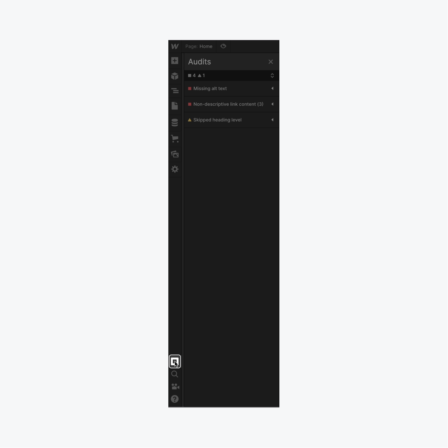
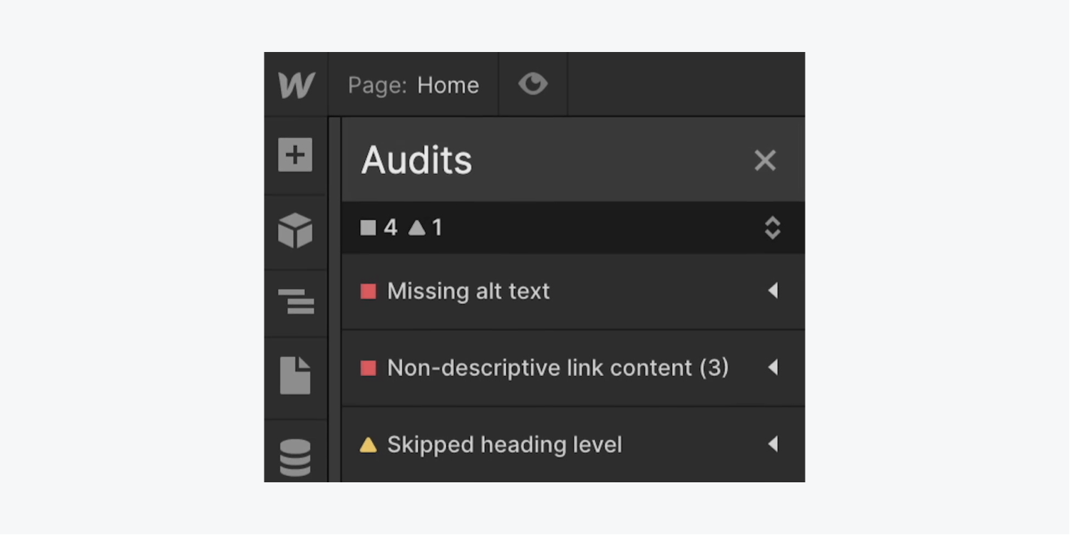
The Audit dashboard highlights common issues related to accessibility so you can rectify them before making your site live. Critical errors (flagged with a red square) indicate issues where your users might miss crucial site content or experience degraded search performance. Moderate errors (flagged with a yellow triangle) signify important issues that are not imperative to fix.
This tutorial will provide you with insights into the Audit dashboard including:
- Spotting accessibility issues
- Resolving accessibility issues
- Disregarding accessibility issues
- Reconsidering accessibility issues
To delve deeper into accessibility, sign up for our accessibility course.
Note: The Audit dashboard does not analyze accessibility issues within components. Therefore, carefully identify and address any accessibility concerns within components manually. Discover more about components.
Spotting accessibility issues
The Audit dashboard currently consists of 4 impactful accessibility checks to help you identify and address common issues during the design phase. It focuses on:
- Missing alternative text
- Non-informative link content
- Skipped heading levels
- Repetitive element IDs
By utilizing the Audit dashboard and learning from the flagged issues, you can enhance your skills and awareness of these considerations so they are integrated into your design and development workflow rather than being an afterthought.
Access the Audit dashboard by clicking the Audit dashboard icon located at the bottom left corner of the Designer.
Expert tip: Use Alt/Option + U on your keyboard to quickly expand or collapse all items in the Audit dashboard.
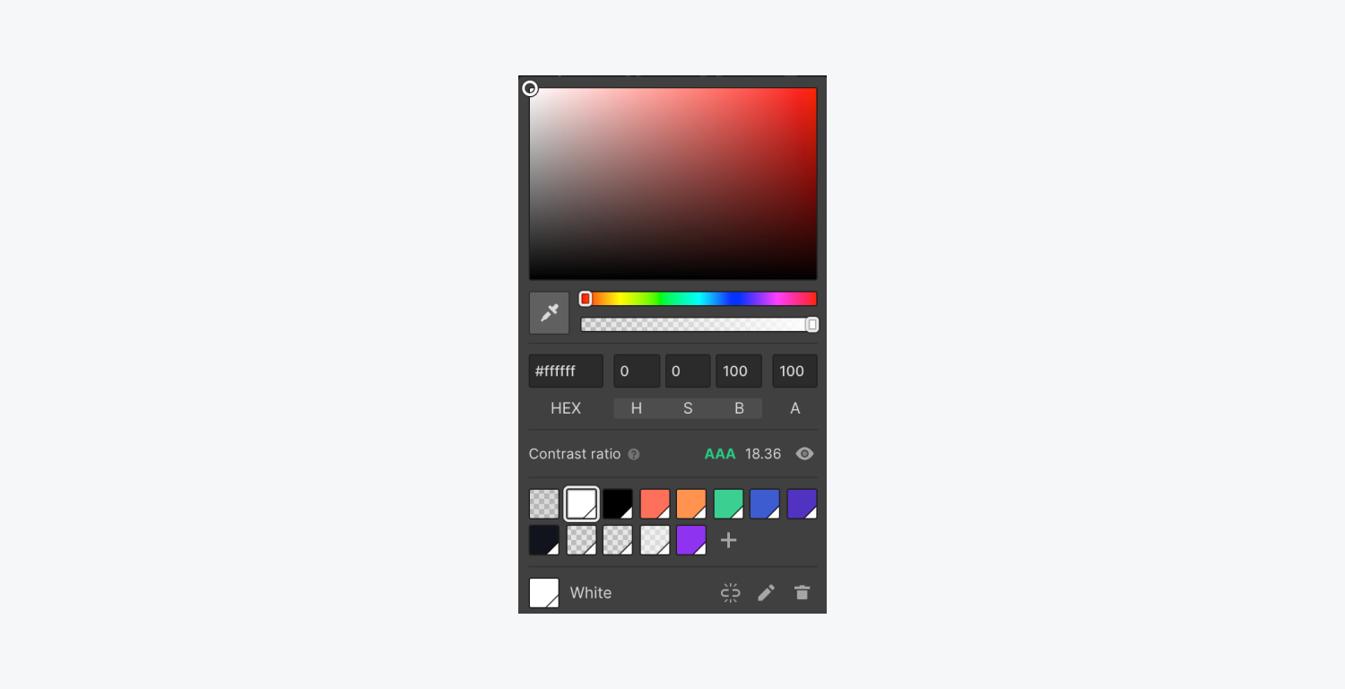
Handy tip: The Audit dashboard does not cover checks for text color contrast ratios, but Webflow provides an embedded color contrast checker in the color picker for text elements to help you verify your text’s accessibility while designing.
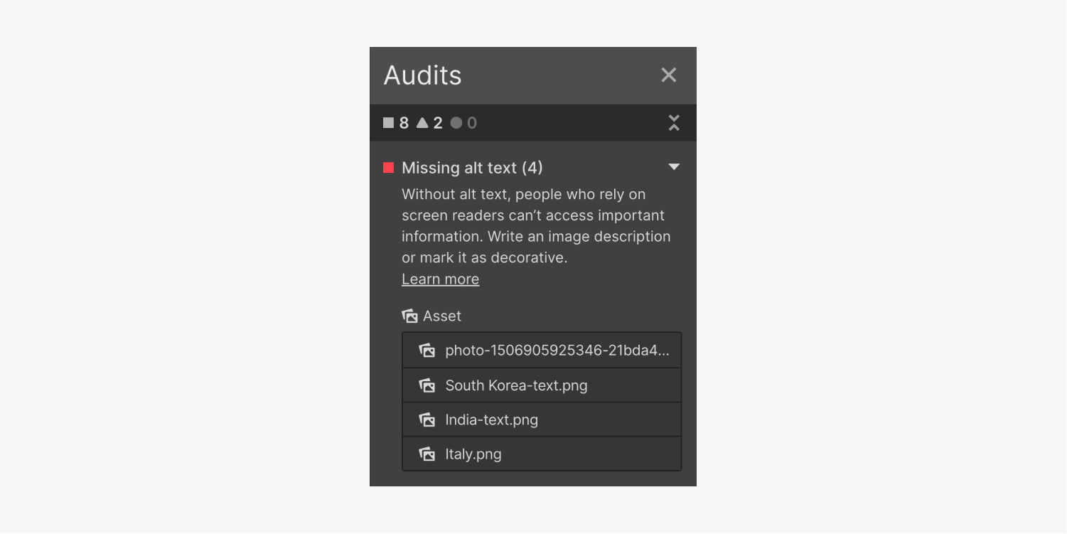
Missing alternative text
Alternative text describes the appearance or function of your image content for visitors who are blind, have low vision, or suffer from visual impairments. It also appears in place of an image if the file fails to load or if a user has disabled images. (It also aids in SEO.)
Helpful to note: A screen reader is a tool that converts text and image content into speech and is utilized by blind, visually impaired, or visually challenged individuals. It also benefits those with cognitive or learning disabilities.
Discover how to rectify missing alternative text.
Reason for flagging missing alternative text by the Audit dashboard
Absence of alternative text indicates you have included images without meaningful alt text or failed to designate an image as decorative. If an image conveys essential information not found elsewhere on the page, individuals unable to view the image will miss that information, and search engines will struggle to interpret your image content.
Note: The Audit dashboard does not assess alternative text for images within Lightbox media components. Moreover, it does not evaluate alternative text for images linked to CMS. Be cautious to add alternative text for images within Lightbox media components and images connected to CMS. Learn more about setting up alternative text for CMS-bound images.
Non-informative link content
Link text should be distinct, understandable without context, and inform readers of the link’s purpose and destination.
Learn how to rectify non-informative link content.
Reason for flagging links without descriptive content by the Audit dashboard
Empty links refer to links lacking meaningful text or image alternative text, causing confusion for users relying on screen readers.
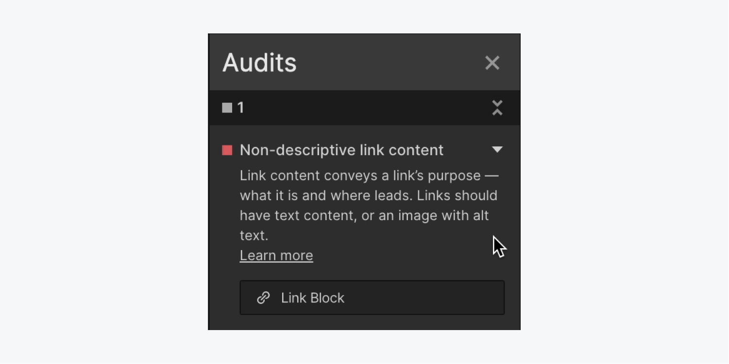
Remember that rasterized text on an image (indicating the text is part of the image and not an independent text unit) is not interpretable by screen readers or search engines. It is recommended to ensure that any descriptive text used with an image is an actual text component.
Get acquainted with accessible typography.
Skipped heading tier
Headings provide individuals with a perception of a page’s arrangement and layout, similar to a table of contents. They enable people to swiftly navigate the structure of your page and divide content to be easily scanned visually or with screen readers. Absence or inadequacy of heading structure compels visitors to put in extra effort to locate what they are seeking.
Discover methods to rectify skipped heading tiers.
Reason for the Audit panel marking skipped heading tiers
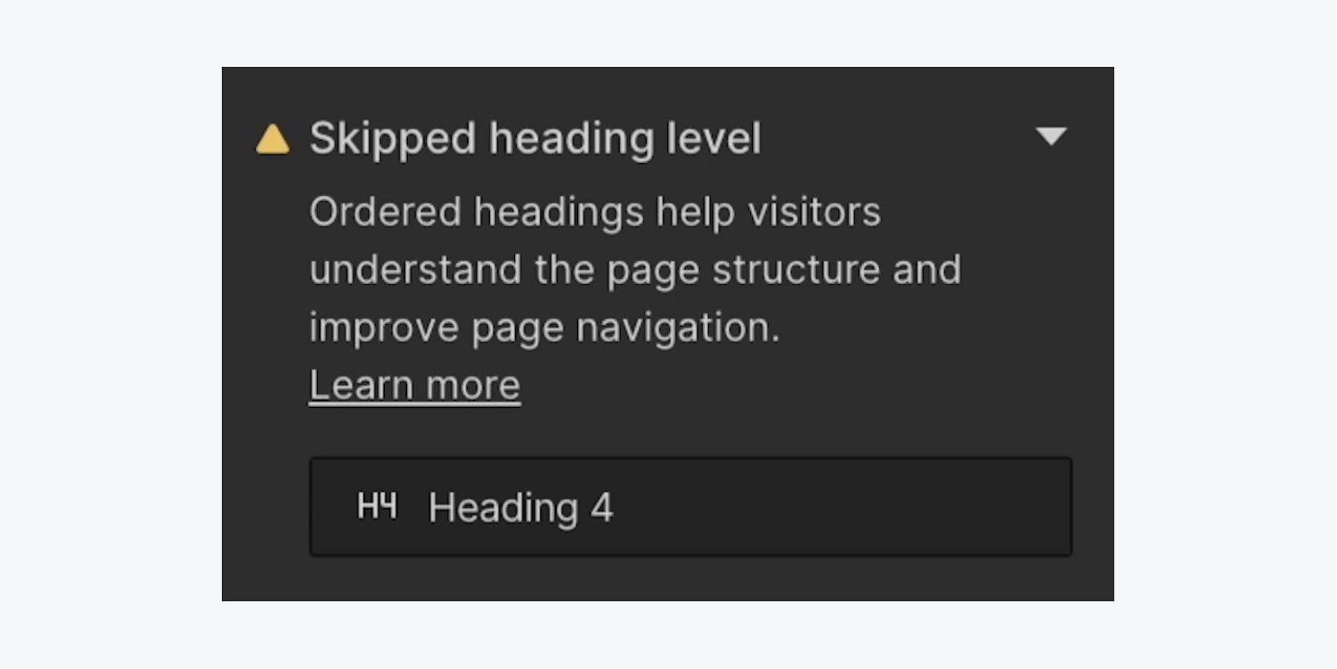
Skipped heading tiers imply that your heading elements (H1, H2, etc.) do not adhere to the correct heading hierarchy. H1 is considered the topmost heading, H2 headings group content below H1, H3 headings fall under H2 headings, and so forth.
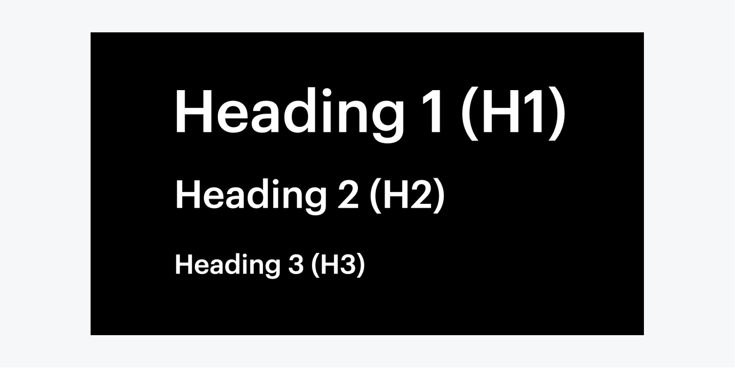
The heading hierarchy is disrupted when a heading level is skipped (e.g., having H1 and H3 headings but no H2 headings). This can be perplexing for individuals with cognitive impairments and those using screen readers.
Replicated element IDs
Designers and developers employ unique identifiers (IDs) to enhance sites for accessibility or to increase site functionality with custom code, encompassing linking, scripting, or styling (using CSS). It is considered standard practice in web development to confirm that each ID is distinct across an entire webpage (i.e., each ID identifies only one element).
Reason for the Audit panel flagging duplicated element IDs
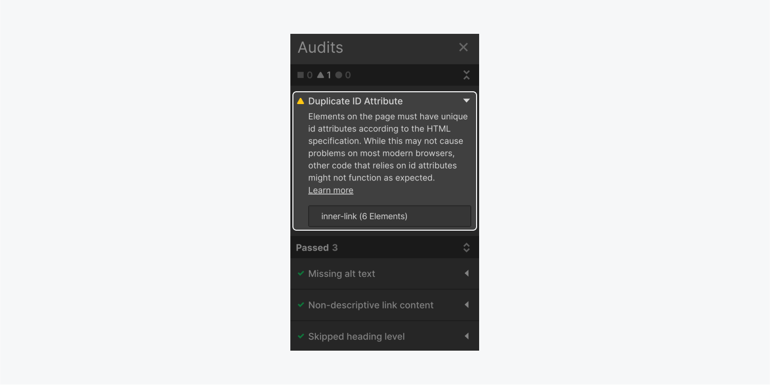
Using the same ID on multiple elements may induce custom code or screen readers to malfunction since they target solely the initial element with the shared ID. Although modern browsers typically accept duplicate IDs, they still pose a heightened risk for site visitors to encounter glitches on the final site.
By utilizing the Audit panel, you can pinpoint duplicate IDs on a page and address them proactively, reducing the time spent debugging custom code and mitigating the risk of impairing the accessibility of your published sites.
Rectify accessibility concerns
In numerous instances, rectifying accessibility concerns encompasses adding the absent classification. We’ll discuss:
- How to correct missing alt text
- How to rectify non-descriptive link content
- How to address skipped heading tiers
- How to amend duplicated element IDs
How to correct missing alt text
You can assign alt text to images from the Asset panel.
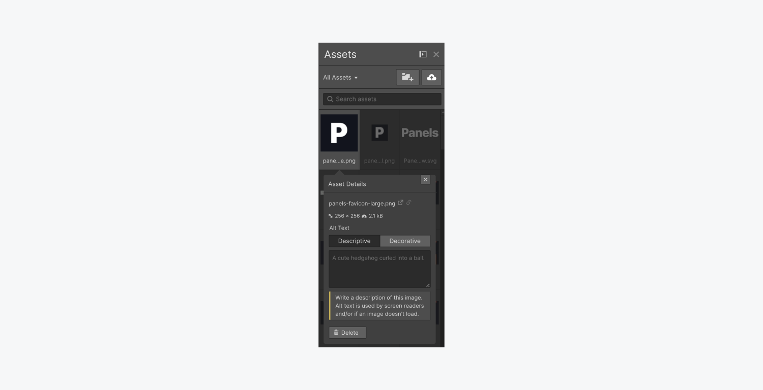
Or, if an image isn’t intended to convey semantic information and is purely decorative, you can explicitly designate the image as decorative so that screen readers skip it.
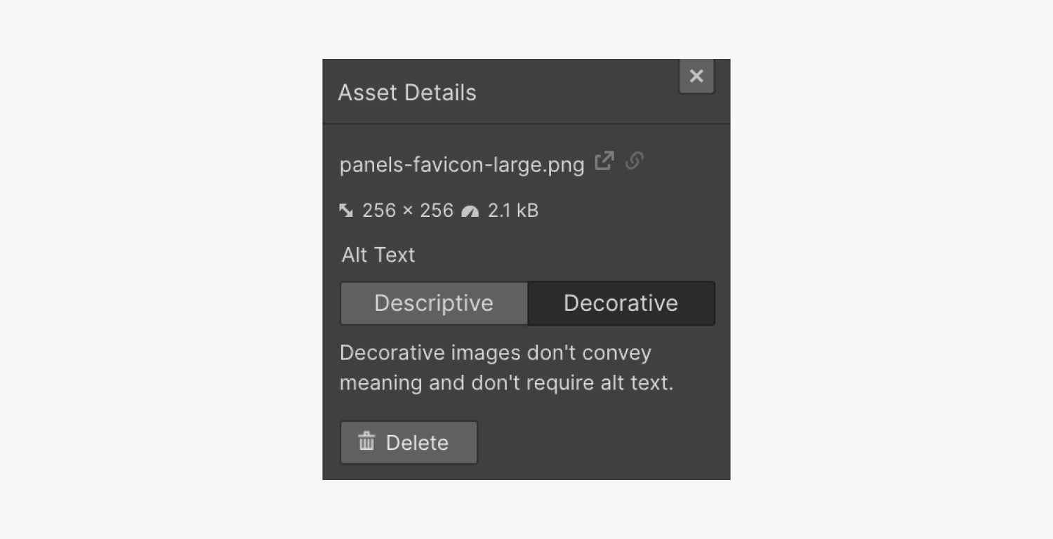
Note: To determine if an image is decorative or informative, remove it from the page. If information is missing without the image, it’s informative and requires alt text. Images that function as links, buttons, logos, or contain crucial information always necessitate alt text.
Crucial: The Evaluation panel does not verify alt text for visuals within Lightbox multimedia components. Furthermore, the Evaluation panel does not analyze alt text for CMS-bound visuals. Make sure to confirm that you’ve included alt text for any visuals within Lightbox multimedia components and visuals linked to the CMS. Learn more on setting alt text for CMS-bound visuals.
Images without alt text in the Audit panel are segmented into 2 categories:
- Resource
- Textual content
Images missing alt text under the Resource category
Whenever the visual is categorized under the Resource classification in the Audit panel, it indicates that the visual on the canvas is linked to a resource that lacks alt text.
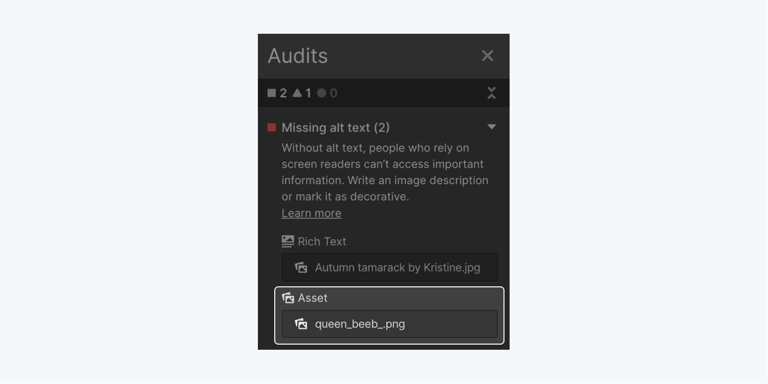
To rectify missing alt text on an Image component:
- Tap on the desired action pointer (this will navigate you to the resource’s preferences in the Resource panel)
- Select “Find it for me” within the Absence of alt text interface to automatically pinpoint the alt text settings for the visual in the Resource panel
- Incorporate explanatory alt text or designate the visual as ornamental
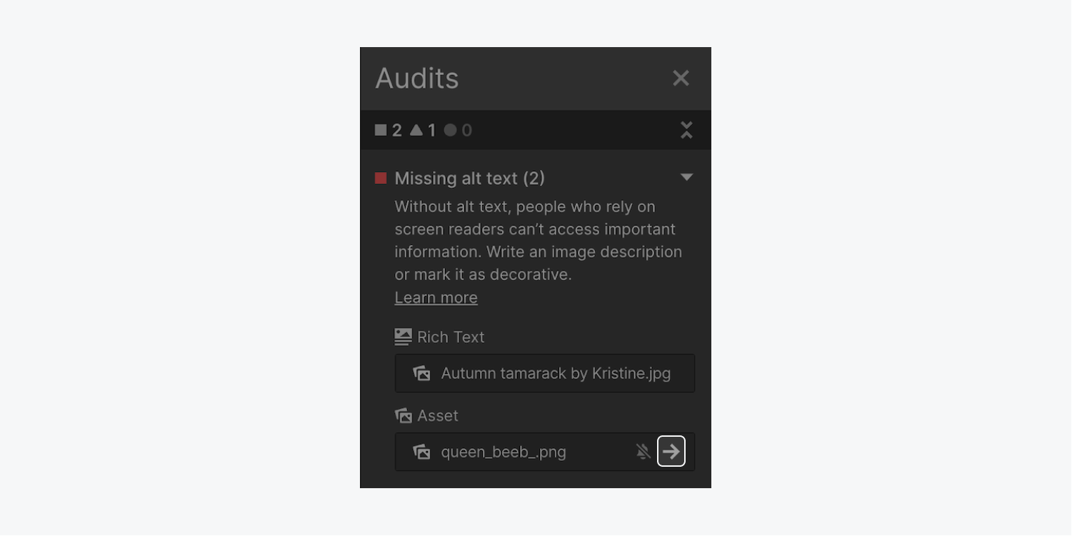
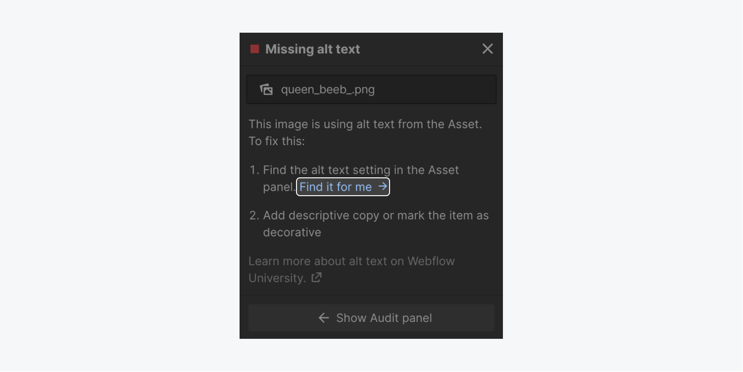
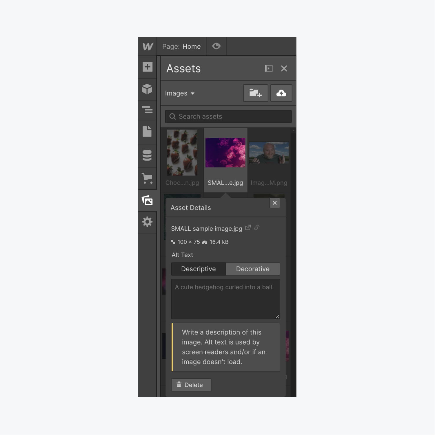
Good to remember: You can relocate the informative interface by clicking and dragging it across the canvas.
If you prefer to substitute alt text configured on visuals in the Asset panel, you can introduce custom alt text to individual visuals on the canvas.
To append custom alt text to visual elements on the canvas:
- Choose the Visual component on the canvas
- Select the “gear” icon to access the Visual settings
- Opt for “Personalized description” from the Alt text drop-down list and input custom alt text for that visual
Find out more about setting alt text on specific visuals.
Images with missing alt text under the Textual content category
If the visual is part of the Textual content category in the Audit panel, it indicates that the visual within the textual element lacks alt text.
To resolve missing alt text on a visual within a textual element:
- Tap the desired action pointer to locate the textual element on the canvas and open the Absence of alt text interface
- Select “Find it for me” in the Absence of alt text interface to automatically find the alt text settings for the visual in the Resource panel
- Integrate explanatory alt text or classify the visual as ornamental
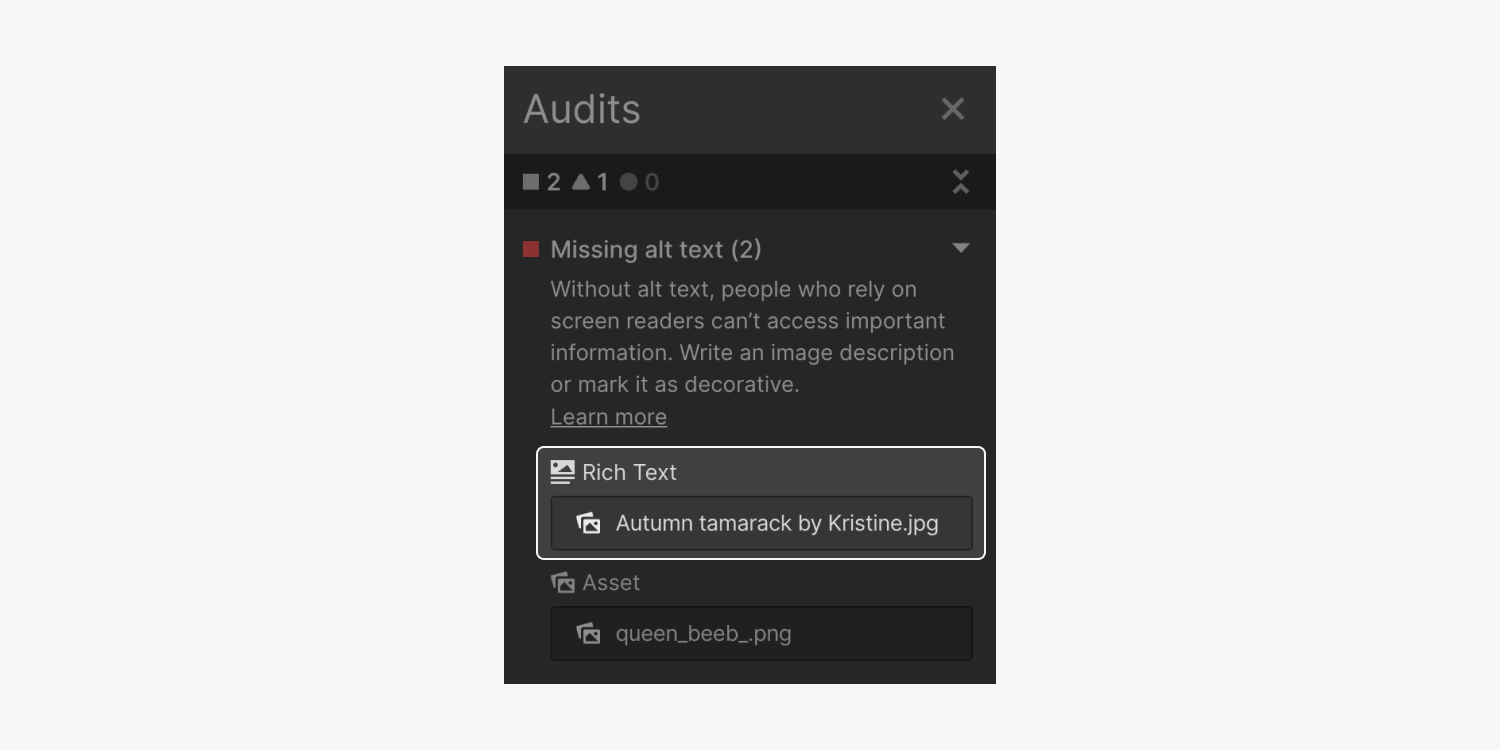
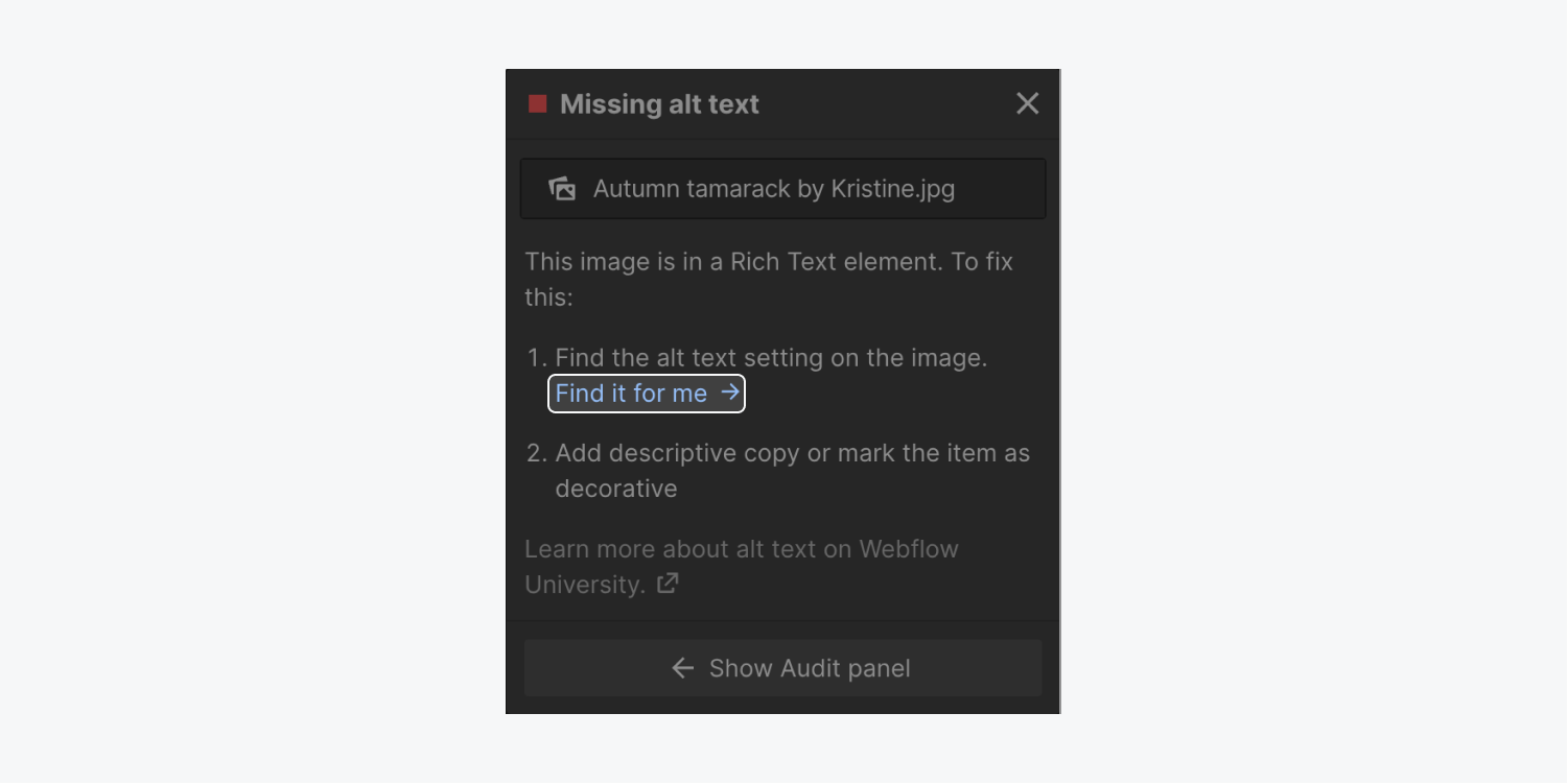
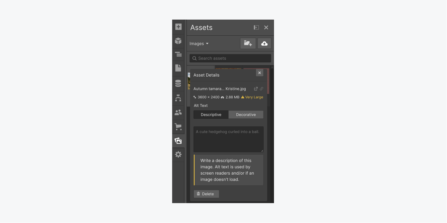
If you wish to replace alt text defined for images in the Asset panel, you have the option to include personalized alt text for individual images within rich text elements.
To provide customized alt text for images within rich text elements:
- Click twice on the image inside the rich text element on the Designer canvas
- Tap the “wrench” symbol
- Opt for “Custom” from the Alt text dropdown and input custom alt text for that particular image
Find out more about configuring alt text for single images.
Important: The Audit panel does not validate alt text for images within Lightbox media elements. In addition, the Audit panel does not verify alt text for CMS-bound images. Ensure you have provided alt text for all images within Lightbox media elements and images linked to the CMS. Learn more about defining alt text for CMS-bound images.
Tips for crafting effective alt text
- Explain the purpose, intention, and significance of the image
- Avoid repeating surrounding content (e.g., alt text is unnecessary if a caption fully describes an image, alt text is redundant, or it duplicates names of individuals in alt text for their biographies. This is repetitive text and does not describe the image or appearance of individuals.)
- Incorporate punctuation (to assist screen readers in providing a more human-like description of the image)
- Compose the text so that visually impaired visitors receive substantial information about the image from alt text, and limit your description to 1 to 2 sentences of essential details (do not go overboard with the description)
- Avoid vague terms like “chart,” “image,” or “diagram,” unless they add relevant context—instead, elucidate the meanings or trends depicted in charts, diagrams, or images
Resources
To delve deeper into image alt text and screen readers, explore our Alt text tutorial, in conjunction with How to Design Great Alt Text: An Introduction and Images must have alternate text from Deque University.
How to amend uninformative link content
To rectify this issue, ensure that all link components on your page include purposeful, descriptive text.
Avoid generic terms like “read more,” “link,” or “click here.” While the Audit panel does not offer specific advice on generic terms, utilize clear, explicit language regarding the function of the link to enhance its usability (e.g., “Download assets”).
You can also utilize assets without text merged with the image. Instead, superimpose text elements on your image assets.
Remember, if you employ image links (such as icon buttons), ensure you also include alt text for those.
Select the target action arrow (the arrow in the Audit panel adjacent to your link) and then revise the link by appending alt text for the image/icon (if the link contains an image).
You can adjust any alt text modifications in your element settings (the settings for your image element) to enhance the descriptiveness of your alt text.
Resources
To explore more about how to configure links and the available options, refer to our links article and the WCAG Link purpose criterion.
How to resolve omitted heading levels
Headings should adhere to a logical, numerical sequence that mirrors the content framework and clearly outlines the section contents.
For instance, the title of this tutorial (Intro to the Audit panel) is the sole level 1 heading (H1) on this page, the subheadings of this tutorial are level 2 headings (H2), and any headings within those subheadings follow further levels (H3, H4, etc.). The heading for this paragraph is a level 3 heading and elucidates theHere is the updated content of this section.
Illustratively, utilizing an <H2> component for a segment title and afterward utilizing <H4> components for the segment’s subheadings will bring about the review failing because the <H3> level is bypassed.
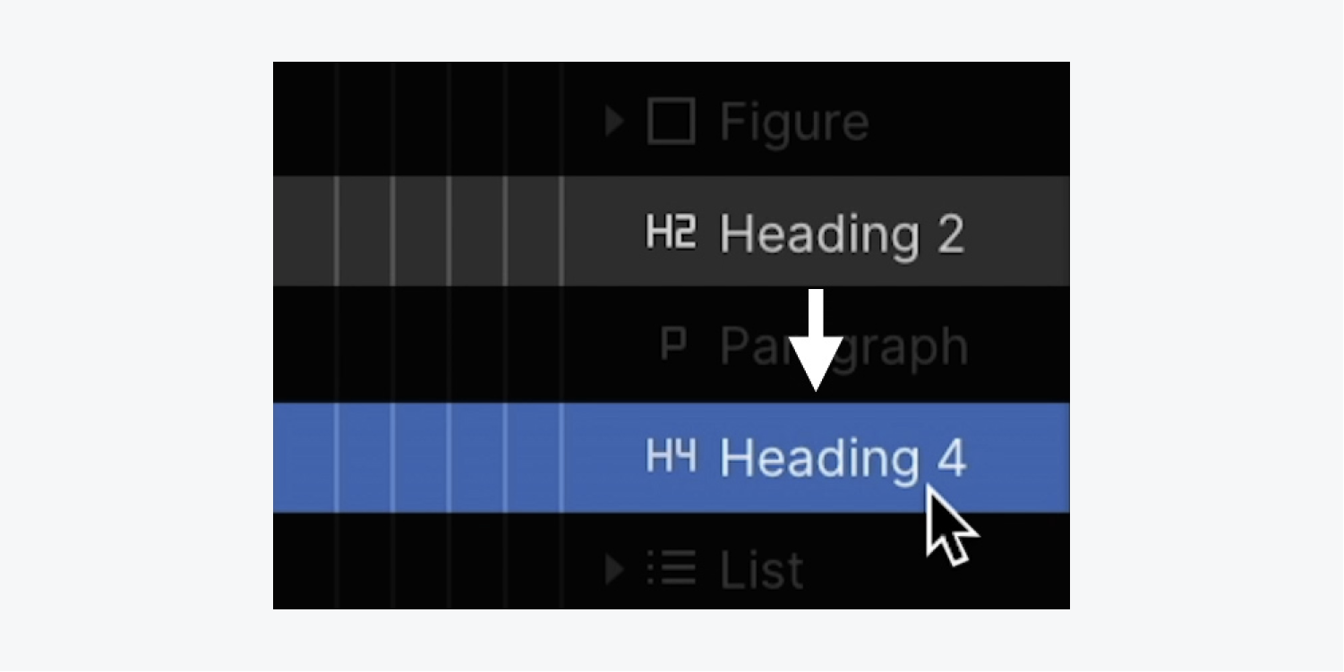
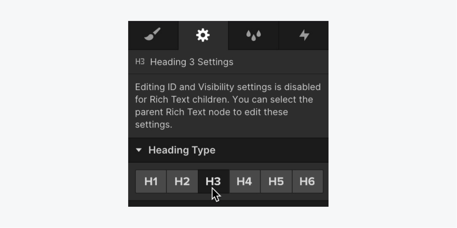
If the overlooked heading was an unintended exclusion, you can assign it to the proper heading kind:
- Choose the Header you intend to change
- Unfold the Settings section (D)
- Click on the Header type that was missed (e.g., “H3”)
Supporting Material
To delve deeper into proper heading sequence and markup configuration, explore the documentation on WebAIM’s site.
How to amend replicated element IDs
Every element ID should be distinct across an entire webpage (i.e., each ID solely identifies an individual element).
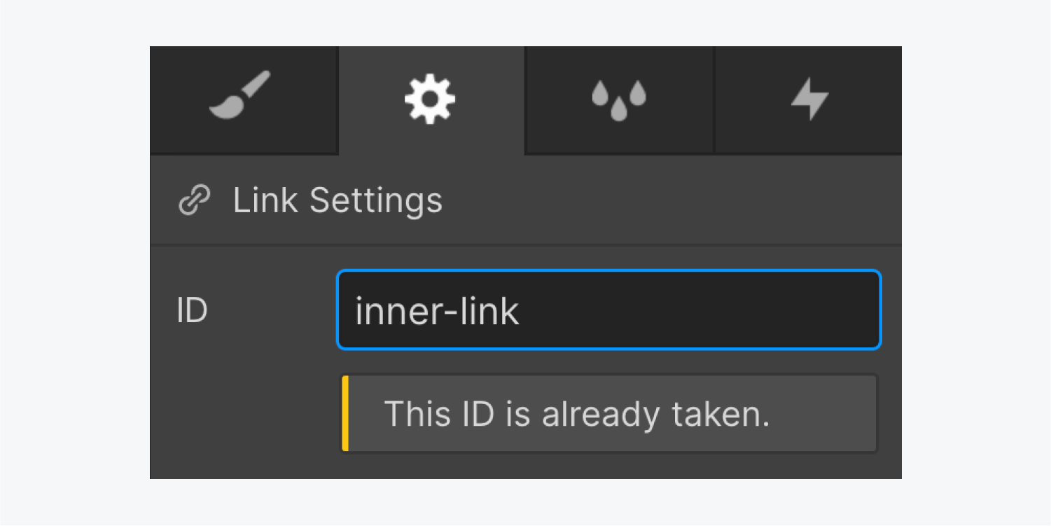
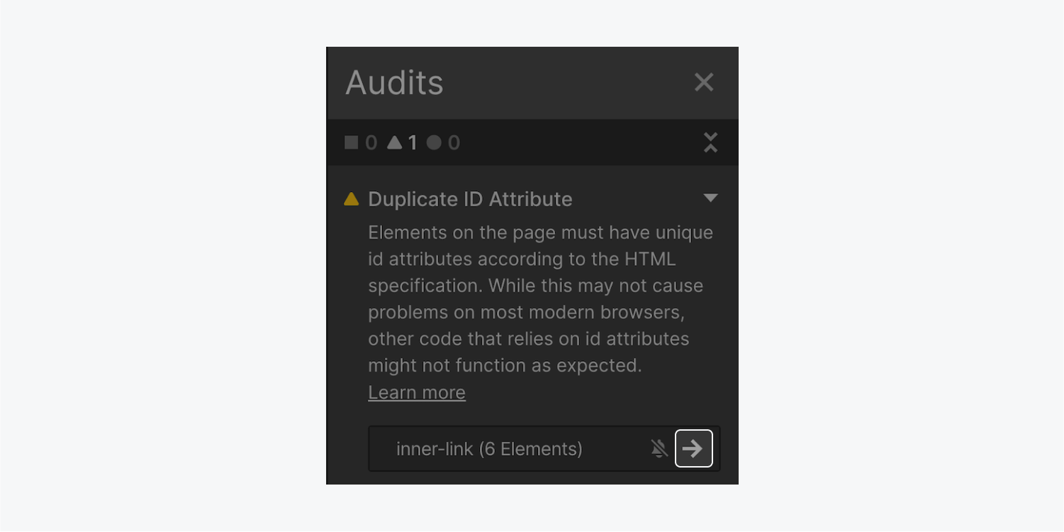
Assigning the same ID to more than one element will prompt an error notification in the Settings panel upon adding the ID and lead to subsequent site audits to fail. The Audit panel will highlight all elements and component instances with duplicated IDs to facilitate identifying and rectifying any duplicated IDs on your site promptly.
For fixing duplicated IDs:
- Tap the desired action arrow adjacent to the flagged ID in the Audit panel to reveal all elements and component instances wielding the duplicated ID
- Click on the “Display me” arrow adjacent to the flagged elements (this action will transport you to the element settings in the Settings panel where the ID is established)
- Adjust or erase the duplicated ID
- Repeat the preceding steps for every element with the duplicated ID
Supporting Material
For further insight, refer to the MDN documentation on the ID attribute.
Bypass accessibility problems
On certain occasions, you may wish to overlook a flagged problem in the Audit panel. For instance, perhaps your content necessitates a deviation in the heading hierarchy. Or possibly you are constructing impromptu and prefer to arrange your content out of sequence.
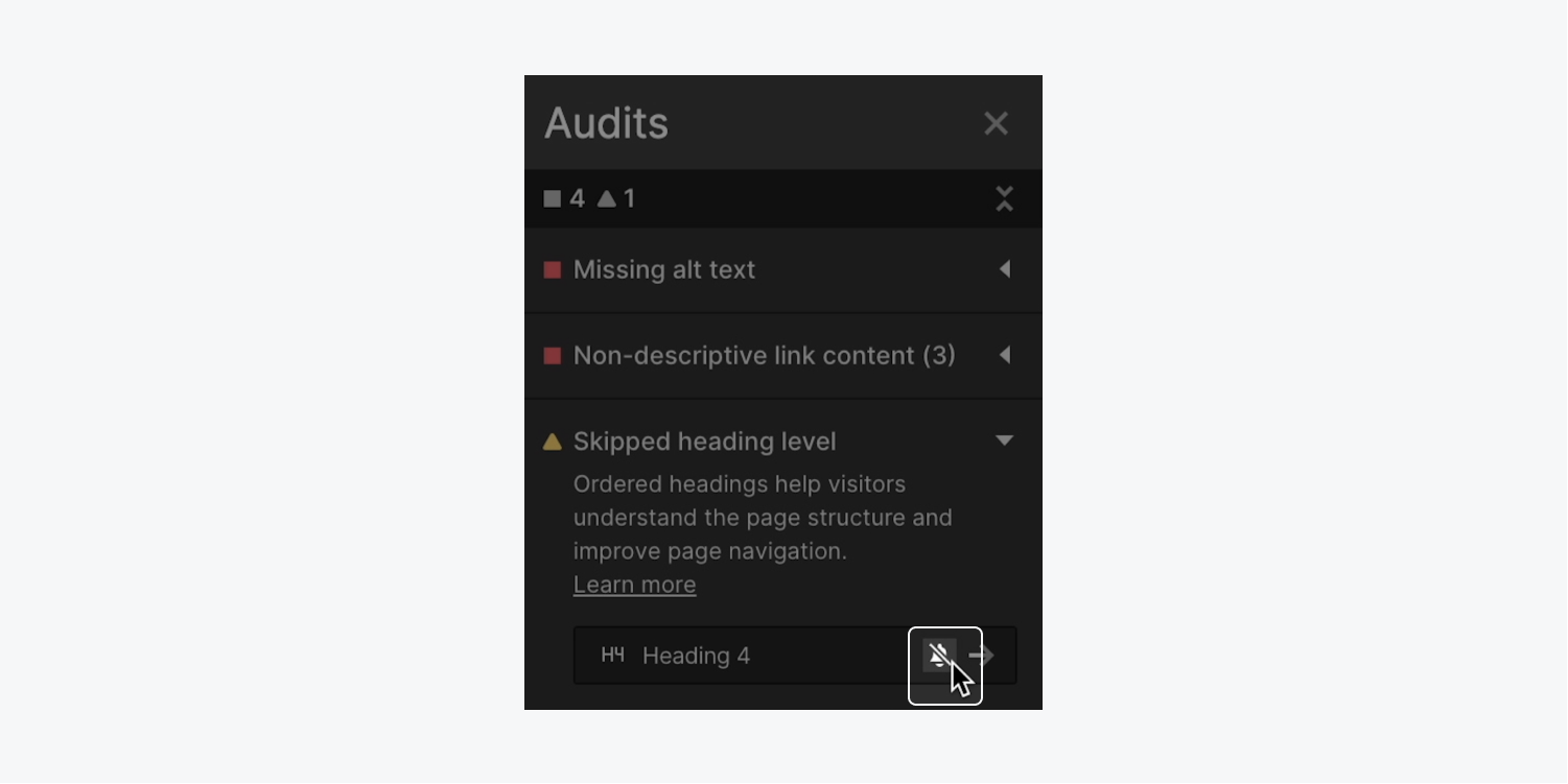
To disregard the problem and waive the notification temporarily (or permanently) in the Audit panel:
- Expand the Audit panel
- Hover over the problem you wish to disregard and click the “silenced bell” icon
Reconsider accessibility issues
Most of the time, dismissing a problem is a provisional resolution while you compose your design. You can reverse the decision to disregard the issue temporarily, and reflag it for rectification as you progress in designing and developing.
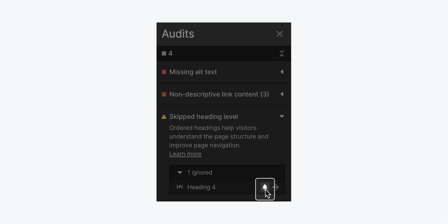
To reverse dismissing an issue:
- Expand the Audit panel
- Click the disclosure arrow to the left of the issue you ignored
- Hover over the dismissed issue and click the “bell” icon
Should you possess feedback, issues to report, or queries about the Audit panel, feel free to inform us in the feedback thread on our forum.
Related literature: Enhance the accessibility of your site
